The first stable release of Bootstrap 4 is here. And it’s pretty cool. This article looks at some of its best features.
It was on 19th August, 2015, that Bootstrap 4 alpha was finally out. This was after months of anticipation, anxious tweets asking for the disclosure of a release date, and a few scattered scraps of news by Mark Otto and Jacob Thornton, having the effect of intensifying rather than quenching our curiosity. More than two years later, the wait for the first stable release is finally over.
As a designer, I love crafting my own CSS. However, I confess that I find Bootstrap a well thought out and strongly supported front-end framework that I’ve immensely enjoyed using — both for building my projects and for learning more about writing better, modular CSS.
As soon as news of the latest release was out, I downloaded the source files for Bootstrap 4 and spent some time going back and forth between reading the docs and digging into the code to find out more.
Here are the latest Bootstrap features I like the most. I hope you find them awesome too!
#1 New Interactive Documentation
The Bootstrap documentation has been exemplary since the framework’s early days. It’s always had the crucial role of being a living document — that is, a tool in sync with the collaborative effort of building the framework and communicating it to others:
Abstracting and documenting components became part of our process for building this one tool and Bootstrap in tandem. — Mark Otto in 2012
Mark himself is quite a fan of great documentation. His Code Guide by @mdo is evidence of his attitude that high-quality documentation is part and parcel of writing high-quality code.
The documentation for version 4 has been rewritten from scratch using Markdown, and its appearance has been revamped with a new layout, color palette, and the use of system fonts.
The Bootstrap docs:
- are a pleasure to navigate, both using the traditional sidebar navigation and the brand new search form
- structure information in a logical manner; content is never overwhelming or confusing
- include instructions and how-tos covering all areas of the framework, from different ways of installing Bootstrap to using each component and dealing with browser quirks.
Finally, if you’d like to run the Bootstrap docs locally on your computer, follow these instructions.
#2 Top-notch Modular Architecture
Bootstrap has often been the target of complaints about code bloat, too opinionated CSS styling, and a profuse quantity of components. The good news is that Bootstrap 4 has both simplified and further modularized its structure.
To begin with, some components have been eliminated altogether. The Glyphicons icon library is not bundled with the framework any more. Panels, wells, and thumbnails are replaced by the Cards component. Also, all CSS reset/normalize code and basic styling are now dealt with in a single brand new module called Reboot.
It’s safe to say that, now more than ever before, using Bootstrap feels like assembling and arranging Lego blocks in different ways. Here are some examples to clarify what I mean.
Easy-to-Override Variables
Bootstrap’s Sass variables use the !default flag, which makes it easy for you to override their values. Grab a copy of the latest release of Bootstrap source files and open _variables.scss in a code editor. Here are just three of the first variables you’ll come across:
$white:    #fff !default;
$gray-100: #f8f9fa !default;
$gray-200: #e9ecef !default;
$gray-300: #dee2e6 !default;!default flag. No need to mess with the original Bootstrap source code.
Ready-made, Light-weight Versions
Besides bootstrap.scss, which includes the entire framework, you’ll also find bootstrap-grid.scss and bootstrap-reboot.scss.
Each of these files includes only selected portions of Bootstrap. If you don’t need the full-blown framework in your project, this is a great head-start: just compile one of the light-weight options and you’re good to go.
Corresponding cut-down compiled packages are available for download from the Bootstrap 4 docs page.
Reusable Components
You can skin and modify components by mixing and matching a few classes. For instance, the brand new cards component is a great example of this versatility in action.
Here’s all the HTML you need for the simplest instance of this component:
<div class="card">
  <div class="card-body">
    This is some text within a card body.
  </div>
</div>
This flexible component easily adapts to a variety of content types and layouts. For instance, you can also arrange cards in touching equal width and height columns by wrapping them in a .card-group container:
<div class="card-group">
  <div class="card">
    <!-- card code here -->
  </div>
  <div class="card">
    <!-- card code here -->
  </div>
  <div class="card">
    <!-- card code here -->
  </div>
</div>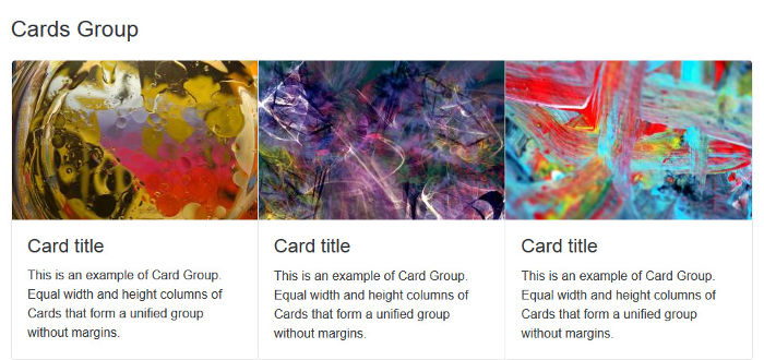
Alternatively, you can group cards having equal width and height columns with margins, using the .card-deck class as follows:
<div class="card-deck">
  <div class="card">
    <!-- card code here -->
  </div>
  <div class="card">
    <!-- card code here -->
  </div>
  <div class="card">
    <!-- card code here -->
  </div>
</div>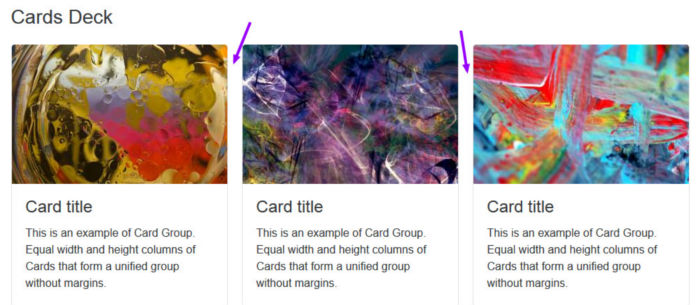
Another cool thing you can do with cards is build a Masonry-like layout. Just wrap the cards in a container with the .card-columns class and leave the rest to Bootstrap:
<div class="card-columns">
  <div class="card">
    <!-- card code here -->
  </div>
</div>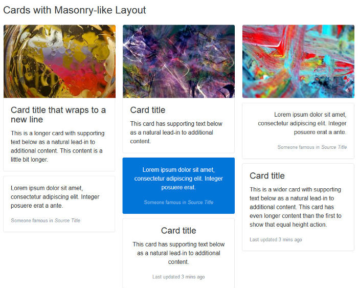
Here I’ve offered only a few examples of Bootstrap’s modular architecture. I think these suffice to show how flexibility and extensibility are built into the framework as a whole, which makes it fun and convenient to use.
#3 Easier Scaling Across Screen Sizes
Since version 3, Bootstrap has introduced a mobile-first approach to web design. That is, start developing for smaller screens first and progressively add or adjust features as you target larger screens.
Version 4 makes further improvements towards adaptive web design by taking the following steps.
The Introduction of a Flexbox-based Grid System
Bootstrap now uses Flexbox to build its grid system.
Since Flexbox is natively flexible, coding a responsive page layout is going to require fewer classes. For instance, to achieve a layout with three columns side by side on larger screens and stacked on top of each other on small screens, just add the col-sm class to each column div:
<div class="container">
  <div class="row">
    <div class="col-sm">
      One of three columns
    </div>
    <div class="col-sm">
      One of three columns
    </div>
    <div class="col-sm">
      One of three columns
    </div>
  </div>
</div>
The Move to rem
Where earlier versions of Bootstrap set px as the absolute unit of measurement, version 4 mostly uses the relative units rem and em. The goal is to have all elements on a web page harmoniously scale with the screen size.
For instance, if you dig into _variables.scss, you’ll see that $font-size-base is set to 1rem, which assumes the browser’s default font-size (usually equivalent to 16px). Bootstrap uses this variable’s value to set the font-size for the document’s <body> (see _reboot.scss).
This means that it’s easier to build web pages where all elements proportionally scale up or down with the screen size without messing up your design.
Here Comes the Extra-large Breakpoint
The introduction of the new extra large breakpoint for the grid system further helps building layouts that scale well across different screen sizes.
This breakpoint is applied using the .col-xl- class and is triggered on screen sizes from 1200px upwards.
Global Margins Reset and Utility Spacer Classes
Forcing consistent spacing between elements in a design is something most front-end developers, including myself, obsess over. It’s a tricky task and the plethora of screen resolutions available doesn’t make the job easier.
To help keep both vertical and horizontal spacing between elements under tight control, Bootstrap 4 resets margin-top to 0 while keeping a consistent margin-bottom value on all elements.
Further, the framework offers an impressive number of utility classes to make it easier for you to adjust margins and paddings at a more granular level across varying screen sizes.
Conclusion
I’ve introduced three broad features that in my view make Bootstrap really stand out:
- great documentation
- Mega Lego–type architecture
- easier scaling across devices
Did you notice I didn’t mention Bootstrap’s move from Less to Sass? Or the rewrite of all JavaScript plugins in ES6?
I consider these to be more like indications of Bootstrap staying current and taking advantage of the latest tools, rather than features integral to the framework itself. But perhaps you disagree with me.
Have you looked into the latest release of Bootstrap? What are your favorite features? Let us know in the comments!
Frequently Asked Questions (FAQs) about Bootstrap’s Super Smart Features
What makes Bootstrap a preferred choice for web development?
Bootstrap is a popular front-end framework that offers a variety of features to simplify web development. It provides a responsive grid system, pre-designed components, and powerful plugins built on jQuery. Its responsive CSS adjusts to phones, tablets, and desktops, making it easier to design websites that look great on all devices. Bootstrap also supports all modern browsers, ensuring your website functions seamlessly across different platforms.
How does Bootstrap’s grid system enhance web design?
Bootstrap’s grid system allows for up to 12 columns across the page. It’s flexible and fully responsive, meaning it adjusts according to the screen size. This makes it easier to create a structured layout for your web pages and maintain consistency across your website. You can also nest grids within grids for more complex layouts.
What are some of the pre-designed components offered by Bootstrap?
Bootstrap offers a wide range of pre-designed components that can be easily integrated into your web pages. These include navigation bars, dropdown menus, progress bars, thumbnails, alerts, and much more. These components are fully customizable and can be styled to match your website’s design.
How do Bootstrap’s jQuery plugins enhance functionality?
Bootstrap comes with several jQuery plugins that add additional functionality to your website. These include plugins for transitions, modals, dropdowns, and tooltips, among others. These plugins can be included individually or all at once, and they offer a great way to add interactive features to your website without having to write complex JavaScript code.
How does Bootstrap ensure compatibility with modern browsers?
Bootstrap is built to work best in the latest desktop and mobile browsers. It ensures compatibility by using feature detection, a technique that checks whether a browser supports a certain feature before using it. This means that even if a browser doesn’t support a certain feature, your website will still function correctly.
How customizable is Bootstrap for my web projects?
Bootstrap is highly customizable. You can easily override its default variables to suit your project’s needs. You can change the default grid system, colors, fonts, and more. Additionally, Bootstrap’s source Sass files are available if you want to dive deeper into customizing your design.
How does Bootstrap contribute to faster web development?
Bootstrap comes with ready-to-use components that can be easily integrated into your web pages. This saves you the time and effort of coding these components from scratch. Additionally, Bootstrap’s consistent framework allows for faster, more efficient coding.
Can I use Bootstrap with other frameworks?
Yes, Bootstrap can be used alongside other frameworks. It’s designed to be as flexible as possible, so you can use it with any other framework without any issues.
How does Bootstrap handle CSS preprocessors?
Bootstrap uses Sass, a powerful CSS preprocessor, for its source CSS files. This allows you to use variables, nesting, mixins, and more, which can greatly simplify your CSS and make it easier to maintain.
What kind of support and resources are available for Bootstrap users?
Bootstrap has a large, active community that offers plenty of resources and support. There are numerous tutorials, guides, and examples available online to help you get started. Additionally, you can find help on various forums and on the official Bootstrap website.
 Maria Antonietta Perna
Maria Antonietta Perna is a teacher and technical writer. She enjoys tinkering with cool CSS standards and is curious about teaching approaches to front-end code. When not coding or writing for the web, she enjoys reading philosophy books, taking long walks, and appreciating good food.