Whenever you read about design and HTML these days, you see references to so-called table-less CSS layout. This article covers how to use the power of CSS to theme eZ publish 3.5. Here, we’ll walk through every step required to create a new theme using CSS.
Getting Started
To be able to follow these steps, you need to have eZ publish installed. I won’t go into detail on how this is achieved, since it’s already been explained at www.ez.no. During installation, you’ll need to select the news package and turn off the left menu. You’ll then have the same setup I use as an example during this article.
You should furthermore have read the article about configuring eZ publish here at SitePoint (Build a WebDav-enabled Intranet with eZ publish). In this article, I’ll demonstrate how you can customize eZ publish even further than was explained there.
If you don’t want to install eZ publish on your system, you can use the online demo of eZ publish available at http://devel.ezpublish.no/ for testing. The respective Website for the administration interface is found at http://admindevel.ezpublish.no/. You can login as the administrator with the login username admin and the password publish.
Modifying the Code
This article explains how you can modify the CSS in eZ publish for the purpose of creating a new eZ publish site style package. Such a package can be imported into any eZ publish 3.5 installation and will change the look and feel of the site instantly. The first step in this process is to get our hands on the CSS files. There are two CSS files that we’ll need to change: site-colors.css and classes-colors.css. These are the files we’ll use later to create our eZ publish CSS package.
There are two ways in which we can modify these files. The first possibility is to open the eZ publish site in a browser that’s capable of saving a complete page containing HTML images and CSS. I used Opera for this example. Once you’ve loaded the default eZ publish user site, you can choose the “File->Save with images” menu as available in Opera. This saves the whole page as a static copy, which you can then use in applying the CSS.
Opera preserves all the CSS files, but renames the files. The file originally called site-colors.css is renamed site-col.css; classes-colors.css is renamed classes-.css. Opera does this to ensure compatibility with the older style file name sizes required in DOS, which have 8 letters before, and 3 after, the dot. This file is the offline copy of the page that I’ll use to create the CSS package throughout the rest of the article.
The other approach is to access the CSS files directly should you have eZ publish installed – this, of course, requires access to a server that runs eZ publish. In a default installation, you can access the CSS files in the directory packages/styles/t01/files/default/file/design/base/stylesheets/t1/ of the eZ publish root.
Quick Overview of the Page
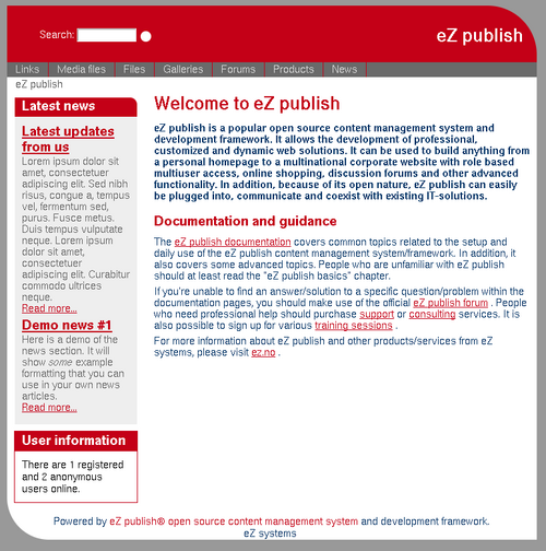
The image below shows what the eZ publish installation looks like after a default installation. The layout of all the single page elements is defined in the two mentioned CSS files. To make it a bit easier for you to customize the files, let me explain how the different parts of the page are named for CSS purposes.
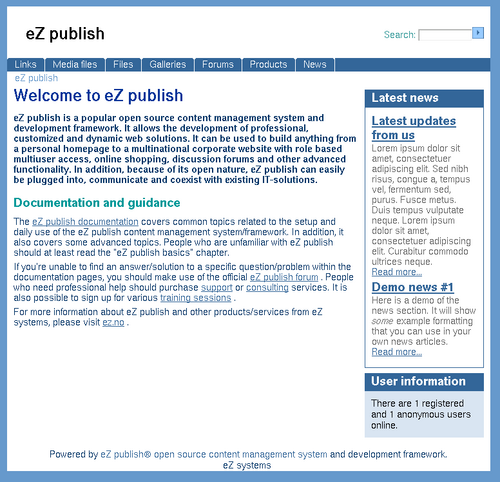
Starting from the top, we have the area that contains all the primary content, and is, accordingly, called “allcontent”. The top of the page, called “topcontent”, contains two elements: the “header” and “toolbar-top”. The header is used to display the logo or title of the site, while the toolbar can contain various tools like the search box and login information.
The upper menu is called “topmenu”; potentially eZ publish can also provide a left menu, but this is hidden in this setup. As I mentioned above, you’ll also need to hide the left menu in your setup in order to follow this tutorial.
The navigation’s breadcrumbs element is called “path”. The boxes on the right hand side are contained in the “rightmenu”, and we call the items “toollist” and “toolbox”. The “toollist” is usually a list of the latest news, for example, while the “toolbox” contains fixed information such as the count of visitors currently online, the search box and the logged-in user’s details.
At the bottom of each page lies another toolbar called “toolbar-bottom”, which is hidden in the default installation, but can be turned on in the administration interface. The last part of the page is called “footer,” and contains the copyright information.
Shuffling Elements
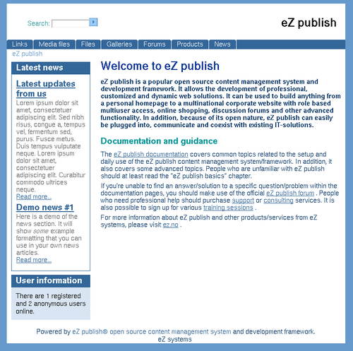
To demonstrate how we can change the overall layout simply by altering the CSS files, let’s float the toolbars in a different way. Here’s the result of this section’s experimentation:
We could start with the header, which is divided into two parts: the logo on the left, and the toolbar with search box on the right.
To float the header to the right, we need to add the following CSS fragment to site-colors.css. You can add these at the bottom of the CSS file.
div#header-design

{

    float: right;

}
Then we float the top toolbar to the left to change the element’s position. This is done by adding the following CSS codes to the site-colors.css file.
div#toolbar-top

{

    float: left;

}


div#toolbar-top ul

{

    float: left;

}
Now, that was simple. We’ve already customized the layout in a way that would have been impossible if the HTML had been tagged with a table structure that specified the layout.
Let’s continue with the right menu, which contains the latest news toolbar, and move it to the left. This is done in a similar way as the previous example: we add the CSS code shown below to site-colors.css. Note that we need to add some more padding on the left to create a space between the toolbar and the edge of the main layout.
div#rightmenu

{

    float: left;

}


div#rightmenu-design

{

    padding-left: 10px;

}
You can see that the main content appears under the right menu. This occurs because the browser breaks the flow, as there’s not enough room. To avoid breaking the design, we need to change the margins of the main content. If we add a 16em margin on the left, and 10px on the right, we have a CSS setting that works. For that reason, we need to change the CSS settings in site-colors.css as shown below.
div.maincontent-noleftmenu

{

    margin-left: 16em;

    margin-right: 10px;

}
Colorizing
Tuning the colors of a site is probably the first thing many of us consider when we start customizing, because we want to make the design reflect the profile of our company or organization. It’s also the simplest to do, because it basically involves changing some hex color codes that we can get from Photoshop. Here’s the page after a little color experimentation:
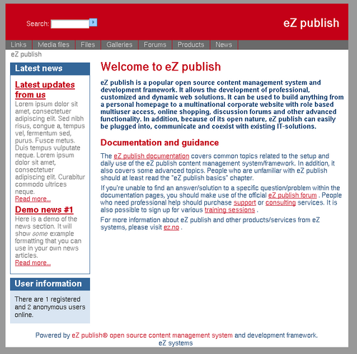
Let’s start at the top. We’ll make the background color of the page grey and the background of the header red. This is achieved by adding the CSS shown below to site-colors.css.
body

{

    background-color: #999;

}


div#topcontent

{

    background-color: #c40017;

}
Now that we’ve changed the background color, we need to alter the color of the text. You can make the top toolbar white by adding the following CSS to site-colors.css.
div#toolbar-top li.toolbar-item, div#toolbar-bottom li.toolbar-item a

{

    color: #fff;

}
The colors for the top menu also need to be changed. I decided to give them two different tints of grey. The selected menu items are made light grey, while the unselected items remain dark gray. The text color is also set to light and dark gray. The CSS code for site-colors.css is shown below.
div#topmenu li

{

    background-color: #6a6a6a;

    border-color: #c40017;

}


div#topmenu li.selected

{

    background-color: #d9d9d9;

}


div#topmenu li a

{

    color: #ddd;

}


div#topmenu li.selected a

{

    color: #555;

}


div#submenu

{

    background-color: #d9d9d9;

    border-color: #d9d9d9;

}


div#submenu li a

{

    color: #555;

}
To make the breadcrumbs gray, we can simply add the CSS code shown below to site-colors.css.
div#path p, div#path p a

{

    color: #555;

}
The header needs to be made red; thus the CSS below needs to be added to site-colors.css.
div#maincontent h1, div#maincontent h2, div#maincontent h3

{


    color: #c40017;

}
Finally, we change the colors of the links in our theme. This is achieved simply, via the following CSS snipped.
a

{

    color: #c40017;

}
Toollist Curves
As an example of how images can be used in a CSS-based design, I’ll make some of the corners in our design round by adding background images to the layout. The first curved corner is defined for the right corner of the tool list, showing the latest news.
The screenshot below shows what the toollist looks like after we have applied these CSS changes.
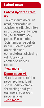
We create an image that has a red foreground color and a white background color. The image is aligned to the top right in the header of the tool list. If we additionally make the borders white and tint the background color of the whole box, the corner of our tool list will appear nicely rounded. Add the CSS code shown below to the site-colors.css file. The image needs to be placed in a sub-folder called images.
div.toollist-design

{

    background-color: #eee;

    border-color: #fff;

}


div.toollist-design h2

{

    color: #ffffff;

    background-color: #c40017;

    background-image: url(images/rounded_right.gif);

    background-repeat: no-repeat;

    background-position: top right;

}
Toolbox Curves
Next, we modify the tool box.
The following CSS code adds a border and sets the background color to white. I did this to make the display of the tool box a little different from the tool list, since they hold different types of content.
div.toolbox-design

{

    background-color: #fff;

    border: 1px solid #c40017;

}


div.toolbox-design h2

{

    color: #ffffff;

    background-color: #c40017;

}
I want to add two more rounded corners at the upper right corner of the main content area and the lower left corner. This is done with the same technique: just create an image with the respective curve, and add it as a background image. The CSS statements that are used to set the background images are shown below.
div#topcontent

{

    background-image: url(images/rounded_top.gif);

    background-repeat: no-repeat;

    background-position: top right;

}


div#allcontent

{

    background-image: url(images/rounded_bottom.gif);

    background-repeat: no-repeat;

    background-position: bottom left;

}
Finally, let’s change the image of the search button. Since it’s a blue bitmap, I replace it with a simple white dot on a red background. This submit button is also changed to reflect a vertical alignment.
input.searchimage

{

    width: 17px;

    height: 17px;

    vertical-align: middle;

    margin-left: 5px;

    background-image: url(images/bullet.gif);

    background-repeat: no-repeat;

}
The Result
We have achieved some fairly simple CSS changes and created our own theme — the result is shown in the screenshot below. If you are a Web designer, you can now envisage the possibilities of easily theming eZ publish sites using CSS.
Creating a Package
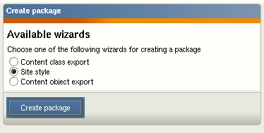
Having changed the CSS files, we must wrap them into a reusable site style package for eZ publish. This is done in the administration interface: click on the setup tab and from there on click on packages. You’ll see a list of wizards. Choose the site style wizard, a screenshot of which is shown below.
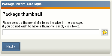
The second screen of this wizard asks you for a thumbnail image, which should be a screenshot or an icon that depicts the look and feel of your theme. Make it 120px wide and 103px high.
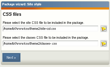
The third screen requests that you provide the CSS files. Here you need to supply the site-colors.css and classes-colors.css files (note that these file names are not shown in the screenshot).
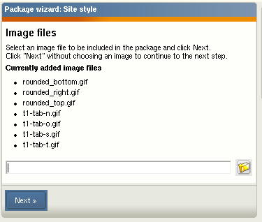
If you use images in a theme, you can upload them in the fourth screen. In my theme, I used some images, such as those used for rounding the edges. The following screenshot shows the uploaded files.
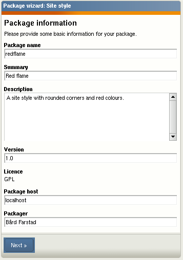
Now, it’s time to enter some information about the site style package. Give it a name and enter some text to describe the package, as shown below.
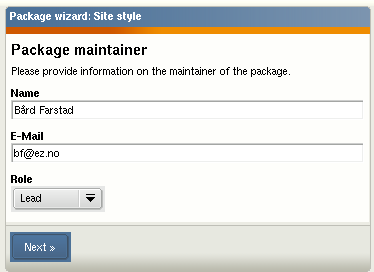
The eZ publish package system also needs to contain some information about the package maintainer. Enter that in the sixth screen:
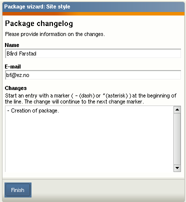
In the last step, you can optionally enter some information about the changes you applied to this version of the package.
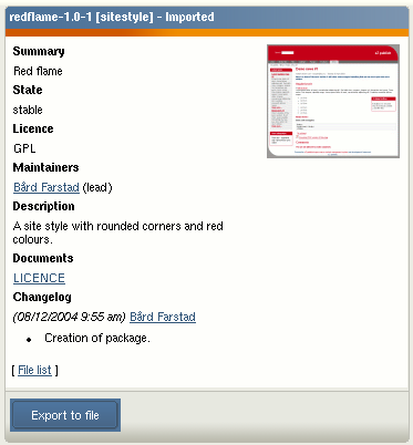
After you’re done, a summary of the package will prompt you to export the package to a file. I’ve exported this theme and uploaded it to the contribution area on http://ez.no. You can download the package from http://ez.no/community/contributions/site_styles.
Importing Packages
Once you have a ready-made site style package, you can import it directly into eZ publish. This is again achieved via the Administration interface. Go to the Setup tab and select Packages from the menu on the left side. Then, click the button to import a new package. All you need to do now is to upload the package file and follow the instructions provided on the screen.
After importing the package you can select it directly from the Look and Feel settings found under the Design tab in the eZ publish Administration interface.
Conclusion
We’ve now seen how easy it is to customize an eZ publish CMS solution just by changing some CSS files. This site style, or theme, can also easily be distributed to other eZ publish users in the form of a package.
Much of the demonstrated CSS work is very simple. This article is not intended as a tutorial in advanced CSS, but rather, explains how you can use general CSS tricks for an out-of-the-box installation of eZ publish.
 Bård Farstad
Bård is one of the co-founders of eZ systems. He has been working professionally with CMS development since 1999 and have written many general purpose libraries like XML parser, SOAP library (client/server), and XML-RPC library (client/server). He is also one of the main developers of the eZ publish CMS. In his spare time he likes to play with his daughter, and play the guitar, and is also into aquascaping.