- Mistake #1. Assuming your users need to sign in
- Mistake #3. Copying other app experiences
- Mistake #4. Underestimating how long updates take on mobile
- Mistake 5. Doing a redesign without user feedback and data
- Mistake #6. Not prioritizing responsiveness.
- Mistake #7. Not delighting users immediately before critical conversions
Making changes on mobile UX can be a tricky process, especially if you come from a web background. In mobile, developers have more constraints, including screen real estate, attention times, and UI control limitations. Improving the mobile experience is always a learning process full of trial and error, so this list will get you on the right track by helping you steer clear of common pitfalls.
Mistake #1. Assuming your users need to sign in
Everyone knows there are a ton of benefits to having users sign in, yet it’s also a significant pain point for your users. Who doesn’t get impatient having to type in the same personal data hundreds and hundreds of time for each app or service?
Most apps’ solutions are to allow users to temporarily skip registration so that they can try out the app and get a sense of value.
While this method works well enough for Apple to adopt it into their User Experience Guidelines, cutting the funnel even further can have huge benefits. If registration is a pain point, why not see what happens when you remove that pain entirely?
HotelTonight, a hotel booking app, used A/B testing to create a variant where users could complete the transaction without having to create a dedicated account. Previously all users had to sign in before completing a booking.
They tracked the bounce rate, as well as completed transactions, and found that discovered that making sign-ins optional actually increased bookings by 15%.
To encourage users to sign up still, they’re given the option to sign up in order to save their data to make future bookings even more painless and quick.
HotelTonight significantly decreased friction by removing a common pain point needed to generate value, then incentivized users to address those same pain points by giving them additional incentive to do so. Removing sign ins turned out to be a great decision for the app, as they were able to improve their bottom line.
Mistake #2. Assuming you need to bombard users with “value”
Two of the most common recommendations for app optimization are to include onboarding tutorials, and allow users to skip registration. Each of these is supposed to give users a great sense of value for an app, making sure they know all they can do with your app, and what they’ll get out of it.
Even though these techniques can typically increase sign ins and engagements, Vevo wanted to see if removing them could possibly increase their KPIs. They hypothesized that removing tutorials would increase the amount of users that logged in and signed up.
After testing two variants: one with and one without, the results were clear. Without tutorials, 10% more users logged in, and 6% more signed up.
Vevo believed that the tutorial was unnecessary because they have enough of a brand that most users who download the app are familiar with the core value proposition of the app. They didn’t need convincing.
Instead, users simply wanted to get started watching music videos as soon as possible, and the tutorial only proved to be a hinderance. Their new flow gives 2 sets of simple instructions, and off you go.
Trying to convince users of possible value through a tutorial can impede them from getting to the actual value in an app. Be sure that your app isn’t doing the same.
Mistake #3. Copying other app experiences
The above two blunders come from implementing generally accepted good practices without questioning if they could be improved. While online advice is generally a good starting point, each app and product is unique in their goals, audience, value, functionality, etc. What works for someone else doesn’t mean it will automatically have the same effects for you.

Instead of implementing example tests found online, draw your ideas from customer feedback. Create surveys, read reviews, and gather as much qualitative data as you can as to what users would like to see changed. Using that data, create new test ideas specific to your app, then use A/B testing to determine their effects on your audience.
Instead of just following in other’s footsteps, teams should strive to use A/B testing as a powerful tool to gain quantitative data about whether a change improves your KPIs or decreases them.
Mistake #4. Underestimating how long updates take on mobile
It’s easy to forget how much longer any change on mobile takes to bleed through to the end-user when compared to web.
On the web, information is stored on company controlled servers so making changes is a breeze. If a mistake is pushed into production, devs can quickly revert to a previous state, or make adjustments and deploy them instantly.
On mobile, making changes is not so easy.
Since an app is hosted on a client’s phone, any updates need to endure a long and arduous journey before making their way into a client’s hands. After development, any changes are subject to an often lengthy app store review process.
Updates also generally require unwilling users to manually update the apps on their phones, which can be a challenge all in itself. This makes it all the more important that what you push out has been thoroughly tested and proven to improve the experience, rather than detract from it.
To help decrease the chances of an embarrassing blunder, use beta testing, or A/B split testing to get feedback on how your users respond. Beta testing allows devs to get qualitative feedback through the form of surveys, emails, comments, or crash reports. A/B testing helps you determine quantitative cause/effect relationships to show you how each change is affecting your core metrics.
Fixing mistakes on mobile can be an excruciating process, but integrating testing as part of your development cycle can help alleviate much of the risk.
If a mistake does occur, you can also use feature flagging and instant updates to create hotfixes and quickly quell any impending disasters.
Mistake 5. Doing a redesign without user feedback and data
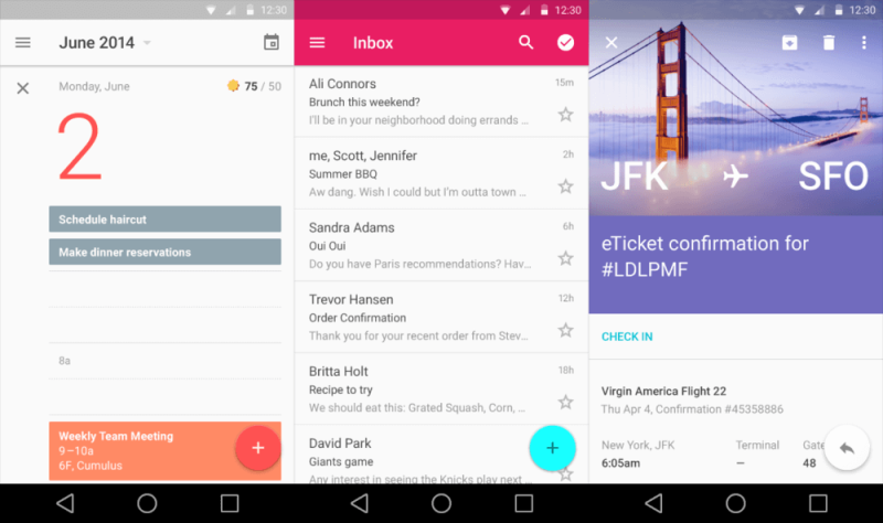
With material design emerging as the hot new thing, it’s natural to feel urges to redesign your app to prevent it from feeling outdated. Unfortunately, overhauling an app can be a huge mistake that causes KPIs to tumble.
Ultimately, conversions are far more important than aesthetics. Almost anyone would prefer to have an app that converts than one that looks attractive while it fails.
So, instead of doing a large overhaul, making and testing incremental changes to bring you closer to your goals is the smart way to go.
This is even more critical on mobile than it is on web. As we mentioned in #4 above, you can’t simply revert back to a previous state once you’ve pushed an update. After launch, users are stuck with what you’ve got until the app stores decide it’s time. You don’t want users deleting your app during that time do you?
Doing a grand overhaul is risky business and will additionally force you to start your CRO for the new design from scratch.
Instead of taking a gamble by making large changes, get feedback from your users as to what they’d like to see. With that user feedback, you can design tests to incrementally redesign your app, and see the effects of each change.
Mistake #6. Not prioritizing responsiveness.
Nowadays, 78% of users expect mobile apps to load as fast as -or faster than- a mobile website, as well as near immediate responses to any action they take. Unlike on web, mobile users want to get tasks done quickly, as they’re often on the go. Whether they’re commuting to work, or checking their phone at a party, people mobile users easily become disengaged by any number of distractions.

As a result, speed and responsiveness are of utmost importance. Any moments of unnecessary lag or confusion create opportunities for the user to disengage with the app and focus on whatever other sparkly object is in front of them. Even if they intend to return later, users often forget and never come back, deleting the app after weeks without use. You missed your opportunity.
Focus on not only speeding up processing time, but also designer user flows so that they can get what they want from your app as fast as possible. Otherwise, you increase the risk that a user will get distracted, or abandon your app for a competitor’s.
Mistake #7. Not delighting users immediately before critical conversions
In any app there are a small number of key conversion points. They can be sign ups, bookings, videos watched, reviews/ratings given, purchases made, or any number of others.
Each app has their own set of key conversions that are vital to meeting overarching goals. To make sure your app is maximizing the conversions that drive your company goals, focus on creating a flow that delights your user just before an important step.
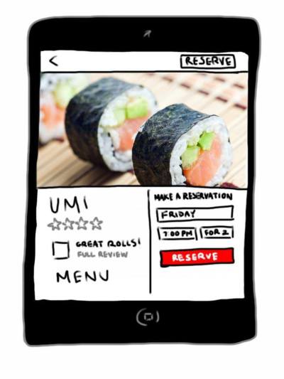
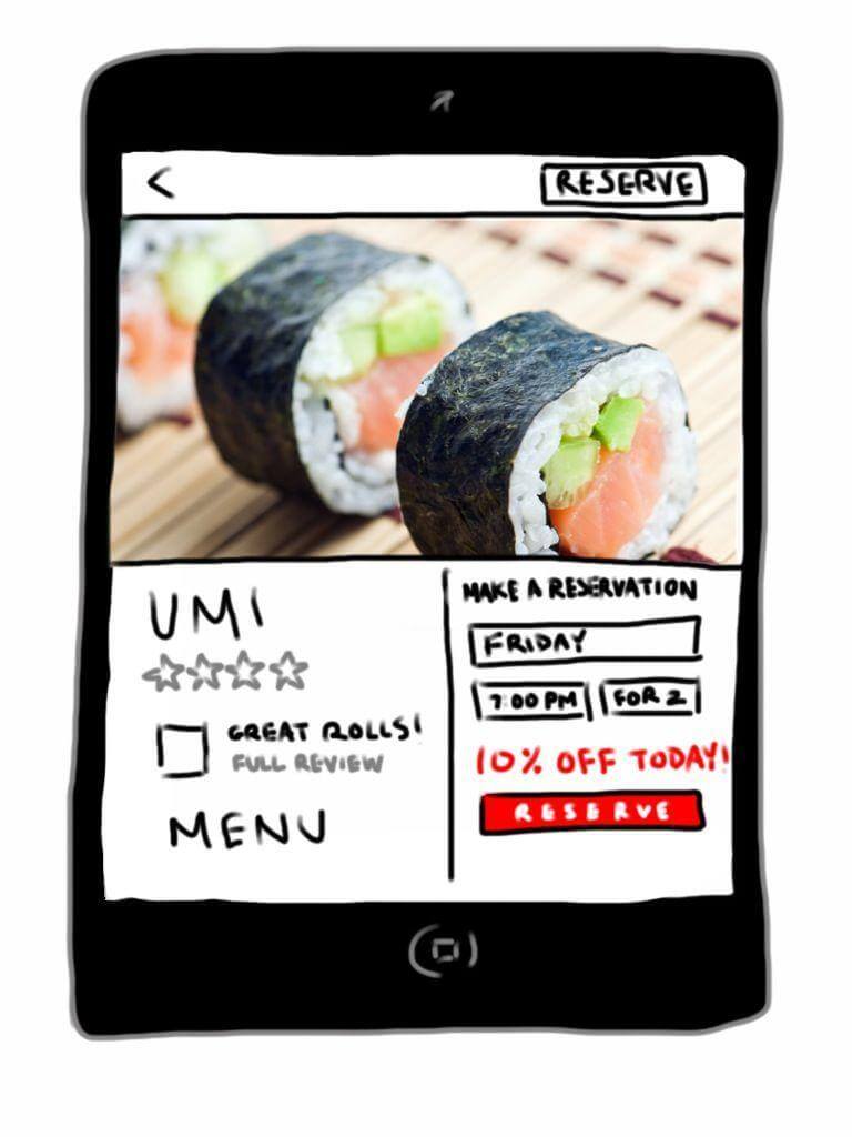
One of our clients, a restaurant reservation app, found that by changing placement of a deal increased their bookings by 28.1%. The team wanted to incorporate special deals for its users, but weren’t sure where in the flow it would be best incorporated. They hypothesized that placing them next to restaurants in the search results would increase clicks to those restaurants, as well as booking rates.
However, A/B testing quickly invalidated that theory.
The team found that the view rates for promoted restaurants increased, but decreased the number of reservations made and the return rate of users.
Highlighting deals was actually turning users away. They concluded that users likely felt that deals hurt the editorial integrity of the app, putting promoted content in a front seat rather than having a fair market.
In a second test, they found that using a surprise and delight tactic increased the booking rate by 28.1%. They instead informed users that the restaurant was having (the same) promotion after a user was already reading reviews for that restaurant. Their decision to place the deal immediately before users made a booking led to surprised and happy users who were much more likely to convert.
Other examples of delighting users is to ask users to rate or review apps in the marketplaces right after helping them complete their desired task. Capitalizing on that euphoric moment can also make users associate your brand with positive emotions, which will help develop brand champions for your app.
Conclusion
Keeping these common UX mistakes in mind will help you grow in the right direction as you improve your product. Remember, that improving the user experience is an ongoing experience. Using testing will help you learn from each inevitable mistake, and get you on track to success.
 Lynn Wang
Lynn Wang is the head of marketing at Apptimize, an A/B testing platform for iOS and Android apps designed for mobile product managers and developers alike. She loves data, dogs, and Chinese food.

