When creating a landing page for your website, it is important to make sure that it is visually appealing, easy to navigate, and free of errors. This article will tell you the five unbreakable rules of landing page design that can make or break your website.
The landing page of your website fulfils many functions. It’s like a front door to your website:
- it provides the user a snapshot of your topic or product
- its visual design and colors convey subtle information about your professionalism, trustworthiness, and attitude
- its links and organization reveal the structure and contents of the rest of your site
- and the words you choose and how you use them reflect on your attention to detail and dedication to your product or topic.
With your landing page conveying so much, it is important to get it right. Here are the things to consider when designing a landing page.
Include media
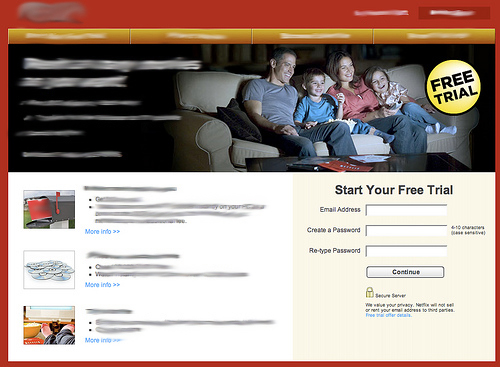
The first rule of landing page design is to always include a picture or video, especially if you are selling a product. The user wants to see what you have to offer, and visual representation helps to do this.
Another reason to include a picture is to prevent the page from being a wall of text, which is too dense and may scare users off. Using media is also important to prevent the page from being too sparse, which may give your site the appearance that it is unfinished.
Make sure the picture or video is relevant, of course: do not just put up a picture to have a picture. This is easy to do with the wealth of stock photos out there. Make it specific to the topic of your page.

If you are selling a product, it is a good idea to make a video showing it off and host it on YouTube. You can have even more impact and seem more professional if you host the video yourself, however this removes the social media aspects of YouTube, which can be very helpful from a marketing standpoint.
It’s also a good idea to make sure your media is high quality, and can be viewed on the majority of users’ systems. Make sure to use a common format and test it on different systems and different browsers. This will not only reveal media incompatibilities, but other design issues as well.
Avoid clutter
It is important to keep the topic of the landing page focused.
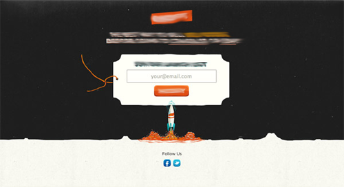
Introduce the topic or product and provide a short description, a picture, and relevant links. Do not overload the page with endless text and useless links, as this will overwhelm and confuse the user.
A good rule for text is that it should be no longer than 15 words wide. Wide columns of text are harder for the user to follow with their eyes. If your column width is too wide, your users may become lost and give up on your site. If your page has a word width of over 20 words, you need to reduce the column width.
Make sure to keep the links to a minimum in the body text of the main content area. This is because too many links in the body text is distracting and your users may be too busy clicking on links to get around to reading your content. It is best to put those links in a sidebar or along the top of the page.

A good way to assess the degree to which your site is cluttered is to do the squint test. The squint test consists of squinting your eyes until you can only see the outline and basic shape of your page. Notice areas of empty space and areas that have content. Make sure there is a good balance and that each area has a good mix of negative space and content.
Avoiding clutter refers not only to content but to design elements as well. This does not mean that you cannot have any design elements on your landing page; quite the contrary, without them your page would be boring and unappealing. The trick is to use them as a highlight or accent.
Use designs to frame your content and to fill in blank spaces. Keep the designs simple and unobtrusive. If the designs are too extravagant or eye-catching, they may distract from your content, which is what you want your user to focus on.
Use perfect grammar and spelling
One of the most important rules of landing page design is to have perfect grammar and spelling.
Nothing will turn users off faster than a spelling error or horribly constructed sentence. While it might not be fair, users do attribute spelling and grammar errors to the author’s lack of skill, expertise and authority.
Spelling and grammar errors are easy to miss, especially in your own writing. The solution is to have two or three people edit your work. Three pairs of eyes are better than one. Make sure at least one of the people editing your work is an experienced editor and is able to correct poor grammar.

The way you use words can have a powerful effect on your users. Choose your words carefully, as words have a great effect on tone and mood. For example, if you are selling flowers, keep the tone light and cheerful and avoid complex or uncommon words.
Create effective links
It’s very important to make sure that your users can recognize where the links on your page are located, what they link to, and how they relate to the links around them.
Effective linking is the cornerstone of good navigation and it is most important on your landing page, the front door to your website.
The most important aspect of effective linking is giving your links good names. The link text should be concise and descriptive. Keeping link names short will help to keep your sidebar width down, which is more appealing.
It’s also important to keep links grouped together on the side in a sidebar or along the top of the page. Links tend to get lost when they are placed in the body text in the middle of the page within paragraphs.
Organize your links in a meaningful way: alphabetical, chronological, largest to smallest, and so on. This will help users to find the link they need quickly if they can easily recognize the organization scheme you are using. A good example of this is when you see a drop down menu from which you are to select your home state, the states are usually listed in alphabetical order so you can quickly find your home state.

The final thing to consider when creating links is that the links on the page should be obvious as links. Do not make your users go hunting for links or have them clicking on words or pictures that are not links. While your users may be able to find links by hovering the mouse cursor over them, this may frustrate some. You want it to be as easy as possible for users to navigate your site.
Group links into categories, give them obvious names, and make sure they stand out as links. Your users will thank you.
Use colors wisely
The final rule when making a website landing page is to make wise use of colors.
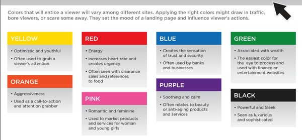
Colors have a very strong effect on users.
- Blue conveys a sense of trust and reliability. Notice how many businesses use the color blue in their logos.
- Red is exciting, a warning, stop, or blood.
- Black can be evil, nothingness, modern, or stylish.
- Yellows and oranges are fiery, flashy, and bold.
- Green is natural, money, or calm.
Keep in mind that these are just generalizations. They vary across cultures, especially. Do some research before you choose colors for your website.

The next most important thing to keep in mind when choosing colors is to keep the number of colors to a minimum. It is nice that your browser can render hundreds of colors; it is not necessarily pleasing to the eye to have five, ten or more colors on a page. A reduced color palette will have two to four colors.
Anything else?
Pay attention to trends and feedback from your users. Design trends change more often than you would think and it is a good idea to keep abreast of them so you can change with them lest your site begin to look dated.
Conducting usability tests is a good way to determine what is working and what is not. Sit down with your users and ask them to find certain information on your site to test navigation, or just ask them how they like the design. It’s a good way to get a sense of what you need to change.
If you take your time and pay attention to all of the rules listed above, you will go a long way to making a landing page that is professional, inviting, and effective at driving traffic to your site and keeping your site visitors engaged.
 Zach Ball
Zach Ball is a freelance writer for coggno.com. He writes information articles on the topics of technology and learning management systems.


