
One of the keys to successful commercial design is understanding your audience. If you find yourself working on a design whose target audience will be mostly women, you may need some ideas on how to make it more “feminine.” In commercial design, your concepts should draw the eye of the viewer and strengthen the delivery of a message. For female audiences, a feminine design is more appealing, more effective, and better suited for the purpose.
So, what makes a design feminine? Can you really design something that is naturally attractive to the female eye? With the right fundamentals applied, anyone — even those of the more macho persuasion — can successfully design for a female audience.
Keep in mind that preferences change between different cultures and age groups. For example, we tend to associate bright pinks and purples with very young women, while deeper shades of red and purple are usually chosen for adult women. As with any design, make sure that you have a clear understanding of your audience and keep that specific audience in mind throughout your designing process.
Use Script or Handwritten Typography
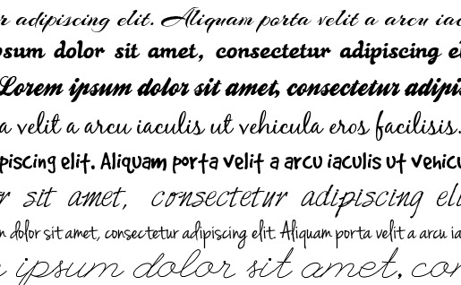
Scripted or handwritten fonts can lend a feminine touch to any design. Of course, use these fonts carefully. Not every design element should be adorned with scripts. Instead, focus on titles or headings, and leave the body text in easy-to-read fonts — typically a simple serif or sans-serif. Also, bear in mind that fonts you choose may not be immediately usable on the web.
Here are a few downloadable fonts to get you started. I used these in the above graphic:
For those wanting some Web Fonts, I tend to stick with Google Webfonts:
Choose Diverse, Bright Colors
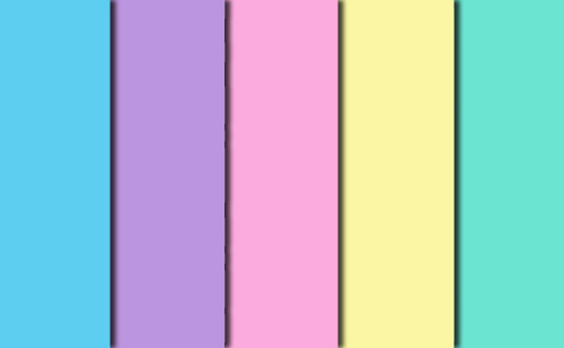
In the introduction, I mentioned color concepts for feminine designs. These concepts are based on numerous studies on color appeal. While the results of such studies vary, they do share several common conclusions: First, neutral tones like browns and grays are poor choices for feminine design. Second, both genders like various shades of blue. Third, greens tend to be preferred more by women. For a wonderful discussion of the breakdown of colors, check out this piece on Entrepreneur.com in which John Williams discusses what different colors say about a brand. Williams’ color associations should have an influence on your feminine design project.
A few simple tips on color: limit your palette, stick with bright colors, keep the contrast high (for readability), and use softer tones since they are generally associated with more feminine concepts. Pastels tend to be a good place to start; they’re built right into the color swatches in Photoshop (Window -> Swatches, then in the fly-out menu select Pastel coated or uncoated). The above color scheme is from the pastel uncoated swatch set.
Include Floral Visual Elements
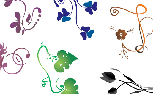
Floral patterns are deeply connected to mother nature, a famously feminine idea across all cultures. An easy way to connect with this concept is to integrate gentle floral and curl elements into your designs. Floral Photoshop and Illustrator brushes make it an easy task to quickly integrate these elements.
The above design was made using a flower vector set from Pink Mustache: Flower Vectors.
Stock Photography

Am I being overly-cliché to say that we girls love baby animals? I’m sure I’m not the only one with a reliable “warm fuzzy” reaction. If you can integrate babies of any kind into your designs for women in the mom or grandma category, you almost certainly should.
For single women in the business world, however, the appeal of babies may be diminished. Photos of other successful career women would be more likely to attract this group. For businesswomen, find photos that show women in charge in the workplace or women who have a gorgeous guy (or two or three) fawning over them, both in the workplace and outside of the work environment.
No matter what subject your photo incorporates, try to find graphics where the subject is looking into the camera. This creates an engaging experience for women especially. Female viewers are more likely to make an almost-emotional connection with the subject in the photo, and this connection will often be transferred to the brand hosting the advertisement.
Use a Personal Writing Style for Copy

The copy on your designs may be the most important element for connecting with a female audience. Your graphics may draw attention, but if your tone is cold or disconnected, your audience will quickly disconnect with your design.
A friendly, casual tone is important. Two ways to quickly change the tone of your copy are to include contractions and avoid large, complicated words or phrases. I like to use parenthetical phrases to interject what I’m thinking (because it kinda gives you an excuse to say whatever you want). Here’s an example:
More Formal: “Males are typically confounded by the complex nuances associated with the feminine.”
Less Formal: “Boys just don’t get girls (and I prefer to keep it that way).”
Most Importantly…
We gals do not like to be put into a box. We are complicated creatures and quite unique (or at least we like to think of ourselves this way), so do not insult us with a design that we can tell was created by a man who just doesn’t understand us. As mentioned above, always study the demographics of your audience. And, especially if you are a dude, have a few women review the design and give you their opinions. You are much more likely to meet the interests of your female audience if you do your research and get some feedback before sending it to your client or for distribution.
How do you approach designing for a female audience? What are some immediate visual cues you associate with this concept?
Frequently Asked Questions on Feminine Designs
What are the key elements of feminine design?
Feminine design is characterized by a few key elements. These include soft and delicate color palettes, often featuring pastel hues or warm, light colors. The use of elegant and sophisticated typography is also common, with script or handwritten fonts often used. Shapes and lines in feminine design are typically curved and fluid, creating a sense of movement and grace. Patterns and textures, such as florals, lace, or other intricate designs, are also frequently used. Lastly, feminine design often incorporates imagery that is delicate, beautiful, and evokes emotion.
How can I incorporate feminine design into my website?
Incorporating feminine design into your website can be achieved in several ways. Start by choosing a color palette that reflects the feminine aesthetic, such as pastels or warm, light colors. Use elegant and sophisticated typography, and consider incorporating script or handwritten fonts. Use curved and fluid lines in your design elements, and consider incorporating patterns or textures. Lastly, choose imagery that is delicate and beautiful, and that evokes emotion.
What is the difference between masculine and feminine design?
Masculine and feminine design differ in several ways. Masculine design tends to use bold, dark colors, and straight, clean lines. The typography is often strong and bold, and the imagery used is typically powerful and commanding. On the other hand, feminine design uses soft, light colors, and curved, fluid lines. The typography is elegant and sophisticated, and the imagery is delicate and beautiful.
Can feminine design be used in any industry?
Yes, feminine design can be used in any industry. It’s all about understanding your target audience and their preferences. If your target audience appreciates a feminine aesthetic, then it can be a powerful tool in your design strategy. However, it’s important to ensure that the design still aligns with your brand identity and message.
How can I choose the right color palette for a feminine design?
Choosing the right color palette for a feminine design involves considering the emotions and feelings you want to evoke. Soft, light colors, such as pastels, can create a sense of calm and tranquility. Warm colors, like pinks and oranges, can evoke feelings of warmth and comfort. It’s also important to consider the context and purpose of the design. For example, a feminine design for a spa website might use a calming pastel blue palette, while a fashion blog might use bold, vibrant pinks.
What types of fonts work best in feminine design?
Elegant and sophisticated fonts often work best in feminine design. Script and handwritten fonts can add a personal, human touch to the design. Serif fonts can also work well, as they can add a sense of tradition and elegance. However, it’s important to ensure that the font is still easy to read and fits with the overall design aesthetic.
How can I use shapes and lines in feminine design?
Shapes and lines in feminine design are typically curved and fluid, creating a sense of movement and grace. This can be achieved through the use of circular shapes, curved lines, and flowing patterns. These elements can be used in various aspects of the design, from the layout and navigation to the imagery and typography.
What types of imagery work best in feminine design?
Imagery in feminine design is often delicate, beautiful, and evokes emotion. This can include photographs of nature, flowers, or people, as well as illustrations or patterns. The imagery should complement the color palette and other design elements, and should contribute to the overall aesthetic and mood of the design.
Can masculine and feminine design elements be combined?
Yes, masculine and feminine design elements can be combined to create a balanced and harmonious design. This can be achieved by using a mix of colors, fonts, shapes, and imagery that reflect both masculine and feminine aesthetics. The key is to ensure that the elements work together cohesively and that the overall design aligns with your brand identity and message.
How can I ensure my feminine design is effective?
To ensure your feminine design is effective, it’s important to keep your target audience in mind. The design should appeal to their tastes and preferences, and should evoke the emotions and feelings you want to convey. It’s also important to ensure that the design is functional and user-friendly, and that it aligns with your brand identity and message. Lastly, don’t be afraid to experiment and iterate on your design until you find the perfect balance of aesthetics and functionality.