This past week the winners of the 2010 Webby Awards were announced. Categories included Websites, Interactive Advertising, Online Film & Video, Mobile which were further subdivided into seventy categories. I’ve picked out some of the winners in the design-related categories.
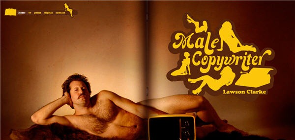
Best Homepage/Welcome page was won by Male Copywriter. It’s a flash-based site showcasing the work of Lawson Clarke who appears to have a good sense of humor. This site also won Best Self Promotion/Portfolio site. The navigation is simple and straight forward with the most striking aspects of the design being the full width background photograph of Mr. Clarke with a giant yellow and brown 70s style logo.
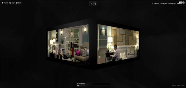
HBO/Imagine won the award for Best Structure/Navigation. Another Flash site but with a very unusual 3D menu system. Initially when the site opened I thought it would be one of those sites where you have to spend more time figuring out how to use it, but it is fairly easy to move around. The navigation includes large images and video cubes floating in space. Click on a box and you get a preview of the show.
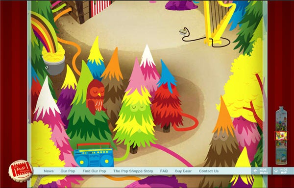
The Pop Shoppe won the Best Use Of Animation/Motion Graphics. Yes, more Flash. This site is bursting with color both in terms of design and the characters that appear in the site. It’s quite “out there” in places with skipping monsters, purple elephants and harp playing bunny rabbits. It’s certainly very imaginative.
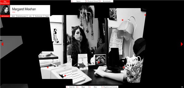
The winner for Best Use Of Photography was The Economist Thinking Space. This site also has a very unusual navigation system which I initially found off-putting, but the content on the site is excellent and the use of photography is undoubtedly superb. This site also won the award for Best Visual Design – Function and it’s made in Flash.
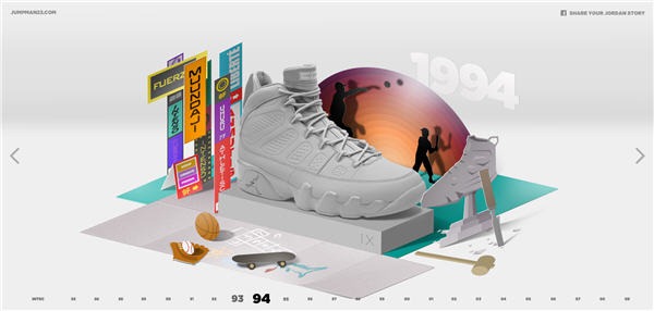
The Best Visual Design – Aesthetic award went to The History Of Flight, which is a Nike site dedicated to Air Jordan shoes. A timeline from 1985 to the present acts as the navigation for this site. Click on the year and you get a what looks like a pop-up book featuring the shoe and some associated paraphernalia with rollover facts about Michael Jordan. There is a nice textured feel to this site and the movement through the time line is very slick.
There were of course, many more winners and if you haven’t seen it already, check out the Webby Awards site to see all the winners and the nominees.
What do you think? Are these worthy winners?
Jennifer Farley is a designer, illustrator and design instructor based in Ireland. She writes about design and illustration on her blog at Laughing Lion Design.
