Usability.
We think we know what the word means, but many people struggle to define or describe it. Of course, we always know when something is usable, because it feels “intuitive”. And we certainly know when something is not usable, as it frustrates the heck out of us.
We might read a bit about the topic of usability every now and then, or feel inspired to actually apply some user-centred design techniques or perform structured usability testing in our day-to-day work. Personally I find myself getting all fired up about this stuff after attending a conference, but a few days afterwards the practical reality of a daily routine means it falls by the wayside.
So how much from the masses of usability theory do we actually use when we build our web sites, and how much goes out the window in exchange for our own judgment calls, or for something that we know has worked in the past? Do you need to be an expert with academic credentials to be able to apply this stuff? Sometimes even the experts fail to agree, or the theory is far removed from the practical, or it forces us to sacrifice aesthetics to get a tick in every box. What’s actually involved in making a web site usable?
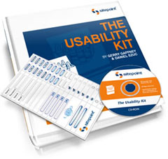 Hot on the heels of World Usability Day, I’m very proud to announce the launch of The Usability Kit, by Gerry Gaffney and Daniel Szuc. Packed with real-world examples, blueprints and best practice tips, The Usability Kit steps you through design techniques like card sorting, paper prototyping and affinity diagramming, and shows you how to conduct focus groups, user interviews and large-scale usability testing for your clients’ web sites. (check out the table of contents for a complete breakdown).
As technical editor of the kit, I can vouch for the wealth of practical advice that the kit contains — you’ll gain both the know-how and the confidence to build sites that work, and you’ll know they work because they’ll have been shaped by users at all stages of the site’s lifecycle.
As with all of SitePoint’s kits, this one comes bundled with a stack of goodies, such as a CD-ROM containing all of the schematics explained in the kit. It also includes something that we’re calling the Magnetic Web Widgets — magnetic buttons, text fields, checkboxes and other form fields that you can use to lay out your next web site on the whiteboard in the meeting room, or on the fridge in the kitchen! They are definitely the coolest set of magnets that you’ll ever own, making magnetic poetry look oh-so-2001. Plus there’s the money back guarantee that we offer on all of our books and kits.
So what’s the second part of this double-whammy? Well, all I can say is to look out for a terrific usability blogger around these traps very soon (wink, wink). I’m very excited about this one. Stay tuned!
 Matthew Magain
Matthew Magain is a UX designer with over 15 years of experience creating exceptional digital experiences for companies such as IBM, Australia Post, and sitepoint.com. He is currently the Chief Doodler at Sketch Group, Co-founder of UX Mastery, and recently co-authored Everyday UX, an inspiring collection of interviews with some of the best UX Designers in the world. Matthew is also the creator of Charlie Weatherburn and the Flying Machine.