Many of us lament the lack of CSS3 features consistently implemented across the board in the most-used browsers. We dream of the utopia of minimal, semantic markup with streamlined CSS providing the most fantastic sites we could ever imagine. Or, heck, we even just ponder what it’d be like to use a simple opacity property without worrying about adding all the browser-specific extensions necessary to pull off the cross-browser feat.
Developing a web application within Adobe AIR can be a spoiling experience. You’ve got the power of the WebKit rendering engine – which also powers Safari – at your fingertips. AIR’s version of the WebKit engine is a little different than that found in the latest version of Safari, but there are still plenty of CSS tricks buried within; it not only makes building web applications easier, but will have you pining to see these features implemented in all major browsers.
In this article we’ll cover a few of these lovely properties and how you can use them in your own AIR projects. Checkout the code archive for this article to compile for yourself.
There will be a quiz at the end, so you can test how closely you paid attention! The first 100 people to complete the quiz will win a copy of the pocket guide Adobe AIR For JavaScript Developers, delivered to their front door for FREE, thanks to Adobe. You can also download the book in PDF format for free for a limited time, so get cracking!
Opacity
From custom tool tips to fancy lightboxes, having elements that are semi-opaque is very Web 2.0. In the case of a lightbox, there are a number of ways to create the screen.
A popular approach for current browsers is to take an element, position it absolutely, stretch it from one corner of the screen to another, and set the level of opacity using CSS3’s opacity and an Internet Explorer filter.
Another alternative out there in the wild Web is to use a PNG background image with a semi-opaque alpha channel. This isn’t too bad a solution, as it allows the element to have content embedded within it, but the extra image does feel a little dirty for the purists among us.
Thankfully, most browsers (except Internet Explorer, currently) support setting colors using rgba(), and this is the technique that I’d recommend using in AIR applications:
background-color: rgba(255, 0, 0, 0.7);The rgba property allows red, green, and blue – along with the fourth parameter for setting opacity, alpha – to be specified without the child elements inheriting it. In this case, the background would have been red with a 70% opacity. That’s one line of code and no images. Not a problem in AIR.
Since this is a way to specify color, you can also use it to set text or border color in exactly the same way. With border color, you do have to be particularly careful. When an element has a background color or image, it extends out to the edge of the border. If you want the background to only extend to the edge of the padding, you can make use of the -webkit-background-clip property.
border: 5px solid rgba(255,0,0,.6);
-webkit-background-clip: padding;
Perfect for getting that glassy border around an element!
Backgrounds
As you’ve just seen, background colors can easily be set to include some level of transparency. Even cooler is the support for multiple backgrounds. No longer do you have to do four separate divs to lock images to each corner for all your rounded-corner goodness.
background: url(assets/top-left.png) no-repeat 0 0,
         url(assets/bottom-left.png) no-repeat 100% 100%;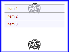
Normally, you’re stuck with the default size of the image and are left to tile it one direction or another, or both, or not at all. In AIR’s WebKit, you can specify the size of the background image, allowing you plenty of flexibility to re-use images, such as gradients, and have them stretch to the available space instead of repeating.
-webkit-background-size: 100%;
-webkit-background-size: 100% 100%;
The background size can take one or two values. If there are two values, the first is the width, and the second value is the height. If applying different background sizes to different images, you’ll need to specify both width and height for each.
-webkit-background-size: 100% 50%, 50% 100%;Borders
Let’s put the “Oh!” back in Web 2.0. Sure, we may have semi-transparent colored borders, but they need to be rounded!
-webkit-border-radius: 5px;Just like that, we’ve got all the rounded corners you need without having to use a single image.
The border-radius property is seeing more mainstream usage by leaving Internet Explorer behind. (Although, if you’re adventurous, you could look to VML to solve your rounded-corner fetish. (Or check out the Internet Explorer behavior by Remiz.)
We’re getting closer to CSS3 nirvana now, but what if you wanted really fancy borders with gradients and special corner accents? Crack open border images! Border images work by taking a single image and slicing it into nine parts based on the values provided. The shorthand for border image is a little confusing, so I’ll detail each of the properties:
-webkit-border-image: uri top right bottom left x_repeat y_repeatThe URI is where your image is located, and then the top, right, bottom, and left values determine how many pixels from the edge should be used. The x_repeat and y_repeat allow you to define how the horizontal and vertical slices should be handled. They can be repeat, stretch, or round (which stretches all nine pieces). Here’s an example:
-webkit-border-image: url(example.gif) 5px 5px 5px 5px repeat stretch; The drop shadow used on the default theme in Snitter makes use of this very technique, by using a PNG with an alpha channel.

Columns
Although multi-column layouts don’t get a lot of love – likely due to the difficulty in pulling them off effectively in a flexible design environment – you may find the need to break down content into a newspaper-style, multi-column approach. For example, you may wish to create an Adobe AIR-based newspaper or RSS client that could load content into the lower-line lengths of a multi-column layout.
To have an element extend to multiple columns, use column-count. It’ll take the existing width of the parent element and split it evenly among the columns.
It’s also a good idea to specify the gap that should appear between each column. This is similar to padding, except the left-most and right-most columns will still flow to the outermost edge of the container.
  -webkit-column-count: 3;
  -webkit-column-gap: 20px;
You can also define a column-rule, which will include a horizontal line aligned to the middle of the column gap.
-webkit-column-rule: 1px solid #333;Alternately, you could use fixed column widths instead of -webkit-column-count. The column width remains consistent as the window is resized; as the window becomes wider, more columns are added.
-webkit-column-width: 200px;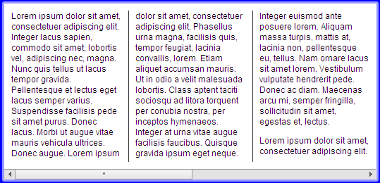
Transforms
We’ve all heard about the CSS transformations in Safari. Transformations allow HTML elements to be scaled, skewed, and rotated. Imagine easy Coverflow-style functionality in AIR.
While they’re not in AIR version 1.1, we’ll start to see some of the features land in version 1.5 as the WebKit engine within Adobe AIR gets updated. Version 1.5 is expected to be out soon.
And Beyond
Adobe made a smart choice using WebKit as the core engine within AIR. There are plenty of CSS3 features that the WebKit team have added, and Adobe AIR developers get to reap the rewards. Having transformations within version 1.5, for example, will help elevate JavaScript-based AIR development, as there will be less reason to use Flash for effects. Now, go experiment and start seeing what the rest of the Web will look like in a few years.
Quiz Yourself
Test your understanding of this article with a short quiz, and receive a FREE copy of the pocket guide, Adobe AIR For JavaScript Developers, delivered to your door for FREE, thanks to Adobe Systems. This offer is only available to the first 100 people, so get in quick (if you miss out, you can also download the book in PDF format for free).
Take the quiz!
 Jonathan Snook
Jonathan Snook has been involved in the Web since '95, and is lucky to be able to call his hobby a career. He worked in web agencies for over six years and has worked with high profile clients in government, the private sector, and non-profit organizations. Jonathan Snook currently runs his own web development business from Ottawa, Canada and continues to write about what he loves on his blog at Snook.ca.


