Some of the design classes I took in college got pretty deep into the anatomy and terminology of type. Many people can already identify serifs, ascenders, and descenders, but for one class, we had about 100 terms to memorize.
While web designers probably don’t need to get into that much detail, it is important that you know some basic terminology if you’re going to be talking about, and working with, type. The image below identifies the most important aspects of type. Each is explained below.
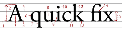 1. Baseline
The baseline is the imaginary horizontal line on which most characters sit. The only character that hangs below the baseline in Figure 4.5 is the lowercase “q.”
2. Cap height
The cap height or capline is another imaginary line. This one marks the height of all capital letters in a typeface. Notice that the cap height is below the maximum height of the typeface.
3. Crossbar
A stroke that connects two lines in the capital letterforms of “A” and “H” is called a crossbar. A horizontal stroke that does not connect two lines, like the one in the lower case “f” or “t,” is known as a cross stroke.
4. Serif
Serif is the name given to the finishing strokes at the bottoms and tops of certain typefaces. I’ll talk more about serifs when we get into typeface distinctions.
5. Meanline
Another imaginary horizontal line that marks the top edge of the lowercase letters is the meanline. Contrary to the way it sounds, the meanline isn’t always exactly centered between the baseline and the cap height.
6. Bowl
The bowl of a letter is the rounded curve that encloses negative space in a letterform. Examples of bowls can be seen in the letters “D,” “o,” and “g.”
7. Descender
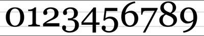
The lower portion of the lowercase letters “g,” “j,” “p,” “q,” and “y” that extend below the baseline of a typeface is known as the descender. The only other characters that typically extend below the baseline are the old-style numerals in some typefaces. These types of numerals, examples of which from the Georgia typeface can be seen in Figure 4.6, were thought to blend better with lowercase roman numerals, and they look particularly good when used within a body of text.
1. Baseline
The baseline is the imaginary horizontal line on which most characters sit. The only character that hangs below the baseline in Figure 4.5 is the lowercase “q.”
2. Cap height
The cap height or capline is another imaginary line. This one marks the height of all capital letters in a typeface. Notice that the cap height is below the maximum height of the typeface.
3. Crossbar
A stroke that connects two lines in the capital letterforms of “A” and “H” is called a crossbar. A horizontal stroke that does not connect two lines, like the one in the lower case “f” or “t,” is known as a cross stroke.
4. Serif
Serif is the name given to the finishing strokes at the bottoms and tops of certain typefaces. I’ll talk more about serifs when we get into typeface distinctions.
5. Meanline
Another imaginary horizontal line that marks the top edge of the lowercase letters is the meanline. Contrary to the way it sounds, the meanline isn’t always exactly centered between the baseline and the cap height.
6. Bowl
The bowl of a letter is the rounded curve that encloses negative space in a letterform. Examples of bowls can be seen in the letters “D,” “o,” and “g.”
7. Descender
The lower portion of the lowercase letters “g,” “j,” “p,” “q,” and “y” that extend below the baseline of a typeface is known as the descender. The only other characters that typically extend below the baseline are the old-style numerals in some typefaces. These types of numerals, examples of which from the Georgia typeface can be seen in Figure 4.6, were thought to blend better with lowercase roman numerals, and they look particularly good when used within a body of text.
 8. Counter
The negative space within a letter is called the counter. In some letters, like “A,” “o,” and “P,” the counter is fully enclosed. The non-closed negative spaces in letters like “G,” “u,” and “c” are also known as counters.
9. Stem
A stem is the main vertical or diagonal stroke in a letterform. These include the vertical portions of the letters “I” and “H,” as well as all of the stokes in the letter “W.”
10. Tittle
This is probably my favorite typeface term. Tittle is the name given to the dot above the lowercase “j” and “i.”
11. Terminal
The end of a stem or stroke that has no serif is known as a terminal. Even the ends of some serif typefaces have terminals, as you can see in the letter “c” in Figure 4.6.
12. Ascender
The tops of most lowercase letters form an imaginary line that’s known as the meanline. Some lowercase letters have an ascender, which is an extension that rises above the meanline. Those letters are “b,” “d,” “f,” “h,” “k,” “l,” and “t.”
13. Leg
The lower, angled strokes seen in the letters “K,” “R,” and “Q” are known as legs. These are also sometimes referred to as tails.
14. Ligature
You may not have noticed in Figure 4.5, but the “f” and “i” of the word “fix” are actually combined into one character. This combination of characters is known as a ligature. Ligatures exist to give the spacing between certain characters a greater aesthetic balance, as Figure 4.7 illustrates.
8. Counter
The negative space within a letter is called the counter. In some letters, like “A,” “o,” and “P,” the counter is fully enclosed. The non-closed negative spaces in letters like “G,” “u,” and “c” are also known as counters.
9. Stem
A stem is the main vertical or diagonal stroke in a letterform. These include the vertical portions of the letters “I” and “H,” as well as all of the stokes in the letter “W.”
10. Tittle
This is probably my favorite typeface term. Tittle is the name given to the dot above the lowercase “j” and “i.”
11. Terminal
The end of a stem or stroke that has no serif is known as a terminal. Even the ends of some serif typefaces have terminals, as you can see in the letter “c” in Figure 4.6.
12. Ascender
The tops of most lowercase letters form an imaginary line that’s known as the meanline. Some lowercase letters have an ascender, which is an extension that rises above the meanline. Those letters are “b,” “d,” “f,” “h,” “k,” “l,” and “t.”
13. Leg
The lower, angled strokes seen in the letters “K,” “R,” and “Q” are known as legs. These are also sometimes referred to as tails.
14. Ligature
You may not have noticed in Figure 4.5, but the “f” and “i” of the word “fix” are actually combined into one character. This combination of characters is known as a ligature. Ligatures exist to give the spacing between certain characters a greater aesthetic balance, as Figure 4.7 illustrates.
 15. x-height
The x-height is exactly what you would expect it to be: the height of the lowercase x in a typeface. Essentially the x-height is the distance between the baseline and the meanline of a typeface. Although it’s not very practical, you can actually use x-height as a relative unit of measurement in CSS (ex).
Have you ever had to explain type to someone — perhaps another designer or a client? Do you think these definitions will help?
15. x-height
The x-height is exactly what you would expect it to be: the height of the lowercase x in a typeface. Essentially the x-height is the distance between the baseline and the meanline of a typeface. Although it’s not very practical, you can actually use x-height as a relative unit of measurement in CSS (ex).
Have you ever had to explain type to someone — perhaps another designer or a client? Do you think these definitions will help?
Frequently Asked Questions (FAQs) about the Anatomy of a Letterform
What is the difference between a typeface and a font?
A typeface refers to a family of related fonts, while a font refers to a specific member of that family. For example, Times New Roman is a typeface, and Times New Roman Bold Italic is a font. The terms are often used interchangeably, but they have distinct meanings in the world of typography.
What is the purpose of a serif in typography?
A serif is a small line or stroke regularly attached to the end of a larger stroke in a letter or symbol within a particular typeface. The primary purpose of a serif is to guide the horizontal flow of the eyes. The small lines make individual letters more distinctive and our brain can recognize words quicker.
What is the difference between ascender and descender in typography?
Ascenders and descenders are parts of a character that rise above or drop below the baseline. Ascenders are the parts of lowercase letters that rise above the x-height (the height of a lowercase ‘x’), such as ‘b’ or ‘d’. Descenders, on the other hand, are the parts of lowercase letters that drop below the baseline, such as ‘p’ or ‘g’.
What is the role of kerning in typography?
Kerning refers to the adjustment of space between individual letter pairs. It plays a crucial role in typography as it affects the readability and appearance of the text. Proper kerning prevents awkward spaces between letters and ensures a smooth reading experience.
What is the significance of the x-height in typography?
The x-height refers to the height of a lowercase ‘x’ in a specific typeface. It is significant because it affects the overall readability of a text. A typeface with a larger x-height is generally easier to read at smaller sizes.
What is a ligature in typography?
A ligature is a special character that combines two or more letters into a single symbol. They are used to improve the aesthetics and readability of certain letter combinations. For example, the ‘fi’ ligature combines the ‘f’ and ‘i’ into a single character to prevent the ‘f’ from colliding with the dot of the ‘i’.
What is the difference between tracking and kerning?
While both tracking and kerning involve adjusting the space between characters, they are used in different contexts. Kerning adjusts the space between individual letter pairs to correct visually uneven spacing. Tracking, on the other hand, adjusts the spacing uniformly over a range of characters to change the overall density or appearance of a text.
What is a counter in typography?
A counter refers to the enclosed or partially enclosed circular or curved negative space (white space) within letters such as ‘d’, ‘o’, and ‘s’. Counters can greatly influence the legibility of a typeface, as they help define a letter’s shape.
What is a baseline in typography?
The baseline is the line upon which most letters “sit” and below which descenders extend. It serves as a guiding line for aligning characters in a line of text. It is one of the most important elements in typography as it ensures consistency and alignment in text.
What is a glyph in typography?
A glyph is a specific form of a character. It can represent a letter or a symbol. For example, the letter ‘a’ can have different glyphs depending on the typeface or style (italic, bold, etc.). Glyphs are the building blocks of typography and play a crucial role in the design and readability of text.
 Jason Beaird
Jason Beaird is a designer and front-end developer with over ten years of experience working on a wide range of award-winning web projects. With a background in graphic design and a passion for web standards, he’s always looking for accessible ways to make the Web a more beautiful place. When he’s not pushing pixels in Photoshop or tinkering with markup, Jason loves sharing his passion for the Web with others.