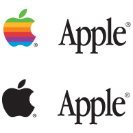
A symbol based logo

 Apple is an organisation that everyone has heard of. One would have to have been living in a cave to not recognise the apple logo with a little bite out of it – or the little white stickers that the marketing department at Apple hopes will be stuck on the back of car windows.
However, this recognition was built over time – over decades. The usage of the Apple logo in its initial form was accompanied by a “low power” wordmark ‘Apple’ and was dropped for the symbol as recognition of the company increased to to such a point that even a 2 year old could recognise it.
If you are hoping to create such an iconic symbol for an organistation that may or may not get to such dizzying heights of recognition, you might partner your iconic symbol with a wordmark. That way, you leave the option to drop the wordmark if and when the organisation reaches that point. If the organisation never reaches that level of recognition, it has the wordmark to partner it — which in the end gives more options for application.
A wordmark based logo
 The Dell logo is a wordmark based logo that incorporates the name itself. The current logo includes a circular device which is basically window dressing and more to do with application than the logo itself. However, the power of this logo cannot be denied. As a logo, people all over the world can read the name of the company. There is no mystery. If someone does not know the company, it is easy for someone to find out who or what it is. While using tall bold letters, the letter ‘E’ is tilted and joins the ‘D’ and the first ‘L’.
While the logo does look like it is based on Arial Black (or something similar), the tilted ‘E’ gives it enough uniqueness to make it a strong wordmark that cannot be mistaken. The designer possibly knew that using bold capital letters would make the viewer feel that the company was big, solid and even corporate — important aspects to build trust with potential customers in its market, which includes large-scale enterprise operations.
Don’t discount the wordmark
A great wordmark will incorporate strong design reasons as well as incorporating the company name — or at least elements of it. Paul Rand produced some of the most effective wordmarks in the history of graphic design.

 The above companies are powerful for many reasons – many of the reasons come from how the organisation was run and how successful they are or were, no matter who originally designed them. Our job is to lend strength to the organisation through meaning, inference and recognition of the single element that represents it as a whole, by designing its logo.
However, the question remains — wordmark or symbol? This can be a hard decision for designers. Sometimes you need to give your thumbnailing a chance and just doodle without too much agenda — don’t discount doodling time!
How do you feel about wordmark and symbol based logos? The answer will likely mirror your design style.
Frequently Asked Questions about Logo Design in the Real World
What are the key elements to consider when designing a logo?
When designing a logo, it’s crucial to consider the brand’s identity, target audience, and the message you want to convey. The logo should be simple yet memorable, versatile to work across various mediums, and timeless to withstand changes in trends. It’s also important to consider color psychology and typography, as these elements can significantly impact the logo’s perception.
How does a logo contribute to a brand’s identity?
A logo is a visual representation of a brand’s identity. It communicates the brand’s values, personality, and unique selling propositions. A well-designed logo can create a strong impression, foster customer loyalty, and differentiate the brand from its competitors.
What is the difference between a symbol and a wordmark in logo design?
A symbol is a distinct graphical element that represents the brand, while a wordmark is a stylized version of the brand’s name itself. Symbols can be abstract or literal representations, while wordmarks rely on typography and lettering to convey the brand’s identity. Both can be effective, but the choice depends on the brand’s marketing strategy and target audience.
How can I protect my logo design from being copied?
To protect your logo design, you can register it as a trademark. This gives you exclusive rights to use the logo and prevents others from using a similar design. The process varies by country, so it’s advisable to consult with a legal expert or intellectual property office.
What are some common mistakes to avoid in logo design?
Common mistakes in logo design include making the design too complex, following trends that may quickly become outdated, and not considering how the logo will look in different contexts. It’s also a mistake to overlook the importance of color and typography, or to create a logo that doesn’t align with the brand’s identity.
How can I ensure my logo design is effective across different mediums?
To ensure your logo is versatile, it should be designed in a vector format, which allows it to be scaled without losing quality. It should also work well in both color and black and white, and be legible at various sizes. Testing the logo on different mediums can help identify any potential issues.
What is the role of color psychology in logo design?
Color psychology is the study of how colors influence human behavior and perception. In logo design, understanding color psychology can help you choose colors that evoke the desired emotional response from your target audience. For example, blue often conveys trust and reliability, while red can evoke feelings of passion and energy.
How can I create a timeless logo design?
To create a timeless logo, avoid following fleeting design trends. Instead, focus on simplicity, relevance, and adaptability. A timeless logo should be able to endure changes in the business environment and continue to effectively represent the brand for many years.
What is the importance of typography in logo design?
Typography plays a crucial role in conveying the brand’s personality and message. The choice of font, size, spacing, and arrangement can significantly impact how the logo is perceived. A well-chosen typeface can enhance the logo’s effectiveness and memorability.
How can I test the effectiveness of my logo design?
You can test your logo design by conducting surveys or focus groups, asking for feedback from your target audience. You can also test it in different contexts and mediums to ensure it works well in various applications. Additionally, you can evaluate its memorability by asking people to recall the logo after a brief exposure.
Felix Mak, a graphic designer for 20 or so years, has been working quietly in the suburbs of Melbourne - and has more recently been delving into the art of web design and development and the wonders of shivs and javascript libraries. A strong proponent of simple design and simple communication, he has a love of the lushness of art nouveau design.

