 The new merged logo
 Current United Airlines Logo
 The Tulip
A short history of the tulip appears on the Facebook page:
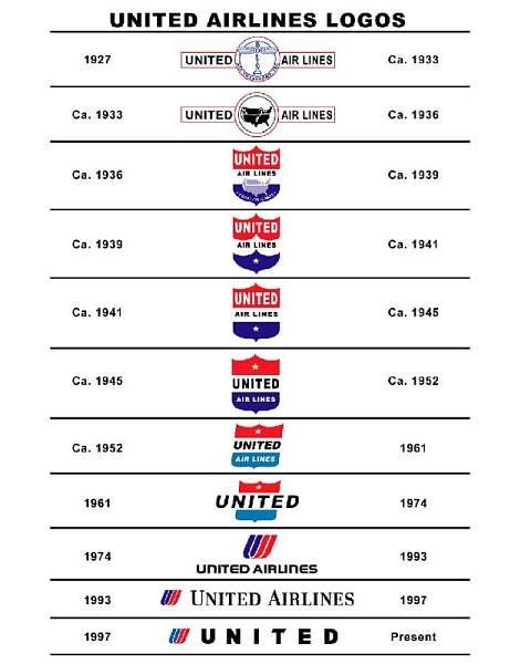
The tulip was designed for United in 1974 by graphic designer Saul Bass. Saul Bass created other famous trademarks as well, such as the AT&T world and even Continental’s old logo, the Jet Stream Globe (which was replaced in 1991 with Continental’s current look). It has graced United’s planes through three different livery designs during this time. Before the tulip, United’s logo was a red, white, and blue shield since 1936.
 A short visual history of the United Airlines logo. Image from the Save the United Airlines Tulip Facebook Page
Continental’s most recent blue and gold logo was designed by Dutch designer Roger van den Bergh of Oonama Design. Other identity work by van den Bergh includes Shandong Airlines, Daewoo Motors, Midwest Airlines, Eos Airlines, The Port Authority of New York & New Jersey, and the Boeing Company.
 Funnily enough, an early version of the Continental logo was also designed by Saul Bass.
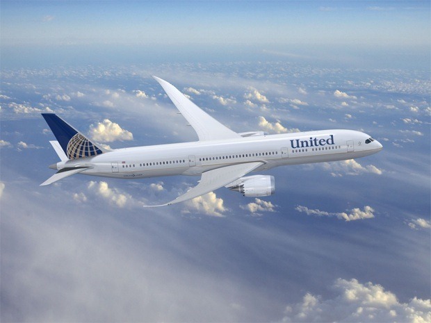
 The new merged logo will appear on all aircraft
 How do you feel about the change from Tulip to Globe? Does it make much difference to the overall branding of the newly merged airline?
Frequently Asked Questions (FAQs) about United Airlines Iconic Tulip Logo
What is the history behind the United Airlines tulip logo?
The United Airlines tulip logo, also known as the Saul Bass logo, was introduced in 1974. Saul Bass, a renowned graphic designer, created this logo as part of a new visual identity for United Airlines. The logo, which features a stylized ‘U’ in the shape of a tulip, was a significant departure from the airline’s previous logos. It was designed to symbolize the airline’s commitment to customer service and innovation. Despite being replaced in 2010, the tulip logo remains a beloved symbol among aviation enthusiasts and design aficionados.
Why was the United Airlines tulip logo replaced?
The tulip logo was replaced in 2010 following the merger of United Airlines and Continental Airlines. The new logo combined elements from both airlines’ previous logos, featuring the word ‘United’ from United Airlines and the globe design from Continental Airlines. The change was part of a broader rebranding effort to unify the merged airlines under a single brand identity.
What was the public reaction to the replacement of the tulip logo?
The replacement of the tulip logo was met with mixed reactions. While some welcomed the new logo as a symbol of the merged airlines’ shared future, others lamented the loss of the iconic tulip design. Many fans of the tulip logo have called for its return, citing its unique design and historical significance.
How does the tulip logo compare to other airline logos?
The tulip logo stands out for its simplicity and distinctiveness. Unlike many airline logos, which often feature birds or national symbols, the tulip logo is abstract and minimalist. Its design is based on the letter ‘U’, representing United Airlines, and a tulip, symbolizing growth and transformation. This combination of simplicity and symbolism has made the tulip logo one of the most recognized and admired in the airline industry.
Are there any plans to bring back the tulip logo?
As of now, there are no official plans to bring back the tulip logo. However, the logo continues to have a strong following among fans and design enthusiasts. Some have even launched campaigns to save the tulip logo, demonstrating its enduring appeal and cultural significance.
What impact did the tulip logo have on United Airlines’ brand identity?
The tulip logo played a crucial role in shaping United Airlines’ brand identity. It symbolized the airline’s commitment to innovation and customer service, helping to differentiate it from competitors. Even after its replacement, the tulip logo continues to be associated with United Airlines, reflecting its lasting impact on the airline’s brand.
How has the tulip logo influenced the design of airline logos?
The tulip logo has had a significant influence on the design of airline logos. Its simplicity and distinctiveness have inspired many other airlines to adopt similar minimalist and abstract designs. The logo’s success has also highlighted the importance of having a unique and memorable logo in the competitive airline industry.
What is the significance of the tulip in the logo?
The tulip in the logo symbolizes growth and transformation. This was in line with United Airlines’ vision at the time of the logo’s creation, which was to transform the airline industry through innovation and customer service. The tulip also adds a touch of elegance and sophistication to the logo, reflecting the airline’s commitment to providing a high-quality travel experience.
How was the tulip logo designed?
The tulip logo was designed by Saul Bass, a renowned graphic designer known for his innovative and minimalist designs. Bass created the logo as part of a new visual identity for United Airlines in 1974. The logo features a stylized ‘U’ in the shape of a tulip, symbolizing the airline’s name and its commitment to growth and transformation.
What makes the tulip logo iconic?
The tulip logo is considered iconic due to its unique design and the impact it had on United Airlines’ brand identity. Its simplicity and distinctiveness set it apart from other airline logos, making it instantly recognizable. The logo’s design, which combines a stylized ‘U’ with a tulip, is also symbolic, reflecting the airline’s commitment to innovation and customer service. Despite being replaced, the tulip logo continues to be admired and remembered, attesting to its iconic status.
Jennifer Farley is a designer, illustrator and design instructor based in Ireland. She writes about design and illustration on her blog at Laughing Lion Design.
