
With so much recent experimental focus on DOM scripting, it feels like years since I’ve seen anything genuinely new in plain, old CSS. That was until today at least.
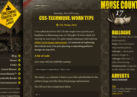 Khmerang.com has published a great little article explaining how they achieved the grungy, weathered look on their headings. No, it’s not sIFR and it’s not even traditional Image Replacement. It is, in fact, a clever variation on Tom Gilder and Levin Alexander‘s ‘old skool’ IR technique, which advocated floating an opaque image layer over your text, rather than the much more common method of just shunting the original text right out of the viewport (i.e. ‘
text-indent:-1000em‘).
Khmerang’s new take on the idea is to swap the image layer with a mostly transparent, distressed pattern, leaving the underlying heading text with a scratched and worn finish.
The really nice bit is the pattern repeats, but will rarely ever align itself identically with the same letter, so every character should appear to be a one-off original.
As you may have already figured, there are a few caveats to consider.
- The text is still selectable, but it’s more difficult than usual. Selecting within the heading is next to impossible. Still, most other IR methods have no prospect of ever allowing text selection, so this technique is already a step up on those.
- You would need to choose a big, beefy font with a large surface area to get a worthwhile effect. Judging from a few quick tests, lighter weight fonts mostly came out looking a bit grubby.
- The method requires some slightly mucky markup —
<h2><span></span>Worn Text</h2>— so if you’re a stickler for semantics, you best avoid this method.
Nevertheless, it certainly provides a very distinctive result, and while it’s not likely to be the sort of trick you would use on project after project, looks like a useful addition to the armoury.
Nice Work.