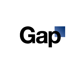
Gap have confirmed that following a storm of criticism of their new logo, they are bringing back their old blue box logo. The new logo was created by Laird & Partners and was pretty much shot to pieces online. There was also much speculation that the new logo was put out there to create debate (mission accomplished) and a crowd-sourcing situation to create a new logo was looking likely.
However, in less than a week, it seems the negative feedback has been overwhelming and Gap president Marka Hansen has confirmed the company will return to the familiar blue box.
 |
 |
| The new old interim Gap logo | The old original Gap logo |
In a statement from the company, Marka Hansen said:
Since we rolled out an updated version of our logo last week on our Website, we’ve seen an outpouring of comments from customers and the online community in support of the iconic blue box logo.
Last week, we moved quickly to address the feedback and began exploring how we could tap into all of the passion. Ultimately, we’ve learned just how much energy there is around our brand. All roads were leading us back to the blue box, so we’ve made the decision not to use the new logo on gap.com any further.
At Gap brand, our customers have always come first. We’ve been listening to and watching all of the comments this past week. We heard them say over and over again they are passionate about our blue box logo, and they want it back. So we’ve made the decision to do just that – we will bring it back across all channels.
In the meantime, the website will go back to our iconic blue box logo and, for Holiday, we’ll turn our blue box red for our seasonal campaign.
We’ve learned a lot in this process. And we are clear that we did not go about this in the right way. We recognize that we missed the opportunity to engage with the online community. This wasn’t the right project at the right time for crowd sourcing.
There may be a time to evolve our logo, but if and when that time comes, we’ll handle it in a different way.
Statement as seen on Ad Age Daily.
As mentioned in a previous post, it’s not unusual for logo re-designs to get hit with a negative reaction. Most people don’t like change and the internet certainly allows people to express an opinion, but is this a case of mob rule or a cunning plan from the Gap?
So who would have thought anyone paid attention to the internet? Was this all a publicity stunt?
Jennifer Farley is a designer, illustrator and design instructor based in Ireland. She writes about design and illustration on her blog at Laughing Lion Design.
