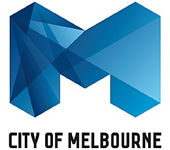
 The logo was designed by giant American branding company Landor Associates, who also re-designed the Coca Cola logo on its 100th Anniversary. The new Melbourne logo comes in several variations and in some versions appears almost jewel-like, or maybe for some critics, like cheap glass.
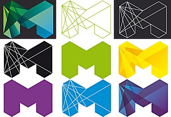 The official blurb from the Lord Mayor of Melbourne;
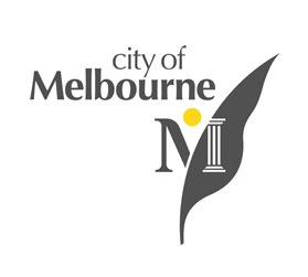
The new design will become an icon for Melbourne, synonymous with the modern, vibrant, cool city Melbourne is today and will continue to be in the future.Melbourne’s previous logo (see below), which was designed about 15 years ago, was a leaf, and considered to be somewhat weak.
 Needless to say, these things don’t come cheap and there have been expressions of concern that the new logo has cost an awful lot. The Mayor of the city revealed that the preliminary research cost Melbourne City Council $91,000, while the final design cost $148,000. (I’m making a mental note here to charge more for logo design).
The Lord Mayor has defended the cost, declaring that savings would be made in the long run by using the new logo. The old leaf logo would be gradually phased out, saving the city about $90,000 per year.
The logo is just part of the overall branding, and is now in place on the City Council’s website, stationery, brochures and will be appearing all over the city.
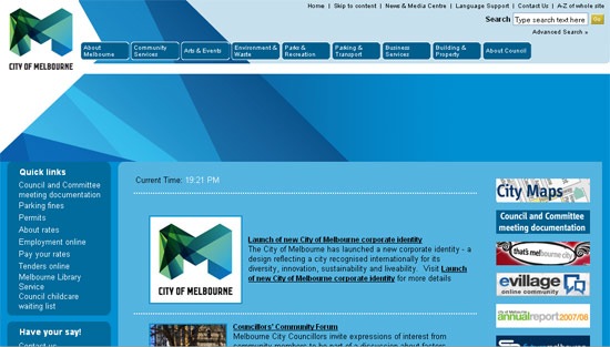 Personally, I like the dark blue multi-faceted version, but I’m not too keen on the flat colors or the outline version. It is a big improvement on the old leaf though.
The Australian Herald Sun newspaper asked local design students to produce a logo to beat the new expensive M, and here are a few of the logos produced. What do you think? Are any of the freebies better?
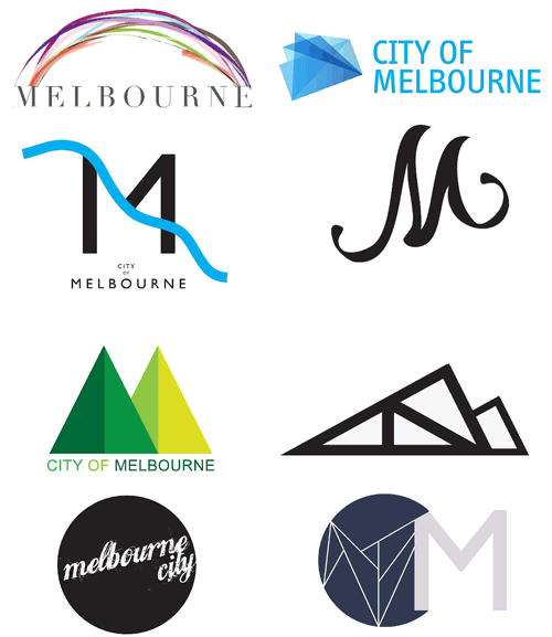 So what do you think of the new Melbourne logo, like it or loathe it? Or maybe just indifferent? What do you think about the costs involved with designing and developing a new corporate identity like this?
Frequently Asked Questions about Melbourne’s New Corporate Identity
What is the significance of Melbourne’s new corporate identity?
Melbourne’s new corporate identity is a significant step towards redefining the city’s image and positioning it as a global city. The new identity is not just a logo, but a comprehensive visual system that represents the city’s values, culture, and vision for the future. It is designed to be flexible and adaptable, reflecting the city’s dynamic and evolving nature. The new identity also aims to enhance Melbourne’s visibility and recognition on the international stage, attracting more tourists, businesses, and investments to the city.
How does Melbourne’s new corporate identity compare to other cities?
Compared to other cities, Melbourne’s new corporate identity stands out for its innovative and forward-thinking approach. While many cities opt for traditional symbols and landmarks in their identities, Melbourne has chosen a more abstract and versatile design. This reflects the city’s commitment to creativity, innovation, and progress. The new identity also incorporates elements of Melbourne’s unique culture and lifestyle, making it distinct and authentic.
What elements are included in Melbourne’s new corporate identity?
Melbourne’s new corporate identity includes a variety of elements that work together to create a cohesive visual system. These include a new logo, color palette, typography, imagery, and graphic elements. The logo features an abstract ‘M’ shape, representing the city’s name and its diverse and dynamic character. The color palette is inspired by Melbourne’s natural and urban landscapes, while the typography and imagery reflect the city’s modern and vibrant personality.
How was Melbourne’s new corporate identity developed?
The development of Melbourne’s new corporate identity was a collaborative and inclusive process. It involved extensive research, consultation, and engagement with various stakeholders, including residents, businesses, and community groups. The process also included a thorough analysis of Melbourne’s strengths, challenges, and aspirations, as well as its competitive positioning in the global market. The result is an identity that truly represents Melbourne and resonates with its people.
How will Melbourne’s new corporate identity be implemented?
The implementation of Melbourne’s new corporate identity will be a gradual and phased process. It will be applied across various touchpoints, including signage, marketing materials, digital platforms, and city assets. The aim is to create a consistent and unified image of Melbourne that is easily recognizable and memorable. The city will also provide guidelines and resources to help businesses and organizations align their branding with the new identity.
What are the benefits of Melbourne’s new corporate identity?
Melbourne’s new corporate identity offers several benefits. It helps to strengthen the city’s brand, enhance its reputation, and increase its visibility and recognition. It also helps to attract more tourists, businesses, and investments, boosting the city’s economy. Moreover, the new identity fosters a sense of pride and belonging among residents, enhancing their connection with the city.
How does Melbourne’s new corporate identity reflect its culture and values?
Melbourne’s new corporate identity is deeply rooted in the city’s culture and values. The design elements, colors, and imagery are all inspired by Melbourne’s unique character, lifestyle, and spirit. The identity also embodies the city’s commitment to diversity, inclusivity, creativity, and sustainability. It celebrates Melbourne’s rich heritage while also looking forward to its future.
How does Melbourne’s new corporate identity contribute to its strategic goals?
Melbourne’s new corporate identity plays a crucial role in achieving its strategic goals. It supports the city’s vision to be a global city, enhancing its international profile and competitiveness. It also helps to promote Melbourne as a desirable destination for tourism, business, and investment. Furthermore, the new identity aligns with the city’s efforts to improve the quality of life for its residents and create a vibrant and sustainable urban environment.
How does Melbourne’s new corporate identity compare to its previous identity?
Compared to its previous identity, Melbourne’s new corporate identity is more modern, dynamic, and versatile. It reflects the city’s evolution and growth, as well as its ambition and vision for the future. The new identity also has a stronger visual impact, making it more memorable and distinctive. It captures the essence of Melbourne today, while also paving the way for its future.
What feedback has Melbourne’s new corporate identity received?
Since its launch, Melbourne’s new corporate identity has received positive feedback from various stakeholders. Many have praised its innovative design, flexibility, and relevance to the city’s character and values. The identity has also been recognized for its potential to enhance Melbourne’s brand and reputation. However, like any change, it has also sparked some debate and discussion, reflecting the diverse perspectives and opinions within the city.
Jennifer Farley is a designer, illustrator and design instructor based in Ireland. She writes about design and illustration on her blog at Laughing Lion Design.

