Separate Mobile Websites
If your time, budget and sanity aren’t important, you can build separate sites for mobile and desktop users. Content can be repackaged and streamlined for the device. Unfortunately…- The days of either desktop or mobile are long gone. There is a huge variety of devices with differing screen sizes, pixel densities, processing speeds, network capabilities and HTML5 features. And few of us have even considered wearables yet! Brands would need to create numerous sites to cater for every eventuality?
- Identifying the user’s device is difficult. User-agent strings are notoriously tricky to parse and won’t tell you anything about the screen dimensions, network speed or other features.
- You normally require separate URLs for each site, e.g. www.site.com and m.site.com. Users can end up on the wrong site for their device and, if you’re not careful, search engines will penalize you for duplicate content.
- Managing one website is tough. You now need to build and deploy several sites and ensure they’re updated concurrently. Perhaps your developers will survive the ordeal but will content editors cope with multiple assets which target different views?
Responsive Web Design
Alternatively, designers and developers can use designs which respond to the browser’s viewport dimensions (typically, the whole screen on smaller devices). Using a mobile-first approach, the site implements a default linear layout perhaps with smaller text and menus accessed from hamburger icons. As the dimensions increase, the design can be re-flowed to show additional columns, larger fonts, more spacing, always-visible menus etc. RWD solves many issues encountered with separate views. We have a single site with one set of content which can respond to an infinite variety of screen sizes. Unfortunately…- Screen size is a crude indication of the device’s capabilities and tells us nothing about the processor speed, network bandwidth or level of HTML5 support. A user with a large monitor could still be using a twenty year-old PC on a dial-up connection.
- The same page and assets are (mostly) delivered to all devices. It’s possible to limit image loading using CSS background images within media queries, the
<picture>element andsrcsetattribute but support remains patchy and it doesn’t solve every problem. Client-side adaption techniques can slow down page rendering too, and this needs to be addressed. For example, a large image could be delivered to a high-density Retina screen even though the user is on a slow connection. - Some options are not easy to implement on the client alone. It’s difficult to re-factor content, e.g. split a long article over several pages. All devices receive the same page even if it’s impractical to read on a small screen.
- The average web page exceeds 2MB. Many use a Responsive Web Design but it doesn’t follow that the site is responsive on a low-powered device. Creating a fast, responsive website has become more imperative now Google rate sites based on performance.
RESS: Responsive Web Design + Server-Side Components
RESS was proposed by Luke Wroblewski in 2011. The concept uses Responsive Web Design but supplements it with feature detection to serve modified content when required. For example, you could:- Serve smaller images on smaller screens or when bandwidth is limited.
- Only serve a video element when the device has HTML5 support on a fast connection.
- Avoid serving Flash games or adverts on iOS and increasingly Android devices.
- Switch to grayscale images on eBook readers.
- Reduce the frequency of Ajax poll requests on slower connections.
- Remove unnecessary CSS3 effects when the device does not support animations.
- Fall-back to PNG images when SVG is not available.
- Provide additional information when the user is in a specific location or country.


Client-Side Device Detection API
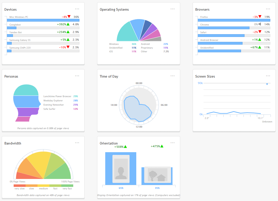
The tracking code also defines a global JavaScript object nameddcs which exposes more than 650 hardware, browser, operating system and network detection parameters. Examples:
Assess the bandwidth score — a rank from zero (very slow) to 20 (typically EDGE/HSPA) to 60 (3G) to 120+ (4G/wifi):
var bandwidthScore = dcs.get('bandwidth.score'); // integervar touchScreen = dcs.get('browser.cantouch'); // booleanvar pixelRatio = dcs.get('internal.browserpixelratio'); // realvar canCall = dcs.get('browser.cantelmakecall'); // booleanvar svg = dcs.get('browser.css.cansvg'); // boolean
var svgSmil = dcs.get('browser.css.cansvgsmil'); // booleanvar county = dcs.get('internal.countrycode'); // 2-character string, e.g. "US"var videoFormat = dcs.get('video.suggestvideoformat'); // objectvar browser = dcs.get('browser.model'); // string, e.g. "Firefox 38"var latest = dcs.get('browser.islatestrelease'); // booleanServer-Side Device Detection API
Device detection is most useful on the server where you can modify the response before it’s sent. Code is provided for PHP, Java and .NET. PHP examples… Does the device support H264 HTML5 video and has a reasonable connection?<?php
if ($dcs->video->canhh264 && $dcs->internal->bandwidthscore > 150) {
echo '<video src="video.mp4" controls></video>';
}
?><?php
if ($dcs->browser->canajax && $dcs->hardware->performance->js > 100) {
echo '<script src="moderndevice.js"></script>';
}
?>Frequently Asked Questions on Improving Responsive Web Design with RESS
What is the main difference between RESS and traditional responsive web design?
Traditional responsive web design (RWD) relies solely on the client-side (browser) to adapt the website’s layout based on the device’s screen size. On the other hand, RESS (Responsive Web Design with Server Side components) combines client-side responsiveness with server-side intelligence. This means the server detects the device’s capabilities and sends an optimized version of the website, resulting in a more efficient and tailored user experience.
How does RESS improve website performance?
RESS improves website performance by reducing the amount of unnecessary data sent to the device. With traditional RWD, all data, including data for elements not visible on the device, is sent. However, with RESS, the server only sends data that is relevant to the specific device, reducing load times and improving overall performance.
Is RESS compatible with all types of devices?
Yes, RESS is designed to be compatible with all types of devices. The server-side component of RESS can detect the capabilities of the device requesting the webpage and deliver an optimized version of the site accordingly. This ensures a seamless user experience across all devices, from desktops to smartphones.
How does RESS affect SEO?
RESS can have a positive impact on SEO. Faster load times and improved user experience can lead to lower bounce rates and higher user engagement, which are factors that search engines consider when ranking websites. Additionally, RESS allows for more efficient crawling and indexing of content by search engine bots.
What are the challenges in implementing RESS?
Implementing RESS requires a higher level of technical expertise compared to traditional RWD. It involves server-side programming and device detection, which can be complex. Additionally, maintaining a RESS website can be more resource-intensive as it requires regular updates to the device detection database to accommodate new devices and browsers.
Can RESS be used with existing websites or is it only for new ones?
RESS can be implemented on both existing and new websites. However, integrating RESS into an existing website may require significant changes to the site’s architecture and code, which can be time-consuming and complex.
How does RESS handle images and other media files?
RESS can optimize the delivery of images and other media files based on the device’s capabilities. The server can resize images, convert them to a more efficient format, or even omit them entirely for devices with limited capabilities. This ensures that media files do not unnecessarily slow down the website’s load time.
Is RESS more expensive to implement than traditional RWD?
The cost of implementing RESS can vary depending on the complexity of the website and the resources available. While the initial implementation may be more expensive due to the need for server-side programming and device detection, the improved performance and user experience can lead to higher user engagement and potentially higher revenue in the long run.
Can RESS be used in conjunction with other web design techniques?
Yes, RESS can be used in conjunction with other web design techniques such as progressive enhancement and adaptive design. These techniques can complement RESS by providing a more robust and flexible web design solution.
How does RESS impact the future of web design?
RESS represents a significant step forward in web design. By combining the flexibility of RWD with the efficiency of server-side components, RESS provides a more tailored and efficient user experience. As more devices with varying capabilities continue to emerge, the need for techniques like RESS that can adapt to these devices will only increase.
Craig is a freelance UK web consultant who built his first page for IE2.0 in 1995. Since that time he's been advocating standards, accessibility, and best-practice HTML5 techniques. He's created enterprise specifications, websites and online applications for companies and organisations including the UK Parliament, the European Parliament, the Department of Energy & Climate Change, Microsoft, and more. He's written more than 1,000 articles for SitePoint and you can find him @craigbuckler.


