Color choices come very early in any design process. Often, designers are constrained to using very specific colors from existing branding. Occasionally, designers are given full freedom (and very little guidance) to choose from millions of colors. Neither scenario is ideal; having too many constraints can be just as difficult as having too many options. Getting bogged down with color-based conundrums can blow away your timeline, slow down your work and frustrate you at the very beginning of the project.
When selecting colors for a design, there are quite a few conventional rules of thumb to choose from: Monochromatic colors offer visual stability and can feel strong and authoritative, complementary colors tend to be visually exciting, and analogous colors are often found in nature and thus are pleasing to the eye. But, with every client placing “standing out” and “being different” as their top priorities, following these typical, standard rules of thumb might do as much harm as good.
You don’t want to be struggling with colors that just aren’t cooperating while your design deadlines loom ahead.
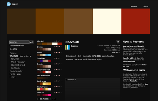
Adobe Kuler allows you to view thousands of user-created color palettes. The palettes can be sorted by popularity, rating, and submission date. They can also be searched via keyword, or visitors can browse them completely at random if they wish. If your design project centers around a specific idea (or a specific constraint) such as “citrus” or “chocolate,” a simple search within Kuler can offer some instant inspiration.
Or, if you don’t have a lead like “citrus” or “chocolate” to get you started, a single color such as “Carolina blue” or “charcoal” will yield similarly helpful results. Generally, you just need one idea to begin with; Kuler can then show you an impressive array of variations on that single starting point.
Kuler also has a new feature called “Pulse” that meticulously tracks the kinds of color palettes that are being downloaded on a daily basis. Using “Pulse,” a designer could make inferences on recent design trends. They could also examine which colors are being widely used and which are truly rare commodities.
Kuler also offers an Android app, but an equivalent iOS app is conspicuously absent. Because Kuler is based on Adobe Flash, it’s possible that Apple’s lack of support for Flash on their ubiquitous iOS devices might mean that an iOS app is out of the question.
Do you use Kuler or a similar color tool to help with design decisions? Or, is using predefined color palettes just as typical and trite as using the standard color rules of thumb?
 Peter North
Peter is Chief Digital Officer of CuriosityStream, a multi-platform nonfiction streaming service by the founder of Discovery Communications (Discovery Channel, Science Channel, Animal Planet, etc.). Peter is also Co-Founder of True North, a management consulting firm and digital marketing agency with clientele that includes WebMD and Salesforce.

