 The size and contrast of your type are probably the two most important factors when making your pages legible. None of the fundamentals of typography—contrast, hierarchy, size, and space—work in isolation, but if the contrast is bad or if the size of your type is too small, you will lose readers.
There was a phase, in the last couple of years, where the body text size became unbelievably small and difficult to read. Thankfully, this trend appears to be over, and there is much more interest in choosing suitable fonts, colors and sizes, and generally making choices about typography, rather than just going for a default.
![]()
The image above shows a lower-case letter x, ranging in size from 6pts to 72pts. This scale has been around since the sixteenth century and is something you will be familiar with if you use any type of software which allows you to choose type sizes.
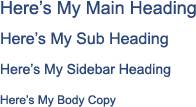
You can use this scale as a guide when choosing your font sizes. For example, you might decide that all of your body text will be set at 12, your main headings set at 18, sub-headings at 16 and sidebar headings at 14 pixels. I know this is not rocket science, but this simple scale can help you make a definite decision about the size of your type for various parts of the web page. This will improve legibility and attractiveness of the layout, and you might find that you start to get a little bit excited about type as a design element!
So once you’ve laid it out and can see how different sized type looks, you can set it in your CSS style sheet. I’m not going to discuss CSS here, but Ian Lloyd has an excellent and detailed primer on getting started with HTML and CSS.
As a rule of thumb, don’t set your body copy to be any less than 10. And think about your audience. If you’re creating a web site for an older audience, you may need to set the size to 14, which may appear massive to you, but if your eyesight is diminishing, big is good.
Of course, you could go much bolder by setting a very large heading, and that has been a recent trend. The important point is that you make a choice about the sizes you’re using. Here’s five sites that I’ve picked out to showcase how various size type can create a completely different vibe on your site.
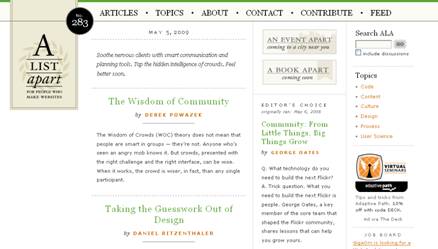
A List Apart. It was inevitable that this site would appear in an article related to type. This site is renowned for its beautiful typography.
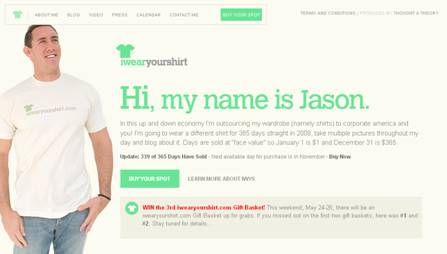
I wear your shirt
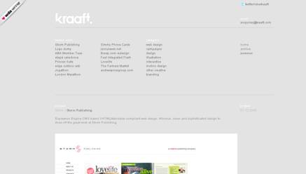
Kraaft.com have deliberately chosen small fonts on their site.
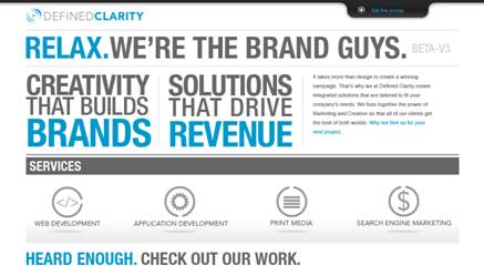
Defined Clarity
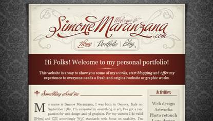
Simone Maranzana
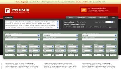
Finally, an online tool that you may find useful for previewing the size (and other properties) of your type is Typetester.
What do you think of the trend of very large fonts on web sites? Is it something you’ve used yourself?
 Jennifer Farley
Jennifer Farley is a designer, illustrator and design instructor based in Ireland. She writes about design and illustration on her blog at Laughing Lion Design.