a) The Casual Surfer
These customers act in a similar way to customers of traditional websites. Casual surfers are not really interested in any one thing, but have a few spare minutes between tasks to take a look around. In the world of desktop PCs, those few minutes might occur between meetings, or while the user’s on a short break. For a mobile customer, those few minutes might occur when the user’s sitting outside waiting to meet friends, in a car or taxi traveling somewhere, or even during the morning commute. If your site is focused on the sort of content that would appeal to casual surfers, then be aware of the limitations on the time and screen-size of your mobile customer.
The goal should be to make your content more “sticky”, so that casual surfers come back for more. For example, you shouldn’t serve up long pieces of content. Instead, aim for small, bite-sized chunks that are just enough to keep customers interested, but not so long that users can’t browse your site in the time they have available.
b) The Repeat Visitor
Repeat customers are those that are constantly returning for some sort of specific news or data. If your site is the kind of site that offers information about stocks, weather or sports scores, you probably have plenty of repeat visitors. The interface of a mobile device is very limited, so if you know what your repeat visitors are coming back for, time and time again, let that naturally bubble up to the top of the site. Avoid burying the content your customers want behind 3 or 4 clicks.
Mobile website customization can be difficult, but it’s not impossible. A traditional site might ask you to log in, but on a mobile device, data entry is not as easy to perform, so it’s best avoided.
One option is to allow visitors to use their desktop machines to streamline their mobile experience. Take a page from Apple’s iTunes Music Store as an example. A repeat customer might customize his or her version of the mobile site while at a desktop machine; this could generate a special URL in which all of that user’s preferences are encoded. The next time the user visits your site from a mobile device, he or she can take advantage of this special URL, enjoying an experience that’s completely customized to his or her preferences.
c) The “Urgent, Now!” Visitor
Depending on your business, your definition of “Urgent, Now!” will vary. For an online store, a customer might consider the following message urgent:
“My books were supposed to arrive yesterday. They’re late. Where are they?”
A more seriously urgent scenario might be:
“I’m running 15 minutes late. Will I be able to catch my flight?”
For some customers, everything is urgent! But by identifying the most important needs of your customers and making the relevant information accessible within one click or less, you’ll increase the usefulness of your mobile site enormously.
4. Publish the Bare Minimum
One of the common myths about mobile web development is the misguided notion that content from your traditional website can be easily re-purposed into smaller bit-sized chunks for the mobile version. A simple change of style from media="screen" to media="handheld" is all you need to do to magically mobilize your site, right?
Wrong.
While it’s indeed possible to filter content with the liberal use of display: none in your mobile style sheet, in reality, this isn’t a good idea. In fact, many CMS systems can output a mobile, streamlined version of your website, but even this is not always what your customers will want.
The W3C defines the concept of One Web as follows:
One Web means making, as far as is reasonable, the same information and services available to users irrespective of the device they are using. However, it does not mean that exactly the same information is available in exactly the same representation across all devices. The context of mobile use, device capability variations, bandwidth issues and mobile network capabilities all affect the representation. Furthermore, some services and information are more suitable for and targeted at particular user contexts.
As this definition suggests, some things are simply not available (or even usable) on some devices. Additionally, some devices (such as a mobile phone) are much better at certain activities (like making phone calls) than other devices. Therefore, a device designed for a specific activity should utilize its unique features on the Web.
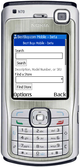
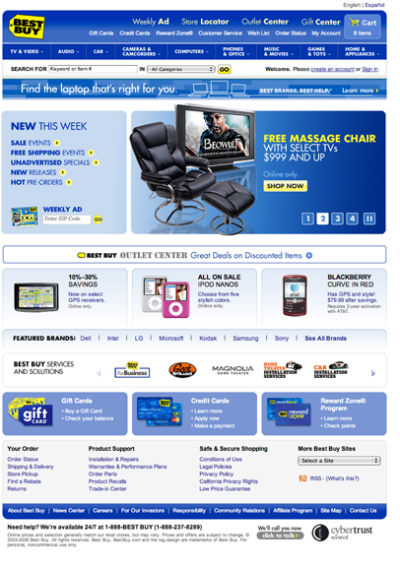
While the concept of having only one site, and to simply style it differently depending on the medium the visitor is using, is popular with many standardistas, a separate mobile site is required in order to deliver an optimized experience for mobile users. Customers who are surfing on a mobile device have different needs and requirements, so to force-feed them the same content as that displayed on the traditional site is a recipe for disaster. The following images show a good example of this principle. The Best Buy mobile site displays only two functions (Product Search and Find A Store)—a far cry from the traditional site.
 Brian Suda
Brian Suda is an informatician currently residing in Rekyavik, Iceland. He has spent a good portion of each day connected to Internet after discovering it back in the mid-01990s. Most recently, he has been focusing more on the mobile space and future predictions. How smaller devices will augment our every day life and what that means to the way we live, work and are entertained. People will have access to more information, so how do we present this in a way that they can begin to understand and make informed decisions about things they encounter in their daily life. This could include better visualizations of data, interactions, work-flows and ethnographic studies of how we relate to these digital objects. His own little patch of Internet can be found at suda.co.uk where many of his past projects and crazy ideas can be found.


