
Key Takeaways
- A/B testing is a crucial tool for designers, allowing them to test different design elements on separate groups within a target audience and measure which performs best according to predetermined criteria such as click-throughs, pageviews, or direct sales.
- It’s important to keep A/B testing simple and avoid changing too many elements at once. Instead, focus on one variable per test to accurately determine which changes are producing positive or negative results. Use tools like Google Analytics to gather data and define your goals before starting the test.
- Small changes can have significant impacts on user behavior and conversion rates. For instance, altering the color of a call-to-action button, simplifying decision-making by limiting choices, or tweaking language in navigation can all lead to improved results. Always remember to analyze your A/B testing results thoroughly to ensure they’re reliable and meaningful.

As Anum Khan pointed out in her January article for SitePoint on color psychology and design, in an ideal world, a client would simply accept all of a designer’s ideas and they’d be left to get on with it.
However, it’s rare that this happens in reality and so a designer has to fit in with the ideas of a client and the client’s marketing department.
This often leads to a discussion of A/B testing, with the idea that different designs can be applied and tested on various groups in order to see which is the more effective.
What is A/B Testing?
Firstly, let’s have a look at what A/B testing is and why it’s a good idea to carry it out. A/B testing is sending two (or more) different designs to separate groups in a target audience, in order to determine which is performs the best according to a predetermined criteria.
This criteria could be measured in many ways, including click-throughs, pageviews, subscriptions, direct sales, or a combination of any of those.
Each version can vary in small or significant ways. Commonly, these differences include a call to action (CTA), colors, input forms, special offers, text or anything that induces a visitor to remain on the site or take action.
However, it’s also worth pointing out that a recent study has found many A/B testing results were misleading, if they weren’t carried out correctly.
This means that before you embark on testing, you should have the following:
- A good-sized ‘sample’ – this is the number of people involved in the test and will depend on the traffic that the site gets. Some advice on managing sample sizes is at Evan’s Awesome A/B Tools.
- A plan for how long the testing will run for – many people make the mistake of stopping a test as soon as it shows positive results, which again produces false results. Some guidelines on this at Visual Optimizer.
- Testing software and Google Analytics
What Software Should I Use?
Currently Optimizely is often a popular choice of software for carrying out A/B testing. You can also use Google Analytics Content Experiments to perform testing with goals.
Choosing Design Elements for Testing
The next obvious question is: “Which elements of a page should you experiment with?”
Always be aware that it’s better not to vary too many different elements in your tests.
In fact, it’s smart to stick to changing one variable per test. Changing multiple elements will make it almost impossible to pin down which variable is gaining positive or negative results.
Before embarking on a test gather data from Google Analytics regarding traffic and define your goals. You can look at bounce rate, segmentation and key performance indicators and use these to help you to decide upon your target metrics.
Once you’ve done this, you can decide how you’re going to achieve what you want through the design. To do this, remember that it’s not just with the use of color that you can apply psychology to a page, there are other tricks that are effective too.
Reduce Choice, Simplify Decision-making
A simple yet effective tactic is to limit the choices a visitor has available to them, ensuring that they have to do what you want them to.
To do this it’s best to keep it simple in order to direct the visitor. Limit choices to one for a small sample size or two (maximum three) for larger samples. This is easy if it’s a purchase choice, as you can also use color to further drive choice.
More than three choices and it’s likely that your visitor will be unable to make a choice and leave.
According to a study by Professor Sheena Iyengar users, when presented with too many options, often chose to take no action. If you’ve ever stood paralysed by choice at a food court or supermarket, you’ll be familiar with this feeling.
The study looked at the sales of two different jam displays set up in an up market store. The number of flavors was varied to measure the reaction of shoppers, offering 24 on one Saturday and six on another.
The study found that the most jam purchased was on a day with just six options. So how can this lesson be applied to design?
- Ensure that the design is uncluttered
- Keep a tight word limit
- Think about how visitors will scan the page
- Think mobile as this will dictate how your page converts too
While I have said it’s possible to test more than one variable above, I still wouldn’t recommend it, especially if you’re new to A/B testing.
Headlines and Images
Eyetrack III, a study carried out by Steve Outing of the Poynter Institute and Laura Ruel at the University of California, tracked the eye direction of 46 readers for an hour whilst they looked at content online.
An overall pattern of behavior was detected in the subjects which found:
- The eye first fixated on the upper left of a page before scanning left to right
- Navigation at the top of the page attracted a lot of attention
- Large headlines, especially when at the upper left, attracted more attention than smaller headlines
- Line breaks discouraged people from looking at content below (such as horizontal rules)
- Text was preferred to images on the home page
- Short paragraphs got more attention than long
- One column performed better than several
- Large ads received more attention than small
What was interesting was that the subjects showed more attention to text than images, so long as it was dominant, short, snappy and in the right place.
You should never discount the power of text by assuming images are more attention-grabbing.
Buttons and Color
If you want to test a CTA button on a landing page, then you should look at how the button color prompts action. In this Hubspot test, which received 2000 visits and ran for just a few days, the red button performed better by 21% over the green.
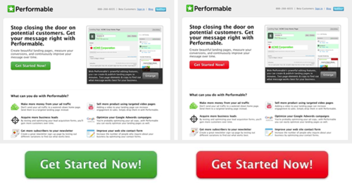
Consider this: a 21% increase in the conversion of this page is potentially a 21% increase to all downstream metrics. So by getting 21% more people to click at the top of this process, we added 21% at the bottom as well. This is why optimizing pages is so valuable. We did not have to increase traffic to the page to see improved results . Instead, we improved the efficiency of the page. And by improving conversion on existing traffic, we thus added considerable value.
This is an interesting consideration to bear in mind. An A/B test doesn’t mean that you have to give a site a complete overhaul, or even get involved in making a sophisticated landing page or complete change. One small variable can make all the difference, so stick with simple for the best results.
Images
Images can make a big difference to conversions so are definitely worth testing. In a test carried out by Signal v Noise, it was found that even someone’s face on an image could return different results.
It was found, somewhat unsurprisingly, that when using images of people, those with the biggest smiles returned the best results. However, it was also found that it didn’t particularly matter who the individual was when it came to gender or traits, they just had to be smiling.
The tests conducted also looked at long form and short form content without an image and a design which included a person and long and short form options. The best results in this case were initially long form, presumably because it appeared much less cluttered than short form, as shown below.
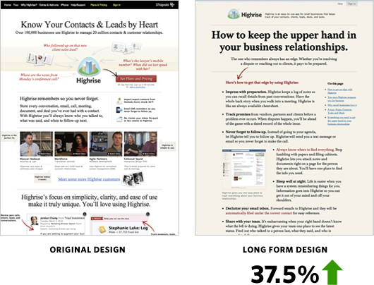
However, when adding the long form to the image of a person, it was far less effective, suggesting that you should use one or the other when it comes to lots of text and images.
Forms
A great example of an effective CTA form can be found at Hello Bar, as clicking on ‘try it out’ takes you directly into the product before you get to the sign-up stage.
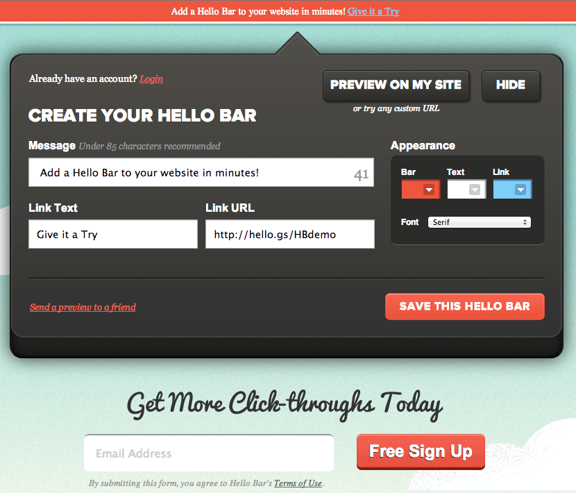
This is a great idea as it allows a visitor to really immerse themselves in the product without having to go through registration first, which is a drop-off point for many sites.
Another good idea is to place a form on a landing page after a visitor has already taken action, such as after a webinar, podcast or similar. Redirecting to a simple email newsletter can be very effective and here you would want to test forms of different lengths in order to see which is the most effective.
In order to build a list, you do want as much information as possible, but asking for a huge form to be filled in puts most people off, so experiment with shorter forms.
Navigation Tweaks Can Have Far Reaching Results
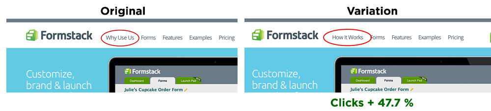
When it comes to prompting users to take action via the navigation system, think about which pages are most visited on the site. This will give you an indication of where they should be positioned on the navigation menu and how language and color should be used for the best results.
A simple change of language to something friendlier can make all the difference. For example, in this A/B test, changing the text from ‘Why Use Us?’ to ‘How it Works’ garnered a 47.7% rise in clicks. This demonstrates ideally that testing doesn’t have to be complex and for it to work, you’re required to get inside the mind of your target audience.
Simple.
Conclusion
Many people are slightly daunted when it comes to running an A/B test, but it needn’t be an intimidating process.
Keep it simple, run one test at a time and ensure that you don’t get too bogged down in the math (by using tools) and it can be a very rewarding experience.
This is in terms of design and the fact that you’ve satisfied the client by driving traffic and essentially, encouraging and making conversions.
Frequently Asked Questions (FAQs) about A/B Testing in UX Design
What is the significance of A/B testing in UX design?
A/B testing is a crucial part of UX design as it helps designers to make data-driven decisions. It involves comparing two versions of a webpage or other user experience to see which performs better. This is done by showing the two variants, A and B, to similar visitors at the same time. The one that gives a better conversion rate, wins. It’s a way to test changes to your webpage against the current design and determine which one produces better results.
How can I effectively implement A/B testing in my design process?
Implementing A/B testing in your design process involves several steps. First, you need to identify a goal – this could be increasing the number of sign-ups, improving the click-through rate, or reducing the bounce rate. Next, generate a hypothesis about what changes could help achieve this goal. Then, create two versions of your design – the original and the variant. Use A/B testing software to split your audience and show each half a different version. Finally, analyze the results to see which design was more effective.
What are some common mistakes to avoid in A/B testing?
Some common mistakes in A/B testing include not testing the right things, not running the test long enough, and making changes based on insignificant results. It’s important to focus on elements that directly impact your goal, run the test until you have statistically significant results, and avoid making decisions based on small differences.
How can I ensure the results of my A/B test are reliable?
To ensure the reliability of your A/B test results, you need to have a large enough sample size and run the test for an adequate amount of time. It’s also important to only test one change at a time, so you can be sure of what caused any differences in performance.
Can A/B testing be used for mobile apps?
Yes, A/B testing can be used for mobile apps. It can help you understand how changes to your app’s design or features impact user behavior. This can be particularly useful when launching new features or redesigning existing ones.
How does A/B testing relate to conversion rate optimization?
A/B testing is a key tool in conversion rate optimization. By testing different versions of a webpage or other user experience, you can identify which version leads to more conversions. This can help you make data-driven decisions about how to optimize your design for conversions.
What tools can I use for A/B testing?
There are many tools available for A/B testing, including Google Optimize, Optimizely, and VWO. These tools can help you set up and run tests, as well as analyze the results.
Can A/B testing help improve user engagement?
Yes, A/B testing can help improve user engagement. By testing different design elements, you can identify what works best for your audience and make changes that increase engagement.
How can I interpret the results of an A/B test?
Interpreting the results of an A/B test involves comparing the performance of the two versions. Look at the conversion rate for each version and see which one is higher. Also, consider the statistical significance of the results – a larger difference in performance is more likely to be significant.
Can A/B testing be used in email marketing?
Yes, A/B testing can be used in email marketing. You can test different subject lines, email content, and calls to action to see what leads to higher open rates and more conversions.