
This article was written in 2007 and remains one of our most popular posts. If you’re keen to learn more about typography, you may find this recent podcast of great interest.
Let’s face it: the core purpose of all web design is communication. Whether we’re talking about an online ecommerce store, a web presence for a Fortune 500 company, or a profile for a social networking site, typography is a vital component. For most people, typography is simply about arranging a familiar set of shapes to make words, sentences, and paragraphs. Having the ability to set type with only a few strokes on a keyboard has allowed us to forget about the creative and artistic possibilities of this medium.
There are numerous obstacles to the effective customization of typography for the Web — and we’ll address these in the coming pages, which have been extracted from my SitePoint book, The Principles of Beautiful Web Design — but the power of type should be motivation enough to push the proverbial envelope. Not convinced? Pick up a magazine, turn on a television set, or take a walk through a grocery store. You will undoubtedly see hundreds of creative and effective uses of type. It is the substance of branding, the key to unspoken communication, and an essential piece of the web design pie.
In order to unlock the potential of type, we must first understand it. Admittedly, this is no easy task. The minute details of letterforms and the spaces around them have been carefully calculated over centuries of investigation and practice. In the early days of print, every letter of every typeface had to be carved into wood or cast from lead, inked, and then pressed onto paper. This was a handcrafted profession requiring exacting attention to detail. Even though the practicality of this practice has long been surpassed by modern printing methods, many colleges and universities offer classes in letterpress so that future graphic designers can both appreciate the benefits of working with type on a computer, and see the potential for typographic exploration.
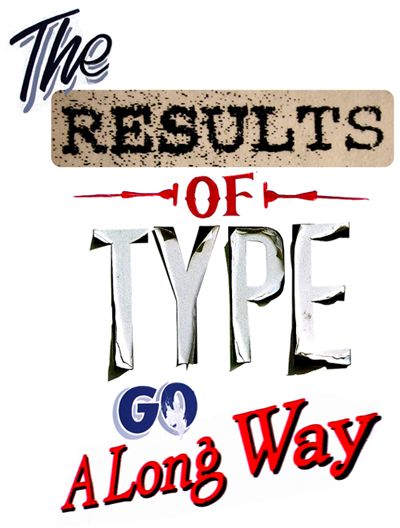
My personal love of typography is twofold. As a designer, I enjoy working with type for the artistic aspects of it. I like the voice that different fonts provide, and the expressiveness of typographic collages like the one in Figure 4.1. After all, the root words that make up typography are typos, meaning impression or mark, and grapheia, meaning writing; typography literally means making impressions with writing. As a programmer, I also appreciate the puzzle-like problem-solving tasks that are involved in working with type. The choices of font and color are only the tip of the type iceberg. In fact, the majority of the decisions that need to be made in our work with type involve the space around the letterforms and text blocks rather than the actual type itself. Nevertheless, choosing an appropriate typeface is a crucial step as well.
Warning: This Topic May Be Addictive!
After studying typography for some time, you’ll never look at a billboard, brochure, or book the same way again. You might start snapping pictures of ride signage at theme parks, rather than your kids. Pondering whether the entrees in a restaurant menu are set in Cantoria or Meyer 2 may become more interesting than choosing between the entrees themselves. The study of typography is one that draws many people in and never lets them go! Consider yourself warned.
The history and implementation of type is a topic that has already filled hundreds of books. In this chapter, though, I intend to provide a brief introduction to the world of typography. First, I’ll cover some of the issues with — and solutions for — taking type to the Web. Then, we’ll get into basic typeface terminology, explore some usage guidelines, and investigate the characteristics of different fonts. From our discussion of legibility concerns, to the question of using dynamic headings online, I hope you’ll find this chapter to be practical and inspirational.
If you like what you see here, and would like to go down the rabbit hole a little deeper, there are plenty of online communities for learning about and discussing typography. One of the most highly regarded is typophile.com. The name “typophile” speaks volumes about the nature of this community, and if you have any questions about type or typefaces, there’s likely to be somebody in those forums that can help.
Taking Type to the Web
When it comes to the Web and choosing fonts for text that will be displayed in a browser, it doesn’t matter if you have five, or 5,000, fonts installed; you have to think in terms of the lowest common denominator. In the ’90s, a brief trend saw many web site designers set the text of their web sites to whatever obscure font they wanted, and include on the site a statement like, “This web site looks best in some font, click here to download it,” as well as posting the actual font file on their web site for download. Not only is this approach most likely to represent a violation of copyright law, but we shouldn’t expect site visitors to go to such lengths just to view our sites.
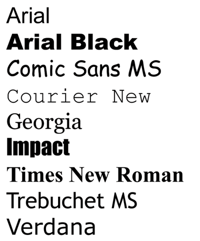
The number of font families that are supported, by default, across both major operating systems is very small. This list of nine font families in Figure 4.2 is commonly known as the safe list. The downside to the safe list is that it doesn’t provide for much variety within each font category. If you need a standard sans-serif font, you have to choose between Arial, Trebuchet MS, and Verdana. For someone who hasn’t been exposed to many fonts, that may seem like a reasonable variety, but for those of us who know the nuances of other sans-serif fonts like Helvetica Neue, Futura, and Univers, using one of the safe fonts can be like using a screwdriver to drive in a nail.
Fortunately, the font-family property of CSS allows you to choose multiple fonts in order of preference. If the first font isn’t available, the second font will be used; if the second font is unavailable, the third font will be used, and so on. Let’s say that you want your section headlines to have a serif font. You think the best font for the job is Calisto MT, so you specify that first — for the few people that have it installed.
Your second choice is your first backup plan, and for this you choose Georgia. If users don’t have Calisto MT installed, they’ll see Georgia. Even though Georgia is on the safe list, some people may not have it installed. Times New Roman is a close equivalent, so you decide that you might as well add it as your next alternative. To finish off the preferential list, to cater to users who don’t have any of those fonts installed, you add what the W3C calls a generic font family. The generic font families are serif, sans-serif, cursive (similar to script or handlettered), fantasy (or Novelty), and monospace. All your font choices so far have been from the serif family, so that’s the generic family you specify. To sum things up, your font-family declaration would look something like this:
font-family: 'Calisto MT', Georgia, 'Times New Roman', serif; Tip: Fonts with Spaces
Remember that any font family names that include spaces must be quoted, either using single (') or double (") quotes.
Displaying Text in Images
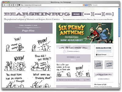
Now, all this preferential font specification is okay, but what if you really want your visitors to see some text in a specific font? In that case, the most obvious solution is to rely on images to display the text in question. This was the approach Kevin Cornell used in the design of his portfolio site, Bearskinrug, which is shown in Figure 4.3. The logo, top navigation, and much of the text on the site is presented as images. This approach not only gave Kevin power over the font display, but also allowed him to integrate the splattered watercolor background graphics into the design of the text. This site features many text graphics … and sometimes a sock monkey named Mojo.
The technique that Kevin used for some of the text graphics on his site works well for static text that doesn’t change very often, but what if you want to use a very specific font for text that changes periodically, like the headline for a news article blog entry? Constantly creating and uploading new text graphics would be a monotonous task, even for a designer who’s a pro at using image-editing software. If you’re setting up a blog for a client who doesn’t know how to use Photoshop or any HTML, you might as well forget about this option. What can you do in this case?
Text Replacement with sIFR
Right now, the most popular option for text replacement is sIFR (pronounced “siffer”), which is an acronym for Scalable Inman Flash Replacement — a technology that allows designers to use Flash and JavaScript to apply their choice of fonts to headings.
![]()
The basic premise behind sIFR is that Flash movies have the ability to embed fonts and display them in all their anti-aliased beauty to the vast majority of web users, who have Flash installed, and that JavaScript is able to replace specified HTML objects with Flash movies. By putting these two concepts together, web designer and developer Shaun Inman was able to create a technique he called Inman Flash Replacement (IFR), the precursor of sIFR. IFR was a revolutionary development in typography for the Web, but it had a few minor shortcomings. Its most notable downside was that it could only be used to replace a single line of text. Recognizing the potential of this technology, Mike Davidson and Mark Wubben, along with countless supporters and testers, have put together a well-documented and easy-to-implement solution — sIFR — that has been released to the development community as open source.
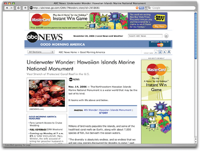
Those who are skeptical of Flash and JavaScript solutions to the Web’s problems can be reassured by the knowledge that sIFR is a completely accessible solution that degrades gracefully. If users don’t have Flash installed, or they have JavaScript turned off, they’ll see the plain old browser text that the script and Flash were supposed to replace. And if you’re skeptical about the solution in general, you’ll be pleased to hear that it has an impressive and growing list of high-profile supporters including ABC News and Nike. Finding examples of sIFR text on web sites can be difficult, especially when they use it to display fonts that are typically installed on many computers. ABC News, for instance, uses sIFR to show news headlines in Futura, as Figure 4.4 illustrates. Futura is a font that’s installed for OSX users by default, but by using sIFR, ABC can be assured that a large majority of its users see headlines in the same typeface.
To download the latest version of sIFR, and access the full installation instructions, visit Mike Davidson’s sIFR Page or Mark Wubben’s sIFR Wiki.
The Blatantly Obvious Solution: Using Safe Fonts
Innovative solutions like sIFR serve as a testament to how badly designers want to use particular fonts in their layouts. So, what if every Internet user actually had installed the font that you wanted to use for your web site? Displaying your site’s text in that font would be as simple as setting the font-family property in CSS. Unfortunately, the number of fonts that are universally available is severely limited. This is precisely the reason why designer Andrei Michael Herasimchuk posted on his site “An open letter to John Warnock” in August of 2006. In his letter, Andrei requested that Adobe’s co-founder convince the company to release eight to 12 of its core fonts into the public domain. If they did so, Apple and Microsoft would surely include these fonts in their operating systems, making them available to all Internet users. While releasing these fonts would deprive Adobe of some future income, Andrei argued that it would “go a long way towards providing designers the tools they need to fulfill the promise of communication on the Internet.” Naturally, the letter has received a great deal of grassroots support from the design community, and it would be fantastic to see something come of it.
Even if the safe list of universally installed fonts never expands, there will always be a way to use non-standard fonts in your web sites. For this reason, it’s important to have an understanding of the different fonts that are available. And to do that, you must first understand some details about the individual glyphs that make up those fonts.
Anatomy of a Letterform
Some of the design classes I took in college got pretty deep into the anatomy and terminology of type. Many people can already identify serifs, ascenders, and descenders, but for one class, we had about 100 terms to memorize. While I won’t be that cruel here, it is important that you know some basic terminology before we get started talking about type. Sure, I could just talk about type using informal words like squiggles, slants, and thingies to describe letterforms, but that could get confusing rather quickly.
Take a look at Figure 4.5, which is explained below.
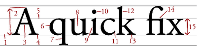
1) baseline
The baseline is the imaginary horizontal line on which most characters sit. The only character that hangs below the baseline in Figure 4.5 is the lowercase “q.”
2) cap height
The cap height or capline is another imaginary line. This one marks the height of all capital letters in a typeface. Notice that the cap height is below the maximum height of the typeface.
3) crossbar
A stroke that connects two lines in the capital letterforms of “A” and “H” is called a crossbar. A horizontal stroke that does not connect two lines, like the one in the lower case “f” or “t,” is known as a cross stroke.
4) serif
Serif is the name given to the finishing strokes at the bottoms and tops of certain typefaces. I’ll talk more about serifs when we get into typeface distinctions.
5) meanline
Another imaginary horizontal line that marks the top edge of the lowercase letters is the meanline. Contrary to the way it sounds, the meanline isn’t always exactly centered between the baseline and the cap height.
6) bowl
The bowl of a letter is the rounded curve that encloses negative space in a letterform. Examples of bowls can be seen in the letters “D,” “o,” and “g.”
7) descender
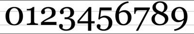
The lower portion of the lowercase letters “g,” “j,” “p,” “q,” and “y” that extend below the baseline of a typeface is known as the descender. The only other characters that typically extend below the baseline are the old-style numerals in some typefaces. These types of numerals, examples of which from the Georgia typeface can be seen in Figure 4.6, were thought to blend better with lowercase roman numerals, and they look particularly good when used within a body of text.
8) counter
The negative space within a letter is called the counter. In some letters, like “A,” “o,” and “P,” the counter is fully enclosed. The non-closed negative spaces in letters like “G,” “u,” and “c” are also known as counters.
9) stem
A stem is the main vertical or diagonal stroke in a letterform. These include the vertical portions of the letters “I” and “H,” as well as all of the stokes in the letter “W.”
10) tittle
This is probably my favorite typeface term. Tittle is the name given to the dot above the lowercase “j” and “i.”
11) terminal
The end of a stem or stroke that has no serif is known as a terminal. Even the ends of some serif typefaces have terminals, as you can see in the letter “c” in Figure 4.6.
12) ascender
The tops of most lowercase letters form an imaginary line that’s known as the meanline. Some lowercase letters have an ascender, which is an extension that rises above the meanline. Those letters are “b,” “d,” “f,” “h,” “k,” “l,” and “t.”
13) leg
The lower, angled strokes seen in the letters “K,” “R,” and “Q” are known as legs. These are also sometimes referred to as tails.
14) ligature
You may not have noticed in Figure 4.5, but the “f” and “i” of the word “fix” are actually combined into one character. This combination of characters is known as a ligature. Ligatures exist to give the spacing between certain characters a greater aesthetic balance, as Figure 4.7 illustrates.

15) x-height
The x-height is exactly what you would expect it to be: the height of the lowercase x in a typeface. Essentially the x-height is the distance between the baseline and the meanline of a typeface. Although it’s not very practical, you can actually use x-height as a relative unit of measurement in CSS (ex).
Text Spacing
Now that you know how to describe the parts of a letterform, the next step is to be able to describe and adjust the space between letters. I mentioned before that many typographic decisions are based on spacing. This is something that has always been true with printed type, and became applicable to web type with the advent of CSS. Regardless of whether we’re talking about using type for print or for the Web, there are two directions in which we can control spacing — horizontally, and vertically.
Horizontal Spacing
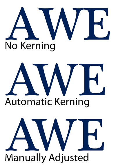
Kerning and tracking are two terms you’ll often hear in conversations about horizontal letter spacing. Kerning is the process of adjusting the space between individual letters. Often when you’re working with type, you’ll notice pairs of letters that appear too close together or too far apart. Most fonts have a set of rules that determine the spacing between specific characters. The kerning between the letters “Wa,” for instance, should be — and is — much tighter than the kerning between “WV.” Most of the time, the rules for the font are sufficient to make the text readable. If not, you can adjust the individual letter pairs within your image creation software of choice.
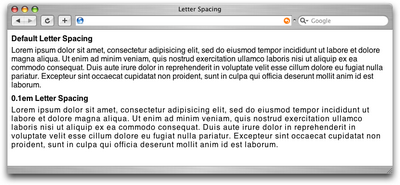
For the text in a web page, it’s impossible to make letter-by-letter kerning adjustments. What you can do is adjust the letter-spacing CSS property, which is known in the print world as adjusting the font’s tracking. Like kerning, tracking adjusts the horizontal spacing between letterforms, but applies to the space between each letter. If you want your text to have a more open, airy feel, try adding a pixel or two to the tracking value. Figure 4.9 shows an example of the effect of spacing. The text in a web page is normally fairly tight, as you can see in Figure 4.9, so assigning a negative value here would probably reduce your text’s legibility.
Another horizontal spacing option in CSS is provided by the word-spacing property. This property can take a positive or negative length, or the keyword normal. As you might expect, this property affects the amount of whitespace between words.
Vertical Spacing
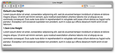
In print design language, the vertical space between lines of text is known as leading (pronounced to rhyme with “bedding”). This term comes from the early days of letterpress when blank strips of lead were used to separate lines of metal type. When there were no added spacers, the lines were said to be set “solid.” Text with added vertical space is much easier to read, but as you can see in the first paragraph in Figure 4.10, the default spacing between lines of text is very small. In the second paragraph in Figure 4.10, we’ve adjusted the CSS line-height property:
line-height: 1.5em; An em is a CSS unit that measures the size of a font, from the top of a font’s cap height to the bottom of its lowest descender. Originally, the em was equal to the width of the capital letter M, which is where its name originated.
Text Alignment
Have you ever noticed that the text you see in books and magazines is often aligned along both the left- and right-hand sides of the page or column? This type of text alignment is known as justification. When text is justified, the letter and word spacing is automatically adjusted so that each full line of text has a word or letter that lines up against the left and right edges of the text area. Many print designers will use justified text for any text block that’s over two lines long and isn’t too narrow. You can take this same text treatment to the Web with CSS by setting the text-alignment property to justify. Before you go and justify the whole Internet, though, let me give you two warnings about justified text:
A river runs through it.
Occasionally, a gap created by wider spacing in one justified row will line up with a gap in the next row, and the next, and the next … and you end up with a canyon or river in your type, as shown in Figure 4.11. This can be distracting for the reader. Print designers can makes adjustments to fix this sort of thing, but on the Web, it’s difficult to predict and impossible to fix.
What? Are? You? Saying?
The river problem gets even worse with narrow columns. Words will often get isolated against the left and right margin or stretched over the entire width of the column. Most word processing programs fix this problem by hyphenating words where necessary. Browsers cannot do this kind of auto-hyphenation, so web designers should avoid using justified text in narrow spaces.
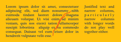
If you don’t want to change the text-alignment of your text to justify, your other options are left, right, or center. When text is centered or aligned along the left or right edge of the page or column, the spacing between the characters and words remains constant. The river problem can occur with any text block, but it’s much less likely to cause legibility issues in text that’s centered, or justified on one side only.
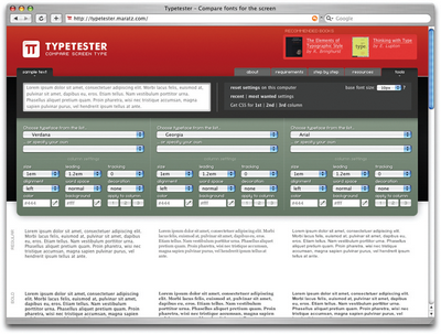
If you want to see how some HTML text will look with different leading, tracking, and alignment settings applied, a great tool to check out is Marko Dugonji’s Typetester, shown in Figure 4.12.
Typetester gives you an interface to which you can apply any conceivable text options to three columns of text; you can then compare the displays side by side. Once you have some settings you like, you can click on the Tools tab to obtain the CSS that creates the effect.
Typeface Distinctions
Everybody knows what a font is. It’s a set of letters that appear in a similar style, they come pre-installed on your computer, and you change it when you want your text to look different. The average Windows PC has just over 40 fonts installed by default, while the average Mac user has access to around 100 fonts. Many of these fonts are grouped together into font families, with each font in the family representing a different variation of the font after which the family is named. Most font families include the regular font face along with italic, bold, and bold italic variants. Some fonts have no variations at all, some may only have bold or italic, and some commercially available font families have hundreds of variants.
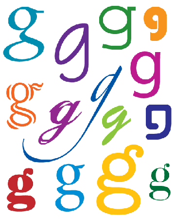
Just as all the members of some families have big ears or abnormally long pinky toes, every font family has its own unique, identifiable characteristics. Take a look at all the variation that exists between fonts for the letter “g” in Figure 4.13.
These characteristics are what help us to categorize fonts and font families. The majority of font families can be classified as either serif or sans serif. Beyond this distinction, there are many other ways in which we can classify and group fonts. I prefer to group fonts into six simple categories: serif, sans serif, handwritten, monospace, novelty, and dingbats. Let’s look at each of them now.
Serif Fonts
Historians believe that the serif has its origin in Roman stone carving. There is much debate over the original purpose of these ornamental strokes, but in more recent history, they’ve been proven to increase legibility in large blocks of text by providing a horizontal line of reference. When most designers try to choose a serif font, Times New Roman is the first one that comes to mind. However, there’s a great variety of serif fonts from which we can choose. To help us with that decision, it’s a good idea to first decide what type of voice we want our text to have.
Take a look at the Garamond text in Figure 4.14. Garamond is an old-style serif font. Old-style serif fonts are adapted from the brush strokes of Italian scribes and can be recognized both by the smooth transitions between thick and thin strokes, and by their rounded serif edges. When I see an old-style serif font, it seems to me to have a hint of historic, handcrafted charm. At the same time, fonts like Garamond are extremely versatile. They’re not so old-fashioned that they can’t be used in modern applications, but this isn’t their forte.
The second font in Figure 4.14 is Baskerville, a transitional serif font. The curved angle that connects the terminal of the stroke to the serif is known as a bracket. The brackets of transitional serif fonts are rounded but the edges of the serifs are squared off. The simple addition of 90-degree angles and perfectly straight lines gives this category of font a more modern and mechanical voice. This category of serif fonts is known as transitional because it provides a transition between old-style and modern serif fonts.
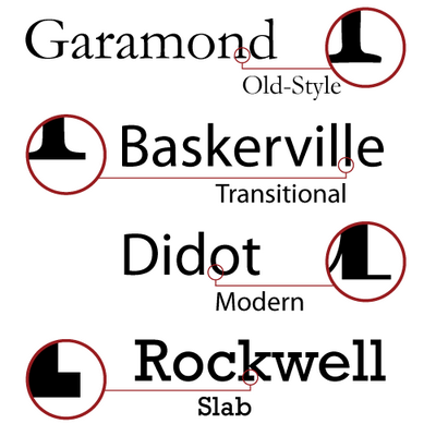
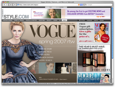
In Figure 4.15, the font Didot is a modern serif font. Modern serif fonts provide a large amount of contrast between the thick and thin strokes, and their serifs are often completely unbracketed. Modern serif fonts were introduced during the Industrial Revolution as a radical alternative to the transitional serif style. Today, these fonts have an association with elegance, sophistication, and fashion. They represent timelessness more than they suggest cutting-edge modernity.
Because of their fine-line details, modern serif fonts are really only suitable for use in headlines. The logo for Vogue magazine, which you can see in Figure 4.15, is a classic example of modern serif font use. Other famous magazines that use modern serif fonts faces for their mastheads include Brides magazine and Harper’s Bazaar.
The consistent use of Italian Didot for the Vogue magazine logo helped to establish both the font and the company as icons of style.
In the later part of the 1800s, as advertising, posters, and flyers became more common, a bolder variation of modern serif fonts was needed to catch people’s attention. It was at this time that slab serif fonts were introduced. Slab serif faces like Rockwell, which you can see in Figure 4.15, have an industrial voice of strength and fortitude. These faces were designed to be extremely readable from a distance.
Sans Serif Fonts
At the time when typographers began experimenting with slab serifs, the idea of eliminating the serif altogether seemed like a huge mistake. Serifs were a tradition and removing them was typographic castration. The initial sans serif fonts were so loathed in the 1800s that they were referred to as grotesque. Eventually, though, people began to warm up to the idea of serif-less typefaces and by the 1920s some argued that the serif would soon be eliminated.
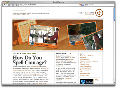
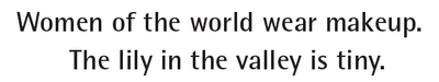
Although serif fonts are still used extensively, the popularity and versatility of the sans serif font category continues to grow. These types of fonts have a cleaner and more contemporary feel. They stand out as headlines, especially when placed near body text that’s set in a serif face. This has long been a standard practice in print design and is a tip that I was taught in college. However, on the Web, the opposite has become true as designers use sans serif fonts for body text, contrasted with serif-font headlines. This trend can be seen on the homepage of Coudal Partners in Figure 4.16.
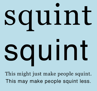
The shift toward using sans serif body text on the Web was born mainly of the limitations of older monitors and laptop screens. The image quality of display devices has improved much over the years, but the stroke variation and minute detail of serif fonts can make them almost unreadable at small sizes on lower resolution displays. The solution is either to increase the size of the font to compensate, or to use a sans serif font that has less detail. As you can see in Figure 4.17, sans serif fonts are more readable at small sizes.
Regardless of how they’re used, sans serif fonts are extremely legible and practical for almost any purpose. The most-often used sans serif fonts are Arial and Verdana. Each of these font families exists in the default font sets of both major operating systems, but in the design world, these families have a reputation for being overused and generic (and in the design community, Arial has the added stigma of being widely considered the poor cousin of Helvetica). This makes them great for body text, where voiceless legibility is the goal, but for headlines and artistic applications, a more unique feel is often required. Sometimes a stronger serif font, or a more distinguished sans serif, will do the trick, but there are certainly more options available outside these two categories.
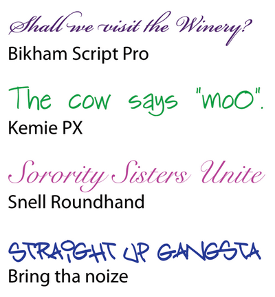
Handwritten Fonts
Before the invention of movable type systems, all text had to be carved, brushed, or written by hand. The downside to handwritten text — especially my own — is that achieving a uniformity of letterforms, alignment, and spacing can be frustrating. And as a result of these challenges, handwritten text can be very difficult to read. Yet the wonderful thing about handwriting is that it acts as a symbol of humanity, and gives a tangible personality to the text it represents. Just look at the text in Figure 4.18. Each line was written to represent the personality of the font in which it is written.
Handwritten fonts provide personality without the human error factor. The lettering and alignment in a handwritten font will be consistent, and if the font is well designed, the spacing should be good, too. As with any font, you cannot rely on site visitors to have your selected handwritten fonts installed, so to use them on the Web, you’ll need to convert your handwritten text to images, or use some type of replacement technique, such as sIFR.
Fixed-width Fonts
You may have noticed by now that in most fonts, each letter takes up a different amount of space. For instance, the capital “W” takes up a large area, while the letter “l” has a very narrow footprint. To illustrate this point in plain text, take a guess which of the following sentences has more characters.
That was a trick question: they actually have the same number of characters! So why does the first sentence appear so much longer than the second? The explanation for this phenomenon is that the majority of fonts are proportionately spaced. Associated with each character of each font are rules that determine not only the width of the character, but also the amount of space that will appear around each character. Take a look at those two sentences again, this time, displayed in the font Courier:
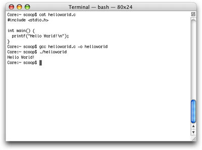
The reason the two sentences appear to be the same width now is that Courier is a fixed-width or monospaced font. This category of fonts has uniform spacing, and the letterforms are designed so that they are similar in width. Fixed-width fonts were initially designed around the technical limitations of typewriters. Since early typewriters weren’t capable of moving the typed page a different distance when a “w” was typed, rather than an “i”, specialized fonts were developed for these devices. These fonts had to remain readable despite the fact that the spacing was the same for every letter. Early computer displays employed fixed-width fonts as well (and many still do — see the terminal window display in Figure 4.19), but it wasn’t long before computers were able to display much more legible variable-width (or proportional) fonts.
So why are fixed-width fonts still around today? Mainly for the sanity of coders and accountants. When these professionals write code or display tabular data as text, it’s important that characters line up from row to row and column to column. If you’re reading this book, you’re probably already familiar with fixed-width fonts. They’re used in terminal windows, as we’ve already seen, as well as text editors and calculators.
On the Web, the standard way to display text in a fixed-width font is to wrap it with <pre> and </pre> tags. pre is short for preformatted text, and aside from displaying fixed-width characters, the pre element also preserves tabs, spaces, and line breaks. This usually makes displaying code or tabular data on a web site as simple as cutting and pasting from the source. I say usually because HTML tags that exist within a box of preformatted text are rendered normally, so if you’re trying to include any tags in your code, you’ll need to replace any <s with the HTML character code equivalent of <, and any >s with >. As with every other HTML element, pre can be styled with CSS. Often, web developers who plan to show code on a page want the code to stand out from the regular text. Using CSS, the <pre> tag can be given a border, a background treatment, additional margins, or a different text treatment, to help it to stand out.
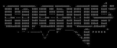
Another interesting, albeit obsolete, use of fixed-width fonts is in the creation of ASCII art. ASCII (American Standard Code for Information Interchange) was one of the original English character encodings for communications equipment, and for several years the 95 printable characters in this seven-bit system were the only graphics that ever showed up on a display. Before the Internet existed outside of the military and academia, there were networks of dial-up bulletin board systems (BBSs), many of which displayed menus and game graphics in ASCII characters. Having grown up during the peak of the BBS era, I loved to see the “underground” graphics people could create using only fixed-width type.
Although much more intricate ASCII art can be created from images using computer programs, the ASCII art created during the late 1980s and early 1990s was composed character by character, and really pushed the limits of the medium. This type of artwork is an often-overlooked link in the history of computer graphics.
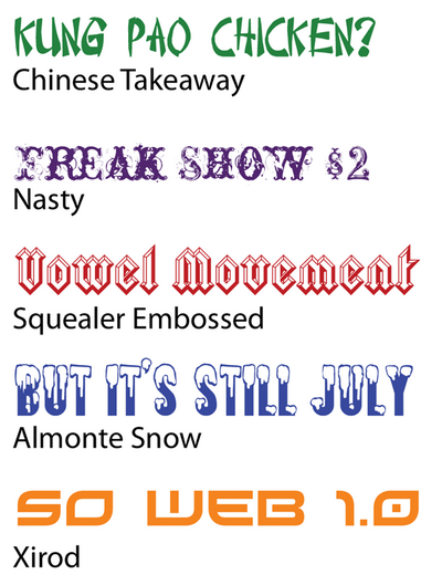
Novelty Fonts
Novelty fonts, which are also known as display or decorative fonts, represent the vast majority of the fonts that are available for free online. Some of the fonts in this category, such as those in Figure 4.21, are modified versions of popular serif or sans-serif fonts, and some are completely off-the-wall ideas that would be better described as conceptual art than a font face. By their very nature, these fonts are less legible than their traditional counterparts, but when used sparingly, they can add a wealth of personality and flair to a design.
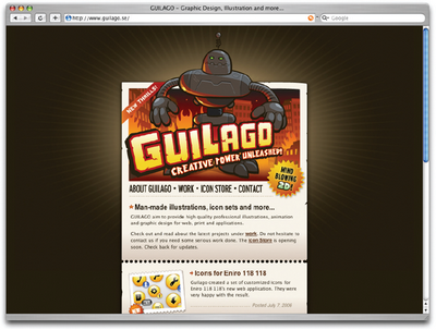
Novelty fonts often make good starting blocks for logo design and decorative type elements. If you take a look at the screenshot of the web site for Scandinavian design company Guilago in Figure 4.22, you’ll notice two different novelty fonts. These fonts have been given some border and perspective treatments to form the company’s logo.
As with all design choices, before you use a novelty font, you should think about your client’s requirements and target audience. Most clients will already have some form of branding in place, and choosing a bizarre or offbeat novelty font may tarnish the company’s image. Even so, it’s best to keep an open mind when you’re coming up with themes for a web site design. It may be that the company you’re working with wants to stray away from its corporate image. Perhaps your clients want to create something a little more “personal.” It seems this was the case for HP, given the font the company used in its “The Computer is Personal Again” ad campaign, shown in Figure 4.23.
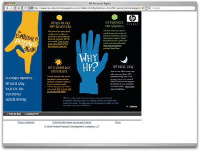
The use of a creative, custom-designed novelty font in the HP campaign gives the commercials a very unique feel. The whimsical font, which I’d describe as being one part college notepaper scribble and one part Nightmare Before Christmas, definitely corroborates the personal theme of the campaign.
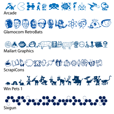
Dingbat Fonts
When you’re looking for illustrations and artwork to incorporate into the design of a web site, one resource that shouldn’t be ignored is dingbat or symbol fonts. In the early days of print, dingbats were ornamental characters that were used to separate printed text and fill whitespace. Original dingbat fonts consisted mainly of flourishes and commonly used symbols. However, the concept of dingbat fonts changed radically with the digital font revolution. Now, any series of graphics can be assigned as characters in a dingbat font.
While these fonts may not seem worthwhile from a typesetting perspective, they can be useful as supportive graphics and icons. Since fonts consist of scalable vector shapes, dingbat glyphs can be set to any size without becoming blurry. The only problem is that, to use these fonts, you have to know where to find the glyph you’re after. Occasionally, I’ll remember an arrow or symbol from a dingbat font and type out half the alphabet before I find the one I want. Fortunately, though, most dingbat fonts have a theme, so it’s easy to remember which font the glyph is in, even if the specific character is hard to find.
When people think about dingbats, the first sets that come to mind are Wingdings and Webdings, the dingbat fonts that come pre-installed in Windows. There are actually hundreds of other dingbat fonts available on the Web. A few examples are given in Figure 4.24.
Finding Fonts
I’ve mentioned that you can find fonts on the Web a few times now, but I haven’t given you any resources! Now that I’ve explained all six of the basic font categories, I guess it’s about time to tell you where you might find some new ones to add to your typographic tool belt.
Free and Shareware Font Galleries
These web sites list and categorize thousands of free and shareware fonts from many different designers. Some of the designers listed on these galleries have their own web sites, through which they sell other fonts that they’ve designed. If you enjoy the fonts created by particular designers, be sure to track down the rest of their work. Many web sites claim to offer free fonts, but in my opinion these are three of the best resources:
- 1001 Fonts, at http://www.1001fonts.com/
- DaFont, at http://www.dafont.com/
- Wanted Fonts, at http://www.wantedfonts.com/
Fonts for Sale
Like the free and shareware galleries mentioned above, these web sites promote fonts from many different designers and foundries. But unlike those galleries, none of these sites offer fonts for free. The benefit of paying for a font family from one of these companies is that you’ll not only have a complete set of characters, but the purchased fonts often include bold, italic, oblique, and other variants.
- FontShop, at http://www.fontshop.com/
- AGFA Monotype, at http://www.fonts.com/
- Veer, at http://www.veer.com/products/type/
- MyFonts, at http://www.myfonts.com/
- International Typeface Corporation, at http://www.itcfonts.com/
Individual Artists and Foundries
Many of my favorite contemporary fonts come from a handful of individual artists and companies. Most of these web sites have a few free fonts, as well as offering a few for sale:
AEnigma Fonts by Brian Kent, at http://www.aenigmafonts.com/
Brian has developed hundreds of great free fonts. I wish his web site were easier to navigate, but it’s still a great resource.
The Astigmatic One Eye Typographic Institute by Prof. Brian J. Bonislawsky, at http://www.astigmatic.com/
Professor Bonislawsky has created many terrific font faces in every imaginable category.
Blue Vinyl Fonts by Jess Latham, at http://www.bvfonts.com/
Like many font designers, Jess started designing fonts as a hobby. His freeware and paid fonts are unique and very well done.
Fountain by Peter Bruhn, at http://www.fountain.nu/
Fountain features some of the best fonts from about 20 different designers around the world. The site also provides very nice freeware fonts.
Larabie Fonts by Ray Larabie, at http://www.larabiefonts.com/
Ray is a rock star in the realm of free fonts. His work is known for having large character sets and being of very high quality.
Misprinted Type by Eduardo Recife, at http://www.misprintedtype.com/
Eduardo is the man when it comes to weathered, worn, and eclectic font faces. His work is unmistakably unique and somewhat twisted.
Pizzadude by Jakob Fischer, at http://www.pizzadude.dk/
Jacob has an admittedly goofy and laid-back style, but has cranked out over 500 handmade fonts since 1998.
Choosing the Right Fonts
Even if you understand all the technical aspects of letterforms and typeface categories, and have access to all the fonts in the world, you can still have difficulty choosing the right ones. That’s because font selection is based just as heavily on artistic license and emotional association as it is on technical issues. So, where do we begin?
In order to start your quest for the perfect font, you should first define the feelings you’re trying to evoke in the members of your target audience. Are you trying to show that the company the web site represents is hip and young, or would you rather portray an aura of steadfast wisdom? Do you want to create something themey, like a Luau or a Mexican fiesta, or are you trying to convey a more formal identity? By asking yourself these kinds of questions, and thinking about fonts on an emotional level, you should be able to decide reasonably easily whether a given font is appropriate for your application. If you don’t think you could answer those questions about a particular font, make up your own questions. The fact is that you’ve probably seen billions of letters and millions of words in your lifetime — you just feel some emotional connections on which you can base your font choices. Think back to the logos, the album covers, the textbooks, and the signage you’ve seen. How have those typographic elements affected your perception of the entities they represent?
Now, let’s take that idea and work backwards, using a generic entity like Joe’s Restaurant. The font that you choose for this design will play a crucial role in the way potential diners perceive the attitude and identity of the restaurant. Take a look at Figure 4.25, and try to choose some fonts that make you think of a casual Italian bistro. Okay, now pick fonts that suggest a metropolitan restaurant serving five-star cuisine. How about a tacky dockside bar? There’s no right answer for any of these scenarios, but there are definitely some fonts that just don’t work in each case. First, try to narrow the field down to a few good candidates, then try to refine your choices again, until you find one that works well.
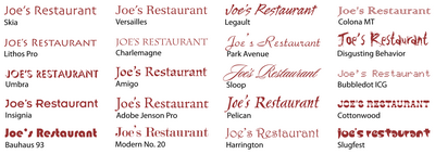
Remember that there are no bad fonts — just inappropriate ones. While a particular font may not work for one purpose, that doesn’t mean it can’t be used for another. Just try to keep an open mind, and if you can narrow the field to a few possibilities, try asking a friend or coworker the question “Which one makes you feel more adjective?” replacing adjective with the feeling you’re aiming to elicit.
Finally, when you’re choosing fonts, it’s important not to choose too many. As a rule of thumb, try not to use more than four different fonts in a web site design. Also, try to avoid combining two different serif fonts or two different sans serif fonts in the same project.
Setting Text Size
The size of text is, and always has been, a confusing topic. Over 300 years elapsed in the history of printed type before the French typefounder Pere Sebastien Truchet introduced the point. Although points have been the standard units of measurement for typography ever since, the exact size of this “standard” unit has changed several times throughout history due to differences between the English and French units of measurement. It wasn’t until the rise of digital typography that the official size of the point was set to 1/72 inch.

While the size of type in the print world is measured by this absolute value, the size of type on the Web must be relative to the resolution of the viewer’s monitor. In CSS, the pixel (px) is the smallest?and best?relative unit for setting the size of text. Monitor resolution is set in pixels, as are the dimensions of all display graphics, so it makes sense to control text size with pixels, as well. So, why doesn’t everyone set web text sizes in pixels? Well, mainly because of Internet Explorer 6. Most browsers, including Internet Explorer, have an option that allows users to change the overall display size of the type on a web site, as Figure 4.26 shows.
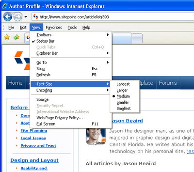
This control adds a major boost to the usability of the Web for people with visual impairments and users of low-resolution displays. In most browsers, the text size control works flawlessly, but in Internet Explorer 6, the settings in the Text Size menu will not affect a web page whose text is set in pixels. Why not? Because the developers of IE believe that the pixel is an absolute unit that should not be resized. Version 7 of Internet Explorer has continued the tradition of refusing to resize text set in pixels, though it does offer a page zoom feature that may constitute a good alternative for some users. Even so, setting font size in pixels cannot be recommended.
Note: What’s an em Again?
I gave a brief definition of ems in our discussion of alignment earlier in this chapter. An em is a relative unit of measurement; one em equals to the vertical size of an element’s text.
There are numerous ways to set font size, but because I think in pixels, my favorite approach involves setting a font size of ten pixels on the body element, and em units for the rest of the document. The default font size in most browsers is 16 pixels. And since the em is relative to the parent element’s font size, the default size of one em is 16 pixels, too. So, if you wanted a page’s paragraph text to display at 12 pixels, you’d have to set the font size of the paragraph to 0.75em; if you wanted 35-pixel h1 headlines, you’d have to set them to 2.19em. (If you’re wondering how I came up with those numbers, I divided the pixel size that I wanted by 16, then rounded to the nearest hundredth of an em.)
I don’t know about you, but I can’t do decimal division in my head. Nor do I like having to drag out my calculator every time I want to set a font size in my CSS file. That’s where the following 62.5% body font size trick comes in. By changing the font size of the body element, the value of one em essentially becomes ten pixels. This makes the math associated with using em-based font sizes a simple matter of moving a decimal point. In this scenario, 12 pixels is equal to 1.2 ems, and 35 pixels is equal to 3.5 ems:
body {
  font-size: 62.5%;
}
p {
  font-size: 1.2em;
}
h1 {
  font-size:3.5em;
}
This method allows me to have the pixel-by-pixel accuracy that I want as a designer, gives Internet Explorer 6 users the ability to resize the text as they see fit, and keeps me a safe distance from my calculator.
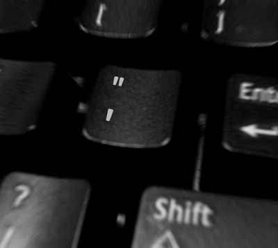
Using Punctuation and Special Characters
When you type text into any reasonably modern word processing program, even though your keyboard key shows that ubiquitous ASCII double quote symbol, you see nice “curly” opening and closing punctuation marks when you hit it. These special quotes can’t be found on your keyboard, as the key in Figure 4.27 shows. But word processing programs understand that when you put something in quotes, you want nice left and right quotes, and it replaces the characters you typed in with the correct ones. The same goes with apostrophes. Have you ever seen an ASCII apostrophe like the one on your keyboard in a book or brochure? Of course not. What we usually see in printed material is a closing single quote. In fact, there exists a vast array of characters that aren’t represented on a standard keyboard, though these characters show up on web pages and in printed material.
Now, that’s all well and good for people using word processors. But for those of us typing text into an HTML document, there’s no system to automatically replace the characters from our keyboards with their grammatically correct equivalents. Depending on which type of character encoding your web site uses, when you paste these characters directly into an HTML document, you may see a bunch of gibberish on the rendered page. Also, the inclusion in text of characters that are used by HTML, like < and >, will wreak havoc in your page, as they cause the beginning or ending of HTML code.
For these reasons, a series of special codes or entities has been created?we type these into our HTML documents to produce correct punctuation marks and just about any special character that we could need. The examples in Table 4.1 are just a sample of the many HTML character codes that exist. The code on the far left is known as an entity name or keyword. For instance, to produce a copyright symbol in your document, enter copy directly into your HTML; you’ll see a © in the rendered page. Each of these entities also has a numerical equivalent; the numerical equivalent of copy is #169 which produces the same symbol. For a more complete list of codes and their alternative entity numbers, check out W3Schools’ HTML Entities page.
Table 4.1 Sample list of HTML character entity references
| Entity | Character | Description |
|---|---|---|
| < | < | Less than |
| > | > | Greater than |
| & | & | Ampersand |
| ‘ | ‘ | Left single quote |
| ’ | ‘ | Right single quote |
| “ | “ | Left double quote |
| ” | “ | Right double quote |
| « | « | Left angle quote |
| » | » | Right angle quote |
| ® | ® | Registered trademark |
| ™ | â„¢ | Trademark |
| © | © | Copyright |
| ¢ | ¢ | Cent |
| £ | £ | Pound |
| € | € | Euro |
| ¥ | Â¥ | Yen |
| ¼ | ¼ | One quarter |
| ½ | ½ | One half |
| ¾ | ¾ | Three quarters |
That’s it for this chapter! To find out more on The Principles of Beautiful Web Design, check out the Table of Contents and Reader Reviews.
If you enjoyed reading this post, you’ll love Learnable; the place to learn fresh skills and techniques from the masters. Members get instant access to all of SitePoint’s ebooks and interactive online courses, like Learn HTML5.
Frequently Asked Questions about Typography Principles
What are the basic principles of typography?
The basic principles of typography include contrast, scale, balance, hierarchy, alignment, and space. Contrast is used to differentiate elements and draw attention. Scale refers to the size of the text, which can be used to create hierarchy and emphasis. Balance is about distributing elements evenly to create a pleasing composition. Hierarchy is used to guide the reader’s eye to the most important elements. Alignment is about lining up text and graphics to create order and cohesion. Space, both negative and positive, is used to give the design room to breathe and to help guide the reader’s eye.
How does typography affect the readability of a design?
Typography plays a crucial role in the readability of a design. The choice of typeface, size, line length, line spacing, and letter spacing can all impact how easy it is for a reader to process the information. A well-designed typography system can guide the reader’s eye and make the content more digestible.
What is the role of typography in branding?
Typography is a powerful tool in branding. It can convey a brand’s personality, values, and tone of voice. The choice of typeface, color, and layout can all contribute to the overall brand image. A consistent typography system can also help to make a brand more recognizable and memorable.
How can I use typography creatively in my designs?
There are many ways to use typography creatively in your designs. You can play with scale and contrast to create emphasis and hierarchy. You can experiment with different typefaces and styles to convey different moods and tones. You can also use typography as a graphic element, creating shapes and patterns with text.
What are some common mistakes to avoid in typography?
Some common mistakes to avoid in typography include using too many different typefaces, not considering readability, not using proper alignment, and not creating a clear hierarchy. It’s also important to consider the medium and context in which the typography will be used.
How can I improve my typography skills?
Improving your typography skills takes practice and study. Start by learning the basic principles and rules of typography. Then, study good examples of typography in different mediums and contexts. Experiment with different typefaces, styles, and layouts in your own designs. And always be open to feedback and critique.
What is the difference between a typeface and a font?
A typeface is a family of related fonts, while a font is a specific member of that family. For example, Helvetica is a typeface, while Helvetica Bold is a font.
How do I choose the right typeface for my design?
Choosing the right typeface for your design depends on several factors, including the content, the audience, the medium, and the brand. Consider the mood and tone you want to convey, as well as the readability and legibility of the typeface.
What is the importance of white space in typography?
White space, or negative space, is crucial in typography. It gives the design room to breathe and helps to guide the reader’s eye. It can also create contrast and hierarchy, and contribute to the overall balance and harmony of the design.
How does typography contribute to the user experience?
Typography plays a key role in the user experience. It can guide the user’s eye, make the content more readable and digestible, and convey the brand’s personality and tone of voice. A well-designed typography system can make the user experience more enjoyable and effective.