I am just finishing up a website, ready to launch it, but there is one last thing to deal with. BTW, this is not a responsive site and I am not at liberty to change that.
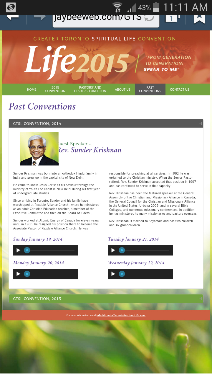
On one page, the images of the speakers don’t keep their aspect ratios on phones and tablets. They seem to be stretched horizontally and before I fiddled with the spacing (which I don’t like now), they covered up a bit of the headings.
How do I force the images to keep their proportions on every device?
Hi you are changing the image size from its normal 180px x 153px to 150px x 143px but then adding padding to it which may confuse some browsers so try removing the padding and doing something like this:
I’ll try that. But in the meantime, where did you get the dimensions 180 x 153 from? I checked both my code and my uploaded image, and they are both 150 x 143.
The styling though is giving it padding that makes it equivalent to 180x153. Not sure what he means about original size - if you view the image separately, it’s only 150x143.
Hmm… I’ve never heard that expression, but I have heard people express dislike for this sort of phrasing before. I’ve never been sure how that’s an offensive thing to do when you’re speaking to someone else - when you’re speaking in person, in many cases, it’d be incredibly awkward to interject names instead of pronouns when referencing other people in the conversation… but I suppose that everyone is entitled to their own opinion
It’s a generation thing - don’t worry
That sounds, somewhat insultingly, like the sort of condescension I might use with my daughter…
Back to the topic at hand - that worked like a charm. I have always used padding to keep text away from images but I guess that doesn’t work with tablets or phones. Thanks for the help.
With respect to the other, I am ‘mother’ to five cats and a dog, none of which look remotely like the one in my avatar. lol
‘It’s a generational thing’ - I hope that’s not a bit of ageism going on there.
Interesting idea I’ll consider trying.
I’ve always used padding to keep inner content away from their container and margins to keep containers away from each other.
It doesn’t really matter which one you use, padding or margins. It just depends on the situation and which element you decide to use it on. A container could use padding to separate it from some paragraph text (with a border). But I couldn’t do the same on hte paragraph text since the padding would separate the text from its OWN border (but the own border would still be up against the container).
No problem. Being female and older, AND loving all aspects of coding is seen as an oxymoron in some developers eyes, so I am used to having to defend myself somewhat.
