Sorry Paul, it’s Chrome where it doesn’t look good
Which link are we looking at? Yours or my demos ?
Please also post a screenshot of what you see please as it will help me to see what the problem is.
The live link I posted should work everywhere within reason 
Here is a screenshot in Safari and Chrome iphone SE of your current page showing all is good.

I won’t be back to my desktop for a few hours yet so will test then.
You’ll have to tell me which one 
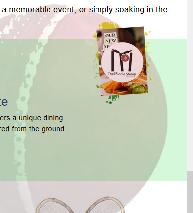
If its the middle stump image that gets too small then you may want to add a minimum width.
e.g.
.image-content {
    width: 25%;
    position: relative;
    display: flex;
    justify-content: flex-start;
    align-items: flex-start;
    min-width: 100px;
}
Yes it’s the middle stump one on the right Paul, I changed the code to this /* Image content takes up 25% of the container width /
.image-content {
width: 25%;
position: relative;
display: flex; / Use flex to control alignment /
justify-content: flex-start; / Align image to the left /
align-items: flex-start; / Align image to the top */
min-width: 100px;
}
but it is still the same
I’ll get back to you with the screen shots of the browsers on my phone, thank you
Sorry Paul, it’s the same on my laptop browser also
Yes that’s how it should look with the code I was working from. I assumed that’s what you wanted it to look like as you added a negative margin to drag it out of the green box.
How is it supposed to look?
Is it not supposed to overlap the green or is is supposed to be centred vertically in the green? These are design issues as such so you will have to decide what it should look like. As far as I could tell it looked like a design choice to overlap at the top but then I never did understand the choices designers make
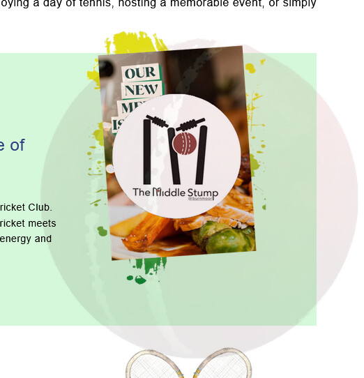
the actual image is 400 x 567
You want it as big as that?
If so then add these changes:
.image-content {
  flex:1 0 25%;
   min-width:240px;/* adjust to suit */
}
Do I add that to this please Paul? /* Image content takes up 25% of the container width /
.image-content {
width: 25%;
position: relative;
display: flex; / Use flex to control alignment /
justify-content: flex-start; / Align image to the left /
align-items: flex-start; / Align image to the top */
min-width: 100px;
}
You don’t really want a fixed size like that as it needs to scale but you can make it bigger if you want by changing he flex value I just gave you.
.image-content {
  flex:1 0 35%;
   min-width:240px;
}
35% will make it around 400px wide at the widest view and then it will scale down on smaller windows..
Yes add it to that rule but you can remove the width:25% as it does nothing in that flex content. The flex percentage I gave you will control the width.
The rule should now look like this:
.image-content {
    position: relative;
    display: flex;
    justify-content: flex-start;
    align-items: flex-start;
   flex:1 0 35%;/* adjust to suit*/
   min-width:240px;/* adjust to suit*/
}
That’s it my friend, thank you, thank you, I’ll check those screen shots now if it’s ok?
I notice the text in the green block is not positioned nicely (unless that was how you wanted it) but you can line up the left edge better by adding this extra code.
.welcome .container .text-content p {
  padding: 0;
}
.welcome .container .text-content h3 {
  width: auto;
}
.welcome .container .text-content img {
  margin-left: -20px;/* left aligned*/
/* margin:auto; uncomment this if you want it centred horizontally*/
    display:block;/* add this also*/
}
@media only screen and (max-width: 768px) {
  .welcome .container .text-content h3 {
    text-align: center;
  }
}
I used to have the green box going from edge to edge Paul, but once I saw how you helped my last time, I didn’t want to say! Cold you add that code into my stylesheet for me please? It sounds great
Yes that’s because you had the element (.container) going full viewport width including the text and that was impossible to read on my monitor as it was basically a couple of very long lines of text. That’s why I suggested a centred layout instead.
You could extend the green only to the edge (not the content) but that would usually mean changing the html so that the green element is not in the wrapper and therefore could stretch full-width. However this is a css trick you could use (invented by me years ago) that will allow a box shadow color to appear to stretch to the viewport edge.
Try adding this extra rule and see if it does what you want.
.container{
      box-shadow: 1360px 0px 0px #d4f8d9, -1360px 0px 0px #d4f8d9;
}
Of course if you use that .container anywhere else it will have that color applied.
I have to go out in a few minutes but I will be around tomorrow afternoon if you get stuck again.
Will do pal, thank you, can I just ask, is it here I insert the code please?
/* Text content takes up 75% of the container width /
.text-content {
padding-right: 20px; / Space between text and image /
text-align: left; / Align text to the left */
}
/* Ensure paragraph text uses a serif font /
.text-content p {
font-family: “Arial”, Times, serif; / Serif font /
text-align: left; / Align text to the left /
font-size: 14px; / Adjust the font size to your preference /
line-height: 1.6; / Increase line spacing for better readability */
}
/* Image content takes up 25% of the container width /
.image-content {
position: relative;
display: flex;
justify-content: flex-start;
align-items: flex-start;
flex:1 0 35%;/ adjust to suit*/
min-width:240px;/* adjust to suit*/
}
I would just stick the additions at the end of the css file for now and if I get a chance tomorrow I will try and amalgamate them into some kind of order.
(Usually you would structure the code to have all the common defaults (and resets at the top) and followed by the structural page elements for the main page. Then you can add css for new pages underneath in a commented section so you know where to look rather than mixing everything in with each other.)
Ok, I’ve amalgamated those last changes into the css file and tidied a few things up. I;ve also added the full width green effect you asked for. (There is still a lot I haven’t touched but that’s something you can address as later and I left a lot of the original comments in there although most are not needed as you don’t need to comment the obvious. )
You can copy the css from the css panel as before to replace all your css (including the anchor styles you had in the head as they shouldn’t be there). I also added a couple of classes to the html to make things easier so you will need to copy the html as you did before.
Here is the editor version:
https://codepen.io/paulobrien/pen/QwWoZVV/0036d93d7ee3d8c8b199aacc1e8b9d12
Here is the live codepen full page version.
https://codepen.io/paulobrien/live/QwWoZVV/0036d93d7ee3d8c8b199aacc1e8b9d12
I will delete those files in a few days so make sure you have copied the code and kept backups etc
1 Like