Hello Paul, only if you are sure about this? Don’t want to take all of your time, however, I really appreciate your help, thank you, here are some screen shots


That chrome phone screenshot doesn’t seem to reflect the current site so I wonder if your cache still has not cleared as mentioned above. Try renaming the css file just to make sure.
I’ll be back tomorrow to debug further 
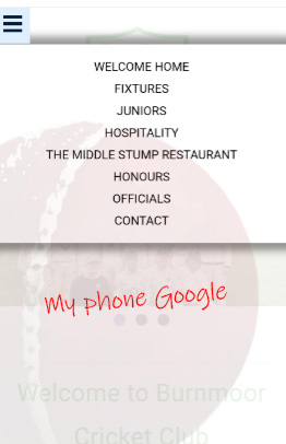
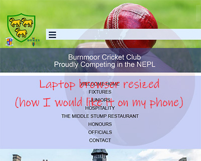
Hi Paul, I tried to rename the stylesheet, and still, no joy. Also, how can I get the Hamburger to display in another area and not at the top left? Say under the banner, it does when I resize the browser window I might change my phone!
I’ll take a look tomorrow but I assume you want the hamburger in the same place it is for tablets?
I would also suggest that you set a max-width on the layout as the text content stretches much too wide on large screens and the header and the elements below never line up.
The way you have done the header as an image is not viable and you should have removed the text from the image and used real text with html and css. Also because you use the contain value on the image the image shrinks disproportionately to the rest of the layout giving you lots of gaps.
I would have made that image originally as a very wide image with a smaller cricket ball in the centre and in that way you can use the value “cover” to always fill the header. Then combined with the text in the html instead of on the image the header can scale more naturally.
I’ll be back tomorrow and try to knock up an example as there are a lot of other little errors in your css not to mention duplicate code and some logic errors and typo errors. .
Hi again Paul, I have been playing about a little & managed to increase the mefia size & now the old menu does’t appear on my phone just on the laptop which is great, however, the Hamburger appears at the top left, is used to be either on the banner or just beneath
Thank you Paul, I teally appreciate your help & look forward to hearing from you
Ok, I’ve put up a demo of how I would start to go about this. I haven’t fixed everything as there’s a lot going on there but I have tidied up the important parts.
I’ve created a wrapper to hold the whole page together and to stop it going full width as that is unreadable on my 2500px monitor (readable line lengths are one of the most important things on the web).
I’ve removed the background image from the header and used a foreground image instead so that it is actual content rather than decoration. That makes it easier to manage the header and keep everything scaling together much nicer without all those gaps you had.
I left the hamburger under the header but made it sticky so it sticks to the top when scrolled along with the navigation. This also removes the need to have any changes at 480px as both will work for tablets and smaller.
Your section content was invalid in that you nested divs and other content inside an h2. An h2 is a heading that can only have inline elements. A heading is also not 500 words or more long as that is a story. The h2 is removed and p elements used for paragraph text. Do not use breaks to imitate paragraphs as that is not what they are designed for. A break is seldom used inn most pages and is used in instances like poems and addresses but not for paragraphs of text which is what the p element stands for.
You also have to many heights and width when none are needed so be careful as most of the time the content will dictate the size. The widths also caused horizontal scrolling when there should not have been any and I removed the overflow:hidden you had on the body as that is a nasty band aid fix that only hinders good code. Never hide the overflow on normal content but use it to let you know when things don’t fit and adjust accordingly. If you have content too large and you hide it then it can’t be seen and on mobile it may indeed shrink all the content to allow the overflow in its calculations.
I’ve put up the example here on a private codepen link (unindexed).
https://codepen.io/paulobrien/live/VYwgLjP/0e1e9d8f6925fcd449683340f4eb1262
You can see and copy the actual css and html in the editor in this link.
https://codepen.io/paulobrien/pen/VYwgLjP/0e1e9d8f6925fcd449683340f4eb1262?editors=1100
As I said his was just a quick run through and there are a lot of other things that could be tidied up or made more consistent. From the comments in the code It looks as though someone else has run through your code before but to be honest I don’t really think they had a clue what they were doing.
1 Like
Hello my friend, wow, how can I thank you Paul? So I just overwrite the index HTML with your HTML & the same with the CSS? I’m going to get on with it later. Yes, I have added code from that advised by Chat & borrowed bits of code from another website I did, probably said Maggie! Do you live in the UK? I live in the North East, I’ll get back to you when I have made the adjustments, many many thanks, Best wishes,
Graeme
Note that I only used the html between the body tags so my html goes inside the body tags of your html. You still need your original head stuff etc (and the stat counter code at the bottom that I removed in the demo).
The css in the css panel can replace all the css that you had in your css file.
Before you do all that though remember to create an original backup of your html and css in case you break something along the way and also to have older versions to look at iif you need to review something.
Thank you Paul, I can see the HTML just needs to go inside the tags
1 Like
I’m just on my way out but if you have problems I’ll be around tomorrow afternoon (or someone else on here may answer earlier :)).
Thank you Paul, where are you based?
UK in the south.
Hi Paul, if I click a link, the website opens perfectly in a browser on my phone (not sure which one) but, if I try & open it in Google it’s not displaying correctly, desktop menu, one of the images not the right size etc. I don’t know if I should be bothered about it! I’m busy going through the code you advised, it’s like a masterclass, thank you.