Hi there,
I am trying to create a grid or flex layout like this:
I have this basic code which outputs my WordPress blog posts in 4 columns going across.
<?php while ( have_posts() ) : the_post(); ?>

		<?php
			$args = array(
				'post_type'      => 'post',
				'posts_per_page' => - 1,
			);
			$q    = new WP_Query( $args );
		?>

		<div class="row">
			<?php while ( $q->have_posts() ) : $q->the_post(); ?>
				<div class="col-6">
					<h3>
						<a href="<?php the_permalink(); ?>">
							<?php the_title(); ?>
						</a>
					</h3>
					<?php the_excerpt(); ?>
				</div>
			<?php endwhile; ?>
			<?php wp_reset_postdata(); ?>
		</div>

	<?php endwhile; ?>
What I would like to do is have two large ones on the left with 4 other ones to the right.
What would be the best way to do this?
Thanks!
Dev
August 18, 2022, 8:41am
2
you can do it easily using elementor without coding on wordpress
I’m trying not to use any page builders
1 Like
You’ll need to set the appropriate number of columns in your grid, then set a class which spans rows.
This page is a great grid resource. Look at the grid-rows property and give it a shot. We can help you further if you get stuck…
You can do this with the “query post” element in the new block editor and you won’t have to use a plugin
Ok I think I have nearly worked it out. Quite pleased with myself haha.
So I now have this:
.parent {
display: grid;
grid-template-columns: repeat(4, 1fr);
grid-template-rows: repeat(2, 1fr);
grid-column-gap: 15px;
grid-row-gap: 15px;
}

.div-box:nth-of-type(1){
   grid-area: 1 / 1 / 3 / 2; }

.div-box:nth-of-type(2){
    grid-area: 1 / 2 / 3 / 3; }

.div-box:nth-of-type(3){
   grid-area: 1 / 3 / 2 / 4; }

.div-box:nth-of-type(4){
   grid-area: 1 / 4 / 2 / 5; }

.div-box:nth-of-type(5){
  grid-area: 2 / 3 / 3 / 4; }

.div-box:nth-of-type(6){
    grid-area: 2 / 4 / 3 / 5; }
and this for the WP PHP
<?php while ( have_posts() ) : the_post(); ?>

		<?php
			$args = array(
				'post_type'      => 'post',
				'posts_per_page' => - 6,
			);
			$q    = new WP_Query( $args );
		?>

		<div class="row">
            <div class="parent">
			<?php while ( $q->have_posts() ) : $q->the_post(); ?>
				<div class="div-box">
					<h3>
						<a href="<?php the_permalink(); ?>">
							<?php the_title(); ?>
						</a>
					</h3>
					<?php //the_excerpt(); ?>
				</div>
			<?php endwhile; ?>
			<?php wp_reset_postdata(); ?>
		</div>
            </div>

	<?php endwhile; ?>
Which seems to work fine.
It basically outputs this:
If I have less content on the two large left boxes, will they match the height of the ones on the right? Basically I want the two columns/1 row on the left to be the same height as the two rows on the right.
I also need to work out the responsiveness. Should I just set the width of the grid to what I want on the various breakpoints, or is there another way to do this?
Thanks!
1 Like
Instead of all that grid-area stuff, you could have simply done:
.div-box:nth-of-type(1),
.div-box:nth-of-type(2) {
    grid-row: 1 / 3;
}
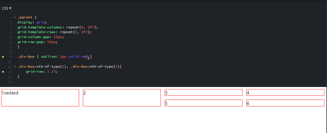
That gives you this (added the outline for visualization)
This way you’re using default behavior and only coding for exceptions
1 Like
That’s awesome, many thanks.
How does just that bit of code tell the 4 boxes on the right to be half the size?
Because by default, a grid object takes up one column and one row. If you define the number of columns, the rendering engine of the browser will figure out the rest.
In other words, if you provide the root parameters and let the browser figure out the basics, and just code for the exceptions, it’s less work for you.
2 Likes
system
January 11, 2023, 5:08am
11
This topic was automatically closed 91 days after the last reply. New replies are no longer allowed.
