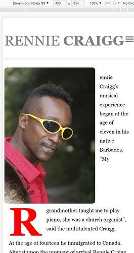
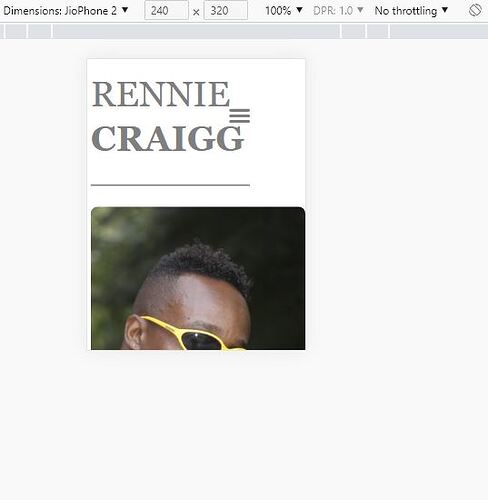
I’ve added some media queries, adjusted the text size and aligned the hamburger, however, it looks like there are 2 mobile screens it doesn’t work with - 480 px and 240px.I updated the link https://test.prygara.com/ I used Chrome inspector for those. Please take a look.
It looks to me as though you need to force drop the text below the image sooner to stop it breaking unevenly.
I’d do something like this:
@media screen and (max-width: 600px) {
  .home .entry-content figure {
    float: none;
    margin: auto;
   padding:0 10px;
  }
}

@media screen and (max-width: 340px) {
  .site-main {
    grid-column: auto;
  }
}
There aren’t any modern phones below 300px (I don;t think) so unless you are designing for a watch I wouldn’t worry about anything under 320px.
Thanks Paul. I only used the 1st one
@media screen and (max-width: 600px) {
  .home .entry-content figure {
    float: none;
    margin: auto;
   padding:0 10px;
  }
}
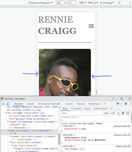
as the 2nd one seems to conflict with auto margins from the 600 media query as the image slightly shifts to the left. Chrome inspector though shows auto margins from the 600 media query as not crossed out… ![]()
The second one was mainly for the text below the image as it squashed into half its width at that low screen size.
Once you get to single columns you don’t usually need the grid or flex rules unless you are changing order or doing something tricky.
You probably just need to tweak the image a bit (maybe display block and auto margins although I can’t test at the moment as on mobile ). ![]()
My desktop monitor is Dell UltraSharp U2412M 24” Resolution: 1920 x 1200 Aspect Ratio: 16:10 and the about page (see link in post #1 in this thread) looks good. However I tried to open it on my friend’s bigger iMac 27 inch screen and there forms white space under the image and two columns of text. Not sure how to remove that space…
P.S. I just had an idea. May be on bigger screens I can somehow vertically center align container that contains all 3 : image and 2 columns of text? ![]()
I’m away from home at the minute but I have a 27" imac and it is too wide to have any browser window maximised. That’s why I always put a max-width on my designs. I suggest that you add a max-width of say 1680px (or whatever looks good) on the body element and center it with margin:auto on the body also. (Usually I would prefer to add that to a page wrapper but you don’t have one ;))
I think I can use <div id="page" class="site"> as a container…is it?
I wonder if I can keep header and footer as a full bleed and constrain content of about and services pages as you suggested - max-width and margin auto. I just did that for about page with the following:
.home .entry-content {
  display: flex;
  font-size: 1.3rem;
  column-gap: 1rem;
  max-width: 1680px;
  margin: auto;

  }
but again for services page if I wrap those articles in a div, <section class="entry-content"> with display:grid would have no effect…
Not sure how it would look on 27" imac though too… ![]()
I’m not sure what you mean but you can set a max-width oin that section quite easily.
e.g.
.services .entry-content{
max-width:1280px;
margin:auto;
border-top:none;
}
.services .entry-header{
border-bottom:2px solid #aaa;
}
There is no problem to do that.
You are right. Please disregard my above comment as there’s no need for that extra div.
This topic was automatically closed 91 days after the last reply. New replies are no longer allowed.


