I just started working on a website for my friend https://test.prygara.com/ which is based on WordPress Underscores theme and was wondering what would be the proper way to declare 960 12 col grid in CSS as mentioned here https://www.wearewibble.com/grid-systems-what-are-they-a-quick-guide/ ?
As per the article it appears the grid they use can be used for desktop and mobile designs and they use it almost for all their projects.
We design using the 12 column grid. Just like the 960 rule, but expand the boundaries of the container. We have even columns, just like the 960 rule, and use an even gutter. We alter this for the actual screen size we design for.
I don’t buy into the 12 col grid system as it seems too restrictive to me and you end up with a site that looks like bootstrap or other similar frameworks. I understand that having a system in place allows for easy alignment but I have rarely found that a strict grid has matched any of the designs that I’ve been given to code.
However others swear by them so I guess it all depends on your approach.
I would take a look at something like this as you can get the code and demos for a 12 col grid and adjust to suit.
In essence css grid is already a grid so all you need to know is css grid.
Thanks for quick response Paul and the link. I agree. It makes sense.I guess how you declare grid would differ for every project depending on what needs to be done. I will go through it later and may be try on a side project just to gain a better understanding of the concept of 12 col.
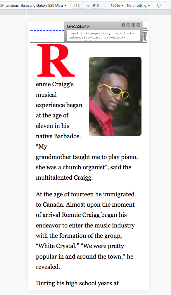
Can you take a look at about page at above URL ? When you start resizing the page there’s 2 major issues (see screenshot) : navigation (I am not sure where to place that ham icon on smaller screens) and image and text alignment with the footer vertical borders. I am a bit stuck in that I am not sure what is the best way to handle those for smaller screens. I am pretty much OK with desktop layout.
Ok, I’ve had a quick look and this is where I would start.
Add this code at the end of the css file testing so it can be changed easily but once you have tweaked it you can integrate it properly as it contains new rules and over-rides.
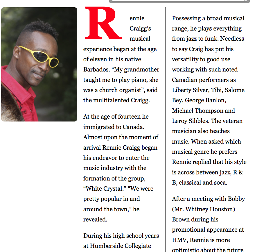
Your footer was miles too wide and causing a massive scrollbar so I changed the grid settings and then on smaller screens I centred the menus. You seemed to be trying to match the borders of the footer with the columns above but that would be futile unless you had them both contained in a grid. You can’t really match things up by hardwiring dimensions as that is a magic number trick that breaks easily. Therefore I centred the footer and removed the borders and it looks much cleaner in my mind.
For your three columns I adjusted the column widths to match better at large screen and then on small screen I floated the image to the right and let the text wrap.
You should of course continue to tweak and perhaps reduce text size slightly for the smaller screen and your drop caps etc but I leave that for you to do as it is mainly tweaking.
I have only put one media query in place to show the process but you may need one more at smaller widths just to tweak better but don’t overdo it as you should be able to get away with just a few media queries.
As an exercise I have left the header section alone as that also needs re-ordering but hopefully you will be able to work that out for yourself now that you have a start.
With my code in place you should see a display like the following live screenshots.
Exactly. I did try the grid before though but was not able to figure out how to have an image, two columns and those vertical borders in the footer (the ones you removed) vertically aligned. And then there was an issue with the column that sits next to the image - on resize for smaller screens there forms an empty space (doesn’t look good to me design wise) under the image when using a grid. Let me try to work with your version and see.
Thanks Paul. I will take a look later. I am thinking may be instead of floating an image just stack the image followed by text of two columns with horizontal border between those {in that case there would be no white space under the image on smaller screens). Let me try if I can achieve this myself based on your suggestions.
Hi Paul,
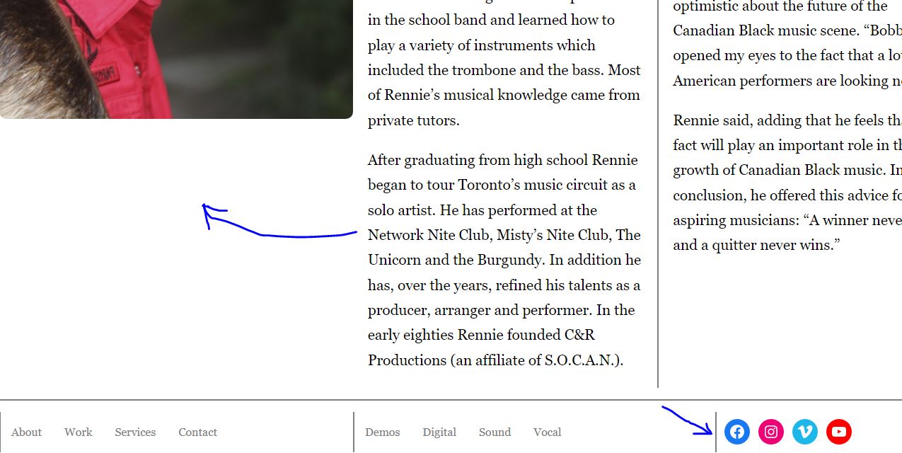
Can you take a look at the screenshot from post #3 ? I tried to draw a blue arrow from the second column pointing to white space under the image that forms on smaller screen sizes. What I am trying to achieve is have text gradually flow under the image on resize to close that white space.
The current HTML structure is
I am not sure if this is possible with above HTML structure. I did try to wrap figure into a div and then float an image to the left so the text flows under the image but it doesn’t seem like a good idea…
The only way that can happen is if the figure and the column are side by side and not direct children of a grid or flexbox. You would then float the figure and the next div will automatically wrap. You would need a structure like this.
You don’t want to do that as it will create a horrible user experience and cause a re-flow to the whole page which on a small mobile will look very bad. You want the menu to slide over the content and it will do this much more smoothly than if you push all the content down at the same time as the mobile will have to redraw all the content in that page.
If you must then you could make it push the content down by putting the menu back in the flow and change position:absolute to position:relative in .menu. There would be other tweaks needed as you would have to reposition the hamburger and tidy a few other things up. However as I mentioned above this is not a good user design for mobile.
That code is invalid as you can’t nest a div inside a label and I wouldn’t trust anyone who did that Change the div to a span and set its display: to block and it will be valid.
You have conflicts in your header which I’m not going to give specific answers to as I am away on holiday
Firstly .site-header is a flex container and has only 2 direct children that will be flex items. (site-branding and site navigation). These are side by side elements so site-navigation cannot be 100% width on the small screen. I would remove the position:relative and the width:100% from .main-navigation and then your hamburger will click back into place.
Then you can absolutely place the .menu at top:100% when you also add position:relative to .site-header. That keeps the menu always at the bottom of the header. No magic numbers needed.
Also note that you need to hide the navigation when you show the hamburger. At the moment its all squashed on one line. You need to hide in the media query and then show it with js when clicked (toggle a class).
The click area on the hamburger is very small so you should see if you have missed something or if the hamburger is under another elements background. It looks to me as though the lines are pulled out of the container so they are not reacting to a click properly.
Give the hamburger a higher z-index for the positioned element.
Sorry I can’t give full answers but I’m on holiday on a very old and slow computer.
As you mentioned there’s an issue with the click area on the hamburger. The lines are pulled out of the empty span with :before and :after pseudo-elements
It looks like the clickable area on the hamburger expanded after I made the above changes (see the blue area on the following screenshot). I also need to position the hamburger in alignment with .site-branding I guess or somehow it fits in mobile design. I find that the menu doesn’t drop out and doesn’t fold as smoothly as the original version.
I think I am stuck a bit with how to arrange stuff in the header for mobile. Say would you suggest that I hide .site-description or should I keep it? Say should I make font smaller for .site-title or have the second word of the title that sits within the span wrap on a new line…?
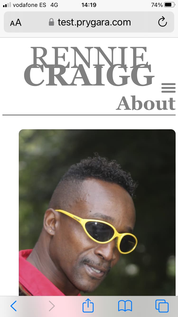
I’m only on mobile for a few days so can’t see the code but here’s a screenshot of what I see on my mobile (assuming I’m looking at the correct version).
If that’s the correct version then yes you need to reduce the text size, adjust line height and align the hamburger better ( I believe I already showed an example of that).
The “About” heading also looks a bit awkward to me and maybe remove or redesign for smaller screen. Maybe centre the word “About” on smaller screens.
A lot of these things are design issues and it really depends on your vision for the site. There may be no absolute right ir wrong but at the end of the day it needs to fit well and look reasonably good and be accessible.