If you’re one of the people who spend most of their reading time skimming through Client and Server Side Coding articles, then you probably should read this article. Yes, you: the one with your code open full-screen in the other monitor. I’m a designer and I work at a hosting/ISP company in a room with four very talented Web programmers. Together, they can develop just about any kind of application, but not one of them could develop a harmonious color scheme if his life depended on it.
Color selection for Website design is a topic that’s been approached from many different angles. Some people approach it from a usability standpoint, explaining how to ensure readability and cross-platform compatibility. Some well-meaning people try to explain that design is all about feelings, describing colors with such hallucinatory delineations as happiness, energy, and stability. Others come to the table with advertising concerns like, “Yellow means cheap, green means money, and black may mean elegance, or maybe…death!”
Have you ever wondered where designers get that mystical ability to say whether a color is or is not “working”? While it’s true that sea-foam green doesn’t make a good accent for a palette of primary colors, nobody really explains why. Just like having a knack for programming concepts, some natural ability can be advantageous when you’re working with color, but most of the skills can be gained from a basic understanding of color theory. Armed with a little knowledge and a few safe rules of thumb, you’ll be more dangerous with a palette than a card-counter at a poker table.
The Painter’s Best Friend
To begin to understand color, you’ll have to think like a painter. Now, don’t go out and start throwing paint around like Jackson Pollack; I mean simply that you need to think in terms of red, yellow, and blue. When you’re working with your beloved computer, colors are displayed in percentages of RGB (red, green, and blue) light using an additive method. This means that, as more of each color is added, you get closer to white light. In contrast — no pun intended — painters use a subtractive color method. So, by asking you to think like a painter, I really mean that I want you to think about colors as combinations of red, yellow, and blue, and to realize that, as you add colors, you get closer to black.

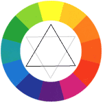
Being a master painter, your most critical tool for mixing colors is your understanding of the simple color wheel shown here. The black triangle that I placed in the center points out the primary colors. If you mix two primary colors, you will get the secondary color that’s pointed out by the lighter gray triangle. When you mix a primary with either of its closest secondary colors, you get a tertiary color; these are located between the points of the black and gray triangles. With this painterly understanding of the color wheel, grasping the concepts of color theory will be a snap.
Color Schemes
When I mentioned my programmer friends, and how they couldn’t create a harmonious set of colors, I was talking about color schemes. There are three main sets of color schemes: analogous, complimentary, and monochromatic.
Analogous
Analogous colors are those that are adjacent to each other on the color wheel. If you pick any range of colors between two points of either triangle on our color wheel (ie yellow to red, orange to violet, red to blue, etc), you will have an analogous color scheme. While I was taking an introductory design class at UCF, we were given a still life, and one class period to paint it using whatever color scheme we were studying. Risking public ridicule in the interest of avoiding copyright infringement, I’ll use these as my color scheme examples. This still-life has an analogous color scheme achieved by mixing only yellow and blue acrylic paint.

Try checking out the links below to see some examples of analogous color schemes in action.
- http://www.zeldman.com – Jeffery Zeldman presents…a very limited analogous color scheme. It’s certainly not complimentary, as none of the colors are positioned opposite one another on our color wheel. Notice that he only really uses two colors in his design, and only two or three tints/shades of each color. Using a limited color palette is a great idea, as long as the colors fall into a strict color theme. Depending on how you pull it off, this will usually produce a crisp, fresh feel.
- http://www.jasonsantamaria.com? – Jason Santa Maria’s classic book cover design is another great example of an analogous color scheme. Notice that every bit of color on his site falls within one third of our color wheel.
- http://www.gorillaglue.com – I’m wondering how a company that sells glue has such a flashy, fun Website … but you’ll notice as you play with the gorilla menu that all of the color on the site ranges from yellow, through orange, to a dark red.
Complementary
Complementary color schemes consist of colors that are located opposite each other on the color wheel, such as green and red, yellow and violet, or orange and blue. These colors are said to complement one another. When placed next to each other, a phenomenon known as simultaneous contrast occurs, wherein each color makes the other look more vibrant.

There are two pitfalls to avoid when using complimentary schemes:
- If you place complementary colors on top of one another, this creates an illusion of movement. This is really bad for text. Have you ever tried to read violet text on a yellow background? Trust me: it’s not pretty.
- Also, colors like cyan and red, which are not quite directly across from each other, yet are not close enough to be analogous, will clash rather than complement. These colors are known as discordants. Unless you want to promote discord among your visitors, I suggest that you don’t use these combinations in your projects.
Complementary color schemes are often more complex than simply using two colors from opposite sides of the color wheel. A double-complementary color scheme, for instance, is one in which two complementary color sets are used in a single theme. Similarly, a split complimentary theme is one in which a color is paired with the two colors adjacent to its compliment. For instance, if you wanted to create a split-complimentary theme using the colors on our color wheel, you would first select a color you want to use, like yellow. Then, you’d choose the dark blue and pink that are adjacent to yellow’s complement, violet.
Here are a few solid examples of complementary color schemes:
- http://www.ufl.edu – The University of Florida has been widely acclaimed for its recent XHTML redesign. It’s also a great example of a complementary color scheme. Take note that although orange and blue are the main design colors, you don’t really see them overlapping much – this would cause that whole movement illusion thing we discussed earlier.
- http://www.modestmousemusic.com – Modest Mouse is another example of a pure complementary color scheme. It’s also one of the few sites I’ve ever seen that’s been able to pull off a green and pink color scheme.
- http://www.panera.com – Panera Bread offers an interesting example of a complimentary color scheme. You can clearly see the double-complementary action with the green to red and the orange to blue relationships on the page.
Monochromatic
If you mix white with a pure color, you produce tints of that color. If you mix black with a pure color, you get shades of that color. So, what do you get if you create an image using only the tints and shades of one color? A monochromatic color scheme. This example is yet another of color-theme based still life, and consists of only tints and shades of the color orange.

Here are a few examples of monochromatic color schemed sites:
- http://www.target.com – Target is the textbook definition of a monochromatic color scheme. Everything is red, white, black, and combinations thereof. On the homepage, it looks like they even avoid using photos that don’t fall in this scheme. Now that’s design dedication!
- http://www.macromedia.com – Macromedia has a similar idea with its teal gradient color scheme. It, too, is strategically using images to tie together the look on the homepage.
- http://www.yakima.com – Yakima does a terrific job of using multiple monochromatic schemes. Each of the main navigational pages has an orange, blue, or green monochromatic scheme.
There are many variations of these three color schemes, and much research has gone into defining scientific methodologies for the coordination of colors, but these are the foundation principles. The best advice I have for developing an eye for color is: keep your eyes open. If you see a Website, advertisement, or illustration that really stands out, ask yourself what type of color scheme it uses. Like analyzing a block of code, knowing the syntax of the language of color is a great start for understanding its purpose.
Hopefully you will find this information useful in choosing colors for your next Web application, or perhaps even as an introduction to your newfound painting hobby! Remember, the color wheel is your friend. You might even consider going out and buying a revolving plastic one from your local art supply store to keep on your desk. At the very minimum you should be able to impress the designer(s) in your department when you define for them the color scheme they used on their latest design comp. Just remember: coders can use color, too.
Frequently Asked Questions about Color Coding for Developers
What is the importance of color in coding?
Color plays a significant role in coding. It helps in distinguishing different elements, making the code more readable and understandable. For instance, different colors can be used to represent variables, functions, classes, and comments. This not only enhances the visual appeal of the code but also makes it easier to debug and maintain. Moreover, color coding can also be used to highlight syntax errors, making it easier for developers to identify and correct them.
How can I choose the right color scheme for my code?
Choosing the right color scheme for your code depends on various factors such as the programming language you are using, your personal preferences, and the environment in which you are coding. Some developers prefer dark themes while others prefer light ones. You can experiment with different color schemes and choose the one that is most comfortable for your eyes and enhances your productivity. There are also various online tools available that can help you in choosing the right color scheme for your code.
What are some popular color schemes for coding?
There are numerous color schemes available for coding. Some of the popular ones include Monokai, Solarized Dark, Dracula, and Nord. These color schemes are designed to reduce eye strain and improve readability. They use contrasting colors to distinguish different elements of the code, making it easier for developers to understand and debug the code.
Can I customize the color scheme of my code editor?
Yes, most code editors allow you to customize the color scheme. You can change the colors of different elements such as background, text, variables, functions, classes, and comments. This allows you to create a color scheme that is comfortable for your eyes and enhances your productivity.
How can I use color to improve the readability of my code?
You can use color to improve the readability of your code by using different colors to represent different elements. For instance, you can use one color for variables, another color for functions, and another color for comments. This not only makes the code more visually appealing but also makes it easier to understand and debug.
What is syntax highlighting and how does it relate to color in coding?
Syntax highlighting is a feature of text editors that displays text, especially source code, in different colors and fonts according to the category of terms. This feature facilitates a more efficient and less error-prone reading and writing of software code.
How does color affect the user experience in web development?
In web development, color can significantly impact a user’s experience and interaction with a website. It can be used to draw attention, express meaning, create desire, drive conversions, and even evoke emotions. A well-thought-out color palette can help create a user-friendly, intuitive interface that encourages user interaction.
What are the best practices for using color in coding?
Some best practices for using color in coding include using a consistent color scheme, choosing colors that are easy on the eyes, using colors to distinguish different elements, and using color to highlight syntax errors. It’s also important to consider color blindness and ensure your color choices are accessible to all users.
How can I learn more about color theory for coding?
There are numerous online resources available that can help you learn more about color theory for coding. These include online tutorials, blogs, videos, and courses. You can also experiment with different color schemes and tools to gain a better understanding of how color can be used in coding.
Are there any tools that can help me with color coding?
Yes, there are various tools available that can help you with color coding. These include color pickers, color scheme generators, and color palette tools. These tools can help you choose colors, generate color schemes, and create color palettes for your code.
Jason Beaird is a designer and front-end developer with over ten years of experience working on a wide range of award-winning web projects. With a background in graphic design and a passion for web standards, he’s always looking for accessible ways to make the Web a more beautiful place. When he’s not pushing pixels in Photoshop or tinkering with markup, Jason loves sharing his passion for the Web with others.


