

Recently on Design Festival I posted about Cubism as a trend in logo design, over on SitePoint you can see some earlier posts I wrote about Pixels and The Shift as trends in logo design, but today I’m continuing with a look at the use of the rainbow, or rainbow colors in identities.
When I’m teaching logo design in the classroom, one of the “tests” I ask my students to do is to check that their logo designs work in black and white. If they find their logo suffers or becomes unrecognizable because of the lack of color, it’s generally a case of going back to the drawing board. One of the reasons we do this test is to see if the logo will work when used in media other than web or television. A logo may be used in black and white news print or as a single color embroidery for example.
Having said all that, we are living more and more in an RGB world, rather than the print world of CMYK. Multicolor identities have become very popular. Using rainbow colors in symbols allows a minimal, often simplistic design to appear as a vibrant feast of color. Color as we know is a great way to grab attention and this is why this trend is popular with designers. Rainbows, or scales of color bleeding into each other can convey a freshness and sense of movement which is not apparent with a single color.
So here’s a small compilation of logos using vibrant rainbow colors for your viewing pleasure and inspiration. These logos come from logo pond, creattica and behance – all great sources of design inspiration.
24Seven
Vivid Ways

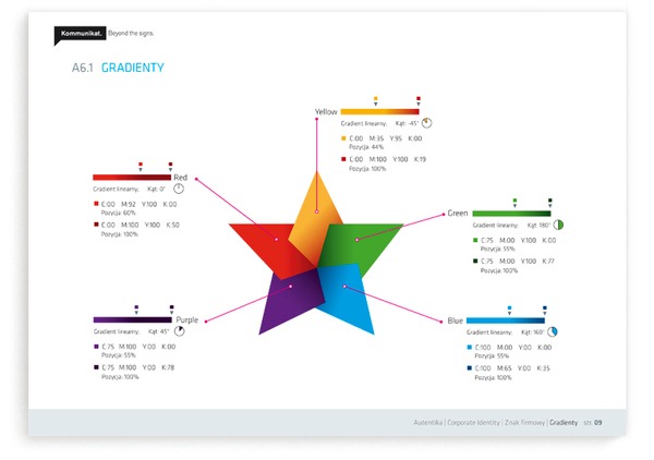
Autentika
Cancer Therapies

Star Creative

Chili Con Color
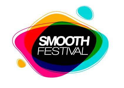
Smooth Festival
Dotfish

Our Society
![]()
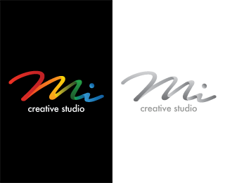
Mi Creative Studio
Papeterie Haute-Ville

![]()
What do you think about these logos? Do you like them? Do any of them stand out for you or do the rainbow colored symbols make them all look generic?
Frequently Asked Questions about Rainbow Logo Design Trends
What are the key elements to consider when designing a rainbow logo?
When designing a rainbow logo, it’s important to consider the color scheme, shape, and symbolism. The colors should be vibrant and well-balanced, representing the diversity and inclusivity that a rainbow symbolizes. The shape of the logo should be simple yet impactful, making it easily recognizable. Lastly, the symbolism should align with the brand’s values and message. A rainbow logo can represent creativity, positivity, and unity, making it a great choice for brands that want to convey these values.
How can I make my rainbow logo unique?
To make your rainbow logo unique, consider incorporating elements that are specific to your brand. This could be a particular shape, symbol, or even a unique color gradient within the rainbow. You can also experiment with different styles, such as minimalistic, abstract, or vintage, to give your logo a distinctive look. Remember, the key is to create a logo that is not only visually appealing but also resonates with your target audience.
What industries are rainbow logos most suitable for?
Rainbow logos are versatile and can be used in a variety of industries. They are particularly popular in creative industries such as design, art, and entertainment due to their vibrant and dynamic nature. They are also commonly used by organizations that advocate for diversity and inclusivity, such as LGBTQ+ rights groups. However, with the right design, a rainbow logo can be suitable for any industry.
How can I use a rainbow logo to convey my brand’s message?
A rainbow logo can be a powerful tool to convey your brand’s message. The colors of the rainbow can represent diversity and inclusivity, making it a great choice for brands that value these principles. Additionally, a rainbow can symbolize hope and positivity, which can resonate with audiences. By incorporating a rainbow into your logo, you can communicate these values visually and create a strong connection with your audience.
What are some common mistakes to avoid when designing a rainbow logo?
Some common mistakes to avoid when designing a rainbow logo include using too many colors, making the design too complex, and not considering the logo’s scalability. While a rainbow logo is colorful by nature, using too many colors can make the design look cluttered and confusing. Similarly, a design that is too complex can be difficult to recognize and remember. Lastly, it’s important to ensure that your logo looks good in different sizes, from business cards to billboards.
How can I choose the right color scheme for my rainbow logo?
Choosing the right color scheme for your rainbow logo depends on your brand’s personality and message. If your brand is fun and energetic, you might opt for bright, vibrant colors. If your brand is more serious and professional, you might choose more subdued, pastel colors. It’s also important to consider color psychology, as different colors can evoke different emotions.
Can a rainbow logo be effective in black and white?
Yes, a rainbow logo can still be effective in black and white. While the colors of a rainbow logo are a key element, the shape and design of the logo are equally important. A well-designed logo should be recognizable and impactful, even without color. This is particularly important for instances where the logo may need to be printed in black and white, such as on certain types of merchandise or promotional materials.
How can I incorporate a rainbow into my existing logo?
Incorporating a rainbow into your existing logo can be done in several ways. You could replace certain elements of your logo with a rainbow, or add a rainbow as a background or border. Another option is to use the colors of the rainbow in your existing logo design. The key is to ensure that the rainbow enhances your logo and aligns with your brand’s identity.
What are some successful examples of rainbow logos?
Some successful examples of rainbow logos include the NBC peacock logo, the Apple rainbow logo, and the Instagram logo. These logos are not only visually appealing but also memorable and iconic. They effectively use the colors of the rainbow to create a distinctive and recognizable brand image.
How can I test the effectiveness of my rainbow logo?
You can test the effectiveness of your rainbow logo by conducting market research. This could involve surveys, focus groups, or A/B testing to gather feedback from your target audience. You can also monitor the performance of your logo in terms of brand recognition and recall. Remember, a successful logo is one that resonates with your audience and aligns with your brand’s identity.

