Key Takeaways
- This beginner’s guide to HTML and CSS covers the basics of setting up a computer for web development, structuring a web page correctly, and using Cascading Style Sheets to modify the appearance of web elements.
- The guide assumes no prior knowledge of web development, starting with basic tools like a text editor and a web browser, and progressing to more complex concepts like using selectors and spans to enhance a web page’s appearance.
- The guide also explains how to use FTP clients for transferring files across the internet, a process that may seem complicated at first but is essential for putting your web page on the internet.
- The guide ends with a FAQ section that answers common questions about HTML and CSS, such as the difference between the two, how to start learning them, and common mistakes beginners make when learning HTML and CSS.
This article was written in 2009 and remains one of our most popular posts. If you’re keen to learn more about HTML and CSS, you may find this recent article on the future of HTML of great interest.
So, you’re ready to take the plunge and begin to learn how to build your own web pages and sites? Fantastic! We’ve got quite a ride ahead, so I hope you’re feeling adventurous.
This information is an excerpt from my recently released book, Build Your Own Web Site The Right Way Using HTML & CSS, 2nd edition.
In the following pages, I’ll show you how to set up your computer — be it PC or Mac — so that you’re ready to build a site.
Then, we’ll meet XHTML and walk through the details of how to structure a web page correctly. In the process, we’ll play around with elements, comments, and symbols, and we’ll talk about the concept of nesting. It might sound complex, but it’s not! In fact, by the end of that discussion, you’ll have a working web page that displays text, links, an image and even a quote!
Finally, we’ll turn to the topic of Cascading Style Sheets, which we’ll use to change the way elements of your web page look. We’ll discuss the different ways in which you can use styles to control the way your page looks before creating our own .css file and using it — as well as tools like selectors and spans — to spruce up our web page’s headings, text, and so on.
Don’t worry if some of these terms are unfamiliar — this excerpt, like the book itself, assumes that you have no knowledge about building web pages. The information I’ll present here basically comprises the first three chapters of the book — later chapters go on to show you how to build forms, optimize graphics for the Web, publish your site, and soup it up with plug-in tools such as blogs, image galleries, and more — the Table of Contents has all the details.
But now, let’s start to set up your computer so that you’re ready to build your first web page. Don’t forget: you can grab these instructions in PDF format if you’d like to save them for reading offline.
Chapter 1. Setting Up Shop
Before you dive in and start to build your web site, we need to take a little time to get your computer set up and ready for the work that lies ahead. That’s what this chapter is all about: ensuring that you have all the tools you need installed and are ready to go.
If you were to look at the hundreds of computing books for sale in your local bookstore, you could be forgiven for thinking that you’d need to invest in a lot of different programs to build a web site. However, the reality is that most of the tools you need are probably sitting there on your computer, tucked away somewhere you wouldn’t think to look for them. And if ever you don’t have the tool for the job, there’s almost certain to be one or more free programs available that can handle the task.
We’ve made the assumption that you already have an Internet connection, most likely broadband (or similar). Don’t worry if you have a slower connection: it won’t affect any of the tasks we’ll undertake in this book. It will, however, mean that some of the suggested downloads or uploads may take longer to complete, but you probably knew that already.
Note: Planning, Schmanning
At this point, it might be tempting to look at your motives for building a web site. Do you have a project plan? What objectives do you have for the site?
While you probably have some objectives, and some idea of how long you want to spend creating your site, we’re going to gloss over the nitty-gritty of project planning to some extent. This is not to say that project planning isn’t an important aspect to consider, but we’re going to assume that because you’ve picked up a book entitled Build Your Own Web Site The Right Way, you probably want to just get right into the building part.
As this is your first web site and it will be a fairly simple one, we can overlook some of the more detailed aspects of site planning. Later, once you’ve learned — and moved beyond — the basics of building a site, you may feel ready to tackle a larger, more technically challenging site. When that time comes, proper planning will be a far more important aspect of the job. But now, let’s gear up to build our first, simple site.
The Basic Tools You Need
As I mentioned earlier, many of the tools you’ll need to build your first web site are already on your computer. So, what tools do you need?
- The primary — and most basic — tool that you’ll need is a text editor; a program that allows you to edit plain text files. You’ll use this to write your web pages.
- Once you’ve written a web page, you can see how it looks in a web browser — that’s the application you use to view web sites.
- Finally, when you’re happy with your new web page, you can put it on the Internet using an FTP client — a utility that allows you to transfer files across the Internet using the File Transfer Protocol. Using FTP may seem a little complicated at first, but thankfully you won’t need to do it too often. We’ll discuss FTP clients in detail in Chapter 8, Launching Your Web Site.
You’ve already got most of these programs on your computer, so let’s go and find them.
Windows Basic Tools
In the following section — and indeed the rest of this book — where we refer to the Windows operating system, that’s really a shorthand way of saying Windows Vista (in all its confusing varieties). Any instructions and screen shots will be with Vista in mind. However, we are not going to shut out all you Windows XP users — and there are many people out there who use XP in preference to Vista, much to Microsoft’s displeasure — so where instructions provided for Vista are not the same for XP, we’ll cover the differences for you.
Your Text Editor: Notepad
The first tool we’ll consider is the text editor. Windows comes with a very simple text editor called Notepad. Many professional web designers who use complicated software packages first started out many years ago using Notepad; indeed, many professionals who have expensive pieces of software that should be time-savers still resort to using Notepad for many tasks. Why? Well, because it’s so simple, little can go wrong. It also loads much more quickly than fully-featured web development programs. Bells and whistles are definitely not featured.
You can find Notepad in the Start menu: go to Start > All Programs > Accessories.
Tip: Shortcut to Notepad
To save yourself navigating to this location each time you want to open Notepad, create a shortcut on your desktop. With the Start menu open to display Notepad’s location, hold down the Ctrl key, click and hold down the mouse button, then drag the Notepad icon to your desktop. When you release the mouse button, a shortcut to the application will appear on your desktop.

Notepad is the most basic of applications, as you can see below.

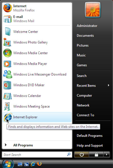
Your Web Browser: Internet Explorer
Once you’ve created a web page using Notepad, you’ll need a way to view the results of your handiwork. You’ll remember that in the preface to this book, we mentioned Internet Explorer (IE). Well, that’s your viewer. Internet Explorer sits right there in the Start menu, also in the Programs folder (accessed via All Programs from the Start menu), in the Quick Launch area (bottom left of the Start menu, near the Windows logo), and a shortcut may also lurk on your desktop.
Mac OS X Basic Tools
Like Windows, the Mac operating system (specifically OS X; we won’t be looking at previous versions of the Mac OS) has a number of tools that you can use straight out of the box. These tools are virtually equivalent to the Windows programs mentioned above.
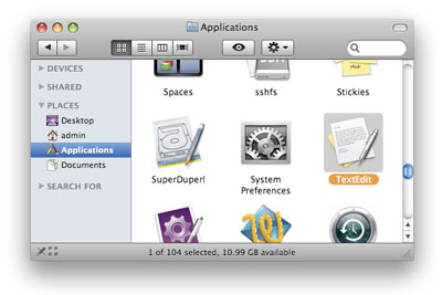
Your Text Editor: TextEdit
While Windows has Notepad, the Mac has TextEdit, which can be found in the Applications folder.
Unlike Notepad, TextEdit works as a rich text editor by default, which means we can work with fonts, make text bold and italic, and so on. However, we want to work with TextEdit as a plain text editor, so you’ll need to adjust some of TextEdit’s preferences. Start TextEdit, then select TextEdit > Preferences from the menu to bring up the Preferences screen. Select Plain text within New Document Attributes, then close the Preferences screen. The next time you create a new file in TextEdit, it will be a plain text document.
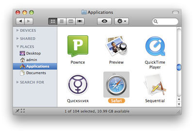
Your Web Browser: Safari
The default browser for Mac users is Safari. You can usually find Safari in the dock (the dock is the bar of icons at the bottom of your screen), but you can also access it through the Applications folder.
Tip: Stick It in the Dock
Just as you can drag shortcuts to programs onto the Windows desktop, you can add programs to the dock in Mac OS X. To add a program to the dock, just drag its icon from the Applications folder onto the dock, and presto! The application is now easily accessible whenever you need it.
Frequently Asked Questions (FAQs) about HTML & CSS for Beginners
What is the difference between HTML and CSS?
HTML (HyperText Markup Language) and CSS (Cascading Style Sheets) are two of the core technologies for building web pages. HTML provides the structure of the page, while CSS is mainly used to control the layout and design of web pages. In other words, HTML is used to create the actual content of the page, such as written text, and CSS is used to decide how the content will look on the page.
How can I start learning HTML and CSS?
The best way to start learning HTML and CSS is by practicing. Start by understanding the basics of HTML, such as tags, elements, and attributes. Then, move on to CSS, where you’ll learn about selectors, properties, and values. There are many online resources available, including tutorials, guides, and interactive platforms that provide hands-on experience.
Do I need any special software to write HTML and CSS?
No, you don’t need any special software to write HTML and CSS. You can write code in any text editor, such as Notepad or TextEdit. However, there are also specialized code editors available, like Sublime Text or Atom, that offer features like syntax highlighting and auto-completion, which can make coding easier and more efficient.
Can I learn HTML and CSS without any prior coding experience?
Absolutely! HTML and CSS are often the first languages that people learn when they decide to start coding. They are relatively straightforward and provide a solid foundation for understanding the basic concepts of web development.
How long does it take to learn HTML and CSS?
The time it takes to learn HTML and CSS can vary greatly depending on your learning pace and the amount of time you can dedicate to studying. However, many people can grasp the basics within a few weeks of consistent study and practice.
What are some common mistakes beginners make when learning HTML and CSS?
Some common mistakes include not properly closing tags, forgetting to declare a DOCTYPE, and using incorrect syntax. It’s also common for beginners to use too many div tags, not use semantic elements, or not properly separating style and structure.
How can I debug my HTML and CSS code?
Most modern web browsers have built-in developer tools that can help you debug your code. These tools allow you to inspect your HTML and CSS code, make temporary changes, and see those changes reflected immediately in the browser.
What are some best practices for writing HTML and CSS?
Some best practices include keeping your code clean and organized, using comments to explain your code, using semantic HTML, separating style and structure, and validating your code using a service like W3C’s Markup Validation Service.
How can I make my website responsive?
To make your website responsive, you’ll need to use CSS media queries. Media queries allow you to apply different styles depending on the characteristics of the device the website is being viewed on, such as the width of the viewport.
What resources can I use to continue learning about HTML and CSS?
There are many online resources available for learning HTML and CSS. Some popular options include online tutorials, coding bootcamps, YouTube videos, and interactive learning platforms. Additionally, there are many books and e-books available on the subject.