

Key Takeaways
- Skeleton is a lightweight CSS framework or boilerplate created by Dave Gamache, consisting of two CSS files: normalize.css and skeleton.css. It provides a simple grid system and basic styles for common HTML components.
- The framework is fully functional in all the latest browsers including IE9+ and uses a mobile-first approach. It doesn’t include a large number of components like other frameworks such as Bootstrap or Foundation but does contain fundamental CSS rules to kick-start the development process.
- Skeleton’s latest version defines a mobile-first 12-column fluid grid, consisting of rows and columns. It also provides utility classes for additional predefined styles and supports a mobile-first approach, activating the grid when the window’s width exceeds 549px.
- While Skeleton can speed up front-end development, it isn’t a one-size-fits-all solution for all projects due to its simplicity and limited features. It’s best suited for smaller projects or developers who prefer to build their styles from scratch.
In early December, Skeleton released a new updated version. In fact, it was its first update for almost two and a half years. That’s good news for those of us who have used Skeleton in the past and loved its simplicity!
In this article, I’ll introduce you to this lightweight CSS framework. I’ll start giving a brief intro about it and presenting its major features. Then I’ll show you how to use it in a real project, which will be based on a demo page that I’ve built.
What is Skeleton?
As mentioned above, Skeleton is a lightweight CSS framework (or boilerplate, if you prefer this definition) created by Dave Gamache. More specifically, it’s two CSS files: the popular normalize.css file and the skeleton.css file. The latter contains the framework’s styles, which are limited to around 400 lines of uncompressed code.
The most important part of Skeleton is its grid system, which I’ll analyze later in this article. Additionally, the framework provides basic styles for common HTML components like buttons, lists, tables, and forms.
To get the latest version of Skeleton, you can visit the website and download the zipped folder. An alternative option is to fork the GitHub repository.
After you download and extract the compressed folder, your file structure would look like this:
Skeleton/

├── css/

│     ├── normalize.css

│     └── skeleton.css

├── images/

│     └── favicon.png

└── index.html
Similar to frameworks like Bootstrap and Foundation, Skeleton also uses a mobile-first approach. However, as discussed, it doesn’t include the large number of components that those frameworks offer; it contains only some fundamental CSS rules that help you kick-start your development process.
It’s worth mentioning that Skeleton is fully functional in all the latest browsers including IE9+. Finally, you can also opt for the Sass or Less extensions of Skeleton.
Versions: Latest vs. Previous
There are many differences between the current version and the previous one. The table below summarizes the most important differences:
| Features | V2.0.2 (Current Version) | V1.2 (Previous Version) |
|---|---|---|
| CSS files | 2 | 3 |
| Mobile-First Approach? | Yes | No |
| Grid | 12-column fluid grid | 16-column fixed grid |
| Typographic Units | rem | px |
Grid
Skeleton’s latest version defines a mobile-first 12-column fluid grid, consisting of rows and columns, as with all CSS grids.

Rows have to be placed inside a wrapper that can have a max-width value of 960px. To create the wrapper you define a div element and apply the container class to it. If you’re familiar with Bootstrap’s grid, you might know that Bootstrap uses the same class name to define its wrapper.
The width of the wrapper element in Skeleton varies depending on the screen size. In any case, as already mentioned, it can’t exceed the 960px. The table below shows its possible values:
| Viewport Width | Container Width |
|---|---|
| < 400px | 100% |
| ≥ 400px | 85% |
| ≥ 550px | 80% |
Columns are nested inside a row. They scale up to 12 for each row. To set up a column you have to define a div element and assign it two classes. First, you add the class that is responsible for specifying the column widths. To achieve this, you can use any class from one to twelve or the one-third, two-thirds, and one-half classes.
The second class is responsible for setting the column margins. Possible classes are columns and column. If you define the column widths with the first option (e.g. using the two class), you should use the columns class (instead of column) as a second class. The exception is when using the one class, which can be equally combined with the columns or column class.
While other frameworks support nested rows, Skeleton recommends not nesting rows within columns. Moreover, Skeleton’s grid system provides extra classes for offsetting your columns. Offset classes (e.g. offset-by-two) allow you to increase the space between columns by adding a margin-left property to them.
Utilities
As mentioned, beyond its well-structured grid, Skeleton comes with additional predefined styles. For example, there’s the button class, which allows you to style an anchor (a) element as a button. There’s also the option to give the button a light blue background-color using the button-primary class.
Another example is if you want to float an element to the left or right, you can add the u-pull-left or u-pull-right class to it. You can also use the u-cf helper class for clearing floats.
Those are just a few of the examples of utility classes bundled with Skeleton.
Using Skeleton
Now it’s time to use Skeleton’s powerful features in a demo project. We’ll explore three different examples.
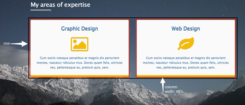
The image below shows the desired layout on small screens and up (≥ 550px) for our header element. Notice that we split the row into 2 equal-sized columns. However, for extra small screens (< 550px) we want the columns to be stacked. That means each of them will expand to cover the entire row’s width.
Here’s the HTML:
<header>

  <div class="container">

    ...

    <section class="services">

        ...

      <div class="row">

        <div class="one-half column">

          ...

        </div>

        <div class="one-half column">

          ...

        </div>

      </div>

    </section>

  </div>

</header>
At this point we should recall that Skeleton supports a mobile-first approach. This means when the browser window has a width less than 550px, the following code snippet is executed:
.column,

.columns {

    width: 100%;

}
This ensures that the columns will be stacked. Next, when the window’s width exceeds the 549px, Skeleton’s grid becomes active causing our columns to occupy 50% of the row’s width (as indicated by the class name one-half). Of course, our layout is based on Skeleton’s default breakpoints, which we have the option to change.
Note: Instead of using the one-half, column class pair as class names, we could have used the six, columns pair, which would produce the same result.
Let’s look at our second example.
Below is the layout of our section.about when the viewport size exceeds the 549px.
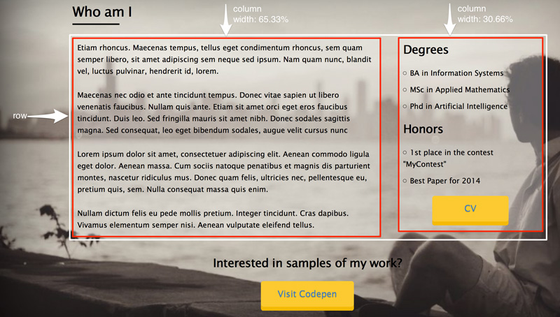
Notice that the first column occupies two-thirds of the row’s width and the second one occupies one-third. Again, for extra small screens our columns are stacked and have widths of 100%.
And the relevant code:
<section class="about">

  <div class="container">

    ...

    <div class="row bottom">

        <div class="two-thirds column">

          ...

        </div>

        <div class="one-third column">

          ...

        </div>

    </div>

    ...

  </div>

</section>
Note: Instead of using the two-thirds, column and one-third, column pairings as class names, we could have used the eight, columns and four, columns pairs respectively, with the same results.
Let’s see our last example.
Here’s how we want to structure our footer element:
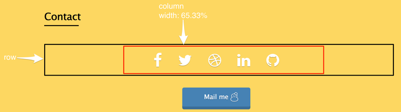
In this case, the target row consists of one column. This occupies about 65.33% of the row’s width. We also want to center it. For this reason, we use the offset-by-two helper class.
The corresponding code can be found below:
<section class="contact">

  <div class="container">

    ...

    <div class="row">

      <div class="offset-by-two eight columns">

        <ul>

            <!-- list here... -->

        </ul>

      </div>

    </div>

    ...

  </div>

</section>
Below is the embedded demo on CodePen:
See the Pen Skeleton layout example by SitePoint (@SitePoint) on CodePen.
Conclusion
In this article, we’ve looked at the main features of Skeleton, a CSS boilerplate that can speed up your front-end development. Of course, keep in mind that Skeleton isn’t a one-size-fits-all solution for all projects. It’s simple, yet limited.
Have you used Skeleton in any of your projects? Do you like its simplicity or do you prefer working with a more comprehensive framework like Bootstrap or Foundation?
Frequently Asked Questions (FAQs) about Skeleton CSS Boilerplate
What is the Skeleton CSS Boilerplate and why should I use it?
Skeleton CSS Boilerplate is a lightweight, responsive CSS framework that provides a simple and efficient way to kickstart the development of websites or web applications. It’s not a UI kit, but a bare-bones style guide that includes only the essentials to get started. It’s designed to be a starting point, which means you can add more complexity as needed. The main advantage of using Skeleton is its simplicity and minimalistic approach. It doesn’t come with unnecessary extras, making it perfect for smaller projects or for developers who prefer to build their styles from scratch.
How do I get started with Skeleton CSS Boilerplate?
To get started with Skeleton, you need to download the Skeleton package from its official website. Once downloaded, extract the files and link the Skeleton CSS file in your HTML file. You can then start using the Skeleton classes in your HTML to style your website. Skeleton also comes with a basic HTML template that you can use as a starting point.
How does the Skeleton grid system work?
Skeleton uses a 12-column fluid grid system. This means that the width of the columns will adjust automatically based on the size of the screen. You can specify the number of columns you want an element to span by adding a class to it. For example, if you want an element to span six columns, you would add the class .six.columns to it. You can also nest grids within grids for more complex layouts.
How can I make my website responsive using Skeleton?
Skeleton is built to be responsive out of the box. It uses media queries to serve its scalable grid, but also has a set of predefined classes for making images responsive, and typography that’s designed to be perfect at any screen size. You just need to use the appropriate classes in your HTML to make your website responsive.
Can I customize Skeleton to suit my needs?
Yes, you can customize Skeleton to suit your needs. Skeleton is designed to be a starting point, which means you can add, modify, or remove any part of it to fit your specific requirements. You can customize the grid, typography, buttons, forms, and more.
Is Skeleton suitable for large projects?
While Skeleton can be used for any size project, it’s best suited for smaller projects due to its minimalistic approach. For larger projects with more complex requirements, you might want to consider using a more comprehensive framework like Bootstrap or Foundation.
Does Skeleton support all modern browsers?
Yes, Skeleton supports all modern browsers including Chrome, Firefox, Safari, Opera, and Internet Explorer 9 and above. However, some features may not work as expected in older browsers due to their lack of support for modern CSS features.
How can I add a navigation bar using Skeleton?
Skeleton doesn’t come with a predefined navigation bar, but you can easily create one using its grid system and some custom CSS. You can create a row for the navigation bar and use columns to layout the navigation links.
Can I use Skeleton with other CSS frameworks?
Yes, you can use Skeleton with other CSS frameworks. However, you need to be careful to avoid conflicts between the styles of the different frameworks. It’s usually best to use Skeleton as a starting point and then add styles from other frameworks as needed.
Where can I find more resources to learn about Skeleton?
You can find more resources to learn about Skeleton on its official website. There are also many tutorials and articles available online that can help you get started with Skeleton.

