You know those little separator elements you find in the indexes or page headings of some books? The ones that look like someone screwed up with the title alignment and then made a half-baked attempt at fixing it by adding a segmented line? I love those things, so I set out to fabricate my own.
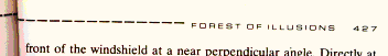
Here’s what we’re aiming for, taken straight from David Sheff’s ‘Game Over – Press Start to Continue’
Having, at that point, only recently launched into the fantastic world of CSS-based design, I figured it’d be a snap to set up something like this for my own site.
I was all kinds of wrong.
Option 1: The <hr> Tag
The obvious, semantically correct way to go about making one of these elements would be to use an <hr> (horizontal ruler) tag, align it to the left and place some text to its right. In a perfect world, we might even get away with that approach. But, alas, it was not to be.
The <hr> cross-browser styling support is flaky at best, as exemplified in this discussion. Not only does the horizontal ruler element fail to support consistent border/background properties, it floats all over the place in logic-defying mockery. I quickly abandoned that approach.
Option 2: A Partly-Visible Block Element
After considering the options, I settled for a block element (of which only the top border was visible), floated beside a title. Let’s see how it’s done.
We want the solution to be as semantically correct as possible, so we’ll encase the whole thing in an <h3> heading (I originally used <h3> because <h1> was the image header on top of my page, <h2> denoted my blog entry dates etc.).
We also want to be able to specify different margin properties for the containing header and the title, so it’s a good idea to put the title in its own blockable element. Thus, we get the following markup:
<h3 id="test">

  <span class="ruler"></span>

  <span>Hello World</span>

</h3>
We’ll use the <span> elements as our blocks (we could use divs, but that’s somewhat less elegant). Notice that the first one belongs to the ruler class. Far from some subtle political commentary, this is done so we can style the block and set it apart from the one that contains the title. The id is included so that we can use this heading with an anchor. We’ll start the styling with the following:
h3 span.ruler {
display: block;
height: 1px;
border-top: 1px #968856 dashed;
border-right: 0;
border-bottom: 0;
border-left: 0;
}
h3 span {
margin-left: 6px;
color: #968856;
font: bold .7em georgia, serif;
}
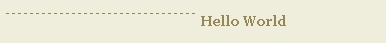
This yields the following:
It's not quite there yet. The block element spec adds a linebreak at the end of each block and, when the blocks are created they assume the maximum available width, so we need to float the ruler. After we add
float: left; we see:
Ghastly! The ruler span, being an empty element floated left, has collapsed into oblivion. It's still there, mind you, but doesn't have any noticeable width to speak of. So we add
width:50%; to the ruler to pull it from under there.
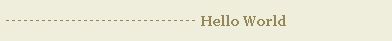
Now we're talking! To replicate the page heard image even more closely, we'll move the ruler further down. We could do this using a pixel measurement, but that would be too easy, wouldn't it? Pixels, though exact, are not resizable in IE with the text size increment tool, and our ruler would fall short of the vertical center when this happened, so we'll go with ems, which are resizable in IE.
The ems approach presents another problem: due to differences in the box model implementation, IE's rendition of n ems is a few pixels off. To remedy this, we'll take advantage of IE's shortcoming. We'll specify the margin twice: once for the browsers that get the standard right, and once for the different flavours of IE:
margin-top: .4em !important;
margin-top: .45em;
!importanttells compliant browsers that the rule should take precedence over other rules for the same property, regardless of position. IE doesn't understand this and thus ends up with the rule specified further down (order is, obviously, extremely important when working with CSS). In this case, the difference is minimal (.05 em) but when I applied this approach to another page on my site, the actual difference was .2 em (that's rather big). It's an interesting hack, so I'll leave it here. It yields:
Now, that wasn't so painful, was it? Here's the full code:
h3 {
margin: 20px 0 0 0;
}
h3 span.ruler {
margin-top: .6em !important;
margin-top: .45em;
width: 50%;
display: block;
height: 1px;
text-align: left;
border-top: 1px #968856 dashed;
border-right: 0;
border-bottom: 0;
border-left: 0;
background-color: #eae8d0;
float: left;
}
h3 span {
margin-left: 6px;
color: #968856;
font: bold .7em georgia, courier, serif;
}
To change the width of the ruler, fiddle with the width value in the ruler class. The properties for the two<span>s don't get confused because the first one uses a more specific selector (noticespan.rulerabove).This technique works for IE 5.0, 5.5, 6, Gecko-based browsers (Moz/Firebird), Safari, Opera, and degrades gracefully for Lynx and text-based browsers (the text is enclosed in a header next to an empty span, after all, so there's not much to interfere). Hope you find this solution handy.
 Sergio Villarreal
Sergio Villarreal is a mexican Web Designer and programmer who went online on 1993 and hasn't unhooked since. He maintains a personal web site/log/comic at Overcaffeinated.net, where he geeks out readily and consistently. Sergio likes his code standard and his words uncouth.