Syncing CSS Animations with HTML5 Audio

Key Takeaways
- CSS and HTML can be combined to add sound effects to CSS animations using HTML’s
- The most crucial part of the sound animation process is adjusting CSS animation to the audio to ensure an accurate in-sync audio-visual experience. This involves syncing animation keyframes to audio timing data.
- The
- The process of syncing CSS animations with HTML5 audio is generally the same across different browsers. However, not all browsers support all HTML5 audio formats. Therefore, multiple sources for the audio file should be provided to ensure compatibility with different browsers.
- The use of CSS animations with live audio streams is possible, but more complex than with pre-recorded audio files. The Web Audio API is needed to analyze the audio stream in real-time and adjust CSS animations accordingly.
CSS and HTML have opened a rich playing field for adding multimedia content to your web page, web app, and e-book projects. One innovative way of combining these two technologies is adding sound effects to your CSS animations using <audio> elements and triggering them with a little bit of JavaScript.
Although sound on the web isn’t universally welcome, there are cases when it can enrich the user experience without being an unnecessary annoyance. Examples are artist and gaming websites or content for children. Sound can even be useful in certain cases to visitors with disabilities.
The most important part of the sound animation process is adjusting your CSS animation to the audio to achieve an accurate in-sync audio-visual experience. In this article I’ll go through the steps of syncing animation keyframes to audio timing data using an interesting example of a beating stylized heart.
See the Pen CSS Animation with Sound: Heartbeat by SitePoint (@SitePoint) on CodePen.
Constructing the Heart
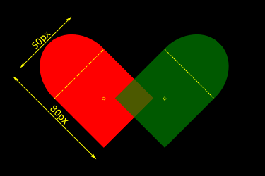
The first ingredient we need is a heart we want to animate. We will construct one using CSS pseudo-elements. Having it constructed in HTML rather than using an image, even if only through pseudo-elements, gives us the opportunity to animate various CSS properties to create a more interesting animation.
We can often find more than one way to build a shape this way, but if we plan to animate it it’s worth thinking about geometry and how different structural choices affect movement and simplify the keyframes code.
In this case the simplest technique is to use two vertical rectangles rounded on top, rotated, and positioned to overlap to form a heart shape. Their size is set using percentages and they’re absolutely positioned with a bit of geometry consideration so it’s easy to scale the original shape by changing the container size. The rectangles are rotated 45 degrees clockwise and counterclockwise to form the left and right parts of the heart.
.heart::before,
.heart::after {
  background-color: red;
  content: "";
  height: 80%;
  left: 25%;
  position: absolute;
  top: 2%;
  transform: translateZ(0) rotate(-45deg);
  width: 50%;
}
.heart::after {
  transform: translateZ(0) rotate(45deg);
}
Rounded sides are set with two radii values to get an elliptic rather than circular curve, and therefore a more natural heart shape. Because rectangle side lengths have a 5/8 ratio, the ellipsis radii calculate to 50%/37.5% to round off only the corners that don’t overlap.
.heart::before,
.heart::after {
  border-radius: 50% 50% 0 0 / 37.5% 37.5% 0 0;
}
Now what remains is to adjust the transform-origin point for the rectangles so the points line up at the center of the square area where the rectangles do overlap. The same look can be achieved by adjusting the absolute position declarations instead of using the transform-origin approach. But that would later complicate the keyframes code because it would force us to control the position in more detail instead of relying on the transform scale function to do the work for us.
The transform-origin point should be calculated with regards to the coordinate system before any transforms are applied (because transforms can affect the coordinate system, for example, the rotate() function rotates the coordinate system along with the element it is applied to). Again the sides length ratio dictates the position of that point: it is easy to see that the X position is at 50%, at the center of the rectangles, but the Y position is calculated at 68.75% of the rectangle height measured from the top (55*100%/80=68.75%). Going with the specific symmetry approach pays off here too, as both rectangles share the same transform-origin point position.
.heart::before,
.heart::after {
  transform-origin: 50% 68.75% 0;
}
And now we have a beautiful symmetric heart shape. We can add an inset box-shadow, different for each rectangle, to make it all plump and 3D.
.heart::before {
  box-shadow: -8px -14px 10px 0 black inset;
}
.heart::after {
  box-shadow: -15px 10px 14px 0 black inset;
}
The Sound of the Heart
To introduce audio into the page, we use the <audio> element with the path to the audio file and without the controls attribute because we don’t want the internal browser audio player to appear (read more in Using HTML5 audio and video on MDN).
<audio id="heartbeat" src="heartbeat.mp3" preload="auto">
  Your browser does not support the <code>audio</code> element.
</audio>
Instead of the controls, we use JavaScript to manipulate the playback. This example uses buttons to start and reset the track, but with a little bit more work we could do without the buttons and start and reset the audio when the heart element is clicked or hovered.
Our sound is the sound of a heartbeat repeated four times and it will serve as the sound our CSS animation will follow.
Flex that Muscle
To make our heart tick, we need to change its shape from original, resting heart, to the state when the muscle is flexed. To flex the heart we scale it down a bit and change its shape with border-radius.

Here is how the flexed styles would read if we needed them static, outside of the animation:
.heart::before,
.heart::after {
  background-color: orange;
  transform: rotate(-45deg) scale(0.8);
  border-radius: 70% 70% 70% 0 / 70% 70% 10% 0;
}
.heart::after {
  transform: rotate(-45deg) scale(0.8);
}
The transition between the resting and flexed states and then back to the original resting shape makes one heart beat. Our keyframe percentages effectively declare, in turns, the resting and flexed styles. But to make it sync with the audio we need to know exactly how long the animation should play and which keyframes percentages to use for which heart state. Some useful audio software can help us analyze the sound and note the timing information we need for our keyframes.
Analyzing the Audio Signal with Audacity
Audacity® is open source cross-platform software for recording and editing sounds. It is easy to use and even if you don’t have experience with similar audio or video editing software it won’t take a lot of effort to get the information you need.
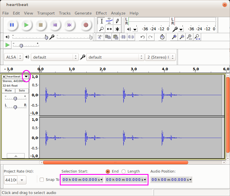
Open your audio signal in Audacity and it will automatically show you the sound waveform. In most cases this will be enough for you to recognize where certain parts of the audio start and end, by looking at the signal shape. Rarely we get a signal where some other spectrogram view mode helps better, but in that case we can switch between different modes through the drop-down menu next to the spectrogram.
Clicking on the spectrogram marks a moment on the timeline, and below it you can read in seconds what time it corresponds to. This is how we find out when each heartbeat starts, ends, and when the heart is in the flexed state. We use the play button to play the entire audio or select a segment, and note the times we need for the animation keyframes.
In our heartbeat case we have 4 distinct heartbeats and it’s easy to recognize it by looking at the waveform. We need to take note of each heartbeat, when it starts, ends, and when it’s in the flexed state. To make this easier we use a spreadsheet app where we note the heartbeats and their timing in seconds.
Translating Audio Timing into Keyframe Timing
Once we have the timing in seconds, we use some math to normalize the audio length to the 100% length notation we use in the animation (multiply by 100 and divide by the total audio time). This is how we get the keyframes percentages as well as what style should be applied to a particular keyframe, whether the heart should be relaxed or flexed.

Reading from this table we can create the keyframes percentages and fill them in with the styles associated with each. In addition to scaling the heart and the border-radius we also change the heart color to emphasize the animation a bit more. Since we’re using transform to scale the heart rectangles, and each rectangle also has a different rotate value, we have to create two different animations, one for each rectangle.
Here is the @keyframes code for the left rectangle (the right rectangle animation only differs in rotation orientation values and border-radius position):
@keyframes heartbeats-before {
  3% {
    background-color: red;
    transform: rotate(-45deg) scale(1);
    border-radius: 50% 50% 0 0 / 37.5% 37.5% 0 0;
   }
  8.2% {
    background-color: orange;
    transform: rotate(-45deg) scale(0.8);
    border-radius: 70% 70% 70% 0 / 70% 70% 10% 0;
  }
  13.7% {
    background-color: red;
    transform: rotate(-45deg) scale(1);
    border-radius: 50% 50% 0 0 / 37.5% 37.5% 0 0;
  }
  25% {
    background-color: red;
    transform: rotate(-45deg) scale(1);
    border-radius: 50% 50% 0 0 / 37.5% 37.5% 0 0;
  }
  30% {
    background-color: orange;
    transform: rotate(-45deg) scale(0.8);
    border-radius: 70% 70% 70% 0 / 70% 70% 10% 0;
  }
  36% {
    background-color: red;
    transform: rotate(-45deg) scale(1);
    border-radius: 50% 50% 0 0 / 37.5% 37.5% 0 0;
  }
  44.4% {
    background-color: red;
    transform: rotate(-45deg) scale(1);
    border-radius: 50% 50% 0 0 / 37.5% 37.5% 0 0;
  }
  49.6% {
    background-color: orange;
    transform: rotate(-45deg) scale(0.8);
    border-radius: 70% 70% 70% 0 / 70% 70% 10% 0;
  }
  56.4% {
    background-color: red;
    transform: rotate(-45deg) scale(1);
    border-radius: 50% 50% 0 0 / 37.5% 37.5% 0 0;
  }
  66.7% {
    background-color: red;
    transform: rotate(-45deg) scale(1);
    border-radius: 50% 50% 0 0 / 37.5% 37.5% 0 0;
  }
  71.8% {
    background-color: orange;
    transform: rotate(-45deg) scale(0.8);
    border-radius: 70% 70% 70% 0 / 70% 70% 10% 0;
  }
  77% {
    background-color: red;
    transform: rotate(-45deg) scale(1);
    border-radius: 50% 50% 0 0 / 37.5% 37.5% 0 0;
  }
}
Finally we assign the corresponding animations to the rectangles. We set the total animation length to the heartbeat audio length, set it to play only once, with a linear timing function, and with no delay. Using a timing function other than linear would mess up the syncing between the animation and the audio, so always remember to use a linear timing function when syncing to an external resource.
.heart.active::before {
  animation: heartbeats-before 5.85s linear 0 1;
}
The animation is assigned to a special class we add to the heart element with JavaScript, at the same event we trigger the audio play. This is how we ensure the animation and the audio start at the same time and all the syncing work pays off.
And that’s it for the heartbeat animation, which you can see in the demo below.
See the Pen CSS Animation with Sound: Heartbeat by SitePoint (@SitePoint) on CodePen.
More CSS Sound Animations!
Hungry for more CSS goodies you can hear as well as observe? Here are some more examples you can take apart and learn from:
See the Pen 5a20ef9d5c68abc42320ac73639f0e39 by SitePoint (@SitePoint) on CodePen.
See the Pen Cuckoo Clock CSS Animation with Sound by SitePoint (@SitePoint) on CodePen.
See the Pen qObQro by SitePoint (@SitePoint) on CodePen.
Below is a list of source for the media resources used in this article:
- The Heartbeat Sound (Public domain)
- Railroad Crossing Signal (Public domain)
- Cuckoo Clock Sound (Public domain)
- Stopwatch Image (Public domain)
- Time Running Out by Iwan Gabovitch under CC-BY 3.0 License
Final thoughts
I hope this article inspires you to consider using sounds in your projects where appropriate and encourages you to come up with imaginative ways to combine the visual with the audio.
What about you? Have you used sounds with your animations successfully before? Is there any particular case of CSS animation you’d love to see? Tell us all about it in the comments!
Frequently Asked Questions (FAQs) on Syncing CSS Animations with HTML5 Audio
How Can I Sync CSS Animations with HTML5 Audio in Different Browsers?
The process of syncing CSS animations with HTML5 audio is generally the same across different browsers. However, it’s important to note that not all browsers support all HTML5 audio formats. For instance, MP3 is supported by all browsers, but OGG is not supported by Internet Explorer. Therefore, it’s advisable to provide multiple sources for your audio file to ensure compatibility with different browsers.
Can I Use CSS Animations with Live Audio Streams?
Yes, you can use CSS animations with live audio streams. However, the process is a bit more complex than with pre-recorded audio files. You’ll need to use the Web Audio API to analyze the audio stream in real-time and adjust your CSS animations accordingly.
Why Are My CSS Animations Not Syncing with My HTML5 Audio?
There could be several reasons why your CSS animations are not syncing with your HTML5 audio. One common issue is that the animation and audio durations do not match. Make sure that the duration of your CSS animation matches the length of your audio file. Also, ensure that your audio file is properly loaded and playing before starting the animation.
How Can I Control the Speed of My CSS Animation Based on the Audio Playback Rate?
You can control the speed of your CSS animation based on the audio playback rate by using the ‘playbackRate’ property of the HTML5 audio element. By adjusting this property, you can make the audio play faster or slower, and your CSS animation will adjust its speed accordingly.
Can I Sync CSS Animations with HTML5 Audio on Mobile Devices?
Yes, you can sync CSS animations with HTML5 audio on mobile devices. However, keep in mind that mobile browsers have some limitations and differences compared to desktop browsers. For instance, some mobile browsers do not allow auto-playing audio, so you might need to add a play button for your audio file.
How Can I Make My CSS Animations More Responsive to Audio Changes?
To make your CSS animations more responsive to audio changes, you can use the Web Audio API. This API allows you to analyze the audio data in real-time and adjust your CSS animations based on the audio’s current state.
Can I Use CSS Animations with HTML5 Audio in a WordPress Site?
Yes, you can use CSS animations with HTML5 audio in a WordPress site. You can add your CSS animations and HTML5 audio in the custom CSS and HTML sections of your WordPress theme, or you can use a plugin that allows you to add custom CSS and HTML.
How Can I Test the Syncing of My CSS Animations with HTML5 Audio?
You can test the syncing of your CSS animations with HTML5 audio by using the developer tools in your browser. These tools allow you to inspect the HTML, CSS, and JavaScript of your page, and you can use them to check if your animations and audio are playing as expected.
Can I Sync CSS Animations with HTML5 Audio in an E-commerce Site?
Yes, you can sync CSS animations with HTML5 audio in an e-commerce site. This can be a great way to enhance the user experience on your site. For instance, you can use CSS animations and audio to highlight special offers or new products.
How Can I Improve the Performance of My CSS Animations Synced with HTML5 Audio?
To improve the performance of your CSS animations synced with HTML5 audio, you can optimize your CSS and audio files. For instance, you can minify your CSS and compress your audio files to reduce their size and loading time. Also, consider using hardware-accelerated CSS properties for your animations, as they can improve rendering performance.
Mihaela loves exploring CSS limits with Sass and finding new ways to solve web and e-book multimedia problems. She owns the web development company Prkos where she plays with graphic design, Drupal, Inkscape, and other open source projects.


Published in
·Design·HTML & CSS·Mobile·Mobile UX·Mobile Web Development·Responsive Web Design·July 2, 2014
Published in
·Development Environment·Patterns & Practices·PHP·Programming·Web·Web Security·August 13, 2014

Published in
·APIs·Authentication·CMS & Frameworks·Frameworks·Laravel·Libraries·Patterns & Practices·PHP·Security·Web Services·February 28, 2017