I stumbled across a really useful article by Barbara Chaparro covering the ‘Top Ten Mistakes of Shopping Cart Design‘ this morning.
The article was published more than three years ago, but I think it’s still very much ‘on the money’.
I recommend reading the whole article, but to paraphrase her, the 10 biggest mistakes are:
- Calling a Shopping Cart anything but a Shopping Cart.
- Requiring users to click a “BUY” button to add an item to the shopping cart.
- Giving little to no visual feedback that an item has been added to the cart.
- Forcing the user to view the Shopping Cart every time an item is placed there.
- Asking the user to buy other related items before adding an item to the cart.
- Requiring a user to REGISTER before adding an item to the cart.
- Requiring a user to change the quantity to zero to remove an item from the cart.
- Requiring written instructions to update the items in the cart.
- Requiring a user to scroll to find an Update cart button.
- Requiring a user to enter shipping, billing, and all personal information before knowing the final costs including shipping and tax.
Anyone familiar with Steve Krug‘s work should certainly recognize some common themes there.
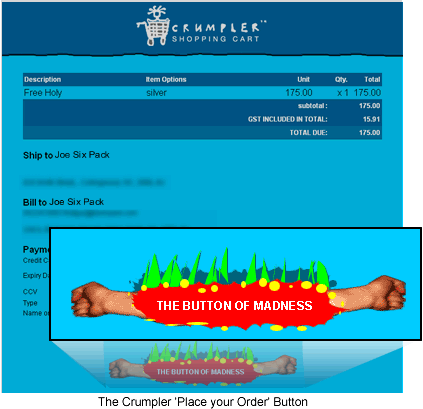
So, when shortly afterwards you visit a site that not only chooses to ignore some of the rules, but literally pokes it’s tongue out and then laugh heartily in face of them, you have to chuckle.
Crumpler are a small company that make funky, but very ruggedly constructed bags, and they sell and support their products through a very playful and quite idiosyncratic website.
So, what would they call their ‘Purchase’ button?
Perhaps ‘Place my Order‘ like Amazon?
Maybe ‘Submit Final Order‘ like ThinkGeek?
‘Buy‘?
I give you … ‘The Button of Madness!‘
 Alex Walker
Alex has been doing cruel and unusual things to CSS since 2001. He is the lead front-end design and dev for SitePoint and one-time SitePoint's Design and UX editor with over 150+ newsletter written. Co-author of The Principles of Beautiful Web Design. Now Alex is involved in the planning, development, production, and marketing of a huge range of printed and online products and references. He has designed over 60+ of SitePoint's book covers.


