Boosting Website Conversions Exponentially with A/B Testing
Many designers underestimate the power of A/B testing and its ability to drive UX and boost conversions. Unfortunately, this is because most A/B tests are conducted without the forethought of a testing plan. Yes, it's easy to run an A/B test, but it's not as easy to do it well.
In this article, I’m going to show you a real-life case study where we used A/B testing to boost conversions exponentially. I’ll walk you through the process that we took, mentioning any tools used, and linking to any useful tutorials along the way. I’m Jon from The Good, where we turn visitors into buyers — and that’s exactly what we did for TreeRing. Read on to find out how.
Why A/B Testing Often Fails
First, let’s talk about why A/B testing often fails.
One of the main reasons that A/B testing fails to yield actionable results is the lack of a strategic, iterative testing plan. Many companies instead approach A/B testing in a scattered, shotgun manner, trying a random test here, another there, all without a cohesive and strategic technique. This is like trying to improve on the piano by practicing different instruments every day. You may have occasional, random success, but you won’t make much substantive progress.
The power of A/B testing is unlocked when you develop a step-by-step, robust testing plan with each step providing more insights into what’s going wrong. In other words, the results of the first test inform how you perform the second test. When you use this method, you see compounding results, with each test achieving greater results. Slowly but surely, as they say.
Introducing TreeRing and Their UX Problems
TreeRing helps schools create better yearbooks. Their social-first approach lets teachers, parents, and students capture memories, safely share them with the school community, and create free, personalized pages for the printed edition — all at no extra cost to the school.
They came to us needing help with their website, where the user experience was significantly hampering their growth. They were seeing a low lead-generation conversion rate for their free sample download. Their primary goal was to get visitors to download a free sample yearbook, and they in turn could use these leads to generate sales and retain customers. But their conversion rate was painfully low, generating much fewer leads than desired.
They had tried one-off conversion improvements and had only seen minimal success. They knew that a better process for A/B testing was crucial, but couldn’t figure out how to make it work, and since their organic traffic growth was slowing due to platforms like Google and Facebook shifting toward an emphasis on paid traffic, they wanted to get more conversions from their existing traffic, rather than paying to acquire new traffic.
That being said, they also wanted us to take a detailed look at their website to determine precisely where they should focus their testing strategy. They had implemented various changes in an effort to improve conversion rates and hadn’t seen much success, because they weren't 100% on what they should be focusing on.
We needed to find out which areas of the UI were key, then carry out a conversion rate optimization strategy to begin test variants of these key UI elements.
How A/B Testing Became Part of the Strategy
We began with an initial audit of their site, working to identify the biggest UX dark spots.
We like to approach problems with a "leaky bucket" strategy. If we can find and fix the largest holes first, we’ll see the biggest impact. Once we highlighted the primary issues (which we’ll talk more about in a moment), we began using A/B testing to solve those issues.
The TreeRing A/B Testing Process
Our initial work involved conducting an extensive conversion audits — qualitative (expressed as feedback, such as user testing), and quantitative (expressed as numbers, such as website analytics) — to outline the UX challenges. This included data from inbound traffic and other key metrics such as conversion data, data from heatmaps and user testing, and data from our UX analysis. Our target conversion goal was to increase free sample yearbook downloads.
With that as a our focal point, we discovered several key factors hampering their conversions.
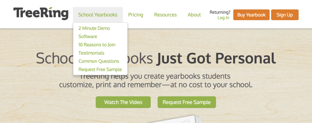
Our qualitative feedback came from user testing with several consumers who matched TreeRings’ ideal consumer. TreeRing told us that this was students, parents and yearbook advisors, and this proved to be correct according to our user research. We utilized UserTesting (the app) to do remote user testing, and asked our user testers to complete a series of tasks while we recorded their screen. These user testers would speak out loud about what they were thinking as they used the website. This information led us to hypothesize that visitors could miss the button that downloads the free sample (it was at the bottom of the navigation menu).
TreeRing told us that this free sample was the key conversions, and we agreed.

Our quantitative data, based mainly on analytics data from Google Analytics, as well as heatmap and clickmap data collected with Hotjar, led us to suspect that there was confusion for mobile visitors around the signup language. Click tracking and heatmap data from Hotjar showed us that a vast majority of visitors would hover their mouse or finger over "Sign Up", but not actually click on it. This is usually an indicator that the language is unclear, leading to visitor confusion, and thus nobody is clicking on the call to action.
With the problems identified, we developed a specific testing plan to address them. This included tests on the order of items in the navigation and call-to-action language variations.
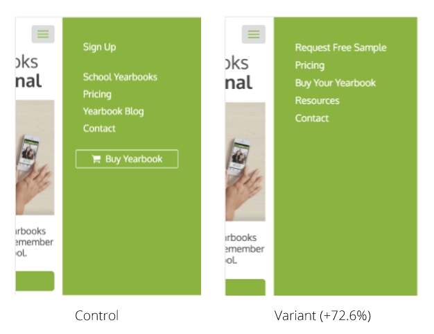
We started by moving the Request Free Sample option from the bottom of the navigation menu to the top using an A/B testing tool called Visual Website Optimizer. However, any A/B testing tool such as CrazyEgg, Optimizely and Google Optimize should work just as well. The outcome of this experiment resulted in a 42% increase in visits to the free sample page and a 12% increase in conversions. We suspect this is because of the serial-position effect — the tendency of a person to recall the first and last items in a series best, and the middle items worst.
We also changed the sign-up language with a variation introducing Request Free Sample as well as Buy Yearbook, based on our knowledge that copy is just as important for UX as visuals. Our hypothesis was that this would be clearer to the two distinct audiences — students/parents and yearbook advisors — who had specific goals when interacting with the navigation.

This experiment generated a 72.6% improvement over the former navigation.
Remember, It’s an Iterative Process
This brings up a crucial element of A/B testing that’s often neglected: testing and discovering improvements in one area of your website can help you build subsequent tests with a higher chance of success. You can borrow insights gained from test results to iterate and build on top of previous or initial results and findings.
This is just the beginning for TreeRing. These initial improvements have already created a 30% growth in year-over-year lead conversions (and that number is still climbing) because the overall process of improving the conversion rate is made up of improving numerous micro-conversions over time — building on prior test results and learnings.
Conclusion
Testing can’t be done in a random, slapdash way. To achieve true success, you need to have a framework for your testing. You need to iterate your tests, and you need to ensure that all tests reach statistical significance. If you don’t, you’ll see minimal gains at best, or worse, you can diminish conversions even further without ever finding out what change made it happen.
If you make these small, incremental improvements, you can create big bottom-line growth in a relatively short amount of time — in the case of TreeRing, just three months.