The Meaning and Purpose of Responsive Web Design
It used to be so simple: you’d design a website or application for a 15-inch monitor, and—incompatibilities between browsers aside—you were done.
Then mobile phones with web browsers came along and ruined our easy lives. Worst of all, people loved browsing the Web on them!
The Rise of Mobile
In 2016, browsing the web on mobile devices overtook desktop browsing for the first time.
Just as developers and designers got used to building websites for phones, along came tablets, watches, TVs, cars, glasses, larger desktop screens, high-resolution screens, and even web browsers built into walls. (Okay, I made that last one up.) Supporting this seemingly endless stream of new devices is becoming ever more challenging.
So how do we support this ever-increasing array of devices? The answer is responsive web design, which harnesses technologies that allow websites to adapt to screens of all sizes.
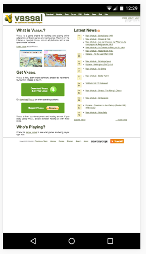
A lot of older sites, or projects maintained by people with little spare time, are unresponsive. For example, the site for the Vassal game engine:
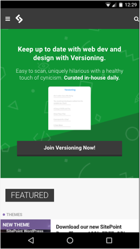
Many other sites, like SitePoint.com, are fully responsive:
Responsive web design (RWD) subscribes to the popular development maxim “Don’t Repeat Yourself” (usually abbreviated to “DRY”). Instead of maintaining multiple codebases for each device that you wish to support, RWD aims to use a single codebase that adapts appropriately to each device. Using RWD techniques, you write one set of HTML, CSS, and JavaScript, and display elements appropriately for each platform. Many of these styles and elements can even be reused or built upon for maximum code efficiency.
Sound good to you? To begin, let’s go back in time a few years.
History
“Responsive” design is not necessarily new and is a term that can mean different things to different people, making its exact history hard to track down.
In theory, developers have been creating responsive designs since there was more than one browser. Browsers have always had subtle (and not so subtle) rendering differences between them, and developers have been learning how to cope with these quirks for decades. If you’re new(er) to web development, be thankful the dominance of Internet Explorer’s earlier versions is mostly over. The days of dealing with their quirks were dark.
Since 2004, responsive design has adopted the more specific meaning of adapting your designs to suit a user’s device of choice—typically based on screen size, but also other capabilities. The concepts for responsive design solidified in 2008, but the term is also referred to as “flexible”, “liquid”, “fluid”, and “elastic” design.
It was the inclusion of media queries in the CSS3 specification that fully gave responsive design the potential it needed to be a genuine and more usable concept. We’ll cover media queries in detail in Chapter 2, but in summary, they allow you to change what you show in a web page based on pre-defined screen sizes or types. Ethan Marcotte formally coined the term “responsive web design” in an article for A List Apart in 2010.
This led to a growth and consolidation of other techniques and technologies alongside media queries, such as flexible images and grids, all of which we’ll cover in this book.
To me, “responsive design” is something of a combination of all these ideas and principles. It’s not just adapting a design to screen sizes, but also to other factors such as color depth, media type (say, a laptop screen, or an eReader), or location.
Schools of Thought Within Responsive Design
There are as many schools of thought about how to use responsive design as there are interpretations of it. Some have come and gone, and others have stuck. We won’t cover any in detail explicitly in this book, but we’ll touch upon their practical applications. Let’s quickly cover a few of them now.
Progressive Enhancement
When following the more traditional principle of progressive enhancement, your primary focus is on making the site content available to all users, however simple their device or slow their connection. Then extra features—such as more sophisticated design and functionality—are added for devices that can utilize them.
Graceful Degradation
The proliferation of mobile browsing has reversed the more traditional path of design. In the past, you started a design on the platform you worked on (typically a computer) and then stripped away style and functionality to support devices with smaller screens or less support for certain features.
While graceful degradation is typically applied to the lack of browser support for particular features, you can also think of it more generally. Its principle is that you start with a fully featured version of a site, running on your ideal device and browser, while also ensuring that essential functionality will work for any user on any (supported) device, even if they lose out on nice-to-have features.
Mobile First
Mobile first is similar to progressive enhancement, but more specific to responsive design. It proposes that you start with your smallest or least capable supported device (typically a phone when the principle was created) and then add functionality and style as you increase the device scale.
Mobile First
As a term, “mobile first” can be confusing, especially to non-designer/developer audiences, giving a skewed impression of the priority that mobile will receive in a project.
In theory, the practice ensures that smaller devices don’t end up getting second best—that all devices are treated with equal importance.
What Do You Need To Support?
Before starting or enhancing any web-based project, it’s important to know if it’s worthwhile, and to assess the (potential) userbase for all your hard work.
If you have an existing website, it may be worth analyzing website traffic to see what types of devices your visitors are using to access your website. If 90% of visitors have consistently visited on a desktop machine, this shows that either your mobile experience is poor, or that your visitors are not big mobile device users. You could embark on extensive research to find out the exact answer, or simply use responsive design techniques to build a mobile-friendly site that may attract new visitors.
If you’re working on a new project, analyzing the needs of your potential users is equally important. This can be done by using traditional market research techniques, creating simple test sites, or looking at your competitors to build a picture of who your customers will be.
Computers
Despite the slow decline in sales, there are still lots of desktop and laptop computers out there, and lots of web browsers running on them. These computers include everything from low-quality (and low-resolution) 11-inch netbooks to high-powered desktops with 28-inch, high-resolution monitors in a variety of proportions and orientations, all of which greatly affect the screen area you have to work with.
Mobile Phones
The percentage of people browsing websites on mobile phones has now reached parity with desktop browsing, so catering for users of mobile browsers is of equal (and likely, growing) importance.
Mobile Browsing Stats
For more details on the rise of mobile web browsing, I recommend the Smart Insights report on Mobile Marketing Statistics and Statcounter’s desktop and mobile usage comparison
On iOS, this is generally through just one browser, and the device’s sizes are more consistent.
Android has a wide variety of browsers and screen dimensions available. Increasing numbers of devices running mobile operating systems also have high-density screens of varying resolutions.
You also need to consider that users are largely browsing with touch and not point-and-click devices, which affects behavior a great deal.
Tablets
Tablet sales may be shrinking, but there will still be a significant userbase for the foreseeable future, and you shouldn’t think of tablets as large mobile phones or small desktops. Also, users may be using touch screens or mice to interact with your site.
Hybrid Devices
If handling computers and tablets wasn’t enough for you, there are now hybrid devices, such as Microsoft’s Surface Pro, that can switch between being a computer and a tablet. While each mode can be treated discretely, it’s worth noting that users may switch context while using your site.
Wearables
Most wearables are yet to gain a web browser, but it may happen. In the meantime, it’s still possible to re-purpose parts of your content on wearables, and these will need to be delivered in short bursts with an easy follow-up action.
TV
Smart TVs and related devices such as Apple TV come with simplified web browsers, and users will generally use them for browsing particular sites, but they’re likely to become increasingly popular. TVs have very large screens, often with low resolution, so sites viewed on them need to be clear enough to see properly and also usable from a distance.
Cars
Really? Yes, really. This is new territory, but an increasing number of cars now have dashboards with access to the internet in some form or another. For the time being, sites rendered on car dashboards will need to present information clearly on a small screen, and be designed not to distract or overwhelm a driver and thus cause an accident. However, many cars now have screens for passengers, who will have much fuller access to the web and content.
Game Consoles
Most modern game consoles spend some of their time connected to the internet, and some of that time with a web browser. This is typically for media consumption and social networks. Browsers on these devices will likely be limited, and a physical keyboard may not be available. For home consoles, design principles from TV will apply, and for handhelds, a limited mobile experience.
In summary, you can’t predict how and where anyone will view your website, so build it to be adaptable, flexible, and responsive.
Print? Isn’t this a web design book? Yes, but print versions of your web pages will still be frequently accessed, whether for actual physical printing or for rendering your content on offline readers such as Instapaper or Pocket. For certain content, “print” is still relevant.
Books, Too
The page you’re reading was also rendered with HTML and CSS. Yes, even the dead tree version.
Sample Application
In my experience, learning by example is always the best way to learn, so for this book, we’ll create a demo website and optimize it for the wide range of devices it might be accessed on. In each chapter, we’ll build upon the same website to illustrate the topic under discussion.
Introducing RWDFlix
RWDFlix is a fictional video streaming service that contains local, national and global TV shows for people to watch online. Which shows a user can watch will depend on their location and the time of day.
Computer Version
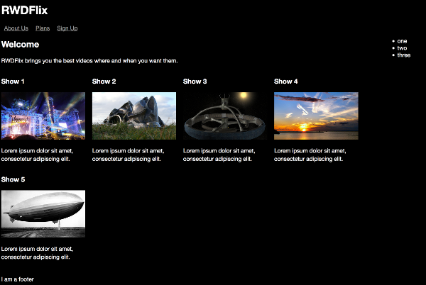
The layout of the site for desktop computers will show image thumbnails, a video player, a title of the program, the length of the video, and a description of the show. While network speeds vary less for desktop users, this version will check for sufficient bandwidth before letting the user play a video.
Tablet Version
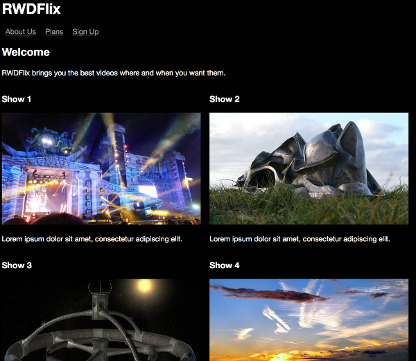
The layout for tablets will focus on allowing users to find a show easily, and, network permitting, to watch it. It will display large thumbnails, the title of the show, the length of the show, the estimated file size, and a description of the show. It will offer to play the video if the user has a data connection or to add the video to a watch list if there’s no connection.
Mobile Version
The mobile version will focus on allowing users to find a show easily, and, network permitting, to watch it. It will display smaller thumbnails, the title of the show, the length of the show, and an estimated file size. As with the tablet version, it will offer to play the video if there’s a data connection, or add it to a watch list if there’s not.
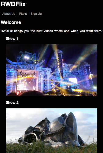
TV Version
The layout for TVs will display large thumbnails, a video player, a title of the program, the length of the video, and a description of the show. To allow for distance viewing and use, the interface will be large and obvious. While out of the scope of this book, it’s also possible that the interface may be controlled and navigated by a physical remote or remote app.

Structuring a Page with HTML5
Before we get started creating responsive designs and using CSS to implement them, it’s important to understand the underlying HTML structure that you’ll be manipulating. Recent developments with HTML have made changes to concepts and page structure, so it’s useful to recap the tools and options now available to a modern web designer.
Before HTML5, logical sections of HTML pages were structured and organized using generic elements like div s and span s. These worked fine for many years, but were too broad and didn’t help designers or web browsers understand increasingly complex page structures.
Among other things, HTML5 introduced new, more semantic elements that describe their use more fully than a simple div. The aim of these new elements was to help with things like accessibility and multi-purposing content, but they also help with responsive web design. They include definitions such as the header, navigation or main content area of the page, as well as specific elements for video and audio. Responsive web design is fundamentally about manipulating page layouts to suit different use cases, and better organization and structure of pages helps you target the elements you need to with CSS and media queries (covered in Chapter 2).
Let’s look at a simplified version of the desktop site. It’s a stripped back copy we’ll start working with in the next chapter:
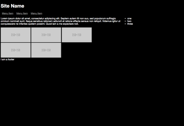
And the code:
<body><header><h1>Site Name</h1></header>
<nav>…</nav>
<main>    <section>…</section>    <aside>…</aside></main>
<footer>…</footer>
</body></html>
Here’s where the HTML elements are on the page:

Here are the functions they perform:
- A
headerelement is used for the site name, logo etc. Other sections of the page can also have their ownheaderelement. - A
navelement is used for navigation links, such as a top, side or footer menu. - A
sectionelement is used to contain the main content of an article or a significant area of a page. - An
asideelement defines a small sub-section that relates to a main section. - A
mainelement wraps other elements unique to the page. In our example, these are thesectionandasideelements. The other elements will repeat across other pages. - A
footerelement is used for the site’s legal name, dates etc. Other sections of the page can also have their ownfooterelement.
The HTML5 specification lists other semantic elements that perform specific functions, and we’ll cover many of them in this book. A well-structured page is very important for responsive design, and also helps with accessibility and SEO.
Here’s more page content organized in a semantic way:
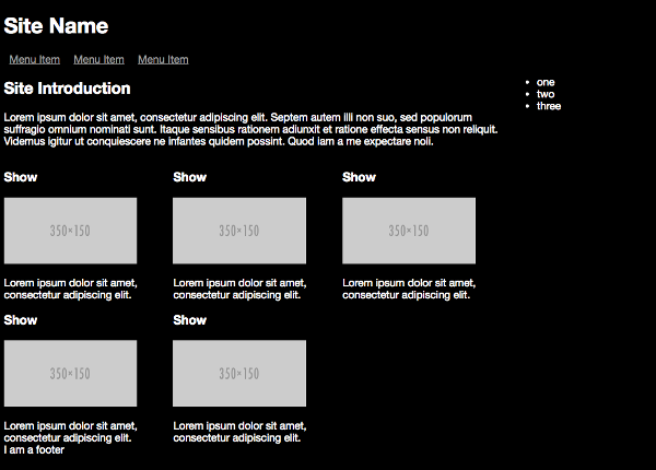
First, I’ve added a heading for the page, which is an h2, as it’s the second-level heading on the page, after the main site title which is an h1.
Each individual TV show is in its own section, under another heading (but an h3 this time, as it’s a level down from the h2), along with an image and short description.
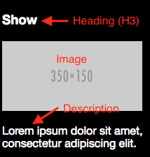
<section class="left"> <h3>Show</h3> <img src="http://placehold.it/350x150" class="thumbnail"> <p>Lorem ipsum dolor sit amet, consectetur adipiscing elit.</p></section>A typical modern application consists of a back end (which stores the data) and one or more applications that display or consume that data. They include responsive web pages, native mobile apps, and other back-end systems. As you’ll see throughout this book, not all contexts will use or display all available data, but instead just the data most relevant to their use case. For example, a TV show episode might have the following values stored in a back end:
- episode name
- series
- length
- age rating
- file size
- show title
- year
- country of origin
- description
- tags
- categories
But the mobile version of the site will only display the values most relevant to a user on a mobile device, ignoring other values only relevant in a different context:
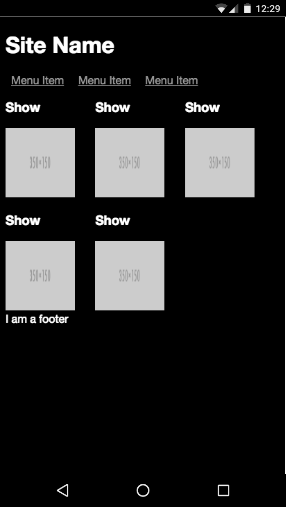
<section class="left"> <h3>Show</h3> <img src="http://placehold.it/125x150" class="thumbnail"> </section>The aside is for supplemental information, such as contacting support and account information. The mobile version of the site is optimized for browsing and watching videos, so the aside isn’t displayed. This layout isn’t the only possibility, of course. You could, for example, choose to display the aside at the bottom of the screen (which we’ll cover when looking at grid systems).
As the screen size decreases, the TV show descriptions get increasingly curtailed to bring more attention to the thumbnails, which are resized appropriately for a mobile device.
If you're interested in learning more about HTML5 and page structure, I recommend you read SitePoint's Jump Start HTML5..
Ready to Respond?
In this chapter, I’ve looked at the need for, and history of, responsive design. I’ve covered the sorts of devices your website now needs to support, and introduced the demo site I’ll use to demonstrate responsive web design principles throughout the rest of the book. We also took a brief look at structuring a page with HTML5. Now we’re ready to dig into the building blocks of responsive design, which is the focus of the following chapter.