Keep up to date on current trends and technologies
Design & UX - Typography
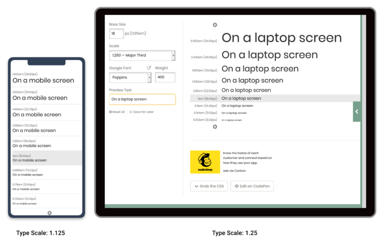
Web Typography: Establishing a Strong Typographic System
Alex Walker

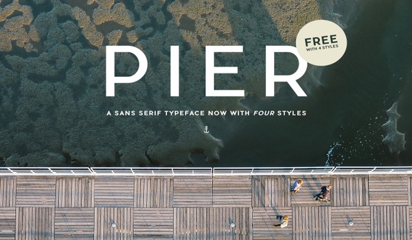
Free Fonts: Best Sources for Free Font Downloads
Daniel Schwarz
Finding the Right Font is Now Easy
SitePoint Sponsors

10 Unexpected Sources of Design Inspiration
Aja Frost
Bridging the Gap Between UX and Copywriting
Daniel Schwarz

12 of the Best Dribbble Designers to Follow
Gabrielle Gosha

Podcast: Behind the Facebook Logo – A $100 Million Story
Alex Walker
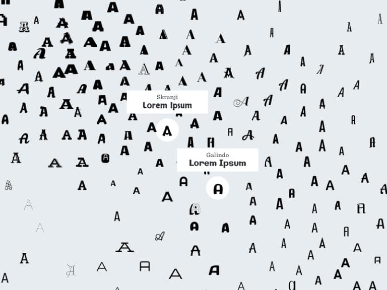
IDEO Font Map: A Faster Way to Find the Best Google Fonts
Daniel Schwarz

Introducing Portfolio WordPress Theme – and the Design Decisions Behind it
Alex Walker

The Best Way to Create Fantastic ‘Invisible Pen’ Effects in SVG
Ivaylo Gerchev
26 Steps of Product & Dashboard Design
Jan Losert
How to Stop Designing Square Layouts by Thinking Outside of the Box
Daniel Schwarz
8 Distinctive Headline Fonts to Make Your Content Sizzle
Gabrielle Gosha
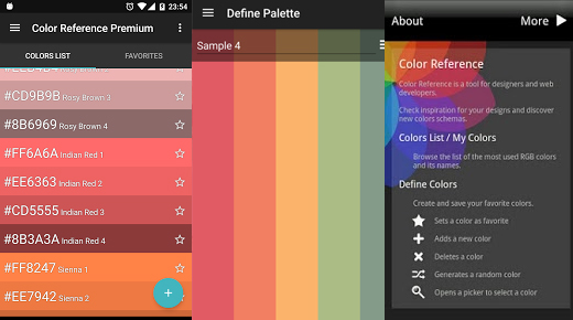
8 Free and Handy Android Apps for Designers
Gabrielle Gosha

Review: Is the New and Improved Google Fonts Better?
Simon Codrington
How to Find Cool, Quirky, Copyright Free Photos on Flickr
Alex Walker

20 Inspirational, Free Tools For Better Typeface Pairing
Maria Antonietta Perna

Is This the Dawning of the Age of Interrobang‽
Alex Walker
5 Ways to Offer a Better UX to Disabled Users
Daniel Schwarz
Taking the Double Trouble Out of Pull Quotes
Alex Walker
The Story Behind SitePoint’s New Typeface: Roboto
Kat Bak
9 Ways That Design Trends Are Holding You Back
workerbee
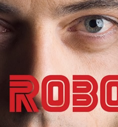
Should You Be Brave with Your Typography? Ask Mr. Robot.
Alex Walker
Getting Random with David Bowie and Fractals
Alex Walker
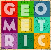
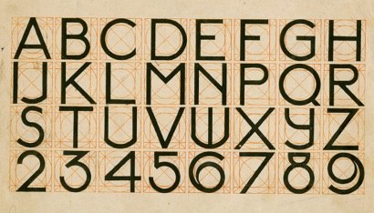
6 Unique Geometric Fonts You Need in Your Toolkit
Simone Sala
Boost Your Skills With These Fun Typography Games
Kelsey Bryant
Is There a Perfect Paragraph Length for the Web?
Alex Walker
6 Free Online Tools to Make Your Life Easier
Simone Sala
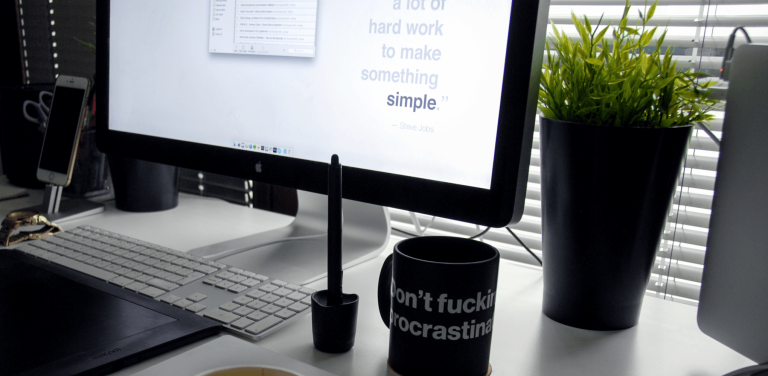
When Less is More – Why Minimalism STILL Rules the Web
Richa Jain
Showing 29 of 29