A few weeks ago I was shopping with my two-year-old daughter when we came across a brilliant little picture book – Gallop! A Scanimation Picture Book by Rufus Butler Seder.
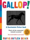
Now to be honest, the written content of Gallop! is fairly standard kids’ fare – “Can you see the horse gallop?” is probably the literary highlight there. However, the little animation trick it employs is quite beautiful.
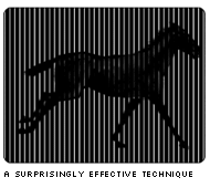
The effect works something like this:
- Take a six-frame animation and slice it into wafer-thin vertical strips.
- Throw away 5 out every 6 strips.
- Re-assemble the remaining strips into a single composite image, containing parts of all six frames.
- Cover this composite image with a black acetate sheet that contains thin, transparent lines running from top to bottom. This sheet obscures most of the image behind it, allowing only one frame to be seen at a time.
As the reader opens and closes the page, the illustration is pushed and pulled sideways behind the sheet. The result is a pretty nifty illusion of movement.
Now, this technique mightn’t sound like it would give a convincing result – after all, there’s a lot of black and not much image to see. However, as the animated GIF above shows, the effect is surprisingly impressive. Impressive enough, in fact, to get me wondering if it might be possible to adapt it to work online as users resize their browsers.
I’m going to cut straight to the chase by showing you the test case I mocked up, and then I’ll talk briefly about some of the challenges and issues I came across in building it. Later, I’ll explain the somewhat hairy process involved in creating your own.
Some Random Thoughts
- This is a first take. There are quite a few lessons I’d bring through to any updated version.
- This is a three-frame animation. I originally tried a simpler two-frame version of this animation. This was clearer, but generated too much lightning.
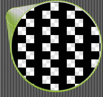
While it’s perfectly possible to design four-, five-, or six-frame animations using this method, the reality is that each additional frame makes the animation progressively darker, reducing the clarity of the animation. - They aren’t straight vertical lines in your example, right? No, vertical lines aren’t the only transparent shapes that work. In fact, I found that grids and checkerboard patterns seem generally to give a clearer result.
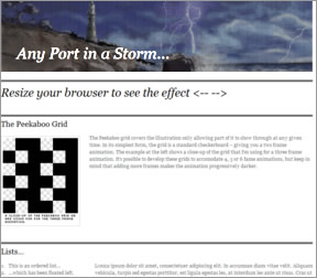
Peekaboo Animation: the Method
Okay, so you’re inspired to give it a try. Let’s look at the nuts and bolts of creating the effect. It does require some precision, so try not to get distracted halfway through the process.
It’s not the easiest process to explain, but I’ll do my best – so stick close. I’m going to use Fireworks for the example, but it shouldn’t be difficult to get a similar result in Photoshop or a variety of equivalent graphic apps.
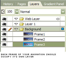
Step 1. Create your animation.
This part is up to you, but you’ll need to create each frame on its own layer.
Step 2. Create your Peekaboo Grid.
The Peekaboo Grid is the semi-transparent grid that overlays our image, allowing only one frame to peek through at any moment. I built my grid in Fireworks, and it’s nothing more than a customized pattern fill.
Here’s a small seamless tile section for you to download. It should allow you to create as much grid as you need.
![]()
To use the tile in Fireworks, create a new square shape, set its fill to Pattern and select Other…. You’ll then be able to select the tiling PNG. Resizing the shape should automatically tile the shape with the repeating grid pattern, giving us as much grid as we need. Export a chunk of grid (as a GIF) that’s big enough to comfortably cover your animation area.
Step 3. Create the Peekaboo Grid Mask.
Now things get a bit trickier. Copy the grid shape we just made, and paste it as a new layer covering your three frame layers. Align the grid to the top, left corner of your document.
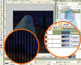
Step 4. Recolor the Mask flouro blue
Those involved in TV production might be aware of the chroma key technique, which allows producers to target a (usually) blue screen behind a weather man, and replace it with animated weather information. We’ll use a variation on this technique now.
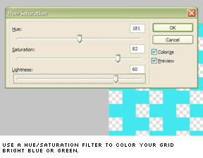
Select your black Peekaboo Grid layer, and apply a Hue/Saturation… filter to it (Filters/Adjust Color/Hue Saturation…). Adjust the sliders until you’ve turned the grid a bright, fluoro blue color.
The exact color you choose isn’t important. You simply need to ensure that the color isn’t used anywhere in the animation, so bright, fluorescent colors are usually best.
Step 5. Export Frame 1
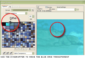
Switch on both the Frame 1 layer and the blue grid layer, then launch Firework’s Export Preview screen (CTRL+ALT+X).
Set your export format to GIF and use the Eyedropper tool to select the fluoro blue color chip from our color palette.
![]()
Hit the EXPORT button, call the image Frame1.gif, and put it somewhere safe.
Step 6. Export Frame 2.
Switch your layers so that the second frame shows. Now very carefully select the grid layer and use the arrow keys to move it exactly one pixel to the left. Take special care here, because if you bump or drag the grid accidentally, it will become “out of phase” with our first frame, meaning you’ll need to repeat Step 5. Export the image as Frame2.gif, once again making the blue color chip transparent.
Step 7. Export Frame 3.
You’re probably able to guess this step now. Make the frame 3 layer visible, and once again carefully jog the blue grid one pixel to the left. Export the result and call it Frame3.gif. You should now have three new images that are essentially “lacework” copies of our animation frames.
Step 8. Combine the images into a composite.
This is where you find out if you were careful enough in the previous steps.
Open all three of your freshly exported frames. Copy Frame2.gif and paste it into Frame1.gif. Do the same with Frame3.gif. If everything has gone to plan, the three frames should knit together perfectly, as the image below shows.

Getting this image just right is the key to this technique, and it’s easy to make mistakes. Don’t give up if it doesn’t quite line up the first time. It took me some time to get it right. Export this composite image to a single file (I called mine stormy-sea.jpg).
Step 8. Create the HTML structure.
Okay, if you got this far, award yourself a gold star for bloody-minded persistence! Now, start a new HTML document and add the following markup to the body:
<div id="header_outer">
<div id="header_inner">
<h1>Here is the Header</h1>
</div>
</div>
This is very simple structure - simply two DIVs wrapping an H1.Step 9. Add the CSS.
Finally, add the following CSS to the
HEAD:
<style type="text/css">

#header_outer {

background:#000 url(images/stormy-sea.jpg) left top no-repeat;

}

#header_inner {

background: transparent url(images/bigw.gif) right top;

border-top:1px solid #000;

height:200px;

position:relative

}

h1 {

color:#fff;

position:absolute;

bottom:0px;

left:1em;

font-size:400%

}

</style>
The outer DIV holds our composite animation image in its background and is aligned to the top left, so it won’t move when we resize the browser.
The inner DIV contains our black Peekaboo Grid, and is always aligned to the top right. This means that when we resize the browser, our grid always slides sideways across our composite image. The basic page should look like something like this.
Final Word
So, there it is. If you managed to slog your way through to create your own version, I doff my hat to you. Producing the composite graphic seems more like an act of faith than a graphics technique.
Unfortunately, at the moment I can’t think of a simpler way to do it, short of writing a custom application designed to generate the image automatically. In my testing I generally found that strongly loop-based animations (i.e. things like wheels, spinning gears or running horse) aren’t as effective.
While turning a page produces a very smooth, measured motion, resizing a browser is typically much jerkier, making it much more likely you’ll skip over frames. Instead, animations that actually benefit from a certain amount of randomness seem to work best. For instance:
- twinkling stars
- headlights on a distant highway
- lights on a city skyline
- reflections glittering off the water
- insects buzzing around a light
Obviously, some will question whether they could justify the time and resources to develop an effect that might not even be seen by all users. No doubt many budgets and projects wouldn’t be suited to this type of trick. But there may be other projects that would benefit from a variation on this method, and the opportunity to surprise and intrigue your users – to cut through the clutter for a moment – isn’t to be underestimated.
P.S. I’d love to see anyone else’s experiments with this idea, so drop me a note if you come up with something cool.
 Alex Walker
Alex has been doing cruel and unusual things to CSS since 2001. He is the lead front-end design and dev for SitePoint and one-time SitePoint's Design and UX editor with over 150+ newsletter written. Co-author of The Principles of Beautiful Web Design. Now Alex is involved in the planning, development, production, and marketing of a huge range of printed and online products and references. He has designed over 60+ of SitePoint's book covers.


