Video as a pop up instead of an image

I am trying to replicate this using a video as a pop up instead of an image,

This is similar also: https://joebiden.com/

That one uses modal.

Is there a difference between how each is done?

Which would be the best way to do it?

Where clicking off the image closes the pop up, or, clicking the x.

https://www.donaldjtrump.com/

This is as far as I got: https://jsfiddle.net/5y79rop8/

1 Like

Please clarify the details a little more.

It sounds like you want your video inside a popup/modal when the page loads and then you are either going to play it or close it.

If so what happens when you close it? Are you leaving the page blank or is there a page underneath that needs to be blacked out also and is revealed when the modal closes?

Using transparent you should be able to see the page behind it.

I was going to leave the background as see through:

background-color: rgba(0, 0, 0, 0.85);

What does that have to do with any of my questions?

Of course transparent allows you to see whats behind because there would be nothing in the way. You don’t even have to say it.

Anyway as you didn’t answer my questions I put together this example from which you can extricate the bits you need as they are pieced from your examples.

Have fun.

How do I fix this?

That button there, should not be a button, but <a instead?

https://jsfiddle.net/4eb3tzLj/6/


.modal {
  display: none;
}
.modal.open {
  display: flex;
  justify-content: center;
  align-content: center;
  position: fixed; /* Stay in place */
  z-index: 99; /* Sit on top */
  left: 0;
  right: 0;
  top: 0;
  bottom: 0;
  overflow: auto; /* Enable scroll if needed */
  background-color: rgb(0, 0, 0); /* Fallback color */
  background-color: rgba(0, 0, 0, 0.8); /* Black w/ opacity */
}
.modal-content {
  position: relative;
  background-color: rgba(255, 255, 255, 0.9);
  margin: auto;
  padding: 15px;
   box-sizing: border-box;
  border: 1px solid #0059dd;
  border-radius: 0;
  z-index: 100;
  background: linear-gradient(45deg,
      transparent,
      transparent 7px,
      rgb(113, 121, 126) 7px,
      rgb(113, 121, 126) 7.5px,
      transparent 7.5px,
      transparent 10px),
    linear-gradient(-45deg,
      transparent,
      transparent 7px,
      rgb(113, 121, 126) 7px,
      rgb(113, 121, 126) 7.5px,
      transparent 7.5px,
      transparent 10px);
  background-size: 10px 10px;
  width: 100%;
  max-width: 642px;
}
.close {
  display: block;
  color: red;
  float: right;
  font-size: 28px;
  font-weight: bold;
  cursor: pointer;
}
.close:hover,
.close:focus {
  color: black;
  text-decoration: none;
  cursor: pointer;
}

.close {
  -webkit-appearance: none;
  appearance: none;
  border: none;
  padding: 0;
  position: absolute;
  top: auto;
  bottom: -47px;
  margin: auto;
  right: 0;
  left: 0;
  width: 47px;
  height: 47px;
  cursor: pointer;
  background: black;
  border-radius: 50%;
  border: 5px solid red;
  display: flex;
  align-items: center;
  justify-content: center;
}

.close::before,
.close::after {
  content: "";
  position: absolute;
  width: 100%;
  height: 5px;
  background: green;
  transform: rotate(45deg);
}

.close::after {
  transform: rotate(-45deg);
}
<div id="myModal" class="modal open">
  <div class="modal-content">
    <div class="blog-pager close">
      
         <button class="close" type="button"></button>
    </div>
    <div class="ratio-keeper">
      <div id="ytplayer0"></div>
    </div>
  </div>
</div>

I’m not sure what you mean as I don;t understand what you are trying to do now.

The working example is in my codepen.

You seem to have changed the js and css and I don;t know what you are trying to do? My js was all you need to close the modal as you that was what you were asking. You didn’t ask to open and close it.

If you want different blog-pager buttons then create a different class for one of the sets.

Starting over: https://jsfiddle.net/xc09he74/4/

How do I keep the close button, and absolute position it towards the bottom of the border?

  position: absolute;
  top: auto;
  bottom: -47px;
  margin: auto;
  right: 0;
  left: 0;

Just change the margin:

e.g. margin: auto auto 0; in here:

.blog-pager {
  transform: translatey(100%);
  pointer-events: none;
  position: absolute;
  inset: 0 0 0 0;
  z-index: 2;
  margin: auto auto 0;
  max-width: 72px;
  height: 52px;
etc....

Then you can adjust the translateY if you don;t want it outside the video.

.

To hide the double scrollbar on small screens when the popup is open you can add this to my example.

body:has(.modal.open){
  overflow:hidden;
}
1 Like

12 posts were split to a new topic: Closing a modal

Allowing it to be scrollable.

Keeping it at one scrollbar, how is that done?

https://jsfiddle.net/k5dc1ab4/

That’s an oxymoron as it can’t be both.

The modal is using position:fixed which means it does not scroll with the viewport. Therefore if the viewport height is smaller than the modal you will not be able to scroll down to see the X using any of the viewports scrollbars. The only way to scroll to see the X is to scroll inside the modal itself which means a separate scroll mechanism to the main viewport. That results in two scrollbars.

Note that is very bad UI to allow the content underneath a modal to scroll. The very nature of a modal should be that the modal is the only thing you interact with until you dismiss it.

What you ask is impossible for a fixed position element that is greater than the viewport height as you have to have 2 scrollbars do to it.

You could make the video responsive and have it get smaller so that it never goes out of the viewport but that would be quite awkward in that set up and would look odd.

Otherwise there is no other solution unless you don’t fix the modal but have it scroll away with the document but once again that is bad UI and plainly nonsense.

How would this one be reduced to 1 scrollbar from two? https://jsfiddle.net/u2pn17we/

It only has one scrollbar? The other scrollbar is the fiddle itself and not part of your layout…

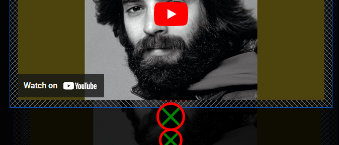
If you mean why is there a scrollbar then that’s because you have placed the exit button below the fold of the screen and thus the scrollbar appears so you can get to it.

You placed the exit button at bottom:-47px so you get 47px of scroll on the viewport.

Move the button up to bottom:0 and the scroll should go away but you would need to raise the z-index otherwise it goes behind the video. If you don;t want it on top of the video then you’d have t make the video smaller. You can’t have a video full screen and then put something below it without having to scroll to it.:slight_smile:

1 Like

Where can this be added? padding: 8px 8px;

https://jsfiddle.net/vqok2d50/

This would be one place: https://jsfiddle.net/cz5kmj16/

.modal.open {
  display: flex;
  justify-content: center;
  align-content: center;
  position: fixed;
  padding: 8px 8px;
}

What about inside, after it’s clicked, the close button?

After clicking on the close button:

padding: 8px 8px; would be added where else?

padding: 8px 8px;

I’m not sure what you are asking as once the modal is closed you are back to your original page and that has padding on most items and you can adjust whatever one you want. You have 50px padding top and bottom on the body so if you want 8px side margins then add it there. body{padding:50px 8px}

As they are all the same you could just use shorthand of padding:8px;

pop up page to look the same:

As not pop up page:

Is there a way to add padding: 8px 8px; to both?

When you click on My Music, https://www.indieshuffle.com/

You are still allowed to scroll on the page.

How is that done?

Exactly as you had it in the first place with the double scrollbar appearing when the popup is too tall for the viewport. Reduce the screen height on that demo and you end up with 2 scrollbars. Very ugly and very bad UI. Its also very bad UI to scroll the page underneath when a modal is in action as I already mentioned.

If that’s the badness you want then remove the overflow:hidden from the :has rule on the body element that I gave you.

1 Like