Mobile blog

This highlighted element bothers me now, along with these

#counterwidget {
  display:block;
  max-width:30%;
  margin:-10em auto;
  background:none;
 
}

.counterwrapper {
  background: linear-gradient(#aaa 5%, #555 2%, #000);
  max-width:6.25em;
  width:5.75em;
  height:0.938em;
  border:0px outset black;
  border-top-left-radius: 50px;
  border-bottom-right-radius: 50px;
  padding-bottom:1px;
  box-shadow:0px -1px 1px 1px #333;
  margin:-1.7em auto;
}

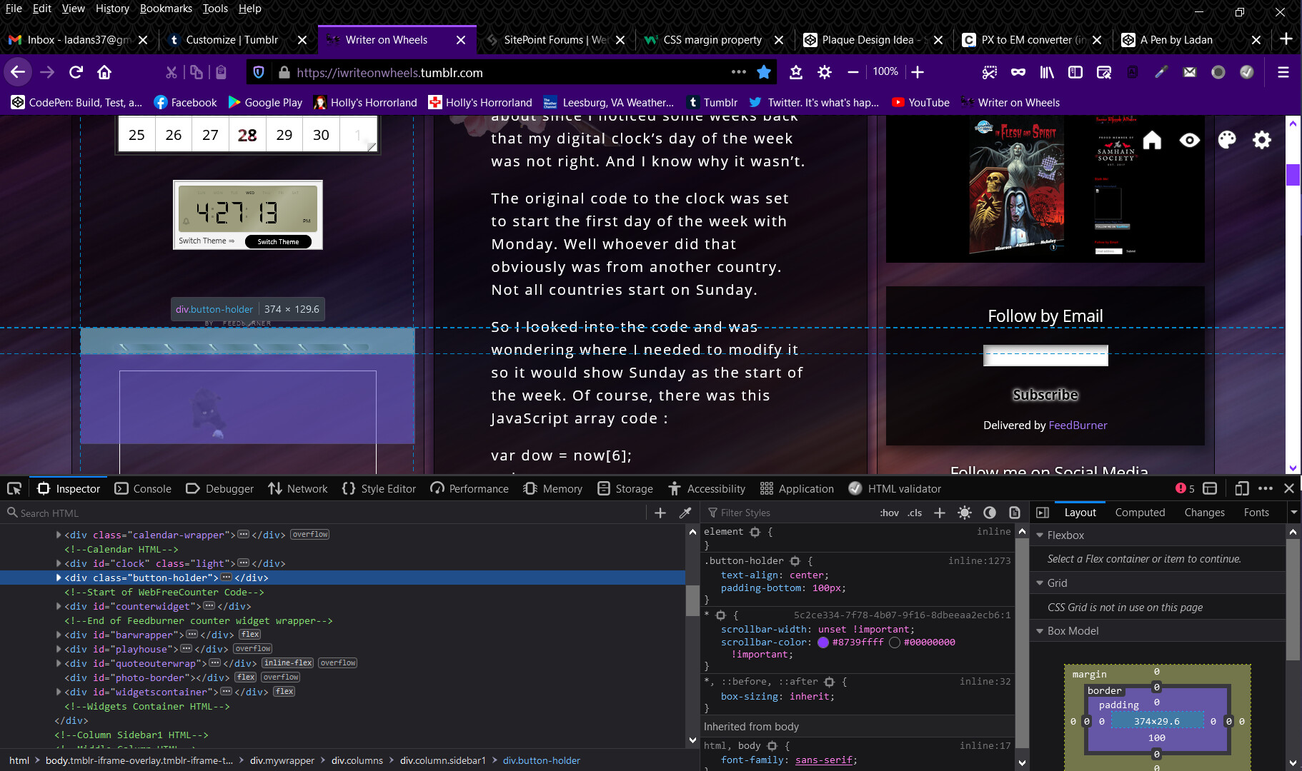
As I’m not sure if the negative margins are ok, or shouldn’t be there. I know I should rarely use negatives, but in this case, I tried everything with it, and didn’t align to where I want. Also tried aligning that highlighted element ( button-holder ), and had no luck with that.

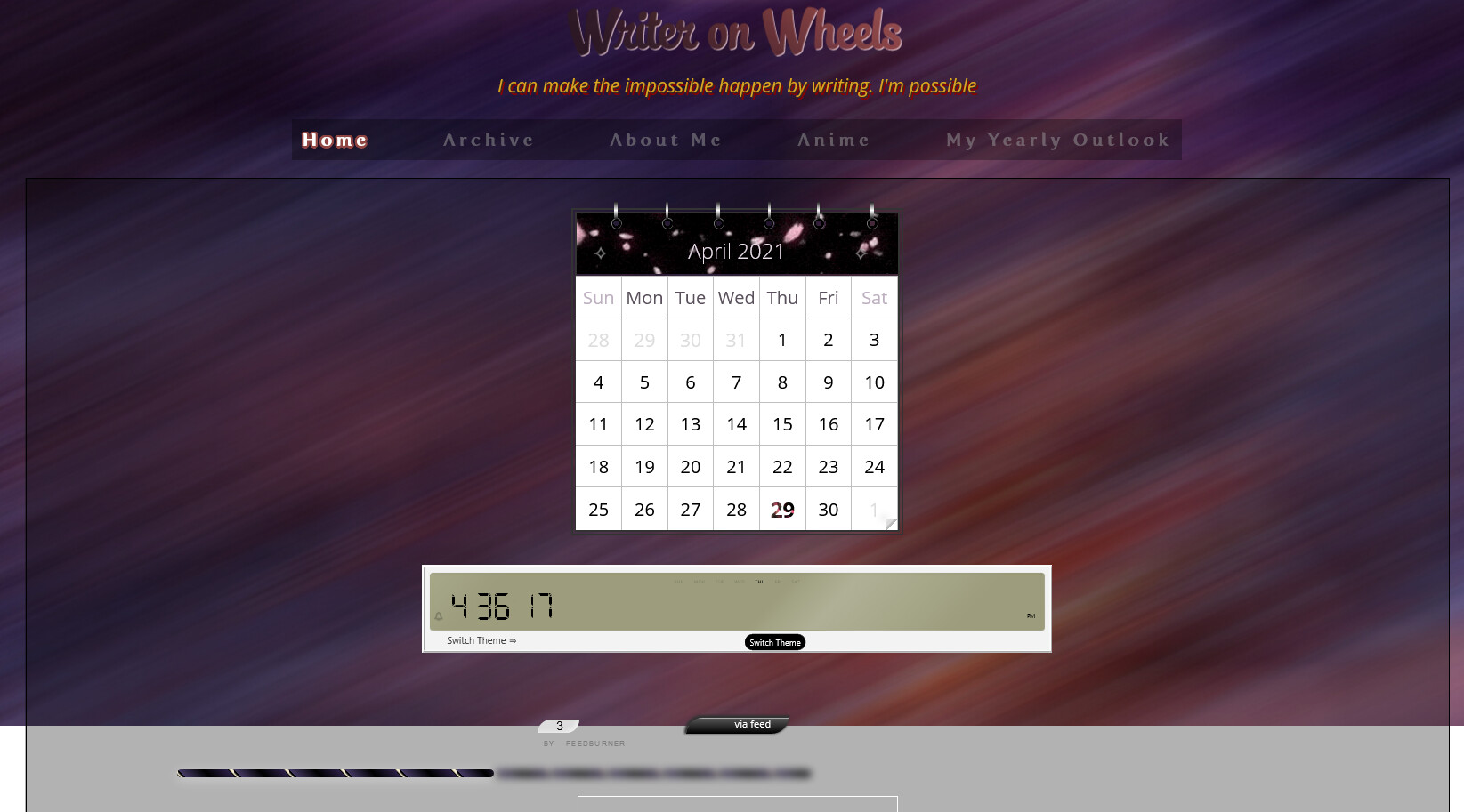
The problem is that the clock element is transformed smaller. Transforms do no alter the flow so the clock is really taking up all the space that it would have done had you not transformed it smaller.

In this case (unless you want to recode the clock completely) you have little choice but to magic number the following content into position. However you should only need to do that for the element that directly follows the clock and then get the flow of the document back to normal.

You are probably better off leaving that section alone if it is looking close to what you wanted.

1 Like

So you’re saying I’m better off not using this

transform: scale(0.45) translateY(-50%);

You would be better off without it but there is no way to make that clock smaller without re-inventing the widget so you are stuck with what you have I’m afraid.

1 Like

Ok. Thanks. As for other elements, I think they look fine now. I’ve fixed up the negative margins on them. Except the .counterwrapper, which I’m not sure about changing its margins. And am still seeing left column being a bit wider than the right. It’s a lot better, but still needs work.

Been looking at my left column again, still trying to find out why it’s wider than it should be. My only guess was because of this element

image

When I removed it last night, nothing changed. Maybe it’s either the archive wrapper or the flex-container to the followers. Otherwise, I don’t see anything else that may be causing it. All gaps have been resolved as far as I can tell, looking through my code.

Add justify-content:space-between here:

#widgetscontainer {
    display: flex;
    background: none;
    padding: 0.5em 0;
    justify-content: space-between;
}

Remove this rule completely:

#entries {
    width: 9.625em;
    height: auto;
    background: none;
}

Remove the margin-left from this rule:

.flex-container {
    display: flex;
    flex-wrap: wrap;
    width: 6.75em;
    background: none;
    align-content: flex-start;
    /* margin-left: 7em; */
}
1 Like

@PaulOB thanks.

Remove this rule completely:

#entries {
    width: 9.625em;
    height: auto;
    background: none;
}

Do you mean to remove the #entries entirely? Also, what does the > * mean in

.columns > * {
  flex:1 0 0;
}

Went Googling for it, but couldn’t find any explanation.

Yes remove that css as its not needed.

The ‘>’ is a child combinator and selects only elements that are direct children of the selector to its left. It does not select grandchildren.

The asterisk is the universal selector and represents all elements. In the code snippet above it will match any element that would be in that position (whether it be a div or span or anything).

Ok, removed it. Still didn’t change anything. Cool, thanks for that explanation. I take my comment about it back a step; I did find where it said about using * , but did not find any example like what you have.

.columns > * {
  flex:1 0 0;
}

Oh. I see why…

image

Need to make changes to the archive wrapper.

It wasn’t like that before. You seem to have moved that Blog Archive outside of its previous context.

The Blog Archive html needs to be inside the archiveheader div or else it becomes a flex item and you get three columns across.

If you are calling it a header then why aren’t you using a header tag of suitable rank.

1 Like

Yeah wasn’t. It became like that when I removed #entries . I will use the header tag instead.

So instead of, .archiveheader I can do h3.archiveheader, since I have a class name for that?

Ok I think it’s not working out because

<div class="archiveheader">Blog Archive</div>

I think the end tag to this should be at the end before the closing Blog Archive html. Like this :


<div class="blogarchivewrapper">
   <h2 class="archiveheader">
    Blog Archive
   </h2>
</div>

Do you mean you removed the html for entries? I told you to remove the CSS only.

Yes that’s what I told you to do,

1 Like

@PaulOB yes, makes sense now. Sorry for the misunderstanding on the #entries. Thought when you said completely, you meant both the CSS and HTML. My bad.

Ok I will work this out, thanks.

Well that didn’t go.

At a guess it looks like you have an extra closing tag after #entries.

   </div><!-- this closing tag is to be deleted -->
        <div class="flex-container">

You will need to address the default top margin on the h2 you added otherwise it won’t align at the top

1 Like

Ok thank you. Will look into that and the h2.

@PaulOB you mean the default margin to Blog Archive header? Assuming so, as it sits lower than Followers header.