Mobile blog

I don’t know where this is positioned now

#photo-border {
  display: flex;
  background: rgba(100,50,175,0.18);
  width: 18.01em;
  border: none;
  position: relative;
  align-items: center;
}

Not seeing it.

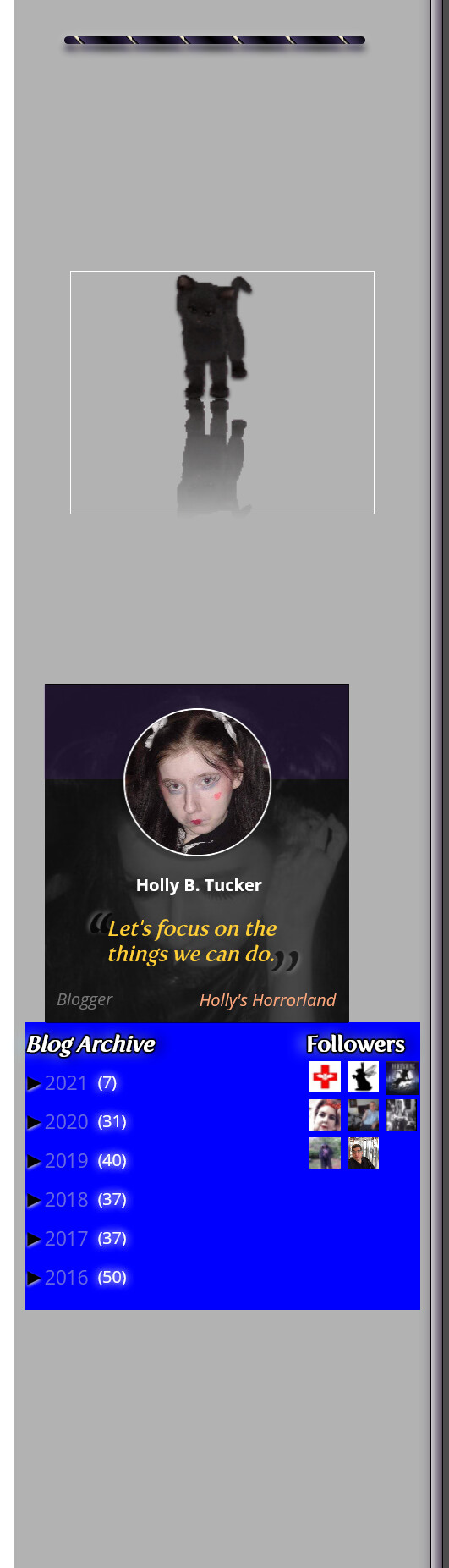
All the way up that left column there are similar mistakes where you have misplaced elements and then corrected with magic number margins. You don’t need any of them if you do it properly.

Besides the calendar-wrapper which you have the margins to that.

Yes and no margins and no clear property on either.

Ok done.

.flex-container {
   display: flex;
   flex-wrap: wrap;
   width: 6.75em;
   background:none;
   float:right;
}
#entries {
  float:left;
  width:9.625em;
  height:auto;
  background:none;
}

.flex-container floated right (or instead both wrapped in a flexbox container instead of floating).

This may be best; a container for both elements. I have too much spacing between the quotebox and them.

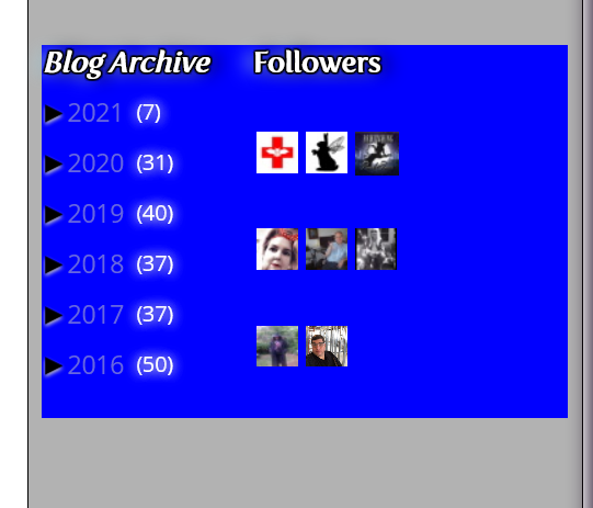
If you are talking about the distance between the blog archive and the followers then there’s no reason why you cant use a sensible horizontal margin to align them. However I thought that was how you had them aligned anyway.

You need to address the big gap above those elements. I have already mentioned those before.

1 Like

@PaulOB no, I mentioned where I am talking about

between the quotebox and them.

Distance between blog archive and followers is fine. However, now the follower squares are too far apart with the container I have put in.

**#widgetscontainer {**
**  width:24em;**
**  height:24em;**
**  background:blue;**
**}**

#entries {
  width:9.625em;
  height:auto;
  background:none;
}

.flex-container {
   display: flex;
   flex-wrap: wrap;
   width: 6.75em;
   background:none;
}

The horizontal spacing between the rows.

Ok problem resolved with above issue

align-content: flex-start;

no reason why you cant use a sensible horizontal margin to align them. However I thought that was how you had them aligned anyway.

Yes, you’re right. I did have this

margin:0 auto;

Added it back.

Would it make sense to add a horizontal margin to this :

#widgetscontainer {
    display: flex;
    width: 24em;
    height: auto;
    background: blue;
    padding: 0.5em 0;
    **margin: -13em auto;**
}

To move it up?

You need to find the reason why there is a gap in the first place. Once you solve that problem then you don’t need to move anything much.

Do you realise that margin:-13em auto means that there is a top margin of -13em and also a bottom margin of -13em?

That will not only drag the element upwards it will also pull the following element upwards as well and just compound the issues.

Look for the reason why there are vertical gaps. You rarely need to use negative margins. Things will naturally be in the right place if you do it correctly.

Back tomorrow now. :slight_smile:

2 Likes

Do you realise that margin:-13em auto means that there is a top margin of -13em and also a bottom margin of -13em?

Yes, can see that. I understand. It’s a shorthand.

Look for the reason why there are vertical gaps. You rarely need to use negative margins. Things will naturally be in the right place if you do it correctly.

This is a hard one for me. I don’t have an owl’s eye. But can try. Also, left column is looking wider yet again. I thought we had fixed it. Think maybe my container may have messed it up.

#widgetscontainer {
  display:flex;
  height:auto;
  background:blue;
  padding: 0.5em 0;
  margin: -13em auto;
}

Ok, take care, while I try my best to sort all this. I’m not perfect :slight_smile: , but I can definitely try my best.

A big gap here.

Open your developer tools and highlight the elements in the left column.

From this screenshot you can clearly see where all the extra space is coming from.

The margin-bottom on that rule is creating a big gap.

If you remove the margin-bottom you get a smaller gap.

e.g.

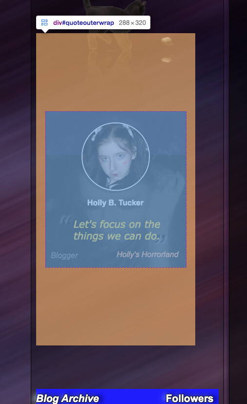
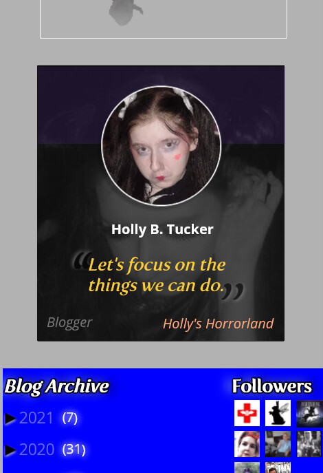
there is still a gap above blog archive and if you look above the image you can see a highlighted light green box. That is your element called photo-border.

#photo-border {
    display: flex;
    background: rgba(100,50,175,0.18);
    width: 18.01em;
    border: none;
    position: relative;
    top: -30.0em;
    left: 1.2em;
    align-items: center;
    padding: 2.8em;
}

You have used position:relative to move it which as we have mentioned countless times doesn’t actually move anything physically and should not be used for structural content. The gap above the blog archives is the space where this photo border image would have lived.

I don’t know what the photo border is supposed to do anyway as I can’t see it well enough with my eyes. If its supposed to be an effect on top of the holly image then it should have been incorporated into that block and probably placed absolutely on top but I don’t really have any idea what it is supposed to be. (I’ve only just realised you have an animated cat stuck in there also but I can hardly see it.)

1 Like

@PaulOB thank you for pointing all this out. I was looking into the counter below the clock earlier, noticing that there is a negative margin there, which I thought that might have been causing it :

#counterwidget {
  display:block;
  max-width:30%;
  margin:-10em auto;
  background:none;
 
}

.counterwrapper {
  background: linear-gradient(#aaa 5%, #555 2%, #000);
  max-width:6.25em;
  width:5.75em;
  height:0.938em;
  border:0px outset black;
  border-top-left-radius: 50px;
  border-bottom-right-radius: 50px;
  padding-bottom:1px;
  box-shadow:0px -1px 1px 1px #333;
  margin:-1.7em auto;
}

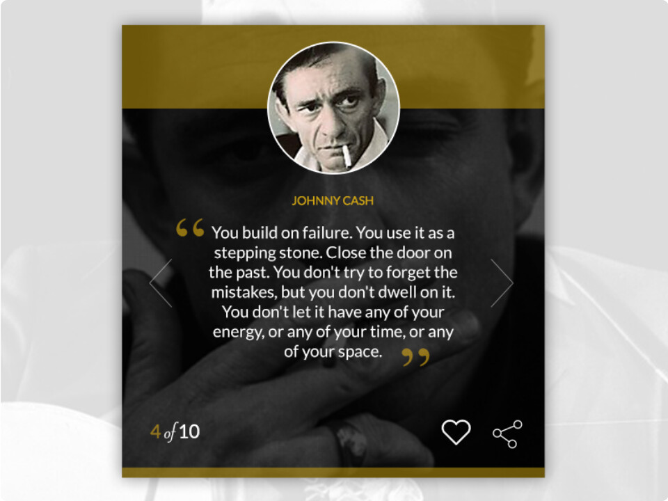
Both these have negative margins in there. The photo border is just a decorative, as I had wanted to look like the example quote box I had found from Johnny Cash. You can’t see it cause its opacity is set to really low values.

I will take a look at it, along with that big gap and see what I can do :slight_smile:.

The margin-bottom on that rule is creating a big gap.

If you remove the margin-bottom you get a smaller gap.

Margin-bottom meaning the one that is 10em


#quoteouterwrap {
  background:none;
  display:inline-flex;
  margin:10em 1.2em;
  width:18em;
  height:20em;
}

<div id="photo-border"></div>

Should probably put it either as a stand alone with a wrapper, or with this somewhere:

<div id="quoteouterwrap">
    <div class="wrap">
      <a class="photo-wrap" href="https://imgbb.com/">
        <img class="photo" src="https://i.ibb.co/q0C4D4M/58461451-594363321051717-6049779766507077632-n.jpg" alt="Girl Image">
          <div class="speech">
            <p>Hey!</p>
          </div>
      </a>
      <div class="workwrap">
        <blockquote class="work">
          <p><span class="ldquo">“</span> <span class="letsfocus">Let's focus on the<br>things we can do.</span><span class="rdquo">”</span></p>
        <footer> <cite class="author">Holly B. Tucker</cite></footer>
        </blockquote>
        <p class="occupation">Blogger <a class="horror" href="https://www.hollyshorrorland.com/">Holly's Horrorland</a></p>
      </div>
      <div class="shinebox shine-animationtop"></div>
      <div class="shinebox shine-animation"></div>
    </div>
</div>

No the 10em in that rule is top and bottom shorthand as you already pointed out a couple of posts back. You would need to change it so that there is no margin-bottom but keep the margin-top (for now).

margin:10em 1.2em 0;

If you don’t understand the shorthand then take some time to read up on it as there are millions of resources around to explain it.

Eventually you will reduce that top margin to near zero also but at the moment you can’t remove that margin because the element above (playhouse) it is misplaced because of negative margins once again.

You will need to keep working all the way up that column and correct all the overlaps.

1 Like

Ok. I understand. I’m trying to get to everything, just one step at a time.

You will need to keep working all the way up that column and correct all the overlaps.

Overlaps caused by the negative margins I suppose.

This is how #playhouse is looking now


#playhouse {
    width:18em;
    height:14.375em;
    background:none;
    box-shadow:none;
    border:1px solid white;
    margin:0 auto;
 
}

Photo border changed to absolute and moved into place like so :

#photo-border {
  display: flex;
  background: rgba(100,50,175,0.18);
  width: 18.01em;
  border: none;
  position: absolute;
  top: 87.7em;
  left: 6.8em;
  align-items: center;
  padding: 2.8em;
}

And #quoteouterwrap :

#quoteouterwrap {
  background:none;
  display:inline-flex;
  margin:10em 1.2em 0;
  width:18em;
  height:20em;
}
#quoteouterwrap {
  background:none;
  display:inline-flex;
  margin:2em 2.5em 2em;
  width:18em;
  height:20em;
}

This seems to work for clearing the overlap around this element.

Think I got all negative margins sorted out.

Now the gap to the clock