Choosing a typeface is the starting point of typographic design, and may even go on to inform the overall design or feel of a page. Traditionally, Web typography suffers from a lack of options when it comes to typeface choice simply because fonts can be displayed only if they’re available on users’ computers. The first job of the Web typographer, then, is to distinguish the fonts that are readily available, and to understand which are best suited to his or her particular tasks.
Very generally speaking, there are two main groups of typefaces that are used on the Web: serif and sans-serif. The difference is easily demonstrated in this image:
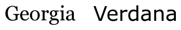
Serif and sans-serif type
Serifs are the extra lines or small decorations added to the ends of the main strokes of the Georgia typeface above. The theory behind these serifs is that they help the letters flow, and lead the eye across the text during reading. Serif fonts are very popular in print, and although there is a certain amount of debate regarding which family of typeface is most legible on the screen, I fall firmly in to the camp that believes that sans-serif faces are a more suitable option.
The variable boldness and fine extra strokes of the serif fonts, particularly at smaller sizes of body text, often appear pixilated and untidy. This is still the case even with the most modern anti-aliasing techniques. With anti-aliasing enabled, the serif fonts look blurred (which is exactly what they are) around their curves and terminals. On the other hand, the straight, low contrast, open strokes of a sans-serif font, such as Verdana, will always leave a good impression on-screen.
The Common Web Fonts
Most designers are probably familiar with what could be considered the common Web fonts. The following CSS rule probably won’t raise too many eyebrows.
body {

font-family: verdana, "trebuchet MS", helvetica, sans-serif;

}
Here, we have three classic fonts that are used all over the Web. However, instead of just copying and pasting this rule, let’s look at why we have made the decision to use those three fonts, and what characterizes them as suitable for our purposes.
Verdana is our first choice font here. This font was designed for the screen and is the most common sans-serif typeface used on the Web today.

The Verdana face in detail
Note the generous amount of space between each character, as well as the amount of whitespace within the characters (glyphs) themselves. This is what makes Verdana so legible on screen, and an excellent choice for a sans-serif on the Web.
Trebuchet is another face created for the screen. Designed in 1996 by Vincent Connare, it is probably the most distinctive of the common Web fonts, and can convey a great deal of energy and personality. Certain features of this typeface depart significantly from what we would expect from a classic grotesk font, for example, the uppercase M seen below.

The Trebuchet face in detail
Despite its distinct personality, Trebuchet’s strokes are blocky and clear. It has a large x-height, helping to increase legibility at smaller sizes.
Finally, we’ve gone for Helvetica. Helvetica, designed in the 1950s and hugely popular throughout the second half of the 20th Century, is a classic in its own right. That it transfers so well to screen is both a testament to its legibility and a blessing for Web typographers.

The Helvetica face in detail
Despite its compact width, Helvetica reads well on screen due to its large x-height. It has a consistent and uniform feel to it, which not only makes it economical with space, but also means it’s easy on the eye.
Finally our CSS rule declares sans-serif as a generic font family. This ensures that users’ systems will at least default to a sans-serif font if they do not have any of the others we have specified.
If you use the rule above, you’ll be certain to provide good, legible text to the vast majority of your users. However, why not experiment a bit more? What are some of the other good screen fonts out there that we can provide to users who have them available?
 Andy Hume
A former lead engineer at Microsoft, Andy currently works for Clearleft in the UK where he writes code and consults for clients like the BBC, Mozilla, and eBay.