 Do you read every privacy policy for every site you use? I’ll come clean and confess I kind of skim it … sometimes. According to research by a team at Carnegie Mellon University, an average website’s privacy policy, as read by someone with an average reading speed, would take around ten minutes to read. And by thinking about the number of websites an average person visits, they concluded that if you were to read every privacy policy in full, you would spend between 30-50 minutes per day — or between 181 and 304 hours per year. What?!
Considering the possible risks to your identity, it’s definitely important to understand a website’s privacy policy and how it affects you, especially if it’s the kind of site that stores your real name, address, or your credit card — but who has that much time? What about end user licence agreements (EULAs), or warranties?
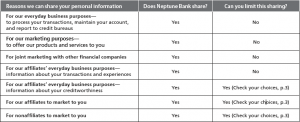
The Carnegie Mellon researchers suggested that it’d be better if users found it easier to skim policies and pick out the most useful bits — that way people might be able to take in more information, and at least have a fighting chance of understanding what’s going on. How do we achieve that? Well, the results of another study revealed this week suggests that a change in how we lay out that information might be all it takes. Researchers on behalf of the Federal Trade Commission tested a variety of different layouts for a bank’s personal information sharing policies — that is, the document detailing how and why they may choose to share your details with a third party — and found that the best way to present this information was in tables, clearly laying out what kinds of information sharing occurred and in which situations. Readers were more likely to correctly answer questions about the content of each bank’s policy when the information was expressed in this manner. Check out the study for yourself (PDF).
That seems like it’d be pretty obvious, right? We’ve already known for years now that on the Web, people find that scannable text is easiest to read — that is, text broken up into bite-sized, manageable chunks, with headings or bullet points where necessary. However, it seems as if that good advice flies out the window when it comes to the big dense lump of legalese. It’s probably fair to say that we’re reluctant to change what our lawyer pals told us to put there, but we’re doing a disservice to ourselves and our users by hiding all that essential information in a big pile of unreasonably thick text. Why are we still making privacy policies so hard to use?
So here’s my challenge to myself, and I hope you’ll join me: the next time I need to edit or create a new privacy policy, EULA or some other kind of dense legalese, I’m going to do what I can to format that policy in a more usable, readable manner. It’s high time that we all made an effort to be clearer about our users’ rights and obligations, and it shouldn’t be a giant investment of time on their part to understand how we plan to deal with their personal information.
Do you pay attention to the usability of your legal text? What do you to do help users understand better?
Raena Jackson Armitage is an Australian web developer with a background in content management, public speaking, and training. When she is not thinking about the Web, she loves knitting, gaming, all-day breakfasts, and cycling.


