User behavior studies show the upper-right corner of a website is the area that draws the least attention from the human eye. It’s simply a reflection of our reading habits. We start at the left, head to the right, and then go top to bottom.

Many viewers examine a website in an ‘F’ pattern, with a top bar of the ‘F’ extended some way across the screen, then they move down horizontally and scan the second part of the letter, until finally they look down the left-hand lower parts of the site.
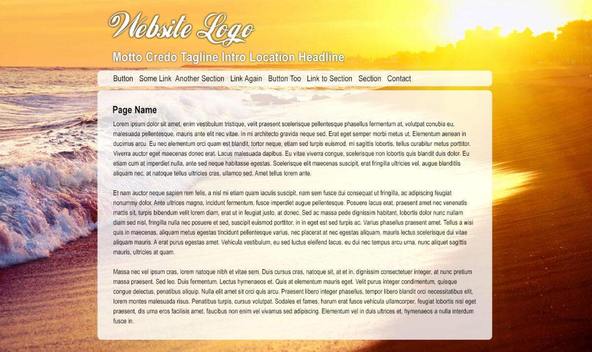
Site visitors overlooking the upper-right corner means it’s not the proper location for important information that the designer is expecting to generate clicks or other actions. Instead, it’s ideal for a contextual image, one that is seen by the viewer but doesn’t require the reading of any text.
However, the trick for designers is finding imagery that fits this dynamic.
When viewers look at a site for the first time, most look to the upper-left corner where there’s an expectation to see the name of the site and other important information. They quickly scan downward, with maybe a glance to the right.
As design teams came to understand viewer eye patterns, they began using the upper-right for less interesting content, such as disclaimers, instructions, and perhaps flags identifying different language version options for the site. While this is an older style of design, the underlying human behavior hasn’t changed.
Larger websites contain different pieces of content that are all vying for the viewers’ attention, but the upper-left remains the most valuable space. The upper right is ideal for images, as they are seen peripherally and can convey information or prompt emotions subconsciously.
Finding the Right Background Images
To illustrate upper-right site images that are a good fit for the screen, let’s review three different sets of background images and how they might interact with the content.
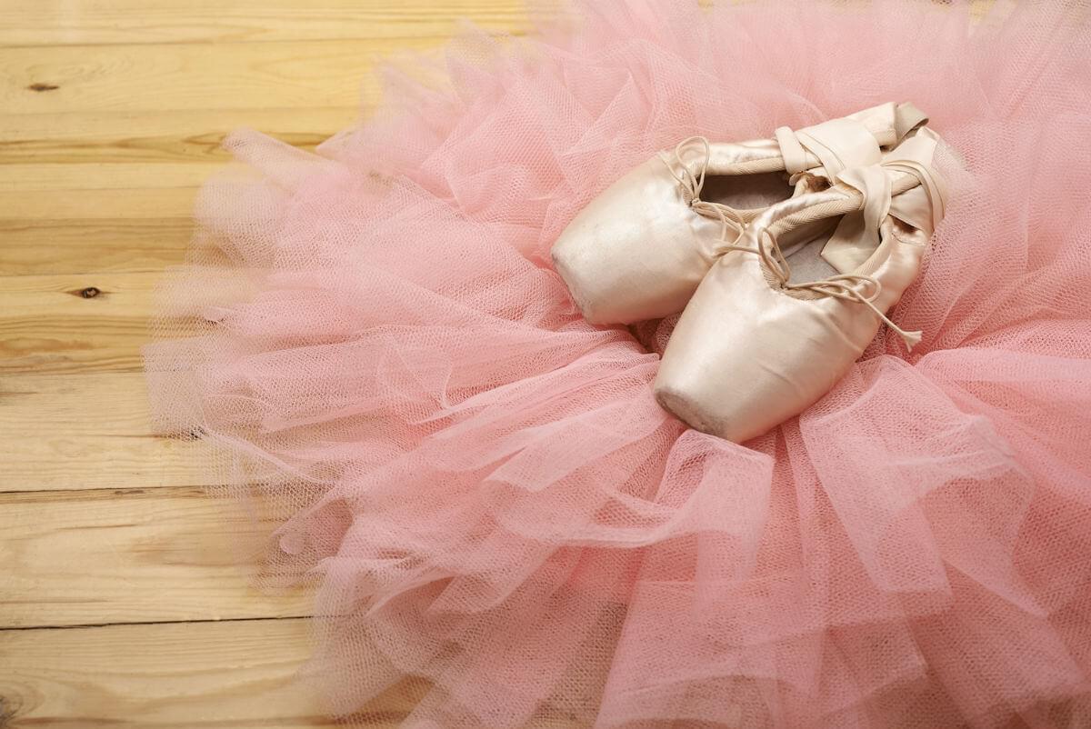
Example 1: Ballet Shoes
Let’s begin with two different images of a ballet scene – one where there are shoes in the upper-right part of the frame, the other with the shoes on the left side.
Image 1
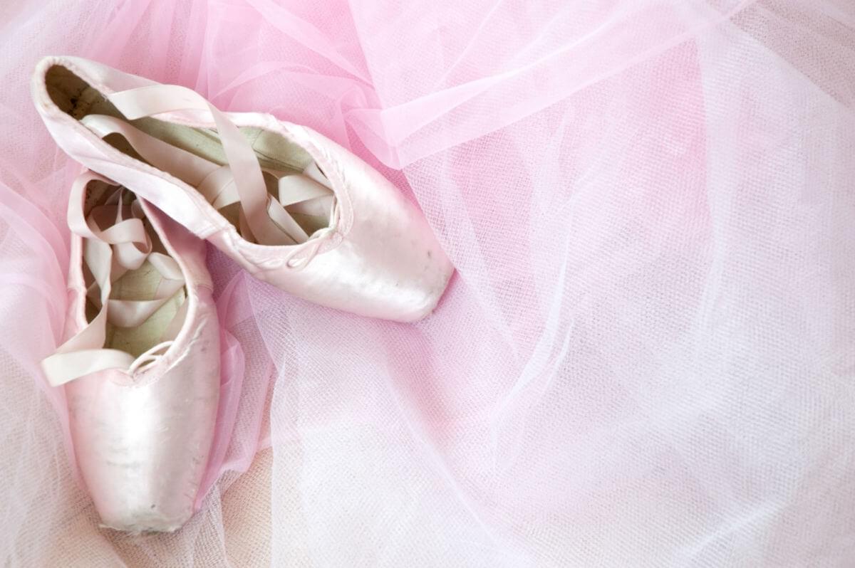
Image 2
Here are some design thoughts on the preferred ‘right side shoe’ image:
- It clearly illustrates the power of a sharply focused image for the upper-right corner.
- The image itself is intimate and draws the viewer into the site with a feeling of sensuality and grace.
- It does leave the left-bottom corner a little bit weak, especially if a contextual content image was placed to the right of the text, then the upper-right would be too dominant. A possible solution would be richer toned wood flooring.

Website photography should lend a human touch, but creating that warm and personal look is difficult when looking for ways to fill the ‘blind’ upper corner. A photographer that creates a composition with the center of attention (and actual focus) into the upper-right corner has made a highly unnatural site, one where the rest of the composition must be boring in order to draw attention.
With too much dominance in the upper corner, there’s a risk of distracting the viewers, and encouraging them to leave the site before they’re engaged.
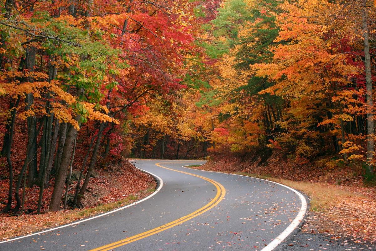
Example 2: The Autumn Forest Road
Our second example uses two broadly similar views of a scenic road twisting through an autumnal forest. Both images feature a road that travels off into the distance, but the first travels directly towards the upper-right corner, and the road reaches the end of the frame. The second road winds towards the center of the composition.
Let’s dissect the two:
Image 1
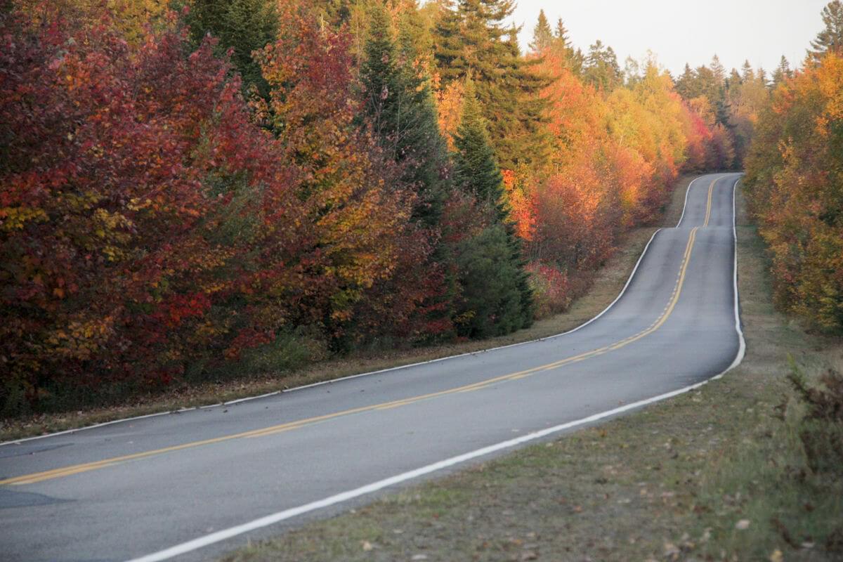
Image 2
- The image with the road extending to the right is ideal because it’s dynamic, and encourages the mind to explore and imagine possibilities.
- Both images would benefit from more forest on the sides of the images, as this would better fit web design usage.
- The image with the road leading down the middle of the image is not as dynamic, and if used with a centered block of copy and links, the road itself will become lost. When the first image is utilized, the viewer sees two connected sections of road.

Example 3: The Beach Scene
The final set of examples are beach scene images containing one with the waves and setting sun, and another with palm trees on the left side.
Image 1
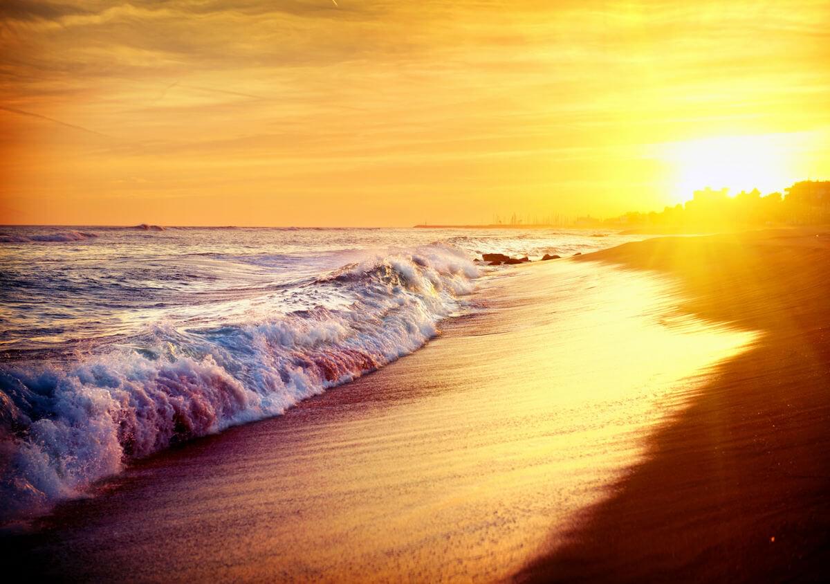
Image 2

- The image without trees has an eye-catching horizontal line of ocean that has an interesting sun featured on the right, with only sky on the left.
- The diagonal effect of the wave pulls the viewer’s attention and is dynamic and powerful.
- The detail of the wave helps balance the sun, giving the designer a lot to work with.
- Trimming more of the sky and including more water and shore would improve the image further.
- The sun should be up against the upper margin, which is against the photographer’s instinct.
- The image with the trees is a more typical scene, with dominant features to the left, and less interesting angles.
The Takeaway?
Ideally, images for a website background should have some visual interest in the upper-right corner and a vertical, narrowing band across the top of the screen.
There should be some visual interest down the right-hand side, which does run against the instincts of many photographers, but it’s a design style that works well for impactful sites.
All images: Dreamstime
Frequently Asked Questions (FAQs) about Web Layout Design
What is the significance of the top right corner in web layout design?
The top right corner of a web page is a crucial area in web layout design. It’s often the first place a user’s eye will land when they open a webpage. This area is typically used for important elements like navigation menus, search bars, or call-to-action buttons. It’s a strategic location to place key information or functionality that you want your users to notice or interact with immediately.
How can I make the most of the top right corner in my web design?
To maximize the use of the top right corner, consider what your users need most. This could be a search bar for easy navigation, a contact button for quick inquiries, or a shopping cart for e-commerce sites. Keep the design clean and simple to avoid overwhelming the user. Also, ensure that the elements in this area are responsive and function well on different devices.
What are some common mistakes to avoid in web layout design?
Common mistakes in web layout design include cluttering the page with too much information, using inconsistent styles and fonts, and neglecting mobile responsiveness. It’s also important to avoid placing crucial information or functionality in areas that users might overlook, such as the bottom of the page or the far right corner.
How does the top right corner affect user experience?
The top right corner significantly impacts user experience. It’s one of the first areas a user will see, so it sets the tone for their interaction with your site. If this area is cluttered, confusing, or non-functional, users may become frustrated and leave your site. Conversely, a well-designed top right corner can enhance usability and encourage users to engage more with your site.
Can I use the top right corner for branding?
Yes, the top right corner can be an effective location for branding elements like your company logo or tagline. However, it’s important to balance this with usability. Don’t sacrifice important functionality for the sake of branding. Remember, your website’s primary purpose is to serve your users, and a positive user experience can do more for your brand than a logo alone.
How can I test the effectiveness of my top right corner design?
You can use various methods to test your design, such as A/B testing, user testing, or heat mapping. These methods can provide valuable insights into how users interact with your site and which elements in the top right corner are most effective.
What is the role of color in the top right corner design?
Color plays a significant role in web design. It can draw attention, set the mood, and even influence user behavior. In the top right corner, use color strategically to highlight important elements and guide users’ eyes to this area.
How does the top right corner design affect SEO?
While the top right corner design doesn’t directly affect SEO, it can indirectly impact it. A well-designed, user-friendly site can lower bounce rates and increase time spent on the site, which can improve your SEO rankings.
What are some examples of effective top right corner designs?
Effective top right corner designs are clean, simple, and user-friendly. They typically include key elements like navigation menus, search bars, or call-to-action buttons. Some websites also use this area for branding or social media icons.
How can I learn more about web layout design?
There are many resources available to learn about web layout design, including online courses, blogs, and books. You can also learn by analyzing successful websites and noting what works well in their design.
 Michaela Freeman
Michaela Freeman is a multi-talented Czech creative professional. Her skills include digital art and design, writing, translations, concept development, project management and PR. She also assists others in unleashing their own creativity and serves as an educator in the field of animal-assisted therapy. Her art website is magnagarden.com.