

In 2014 Google published the Material Design specification, a visual language aiming to bring together solid design principles, a consistent user experience across different platforms and devices, and technological and scientific innovation.
July 2015 saw Google release Material Design Lite, a front-end library designed to make it easier to add the material design look and feel to a website.
In this article I’m focusing on the following fundamental principles and components of material design and how you can implement them using the Material Design Lite (MDL) library:
- Typography
- Color
- Layout
- Cards
Key Takeaways
- Material Design Lite (MDL) by Google is a front-end library that simplifies the implementation of Material Design aesthetics into web projects, making it easier to maintain a consistent user experience across various platforms.
- MDL can be incorporated into your project using Google’s CDN for CSS and JavaScript files, or by downloading and hosting the files yourself, with detailed setup instructions available for various environments including Bower and npm.
- The library offers a robust typography system using the Roboto and Noto fonts, supporting a wide range of scripts and providing predefined classes for applying consistent typographic scales.
- MDL provides a customizable color system, allowing developers to select a primary and an accent color from a predefined palette, enhancing the visual appeal while maintaining usability guidelines.
- Key MDL components such as layout, cards, and tabs are designed to be responsive and modular, leveraging Flexbox and BEM methodologies to facilitate a more structured and scalable CSS architecture.
The Demo Project
The demo project for this article is called Kaptain Kitty. It’s an HTML template aiming to illustrate how you can apply the material design concepts and MDL components I discuss in this article to a web page.
If you’d like to put Material Design Lite to its paces as you dive into the article, you’ll need your favorite code editor and a modern up-to-date browser.
You can view the demo project and its source code on CodePen:
See the Pen Demo Template Using Material Design Lite by SitePoint (@SitePoint) on CodePen.
Let’s begin.
Including Material Design Lite in Your Project
When it comes to including MDL in your project, you have the following options:
- Load the necessary CSS and JavaScript files using [Google’s CDN] (Content Delivery Network).
- Download the minified CSS and JavaScript files and host them on your server.
- Download and build the source code from the MDL project on GitHub.
- If you use Bower to manage your project, you can type the following command to install the MDL library files in the
bower_componentsfolder:bower install material-design-lite --save - If npm is your package manager of choice, run the following command to install the MDL files in the
node_modulesfolder:npm install material-design-lite --save
Google recommends using the CSS and JavaScript files hosted on their CDN. This is the method you’ll find in the demo page for this article.
First off, in the <head> section of your HTML document, include references to the MDL CSS file, Google’s Material Design icons, and the project’s stylesheet, where you’re going to add your own customizations:
<link rel="stylesheet"

      href="https://storage.googleapis.com/code.getmdl.io/1.0.6/material.indigo-pink.min.css">

<link rel="stylesheet"

      href="https://fonts.googleapis.com/icon?family=Material+Icons">

<link rel="stylesheet" href="css/styles.css">
Next, just before the closing </body> tag, add a reference to the MDL JavaScript file:
<script src="https://storage.googleapis.com/code.getmdl.io/1.0.6/material.min.js">

</script>
Typography in Material Design Lite
Material Design’s chosen typefaces for English and English-like languages (Latin, Greek, and Cyrillic characters) are Roboto and Noto.
Noto also supports dense scripts like Chinese, Japanese, and Korean, and tall scripts like Southeast Asian and Middle Eastern languages, e.g., Arabic, Hindi, etc.
To include the Roboto font files in your project, add the following <link> tag at the top of the <head> section of your HTML document:
<link rel="stylesheet"

      href="http://fonts.googleapis.com/css?family=Roboto:400,100,500,300italic,500italic,700italic,900,300">
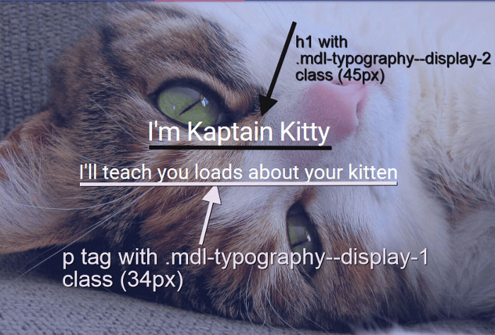
For Latin, Greek, and Cyrillic characters, the material design specification recommends a typographic scale of 12, 14, 16, 20, and 34. You can apply the material design typography principles using MDL by adding a set of specific classes to the markup.
For instance, adding .mdl-typography--display-2 to an <h1> tag and .mdl-typography--display-1 to a <p> tag, adds a font size value of 45px and 34px, respectively:
<h1 class="mdl-typography--display-2">Title</h1>

<p class="mdl-typography--display-1">

  Sub-title

</p>
MDL has a number of classes with typographic scale, accessibility, and readability principles baked in. This makes it easier to display beautiful text content that is pleasant to read irrespective of the device being used to access it.
For a complete list of typography classes, visit the MDL typography component page on GitHub.
Choosing a Color for your MDL Project
Take note of the MDL library stylesheet filename: material.indigo-pink.min.css. The name points to the Material Design color palette implemented in the stylesheet. The default color palette uses indigo as primary color and pink as accent color. But you’re not stuck with these. Below are material design’s recommendations on how to work out a custom color palette and how to implement it using MDL.
Material Design Color Principles
Material design loves combining bold and muted colors, shadows, and highlights:
Color should be unexpected and vibrant.
Google Material Design Spec
However, this doesn’t amount to splashing random colors on your web page. Quite the opposite.
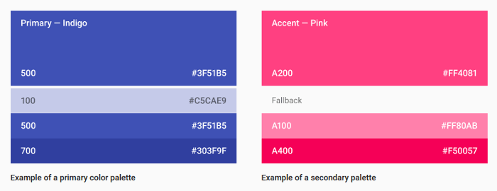
Material design offers a wide range of beautiful color palettes that work harmoniously together. To make it easier to pick colors, each color in a palette has a number label as well as the hexadecimal color value to identify it. Material design guidelines indicate the 500 colors as primary colors. The other colors are best used as accent colors.
When you work out a custom color selection for your website, material design recommends that you pick three hues from the primary palette and one accent color from the secondary palette. Here’s an example:
Limit the use of accent colors to links, your primary action button, and some components like switches and sliders. Avoid using accent colors for body text:

Also, the material design guidelines discourage using the accent colors in large areas of the page and in app bars. Especially important is not to use the same color for both the floating action button and the background:

Now that you have a solid understanding of material design color guidelines, it’s time to make an awesome color selection for your MDL project. Here’s how.
Customizing the Default Color Palette in Material Design Lite
You can switch from the default indigo-pink palette to your own custom palette in either of the following ways.
If you’re using Google’s CDN, like I’ve done in the demo for this article, follow these steps:
- Locate the URL to the MDL stylesheet file inside the
hrefattribute of the<link>tag in the<header>section of your HTML page - Replace indigo with your chosen primary color and pink with your favorite accent color.
For instance, let’s say the colors you select from the material design palettes are teal as primary and amber as accent. Here’s what the URL to the MDL stylesheet hosted on Google CDN looks like:
<link rel="stylesheet"

      href="https://storage.googleapis.com/code.getmdl.io/1.0.6/material.teal-amber.min.css">
You’re done!
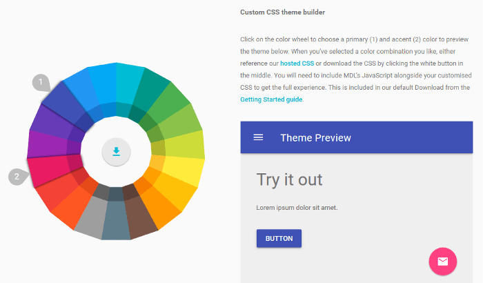
If you’d rather host the compiled and minified MDL files on your server, the MDL website has you covered. There you’ll find the Customize and Preview tool, which lets you select a primary and accent color palette from an interactive color wheel. You can then download the CSS for your chosen theme and plug it straight into your project:
The HTML demo for this article uses the default indigo-pink palette, but you’re free to experiment with different color selections using either of the methods outlined above.
MDL Layout Component
MDL offers a number of commonly-used web components, including layout, buttons, cards, switches, etc. Start building the structure of your HTML template using the layout component of Material Design Lite.
MDL encloses the entire layout inside a container element with the classes of .mdl-layout .mdl-js-layout.
Start by adding the following code snippet after the opening <body> tag of your HTML document:
<div class="mdl-layout mdl-js-layout">

  <!-- All your template markup goes here -->

</div>
MDL uses CSS flexbox for layout. The .mdl-layout element is a flex container with the flex-direction property set to column.
The layout component includes the following four sub-components:
- Navigation layouts
- Grid
- Tabs
- Footer
Using Tabs for Navigation
You can build your navigation by choosing from the following options:
- Transparent header
- Fixed drawer, no header
- Fixed header
- Fixed header and drawer
- Scrolling header
- Waterfall header – header that contracts on page scroll.
You’re free to look into the options above on the MDL navigation layouts section and experiment with each of them for your project.
As for the HTML demo that accompanies this article, I’ve opted for a tabbed navigation using the Tabs component. The beauty of tabs is that, although the content is sectioned out into mutually exclusive screens, all sections are physically placed on the same page. This means that when users click on a tabbed navigation link, they won’t need to wait for the server to load a new page in their browser. All the content is instantly available, thereby creating a pleasant experience for site visitors.
To quickly build a tabbed header layout, follow these steps:
Add two more classes to the layout container element you coded earlier – .mdl-layout--fixed-header and .mdl-layout--fixed-tabs:
<div class="mdl-layout

            mdl-js-layout mdl-layout--fixed-header

            mdl-layout--fixed-tabs">

</div>
Note how MDL organizes CSS using namespaced BEM classes. If you’re not familiar with BEM methodology, Working with BEM at Scale – Advice From Top Developers by Patrick Catanzariti offers a superb overview.
Next, code the <header> section as follows:
<header class="mdl-layout__header">

  <div class="mdl-layout__header-row">

    <!-- Title -->

    <span class="mdl-layout-title">Your Title</span>

  </div>

  <!-- Tabs -->

  <div class="mdl-layout__tab-bar mdl-js-ripple-effect">

    <a href="#fixed-tab-1" class="mdl-layout__tab is-active">Tab 1</a>

    <a href="#fixed-tab-2" class="mdl-layout__tab">Tab 2</a>

  </div>

</header>
Finally, you need to add the corresponding content panels:
<main class="mdl-layout__content">

  <!-- Panel 1 -->

  <section class="mdl-layout__tab-panel is-active" id="fixed-tab-1">

    <div class="page-content">

      <!-- Your content for panel 1 goes here -->

      content panel 1

    </div>

  </section>
  <!-- Panel 2 -->

  <section class="mdl-layout__tab-panel" id="fixed-tab-2">

    <div class="page-content">

      <!-- Your content for panel 2 goes here -->

        content panel 2

    </div>

  </section>

</main>
The panel with id="fixed-tab-1" has the .is-active class and will be displayed by default.
Placing Extra Content in the Drawer Component
The demo also uses a drawer section. A drawer is a side panel that you can hide and show with the click of a button. You can also choose to keep the drawer open and fixed so that its content always stays in full view.
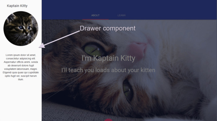
Drawers are great for adding widgets, sharing buttons, and extra navigation links to a web page without cluttering the design.
Using the code snippet you added earlier, just after the <header> section, write the code below to add a drawer component to your layout:
<div class="mdl-layout__drawer">

  <span class="mdl-layout-title">Your Title</span>

</div>
View these snippets in action or inspect the demo project’s source code for a full implementation of the tabbed navigation and drawer components.
The Material Design Lite Grid
Material Design Lite uses a 12-column grid for desktop screens, 8-column grid for tablets (up to 800px), and a 4-column grid for mobile screen sizes (up to 500px).
You enclose the grid columns inside a container element with a class of .mdl-grid:
<div class="mdl-grid">

  <!-- Grid columns go here -->

</div>
By default, the grid columns container element spans the entire width of the screen. If this is not what you want, it’s up to you to define its width in your stylesheet.
For instance, the demo project for this article implements both full-screen and centered boxed sections:

The layout is achieved by wrapping each section in a different .mdl-grid element and giving the boxed section an additional custom class with a CSS max-width value of 960px.
The HTML:
<div class="mdl-grid intro-section">

  <!-- boxed content here -->

</div>
And the CSS:
.intro-section {

  max-width: 960px;

}
Also, if you’d like to have no margins between grid columns, MDL has a handy class that you can add to the grid columns container element – .mdl-grid--no-spacing:
<div class="mdl-grid mdl-grid--no-spacing">

  <!-- content here -->

</div>
This will give you something like this:

Next, you build the columns inside the .mdl-grid element by adding a <div> element with the class of .mdl-cell. Here’s the code for a 3-column grid:
<div class="content-grid mdl-grid">

  <div class="mdl-cell">

    <!-- content here -->

  </div>

  <div class="mdl-cell">

    <!-- content here -->

  </div>

  <div class="mdl-cell">

    <!-- content here -->

  </div>

</div>
If you’d like to override the default column size, you need to add a .mdl-cell--{number}-col class with a number ranging from 1 to 12. Here’s the code for a 2-column grid:
<div class="mdl-grid">

  <div class="mdl-cell mdl-cell--6-col">

    <!-- content here -->

  </div>

  <div class="mdl-cell mdl-cell--6-col">

    <!-- content here -->

  </div>

</div>
Check out the live demo on CodePen.
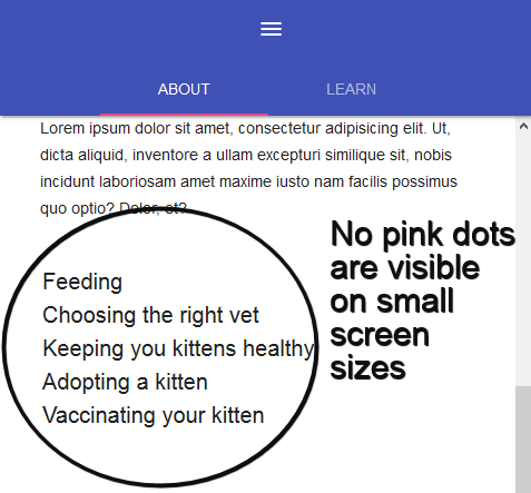
If your design requires it, MDL offers handy utility classes to hide columns at specific screen sizes:
.mdl-cell--hide-desktophides the column on desktop screen sizes (larger than 840px).mdl-cell--hide-tablethides the column on tablet-screen sizes (larger than 480px).mdl-cell--hide-phonehides the column on mobile screen sizes (less than and up to 480px)
To see this in action, view the welcome section of the demo project at different screen sizes. You’ll soon notice that the decorative pink circles next to the list items are not visible on small screens:

The Material Design Lite Cards component
The card UI pattern has been gaining popularity for quite some time now, especially thanks to websites like Pinterest.
Here’s how material design defines the card component:
A card is a sheet of material that serves as an entry point to more detailed information. A card could contain a photo, text, and a link about a single subject.
Material design spec
You can add different types of content to a single card, but make sure it’s all related to a core topic. Also, avoid placing too much information or too many links and buttons inside a card. Rather, point users to a dedicated page where you’ve laid out more detailed information about the topic.
Here’s how you can add a simple card to your page using the MDL card component:
<div class="mdl-card mdl-shadow--2dp">

  <div class="mdl-card__title">

    <h2 class="mdl-card__title-text">Card title</h2>

  </div>

  <div class="mdl-card__media">

    <img src="card-img.jpg" alt="">

  </div>

  <div class="mdl-card__supporting-text">

    Lorem ipsum dolor sit amet, consectetur adipiscing elit.

    Aenan convallis.

  </div>

  <div class="mdl-card__actions mdl-card--border">

    <a class="mdl-button mdl-button--colored mdl-js-button mdl-js-ripple-effect">

      Read more

    </a>

  </div>

</div>
You wrap the card content inside a container element with the class of .mdl-card. The .mdl-shadow--{number}dp class lets you take control of the drop shadow’s depth: adding 3, 4, 6, 8, or 16 to this class will result in a deeper drop shadow.
Next, you add a container for the following card sections:
- Card title, using the
.mdl-card__titleclass - Card media, using the
.mdl-card__mediaclass - Card text content using the
.mdl-card__supporting-textclass - Card actions using the
.mdl-card__actionsclass, if your card includes an action button or similar elements.
Finally, you flesh out this structure with the appropriate content making sure your title tag has a class of .mdl-card__title-text.
Here’s the live snippet on CodePen:
See the Pen Material Design Lite Cards by SitePoint (@SitePoint) on CodePen.
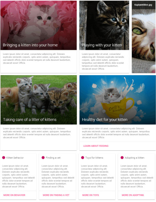
You can also turn a grid cell into a card component by adding the appropriate .mdl-card class to an element with the .mdl-cell class:
<div class="mdl-grid">

  <div class="mdl-cell mdl-card mdl-shadow--2dp">

     <!-- Card content here -->

  </div>

</div>
You can find this approach in the accompanying demo project. This is a great way to achieve a responsive tiled layout:
Conclusion
This article has been all about exploring the Material Design Lite library by Google and putting it into practice in a real HTML web template.
MDL is not a comprehensive framework like, for example, Bootstrap. It doesn’t have you covered for all the components and styles your application most likely needs. Therefore, expect to code some features yourself.
However, the library is still evolving and it might surprise us with some new stuff in future releases. Also, the web offers a rich material design ecosystem of resources for designers and developers, most of them free.
You can use the HTML template for this article, together with the templates on the MDL website, as one more resource to start experimenting with MDL and building your own awesome material design project.
Check out our guide to the best Material UI themes.
Frequently Asked Questions (FAQs) about Material Design Lite by Google
What is Material Design Lite (MDL) and how does it differ from Material Design?
Material Design Lite (MDL) is a design philosophy developed by Google that aims to provide a unified user experience across all devices and platforms. It is a lighter version of Material Design, a comprehensive design system that combines theory, resources, and tools for crafting digital experiences. While Material Design is a complete design language that includes a vast array of tools, guidelines, and components, MDL is a subset of this system, offering a simpler, more lightweight framework that’s easier to implement. It’s particularly useful for developers who want to create a modern, sleek user interface without the complexity of the full Material Design system.
How can I get started with Material Design Lite?
To get started with Material Design Lite, you need to include the MDL CSS and JavaScript files in your project. These files can be downloaded from the official MDL website or included directly from a Content Delivery Network (CDN). Once you’ve included these files, you can start using MDL components in your HTML code. The MDL website provides comprehensive documentation and examples to help you understand how to use each component.
What are the key components of Material Design Lite?
Material Design Lite includes a variety of components that you can use to build your user interface. These include buttons, checkboxes, text fields, sliders, and more. Each component is designed to provide a consistent, modern look and feel, and they can be customized to fit your specific needs. The MDL website provides detailed documentation for each component, including code examples and usage guidelines.
Can I use Material Design Lite for commercial projects?
Yes, Material Design Lite is open-source and free to use for both personal and commercial projects. It’s licensed under the Apache License 2.0, which allows you to freely use, modify, and distribute the software, provided that you comply with the terms of the license.
How does Material Design Lite compare to other design frameworks?
Material Design Lite is a lightweight, easy-to-use framework that provides a modern, sleek look and feel. It’s designed to be easy to implement, with a simple, straightforward API and comprehensive documentation. Compared to other design frameworks, MDL is less comprehensive but also less complex, making it a good choice for developers who want a simple, effective design system without the overhead of a full-fledged framework.
Is Material Design Lite compatible with all browsers?
Material Design Lite is designed to be compatible with all modern browsers, including Chrome, Firefox, Safari, and Edge. However, it may not work as expected in older browsers or those that do not fully support modern web standards.
Can I customize Material Design Lite to fit my brand?
Yes, Material Design Lite is highly customizable. You can change the colors, fonts, and other design elements to match your brand’s visual identity. The MDL website provides detailed guidelines on how to customize the framework to fit your needs.
Does Material Design Lite support responsive design?
Yes, Material Design Lite supports responsive design. It includes a responsive grid system that allows you to create layouts that adapt to different screen sizes and orientations. This makes it easy to create websites and apps that look great on both desktop and mobile devices.
How can I contribute to Material Design Lite?
As an open-source project, Material Design Lite welcomes contributions from the community. You can contribute by reporting bugs, suggesting new features, or submitting code changes. All contributions should follow the project’s contribution guidelines, which are available on the MDL website.
Where can I find more resources to learn about Material Design Lite?
The official MDL website is the best place to start. It provides comprehensive documentation, code examples, and usage guidelines for all MDL components. Additionally, there are many online tutorials, articles, and videos that can help you learn more about MDL and how to use it effectively in your projects.

