
Whenever I sign up for a new web app, I immediately download the companion mobile app as well (or vice versa). After all, I use my laptop and iPhone almost interchangeably, often starting a task on one device and then finishing it in another. I bet you do the same.
On the creator side, having desktop, mobile, and potentially tablet versions of your app presents a challenge to new users: How do you create an onboarding experience that spans across devices?
The same flow that works perfectly on a big computer monitor, qa laptop, or even an iPad may be far too complex for a small phone screen. Plus, while auto-fill has made completing forms fairly easy on computers, users still need to manually enter text on their phones. And to make things even trickier, navigating with a keyboard and mouse or trackpad is completely different than with touch gestures.
Nonetheless, designing a cohesive onboarding process that translates to different devices isn’t impossible. Let’s look at two examples-Expensify and Mint-to see how they’ve done it successfully.
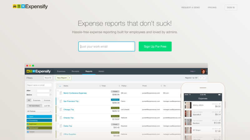
Expensify
Expensify’s slogan is “Expense reports that don’t suck,” which tells me right away the product will be easy to use (or should be, anyway).
Desktop
After I click “sign-up,” Expensify asks for my work email. I enter it and immediately, I zoom to my newly created dashboard.
According to my timer, this task took three seconds. That’s pretty darn impressive.
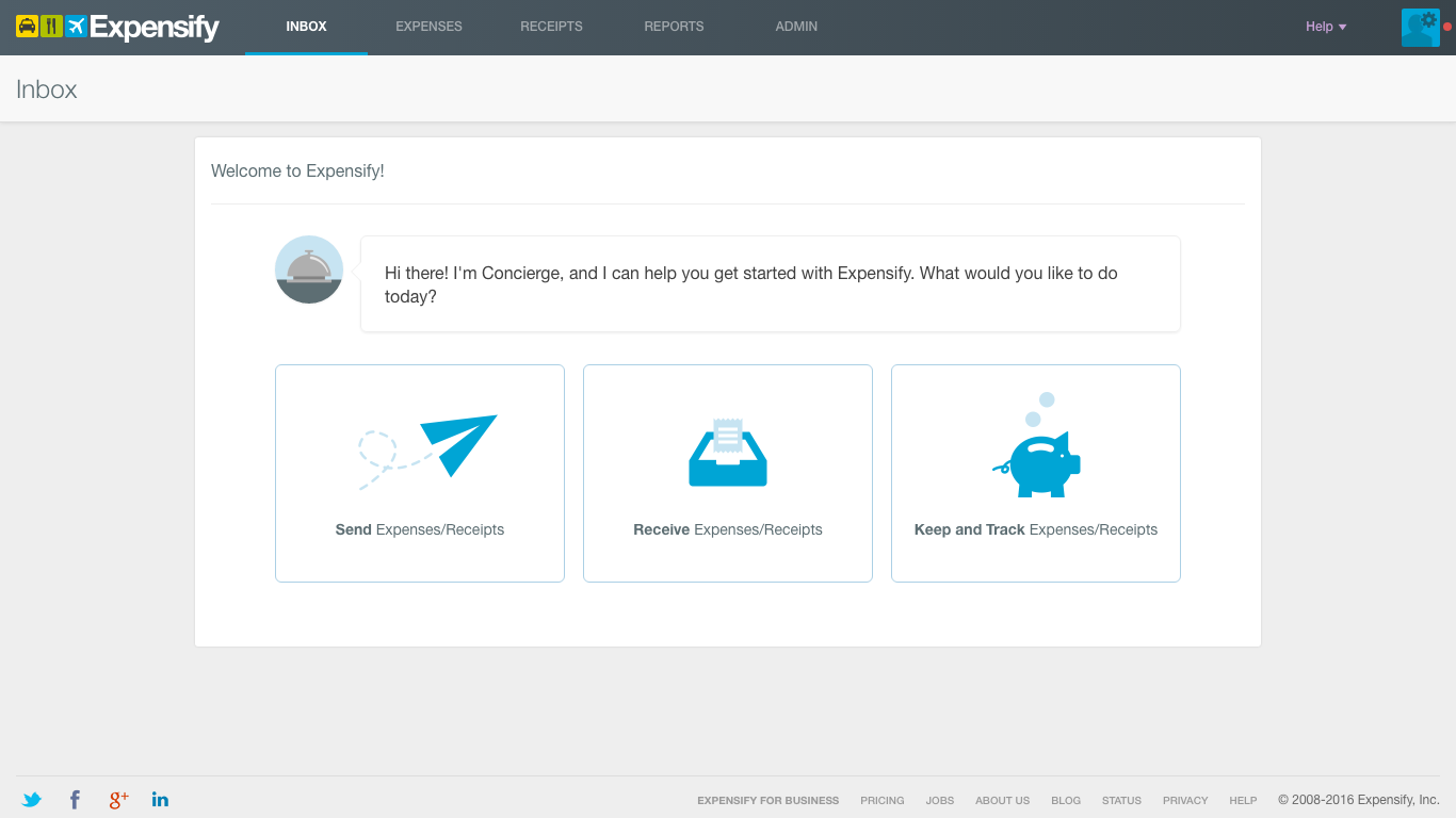
I’m also impressed by the “Concierge” onboarding screen. True concierge onboarding involves a real person guiding you through the steps, which is incredibly helpful for the user but time and labor intensive for the company. Expensify’s automated version is far more scaleable.
My one nitpick? It would feel a little friendlier to be greeted by a human persona, like “Carol the Concierge,” than a talking bell. Incorporating a distinct personality into your app can make your app more memorable and engaging.
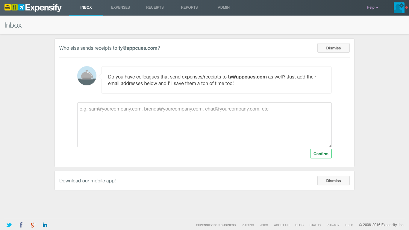
The app asks me who I’d like to send my expense reports to. Requesting an email address before I’ve even uploaded my receipt is smart; the faster I create a network in Expensify, the more likely I am to keep using it.
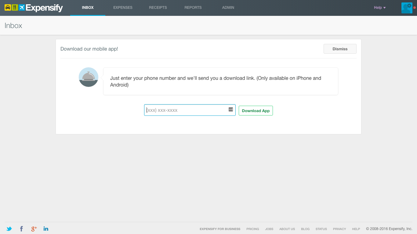
Next, I’m prompted to download the mobile app. I like how quick and easy the download is-I can text myself a link rather than having to find the app myself in the App or Google Play Store – but this modal puts yet another step in between clicking “Send Expenses/Receipts” and actually uploading a receipt.
A better flow probably would have been:
Click “Send Expenses/Receipts” → Choose recipients → Upload and send receipt → Receive link to download mobile app
With this modified flow, you get the user to download the app while she’s still riding high from the “Aha!” moment.
Once I’m done, Expensify shoots me to my dashboard. The cheery, congratulatory message makes me smile. There’s apparently no tour or walk-through guide; in fact, there’s not even an FAQ, as I discover when I click “Help.” However, I don’t feel like I need more assistance: The navigation bar is simple and intuitive, and I now know how to send expenses. Looks like Expensify’s desktop app has fulfilled its promise to make the expense process suck less. But will the mobile app do the same? Let’s find out.
Mobile
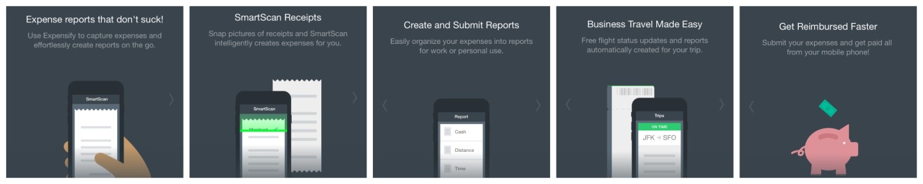
Interestingly, Expensify’s mobile onboarding flow starts with a series of screens explaining the value of the app. This approach is known as ‘benefits-oriented onboarding’ but there are two other alternatives.
‘Function-oriented onboarding’ teaches you how to use the product. ‘Progressive onboarding’ shows you relevant info as you navigate the app.Why exclude this run-down of the benefits from Expensify’s web onboarding? I’m guessing more users first download the mobile app, then use the site, rather than the other way around.
Personally, I’m not a huge fan of tap-through carousels. I end up repeatedly jabbing my screen so I can get to the good stuff (i.e. the app itself) as quickly as possible. UX research suggests I’m not the only one.
Once past the screens, I’m into my dashboard. Everything looks and acts familiar, like I’ve already used the app before – probably because the interface looks like a cross between Swarm and Snapchat. This is a good reminder that if you want to lessen your user’s learning curve, use familiar icons, interactions, and design patterns.
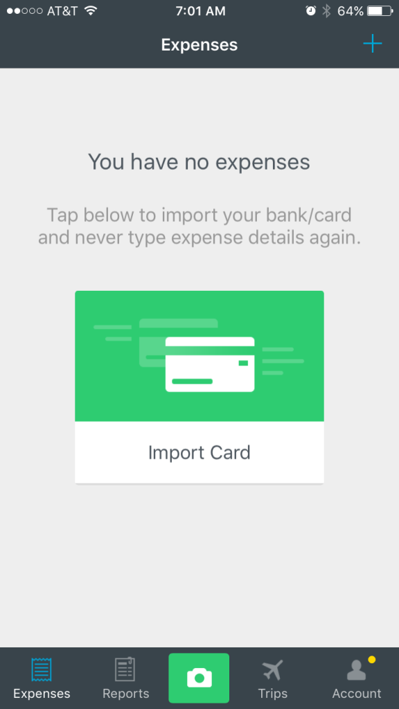
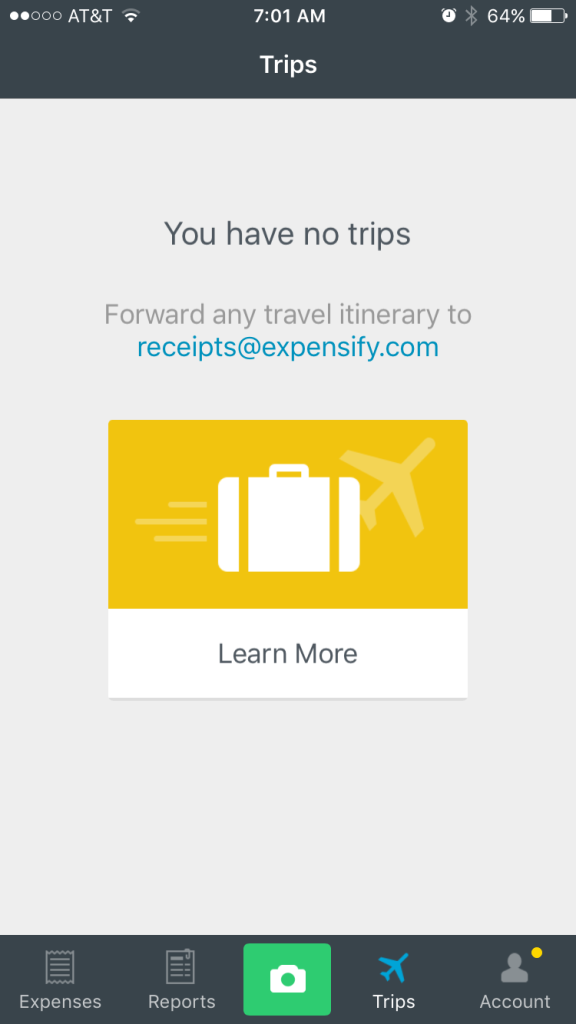
Like with the desktop app, there isn’t a traditional onboarding process. Since the app doesn’t have any of my info yet, each screen prompts me to take a different action (connect my bank account, create an expense report, etc.) And of course, there’s the big green camera smack dab in the middle of the menu, showing me I can take a picture of my receipt at any time.
As soon as I take any action within the app, I’ll have my first “Aha!” moment. Expensify deserves major props for delivering value so quickly and seamlessly – and without giving me traditional instructions.
Grade: A-
Expensify’s desktop and mobile onboarding processes pair well together. Both propel me toward uploading and sending my first expense, yet they’re both individually suited for their mediums. I’d boost its grade to an A if Expensify got rid of its mobile screen carousel; I don’t think you need it to communicate the app’s value when that comes across so clearly simply from using it.
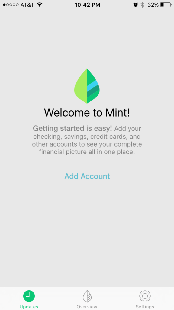
Mint
Mint is billed as a comprehensive personal finance app, giving you a single digital place to set budgets, pay your bills, track your spending, check your credit score, and even get financial advice.
Desktop
As soon as I see double entry fields for both my email and my password, I’m glad I didn’t first attempt a mobile sign-up. Since using Mint will require sensitive financial information on my part, having double email and double passwords forms feels more justified than if I was creating an account in a different app, but it’s still a little tedious.
Notice the sidebar telling me why I’ll love Mint. If you’ve got a long sign-up process, adding a visual reminder of your app’s benefits will motivate your users to keep going.

Now I have to enter my location. Hmm, is this really such crucial info it couldn’t wait till my account had been created?
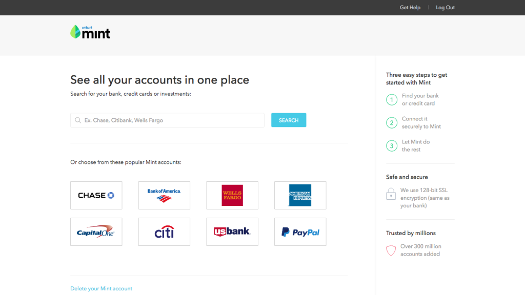
Next, I connect my bank account. I’m not crazy about the banner copy: “See all your accounts in one place.” After all, I only have one account: I signed up to use Mint’s budgeting features.
Choosing a more universal value proposition, like “See where your money goes,” or “Get control over your spending,” might be more effective.
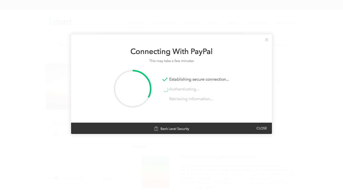
Check out the nifty loading screen. In all likelihood, the milestones on this screen are artificial, but I don’t care – the time goes faster when you give users mini-updates on what’s happening while they wait.
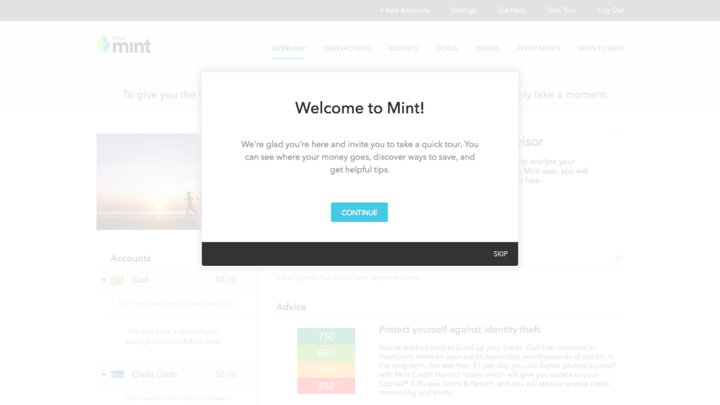
A modal pops up inviting me to take a tour. The good news: The tour lets you jump to specific features, so if you’re interested in, say, setting a budget, you could click “Tell me about: Budget.” This option showcases Mint’s wide range of features while letting the user take the metaphorical wheel.
Even better, each tip comes with an action-so I can immediately derive value from the feature. For example, in the section of tour explaining how goals work, there’s a link to set my first goal.
The bad news: The tour is really long. I choose to complete the entire thing, which means I read nine boxes of text. I’m a little tired and overwhelmed by the end.
If, like Mint, you’ve got a pretty comprehensive product, consider limiting your tour to your four or five core features and explaining the others via lifecycle emails.
Mobile
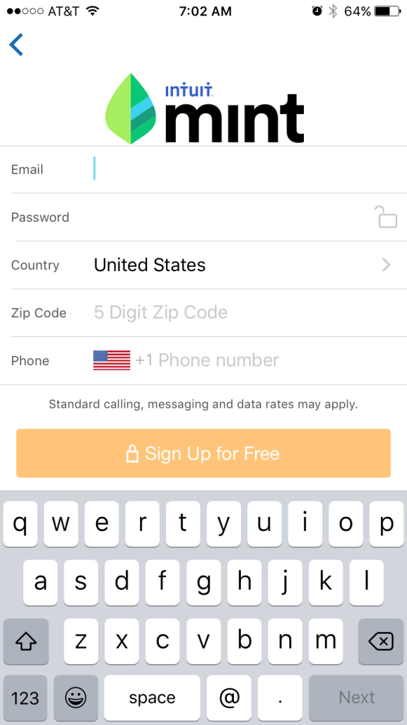
I’m curious to see how Mint will adapt its rather intense onboarding flow for mobile. I download the app and create a new account using a different email.
When the app asks me to enter my email and password twice-not to mention my location and zip code-I’m a little disgruntled. Typing so much on a small keyboard isn’t fun; in addition, I’m filling out a lot of forms for a single screen.
To avoid this very issue, many apps will string out their contents or form fields over multiple screens, rather than cramming everything into one or two screens.
Mint now prompts me to connect my bank account. This flow is mirroring the desktop flow to the T.
Even the loading updates (“Establishing secure connection”, “Downloading transactions,” etc.) are the same.
Yet when the app finishes connecting to my bank and I land in the dashboard, there’s no tour.
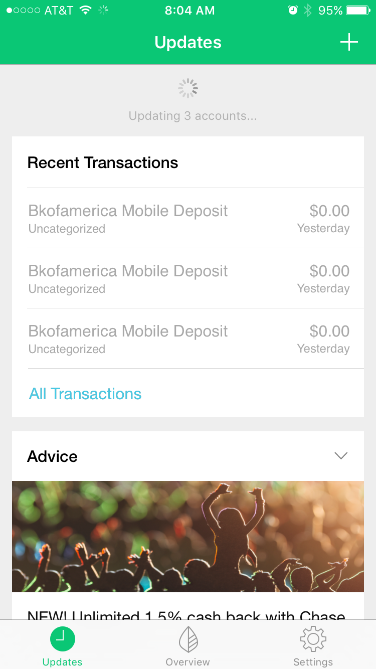
I poke around a bit to see if any tooltips or modals will show up, but apparently, the onboarding process is over.
While this could be disconcerting, I actually don’t mind. Mint’s mobile app is extremely easy to navigate, thanks to the well-chosen icons and straightforward copy. I instantly understand how to use the main features (managing my latest transactions and monitoring my overall spending). And with these within my grasp, I can take my time exploring the secondary features (such as getting advice and checking my credit score) on my own time.
Grade: B+
Mint’s initial sign-up forms are a little too ambitious-I wish the app chunked out the content so the process felt more manageable.
Furthermore, the nine-tip tour for the desktop version made my head spin. But Mint gains a lot of lost ground with its mobile onboarding flow. After the laborious sign-up, figuring out how the app works is easy and pleasurable, even though there’s virtually no more onboarding.
What do you think are the biggest challenges of designing onboarding flows for both mobile and web?
Frequently Asked Questions (FAQs) on Multi-Device Onboarding
What is multi-device onboarding and why is it important?
Multi-device onboarding is the process of introducing a new user to a product or service across multiple devices, such as smartphones, tablets, and desktop computers. It’s crucial because it ensures a seamless user experience, regardless of the device used. It also helps to increase user engagement, retention, and ultimately, the success of the product or service.
How does multi-device onboarding differ from single-device onboarding?
Unlike single-device onboarding, which focuses on a single platform, multi-device onboarding aims to provide a consistent and seamless user experience across various devices. This approach takes into account the different user interfaces and functionalities of each device, ensuring that the onboarding process is effective and user-friendly on all platforms.
What are some best practices for multi-device onboarding?
Best practices for multi-device onboarding include creating a consistent user experience across all devices, personalizing the onboarding process, providing clear and concise instructions, and regularly testing and updating the onboarding process to ensure it remains effective and relevant.
How can I measure the success of my multi-device onboarding process?
The success of a multi-device onboarding process can be measured through various metrics, such as user engagement, retention rates, and user feedback. These metrics can provide valuable insights into the effectiveness of the onboarding process and highlight areas for improvement.
What are some common challenges in multi-device onboarding and how can they be addressed?
Some common challenges in multi-device onboarding include ensuring consistency across different devices, addressing varying user preferences, and managing technical issues. These challenges can be addressed by focusing on user-centric design, regularly testing the onboarding process, and seeking user feedback to make necessary improvements.
How can I ensure a seamless user experience in multi-device onboarding?
To ensure a seamless user experience in multi-device onboarding, it’s important to focus on user-centric design, provide clear and concise instructions, and ensure consistency across all devices. Regular testing and user feedback can also help identify and address any issues or areas for improvement.
What role does personalization play in multi-device onboarding?
Personalization plays a crucial role in multi-device onboarding. By tailoring the onboarding process to the individual user’s needs and preferences, you can enhance user engagement, improve user satisfaction, and increase the likelihood of user retention.
How can I use multi-device onboarding to increase user retention?
Multi-device onboarding can increase user retention by providing a seamless and engaging user experience across all devices. By ensuring that the onboarding process is user-friendly, informative, and personalized, you can increase the likelihood that users will continue to use your product or service.
What are some examples of successful multi-device onboarding?
Examples of successful multi-device onboarding include Mint and Expensify. These companies have effectively used multi-device onboarding to provide a seamless user experience, increase user engagement, and improve user retention.
How can I improve my current multi-device onboarding process?
To improve your current multi-device onboarding process, consider seeking user feedback, regularly testing the onboarding process, and focusing on user-centric design. Additionally, personalizing the onboarding process and ensuring consistency across all devices can also enhance the user experience and effectiveness of the onboarding process.
 Aja Frost
Aja Frost is a writer, tech/design geek, and podcast addict. Check out her site or say hi on Twitter.