When you hear the word infographic, you more than likely think about the trend that’s emerged in recent years to present information visually on websites.
These vary in the quality of the research that’s gone into them and as such, the information they contain. They also vary wildly in how they look and are designed with many marketers and designers consistently coming up with new ideas for making things that little bit more interesting.
The online business community loves a juicy infographic and they tend to do really well on social media — especially G+.
However, infographics are not a recent invention – we’ve been using visual learning aids for many, many years now.
Maps, for instance, go back to the dawn of civilization, and can be seen as the original infographic — a way of synthesizing complex geographical information into a more understandable format.
With this in mind, let’s have a look today at some of the most influential infographics of all time, in no particular order, and what we’ve learned from them.
#1: Harry Beck’s London Tube Map 1931
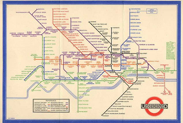
When you look at the image above it will come as no particular surprise to learn that Harry Beck was an electrical draftsman whose job it was to create drawings of electrical circuits. He didn’t of course have the fancy devices that we do now to help him however, and it was all undertaken manually, with him producing hand drawn sketches.
Beck lived in the city and worked at London Underground when he began the map as an engineering draughtsman, designing the map in his spare time and as an uncommissioned project.
The reception to it wasn’t exactly warm in the first instance but in 1933, the London Underground gave in and introduced the map in a small pamphlet. This ran to 700,000 copies and the map proved so popular that another print run had to be done the following month.
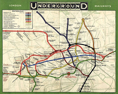
Previous incarnations of a Tube map were completely different and relied more on the surrounding streets than the actual tube network itself, as shown below.
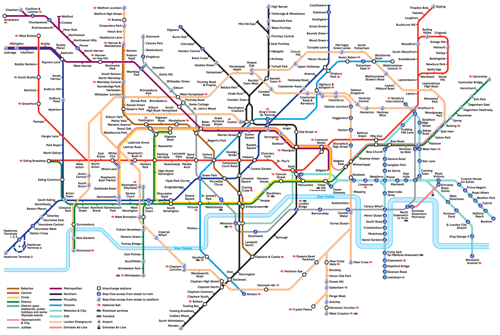
The Tube Map shows how rail lines link together with other lines underground using a system of color coding. This meant that visitors to London didn’t have to rely on any local knowledge. The original map only contained 8 lines where now we’d see 14 as the transport system has grown and evolved.
The map is important in design terms for a few reasons.
Firstly, because it broke the mold in terms of how the information was presented. It was and remains highly visual and logical and offered a simple solution to a thorny problem.
By their nature transport maps need to be easy to refer to and make sense of quickly as well as being portable. The color coding system meant that the need for a complex and confusing key was done away with and it’s worked so well that it’s still found in all of the city’s tube terminals today.
It’s not particularly easy getting around London, but this map does help to make sense of it (to some extent at least, my own sense of direction is so poor that it confused the heck out of me on my last visit to London, but no doubt it would have been worse without it.)
The best thing about the Tube Map really is in innovative thinking more than anything else. Beck used his experience in creating drawings of electrical circuits to come up with something that others trained in a design discipline might not have.
What can we learn from this as designers ourselves though? Simple. Never be afraid to think about creating a design from all angles, be creative and be innovative as you never know where it might lead.
Beck continued his work on the map until his death in 1964 and despite its success, certainly didn’t make his fortune (although it’s safe to say that he achieved a certain amount of fame) from it. However, his idea is now used extensively around the world’s transport and other systems.
#2: John Snow’s Cholera Map
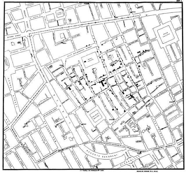
John Snow in Game of Thrones may very well know nothing but the British physician of the same name knew quite a lot. Snow was, according to our friend Wikipedia, ” one of the fathers of modern epidemiology” as well as being a forerunner in the adoption of medical hygiene practices and anaesthesia. However, he’s best known for his creation of the cholera map in 1854 that ultimately helped to improve health around the world.
In the 19th Century, it was commonly believed that it was ‘miasma’ or ‘bad air’ that caused such diseases such as cholera and typhoid. Snow was a sceptic of this idea and believed that such diseases were instead waterborne.
When Snow painstakingly mapped out the all cholera deaths in London it become clear that many of the cases were clustered around a single water pump in what was then Broad Street.
His evidence was entirely circumstantial as at that time it still wasn’t understood how germs spread. Despite examining the contaminated water under a microscope, he was unable to prove it this way.
Some of the cases were however not in the Broad street area, but Snow proved that they were affected by the pump nonetheless.
According to The Guardian, Snow wrote that:
In some of the instances, where the deaths are scattered a little further from the rest on the map, the malady was probably contracted at a nearer point to the pump.
Some questioned how a 59-year-old woman victim with no connection to the Broad street area might have contracted the disease.
Snow takes up the story:
I was informed by this lady’s son that she had not been in the neighbourhood of Broad Street for many months. A cart went from Broad Street to West End every day and it was the custom to take out a large bottle of the water from the pump in Broad Street, as she preferred it. The water was taken on Thursday 31st August., and she drank of it in the evening, and also on Friday. She was seized with cholera on the evening of the latter day, and died on Saturday.
However not all Broad Street locals were doomed. Brewery workers in the area were noticeably spared. As they received beer as part payment, the workers drank very little water and reported no cholera cases.
Further evidence included buildings in the area which had their own water supply whose inhabitants remained unaffected, including a nearby workhouse. These were institutions in the UK which offered lodgings in exchange for employment for the poor. And that’s the kindest of descriptions, so these were places where you might expect disease to be relatively rampant compared to private residences. This wasn’t the case though.
Eventually Snow’s evidence — and the way in which he presented it — won out. It was later concluded that the Broad Street water had become contaminated by a baby’s diaper.
Snow’s map is important as it lent new ideas to the way that disease spreads and also how data can be effectively visualized. This wasn’t just important to the UK of course, it helped shape how disease is viewed and treated around the globe.
#3: Hans Rosling’s Gapminder
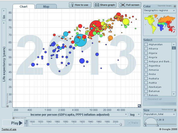
Swedish scientist Hans Rosling shot to fame in 2007 following a TED talk which allowed his to share his data visualizations with the world. The original visualization that he showed at the talk (above) shows the relationship between life expectancy and income.
Rosling has been working with data for more than 30 years and since the fateful day of his talk has created further visualizations which include the following:
- Child health
- Poverty
- Health
- Climate
- Economy
- Education
- Global trends
- HIV
Rosling is a professor of health at the Karolinska Institute in Sweden and according to TED:
What sets Rosling apart isn’t just his apt observations of broad social and economic trends, but the stunning way he presents them. Guaranteed: You’ve never seen data presented like this. By any logic, a presentation that tracks global health and poverty trends should be, in a word: boring. But in Rosling’s hands, data sings. Trends come to life. And the big picture — usually hazy at best — snaps into sharp focus.
Currently, Rosling is working on dispelling common myths concerning the gap between the “so-called developing world” and the West. He aims to show that the perceived gap is no longer as large as it’s still thought to be and that the developing world is on the same health and prosperity trajectory as the West. He developed his own visualization software, which was purchased by Google in 2007 following his TED talk where he first met the search giant’s representatives.
He has also worked as a physician, spending a lot of time in Africa where he tracked a rare disease, and published a book on global health. Rosling’s data visualizations are important as they allow us to easily see a graphical representation of many of the world’s most important issues and learn from them. Many of us would agree that there’s a link between poverty and income, but that’s not the same as having the truth mapped out in front of you for you to see.
You can access the full map at the Gapminder website, as well as browse further maps on a range of issues.
#4: Florence Nightingale – War Mortality
Florence Nightingale is a famous nurse who amongst other things, travelled to Turkey during the Crimean War to help care for wounded British troops who were shipped across the Black Sea. She was one of 38 voluntary nurses who attended the medical stations which were insufficient for caring for injured soldiers thanks to a lack of sanitary conditions and medical supplies.
The Times Newspaper described her at the time as the following:
She is a ‘ministering angel’ without any exaggeration in these hospitals, and as her slender form glides quietly along each corridor, every poor fellow’s face softens with gratitude at the sight of her. When all the medical officers have retired for the night and silence and darkness have settled down upon those miles of prostrate sick, she may be observed alone, with a little lamp in her hand, making her solitary rounds.
Following this she became commonly known as ‘The Lady with the Lamp’ but these were not her most important deeds. Nightingale kept excellent records and used these to document the many cases of disease in the hospitals. And disease really was rife in many forms, especially with concern to dysentery, cholera and typhoid. She improved many of the conditions in the army hospitals and this led to a dramatic reduction in death rates.
In 1859, Nightingale published a paper, A contribution to the sanitary history of the British Army during the late war with Russia which focused on data and charts, the most famous (and documented) of which is shown above.
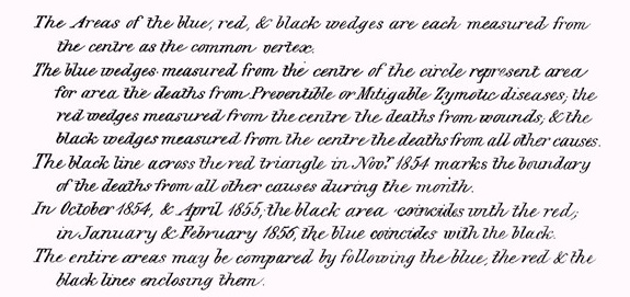
The chart gave data for the army’s stay in the East, month-by-month, and the totals for three causes of death. These were, in her opinion, deaths that could have been prevented by providing better conditions for patients. In other charts she also shows how deaths were reduced by making conditions more acceptable by the end of the Crimean War.
The lesson to be learned from this was of course that people were dying when they needn’t be and without the data to prove it, it’s possible that many, many more lives would have been lost than were.
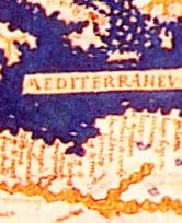
#5: Henricus Martellus World Map (1490)
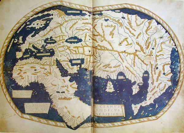
It’s thought that this is the map , or one very much like it, was used by Columbus to persuade Ferdinand of Aragon and Isabella of Castile to offer their support to him on his adventures. Columbus didn’t however create the map, rather it was the work of the German cartographer (who the map is named for) who was living in Florence, Italy at the time.
However, it’s thought that this map was derived from one created by Bartholomew Columbus in 1485. What makes this one special is the idea that Columbus used it to convince his sponsors that Europe was not in fact that far across the water from China.
It’s also the first map to record the rounding of the Cape of Good Hope which further proved that there was no land link to Asia in the south. This in turn meant that Europeans could reach the East Indies by sea without having to travel through Muslim territory.
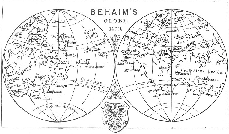
Martellus created a number of maps and whilst little is known about him, they’re thought to be hugely influential in a number of ways – that mentioned above and that the map above inspired Martin Behaim to make his famous globe in 1492. At the time of the map’s creation, the East hadn’t been accessed by the West and so Columbus would have been keen to be the first to conquer it and gain access to the riches of the area.
Humans have been penning maps for thousands of years in one way or another, but this was a highly influential map with regards to world discovery.
Influential imagery
It was difficult to pick out some of the most important graphical representations that have occurred throughout history so I do hope that I’ve done it justice. Others that equally deserved inclusion were the London Poverty Map by Charles Booth and of course, Google Earth because for our time, it’s at least as important as some of the others.
What’s important is that it demonstrate how making information visual can break down barriers and make for a better understanding of often complex subjects.
From health benefits, to travel systems, to world poverty and health, there’s a lot that has been learnt in the past from infographics just as there’s still a lot we can learn in the present.
Now that we also have the power of big data, who knows how far visualizing it may take us?
Frequently Asked Questions (FAQs) about Infographics that Changed the World
What is the significance of the London Tube Map?
The London Tube Map, designed by Harry Beck, is a significant infographic because it revolutionized the way people perceive and navigate public transportation systems. Beck’s design was not geographically accurate, but it was simple, clear, and easy to understand. It represented the complex network of London’s underground railway system in a way that was accessible to everyone. This design has been replicated in many cities around the world, demonstrating its universal appeal and effectiveness.
How did the cholera map by John Snow impact public health?
John Snow’s cholera map is a landmark in the field of public health. By plotting the locations of cholera cases in London, Snow was able to identify the source of the outbreak – a contaminated water pump. This led to a fundamental shift in understanding disease transmission, highlighting the importance of sanitation and clean water. It also marked the beginning of epidemiology, the study of how diseases spread.
What is the story behind the map that changed the world by William Smith?
William Smith’s geological map is often referred to as the map that changed the world. It was the first map to depict the geological layers of the earth’s crust, providing crucial information for the mining industry and paving the way for the study of geology. Despite facing financial difficulties and lack of recognition during his lifetime, Smith’s work has had a lasting impact on our understanding of the earth.
How have infographics evolved over time?
Infographics have evolved significantly over time, from simple hand-drawn maps to complex digital visualizations. The advent of technology has allowed for more intricate designs and interactive elements, making infographics a powerful tool for communication in the digital age. Despite these advancements, the core principles of clarity, simplicity, and visual appeal remain the same.
Why are infographics important in communication?
Infographics are important in communication because they present information in a visually engaging and easily digestible format. They can simplify complex data, making it more accessible to a wider audience. Infographics can also enhance memory retention, as people generally remember visual information better than text. They are a versatile tool that can be used in various fields, from education to marketing.
How can I create effective infographics?
Creating effective infographics requires a clear understanding of your audience and the message you want to convey. Start by gathering and organizing your data. Then, choose a design that best represents your information. Use colors, shapes, and typography to enhance readability and visual appeal. Finally, keep it simple and avoid cluttering your infographic with too much information.
What are some examples of modern infographics?
Modern infographics come in various forms, from charts and graphs to maps and timelines. They can be found in news articles, social media posts, reports, presentations, and more. Some examples include the COVID-19 data visualizations, election result maps, and social media analytics.
How do infographics contribute to storytelling?
Infographics contribute to storytelling by visually representing information in a narrative format. They can highlight key points, show trends and patterns, and provide context, making the story more engaging and memorable. Infographics can also evoke emotions, adding a personal touch to the story.
Can infographics be interactive?
Yes, with the advancement of technology, infographics can be interactive. Interactive infographics allow users to explore data at their own pace, making the experience more engaging and personalized. They can include elements like sliders, buttons, and hover effects.
What are the future trends in infographics?
Future trends in infographics include increased interactivity, use of augmented reality (AR) and virtual reality (VR), and integration of artificial intelligence (AI). As technology continues to evolve, we can expect infographics to become more immersive, personalized, and data-driven.
 Kerry Butters
Kerry is a prolific technology writer, covering a range of subjects from design & development, SEO & social, to corporate tech & gadgets. Co-author of SitePoint’s Jump Start HTML5, Kerry also heads up digital content agency markITwrite and is an all-round geek.