- DON’T Forget About the CTA
- DO Make Those Buttons Clickable
- DON’T Go Too Big
- DO Create Flattering Buttons
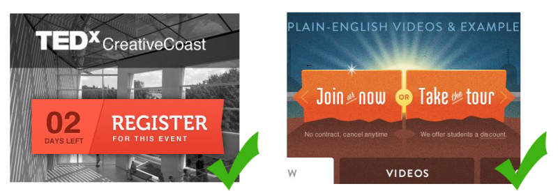
- DON’T Just Throw Your Button Anywhere
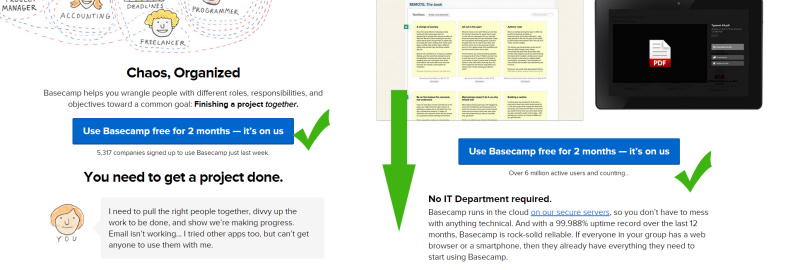
- DO Establish Connection
- DON’T Be Afraid to Use Several CTAs
- DO Use Possessive and Personal Language
- DON’T Forget to Link
- DO Make it Mobile Friendly
- DON’T Get Too Wordy
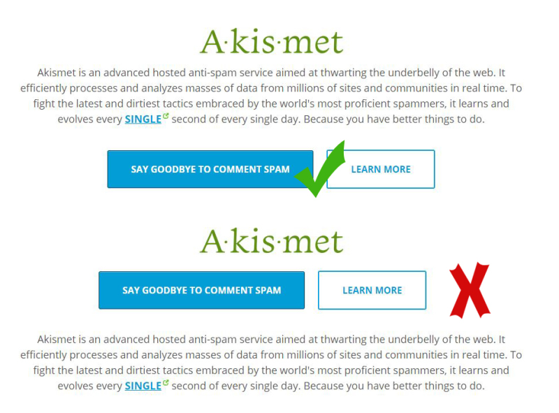
- DO Show That Your Button is a Button
- DON’T Create Red CTAs
- DO Use Appropriate Font Sizes
- Conclusion
- Frequently Asked Questions about CTA Buttons
With another year well under way, a lot of us are likely doing one of two things. Either creating a new website, or improving our current site/s.
No matter which path you’re following, there will almost certainly be a CTA button — Call To Action — or two in the mix.
The mighty CTA is often the linchpin between a conversion and a flake. It’s arguably more important than any other content, as it’s positioned right at the junction of success and failure for your site.
In order to make sure you are getting the most out of your buttons you need to know the do’s and don’ts of a CTA. Here’s a checklist to help you avoid the absolute ‘showstopper’ mistakes.
DON’T Forget About the CTA

Sure it might seem silly to have this on the list but you’d be surprised to know that some sites forget about the power of a CTA. Did you know a study back in 2013 showed that 70% of small business B2B sites didn’t have a clear CTA? 70%! The number itself is mind blowing considering that most businesses are in the business of conversion.
Remember that the CTA gets people going and while you should never think your site visitors aren’t “go getters”, a little prompting never hurts.
DO Make Those Buttons Clickable

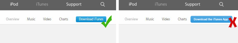
Now when I say “make them clickable” I’m talking about your use of language as opposed to the mechanics of making sure that they are properly coded and linked. Yes, those are important but it doesn’t really matter if your button doesn’t do it’s job, you know the one that prompts people to actually click your buttons.
Prompting with creative and motivating language lets people know that you mean business. Getting rid of mundane and lackluster words like “SUBMIT” and “DOWNLOAD” generates better appeal and interest.
DON’T Go Too Big

Can you stand 20 feet away from your computer monitor and see your CTA as bright as day? If yes then your button is way too big. Sure you want the visitor to easily detect the button but using too large of a button can do a few things. It can come across as overly-aggressive, it can give your overall layout a messy look and it can have people overlooking the rest of your content simply because they can’t get past the CTA size.
DO Create Flattering Buttons
There have been enough case studies over the last few years that have pretty much established that people base their opinions and reactions to things and people on appearance.
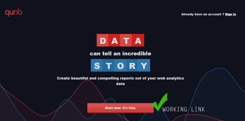
This alone is a reason to make sure that you have “pretty” CTAs. Using stand out colors and creating contrasts within hues and shapes can help draw in the eye as well as get people to start clicking and reading. Using consistency to match the website is also a big help.
DON’T Just Throw Your Button Anywhere
Throwing your belongings around your house is a sure way to lose your things. This is why we create places for these things to go and the same goes for the CTA. Just placing your CTA anywhere on your page will undoubtedly affect reception and detection which are two things you don’t want to lose out on. If you have to search for the CTA then it is obviously in the wrong area.
DO Establish Connection
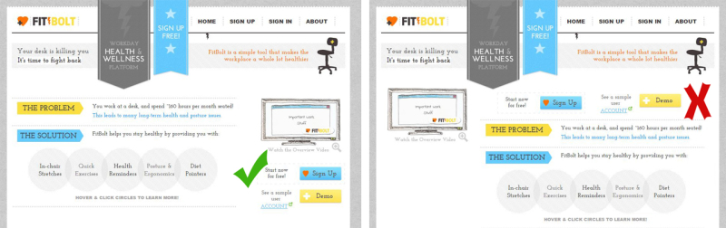
Establishing connection using your CTA means that the button is in a position where it will align with the interest of the site visitor. This will mean that the button’s prompt matches or is related to the nearby copy. Not only are you creating a guide without hammering the visitor over the head of where to go next or how to proceed but you are generating a better probability that the button will be clicked.
DON’T Be Afraid to Use Several CTAs
While shoving button after button in people’s faces is not the way to go, you don’t want to miss out on placing a valuable CTA in an area that it needs to be. Remember that a CTA isn’t just a button to get someone to download or buy a resource. It’s an element that people can use to contact you , learn more or create something out of necessity. Finding middle ground of how many to use especially on one page is something that can be determined via testing and surveys.
DO Use Possessive and Personal Language

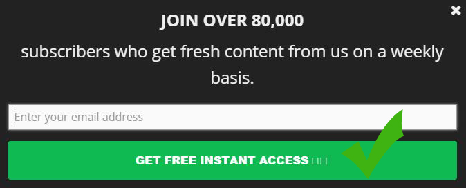
Vague language or cliche language is unflattering and uncreative. You must remember that you are targeting real human beings and while you cannot personalize your site for each and every person who visits, you can opt for a close alternative. Take your language from standard “Make Your Account” to “Make MY Account”.
Simple changes to more possessive words like “me” “my” and “mine” makes the visitor feel as if you are addressing them directly.
DON’T Forget to Link
While this does seem like another no-brainer there are several sites out there right now that have made this mistake. Having a CTA button is great but it won’t do you any good if you forget to link the CTA to the correct page or input a broken link. Other than a broken or link-lacking button some CTAs strangely just send you back to the home page which creates frustration for the user.
DO Make it Mobile Friendly
With mobile devices seemingly being the new way to get online you want to make sure that your CTAs are mobile friendly. You will want to make sure that what a desktop user will see is the same thing that someone on their phone or tablet will see. The experience should be as identical as you can make it in order to capture mobile users.
DON’T Get Too Wordy
Your CTA should be like a snake. It should strike fast and bite hard to grab your visitors. Being too wordy can create impatient visitors that may very well just click the back button or overlook your button altogether. Not only this but using too many words and failing to get straight to the point can create confusion and once more a button not clicked on.
DO Show That Your Button is a Button

Making sure that visitors know that your button is clickable is a very important. If they don’t realize this then chances are they will not click. Using bevels and drop shadows elements can help with this. Adding animation like rollovers and a glow is another trick you can use to make people click. The time for flash animation has passed however as it won’t work for those who are on devices or computers that don’t have the capabilities to use flash.
DON’T Create Red CTAs
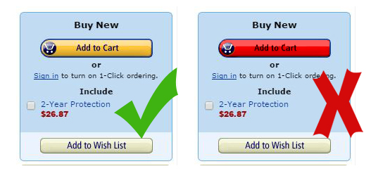
While there are people who will argue this, a red CTA can spell doom for your site. In other words people will turn away instead of clicking. The general consensus is that the color red means “bad” and therefore a red button is not meant to be clicked on. If you must have a red button go for a lighter or darker shade of red and use gradients to create a soft and inviting look.
DO Use Appropriate Font Sizes

Just as you don’t want too small or too big of a CTA button, you want to make sure that your font is just right. Visitors should be able to read the text of your button quickly and easily. This may be fixed by choosing a simple type and at a good size. Remember the words need to stand out and catch everyone’s eye.
Conclusion
Now that you have an idea of what you should and should not do in regards to with your CTA buttons I think you are on your way to creating a better and more successful button. Make sure that you check out my tips on making your buttons overall more clickable.
Keep in mind that while these principles are a great starting point, websites are complex beasts and small changes can ripple through in strange and unexpected ways. Test, test and test some more until you get something that works for you.
Frequently Asked Questions about CTA Buttons
What are the key elements of an effective CTA button?
An effective CTA button should be visually striking with action-oriented text. It should be large enough to be noticed but not so large that it overwhelms the rest of the content. The color of the button should contrast with the background to make it stand out. The text should be concise, clear, and compelling, encouraging the user to take action. It’s also important to place the button strategically on the page where users can easily see it.
How can I test the effectiveness of my CTA buttons?
A/B testing is a popular method for testing the effectiveness of CTA buttons. This involves creating two versions of the same page, but with different CTA buttons. You can then monitor which version gets more clicks or conversions. Tools like Google Analytics can help you track these metrics.
How many CTA buttons should I have on a page?
There’s no hard and fast rule for the number of CTA buttons on a page. It depends on the length and purpose of the page. However, it’s important not to overwhelm the user with too many CTAs. A good rule of thumb is to have one primary CTA and a few secondary ones if necessary.
What are some common mistakes to avoid when designing CTA buttons?
Some common mistakes include making the button too small, using a color that doesn’t stand out, placing the button in a location where it’s not easily seen, and using vague or uninteresting text. It’s also a mistake to have too many CTAs on a page, which can confuse and overwhelm the user.
How can I make my CTA buttons more compelling?
To make your CTA buttons more compelling, use action-oriented, persuasive text. Personalize the text to make it more relevant to the user. Also, consider using a sense of urgency to encourage the user to act immediately.
What is the best color for a CTA button?
There’s no definitive answer to this as it depends on the overall design of your page. However, the button should contrast with the background to make it stand out. Some studies suggest that green and orange buttons are particularly effective, but the most important thing is that the color fits with your brand and design.
Where should I place my CTA button?
The placement of the CTA button depends on the layout of your page. However, it’s generally effective to place the button above the fold, so it’s visible without scrolling. It’s also a good idea to place the button near the relevant text, so the user knows what action they’re being asked to take.
How big should my CTA button be?
The size of the CTA button should be large enough to be noticeable but not so large that it overwhelms the rest of the content. It’s also important to consider mobile users, so the button should be large enough to be easily tapped on a small screen.
Can I use images or icons on my CTA buttons?
Yes, images or icons can be effective on CTA buttons if they’re relevant and help convey the action you want the user to take. However, they should not distract from the button’s text or make the button too cluttered.
Should I use first person or second person language on my CTA buttons?
Both can be effective, but it depends on the context and your brand voice. First person language can make the CTA more personal and engaging, while second person can be more direct and commanding. It’s a good idea to test different approaches to see what works best for your audience.
 Gabrielle Gosha
Gabrielle is a creative type who specializes in graphic design, animation and photography.