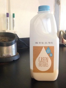
As big coffee drinkers at SitePoint, we also churn through a crate of milk each week. Recently the milk company we use rebranded. Here’s the new label.
If it is possible for a brain to ‘wince’, mine did when I saw this. In fact, my brain still winces every time I see this milk bottle.
There’s no question that ‘Green Pastures’ is a perfectly respectable name for any dairy product. The phrase conjures visions of peaceful, contented cows grazing lazily in lush fields.
High-fives on the naming workshop, guys!
However, how they settled on the idea of using a dry, dusty brown to portray their ‘green pastures’ label – the color of droughts, deserts and sun-baked clay – is one of life’s great mysteries. It’s great to be brave in design, but you need to be careful you aren’t undermining your message.
While some people feel the sensation more acutely than others, most of us feel some sense of mental discomfort when we notice oddities like this. Psychologists call this discomfort ‘cognitive dissonance‘ – an idea that was first described by Leon Festinger.
Festinger theorized that when people encounter it they will usually:
- Try to remove or resolve the discomfort
- Avoid that discomfort in future
Our milk tastes fine and since it is delivered to the fridge, I use it. But would I select it from a supermarket shelf? No, not if I had a choice. Sure, it’s just a printed sticker but it just feels a little bit wrong.
Strangely, this even happens when random, accidental dissonances arise.
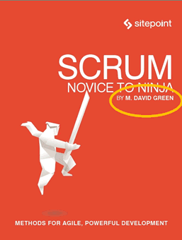
I’m currently working on the book cover for ‘Scrum: Novice to Ninja‘ by M. David Green. Clearly David is ‘Green’ by surname only, and not hue (He may or may not be ‘politically green’).
Yet when I composited his name onto an orange background it felt weird. At first I couldn’t even figure out why, but somewhere my subconscious seemed to be elbowing me impatiently. Eventually my conscious mind ‘got’ it too.
When I switched the orange to a green, it was like shaking a stone out of my shoe. It fixed things.
Even watching the animation above, I still get the same feeling. Weird, huh?
Don’t Dis’ Dissonance
Does this doesn’t mean that you should always avoid cognitive dissonance at all costs?
No. In fact, the entire mechanic of games like Farmville, Sim City and even ol’ school Mouse Trap board game is built around using your own discomfort to draw you deeper into the game.
You invest some time and then have a choice. To do nothing and gradually lose what you have. Or invest more time, protect what you have and obtain more – even if the ‘more’ you obtain is of no tangible value.
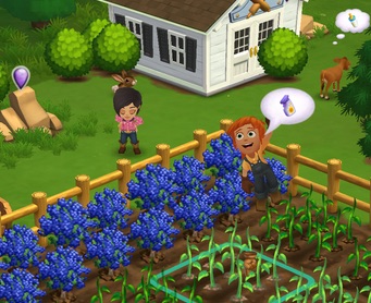
After all, you reason, it would be crazy to let those virtual eggplants just wither on the vine because you didn’t harvest them in time, right? After all those hours you’ve spent…
Providing ways for casual gamers to soothe their ‘pyschic discomfort’ is how Zynga was to able to rake in tens of millions of dollars a day in 2010-11. They didn’t even need to offer things like interesting gameplay, hand-eye co-ordination challenges or even fun.
In truth, not many people ever talked about loving the experience of playing Farmville – they just preferred it over what happens when they stop playing and their farm dies.
So, it turns out that if you harness it correctly, cognitive dissonance can be a really useful force to move and motivate people who are already engaged in your site, app, game, etc.
But it can be much more damaging if it emerges during the introduction of your product/service. At that time the easiest way to soothe their discomfort is to choose another milk company.
Dissonance is a dark and powerful force. Use it wisely.
Republished from the SitePoint Design Newsletter
 Alex Walker
Alex has been doing cruel and unusual things to CSS since 2001. He is the lead front-end design and dev for SitePoint and one-time SitePoint's Design and UX editor with over 150+ newsletter written. Co-author of The Principles of Beautiful Web Design. Now Alex is involved in the planning, development, production, and marketing of a huge range of printed and online products and references. He has designed over 60+ of SitePoint's book covers.