At the time of publishing, I noted that IE7 allowed you use CSS to set image width to a percentage (for instance, 30%), but that it failed to re-calculate that percentage if you resized the browser and a full refresh was required to force the graphic to resize. Resident CSS guru and co-writer of our new CSS reference, Paul O’Brien has pointed out a nice solution to this bug that I’ll detail below.
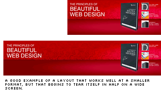
Sometimes, the Web’s greatest strength can also be its biggest Achilles’ heel. As clever as web content can be at reformatting itself for different devices and screen sizes, there’s one layout issue I always battle with — the fact that liquid site layouts stretch and images don’t. While a layout can stretch and contract, and text can flow and wrap, images are assigned a pixel size at birth, and that’s precisely how they’re displayed thereafter, regardless of their surroundings. In most typical article or blog post layouts, this doesn’t present a huge issue. On a really large screen, the images might seem a little undersized, but as long as the text flows around the image correctly, it usually just looks little text heavy, rather than plain wrong. I see this issue mostly in graphical site headers and image heavy promos (like the one below). Typically the more balanced and composed they look at smaller browser widths, the more strung-out and weedy they look on wide screens.
 So, what are your options for resizing these layouts?
1) Adobe Flash: Vectors graphics will always be the ideal tool for resizing and Flash has always been a vector tool at heart, so if your original imagery is mainly vectors, there are some compelling reasons for embedding the whole thing in an SWF.
2) Canvas: The canvas element is part of the new HTML5 spec, and is currently surprisingly well supported by most of the leading browsers. The canvas tag (
So, what are your options for resizing these layouts?
1) Adobe Flash: Vectors graphics will always be the ideal tool for resizing and Flash has always been a vector tool at heart, so if your original imagery is mainly vectors, there are some compelling reasons for embedding the whole thing in an SWF.
2) Canvas: The canvas element is part of the new HTML5 spec, and is currently surprisingly well supported by most of the leading browsers. The canvas tag (<canvas>) itself is nothing more than an empty drawing space waiting for us to fill, but you’ll need some JavaScript voodoo to make good use of it.
For now we’ll leave canvas alone, but it looks to be presenting some really interesting options, so we’ll return to it in the Design View in the near future.
3) Smart Image Resizing/Seam Carving: Seam carving is probably the buzz word of 2007, and if you’ve been following the SitePoint blogs and forums over recent months you’ll likely already be aware of the idea. This is exactly the kind of situation in which seam carving would shine.
Unfortunately, although the concept is brilliant, a way to deploy it within a page still looks to be at least a few months away at this stage, and will likely rely on Flash.
However, while we wait for better technology, I’ve come up with an alternative method for resizing imagery in certain situations. It certainly isn’t applicable in most situations, but if you keep it in mind when you’re planning your imagery, it might be a nice trick to keep up your sleeve.
 Firstly, let’s have a look at the stretchy image in action. To the right is an animation showing the stretch. Almost identical code is running live on the SitePoint home page (in rotation), but I’ve separated it out to a standalone page to make things simpler.
As you can see, as you stretch your browser wider, the three “feature boxes” move away from the book image, while the ‘connecting arms’ stay connected. While the effect eventually fails at super-wide and very low resolutions, it certainly deals with the available space much more elegantly than a standard image ever could — all without requiring any special technology or complex scripts.
Firstly, let’s have a look at the stretchy image in action. To the right is an animation showing the stretch. Almost identical code is running live on the SitePoint home page (in rotation), but I’ve separated it out to a standalone page to make things simpler.
As you can see, as you stretch your browser wider, the three “feature boxes” move away from the book image, while the ‘connecting arms’ stay connected. While the effect eventually fails at super-wide and very low resolutions, it certainly deals with the available space much more elegantly than a standard image ever could — all without requiring any special technology or complex scripts.
The Method
Of course, browsers can and always have been able to resize images on the fly. It’s just that they’ve always done such a rotten job at it, so we designers tend to ignore that ability. The key to this trick is limiting the stretchiness to the parts of the graphic that matter the least — in this case, the connecting arms.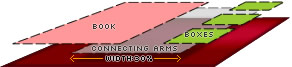 Our image is composed of three smaller, overlapping graphics, each of which is set to
 position:absolute, which just simplifies the whole process of overlapping them. The wrapping DIV that contains them is set to position:relative to keep them inside their box.
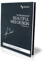 Graphic 1: The Book
The book itself is a transparent PNG8 and set to
Graphic 1: The Book
The book itself is a transparent PNG8 and set to left:55% — this will make sure it’s always positioned a little over half way across the container DIV, regardless of its width. I’ve also set it to top:-1em so that the top edge of the book pokes out of the box. We don’t want this image to distort at all, so we give it it’s natural dimensions — 139x197px.
Lastly, I ensured that the book image would always be in front of everything else by setting its z-index to 99. This will make sure the connecting arms always disappear behind the book image.
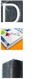 Graphic 2: The Three Feature Boxes
As these cover promos only have a lifespan of a couple weeks, I took the simplest option here and set the three feature boxes up as a single graphic, although in a perfect world I’d have made them a list.
I want this image to stay on the right-hand side of the container, so I’ve positioned it
Graphic 2: The Three Feature Boxes
As these cover promos only have a lifespan of a couple weeks, I took the simplest option here and set the three feature boxes up as a single graphic, although in a perfect world I’d have made them a list.
I want this image to stay on the right-hand side of the container, so I’ve positioned it right:2%.
Like the book image, I’ve moved it to the front of our stack (z-index:90) and set its image dimensions to the default (111x160px) to keep it sharp and clear.
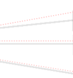 Graphic 3: The Connecting Arms
This, of course, is our stretchy graphic. It’s nothing more than a transparent PNG8 with some pinkish dotted lines. I added some fake soft shadows to give it a touch more depth.
The important point is to keep this graphic relatively plain and raw from the start. If we make it a bit chunky to begin with, stretching it out of shape can’t do all that much damage to it.
Firstly I’ve positioned this
Graphic 3: The Connecting Arms
This, of course, is our stretchy graphic. It’s nothing more than a transparent PNG8 with some pinkish dotted lines. I added some fake soft shadows to give it a touch more depth.
The important point is to keep this graphic relatively plain and raw from the start. If we make it a bit chunky to begin with, stretching it out of shape can’t do all that much damage to it.
Firstly I’ve positioned this left:56%, so its left-hand side should always tuck in behind the book image (which was left:55%), regardless of the page width. I’ve also set the z-index for this graphic to 85, so it should never be in front of either the book or the boxes.
Next, I set the width of this connecting graphic to width:30%. This is 30% of the containing DIV, so the graphic will stretch and contract as its container does. The graphic’s right-hand edge tucks in nicely behind the feature boxes.
There’s no magical method for working out this percentage (30%) — it just takes a bit of trial and error. I set a temporary border on the stretchy graphic while I tweaked it, which helped to makes things clearer.
As you can see, the connecting arms certainly do distort as they stretch, but it doesn’t seem to be damaging to the overall result — to my eye at least.
The Wrap-up
If you like this effect, to my mind there are two challenges you’ll have to contend with. The first challenge is a technical one. IE7 is happy to set your image width at 30% on page load, but it steadfastly refuses to automatically recalculate that width if you resize your browser window. Reloading the page will reset the width, but I don’t know of any way of forcing IE7 to recalculate the width on the fly. Strangely, for all it’s other issues, IE6 will scale the image correctly, so this is clearly a new bug. The second challenge is simply finding a plausible situation in which to use this technique. I’d certainly be keen to see any variations on the theme that you might come up with. Paul O’Brien has suggested a fix for the IE7 refresh bug. He writes:Regarding your stretchy images article the fix for IE7 is simply to wrap the image in a span and apply the measurements to the span and make the image 100% width and height. I always do it this way and it seems to work without problems :) e.g.
div#promo-b div span#stretch {
 position:absolute;
 top:.5em;
 left:56%;
 z-index:85;
 width:30%;
 height:150px
}
div#promo-b div span#stretch img {
width:100%;
height:100%;
}
<span id="stretch"  >
<img src="https://www.sitepoint.com/images/books/design1/design1-stretch2.png" alt="" /></span>
Frequently Asked Questions on Stretchy Images with HTML and CSS
How can I ensure my images maintain their aspect ratio when resized?
To maintain the aspect ratio of an image when resizing, you can use the CSS property object-fit. This property defines how an element responds to the height and width of its content box. It’s similar to background-size but works with <img> and <video> elements. For instance, object-fit: cover; scales the image to cover the content box, regardless of its aspect ratio.
What is the difference between object-fit: cover and object-fit: contain?
The object-fit: cover property scales the image to cover the entire content box, potentially cropping the image in the process. On the other hand, object-fit: contain scales the image to fit within the content box while maintaining its aspect ratio, ensuring that the entire image is visible, which may leave some space in the content box.
How can I make an image responsive using CSS?
To make an image responsive, you can use the max-width property in CSS. Setting max-width: 100%; ensures that the image will never exceed the width of its container. This is particularly useful when designing for different screen sizes to ensure the image scales down on smaller devices.
How can I crop an image using CSS?
CSS provides the object-fit property to crop images. By setting object-fit: none; and specifying a width and height, you can effectively crop your image. However, this may distort the image if the specified dimensions do not match the image’s aspect ratio.
How can I center an image within its container?
To center an image within its container, you can use the margin: auto; property in CSS. This works when the image’s width is specified, and the container has a specified height.
How can I stretch an image to fill its container without distorting it?
To stretch an image to fill its container without distorting it, you can use the object-fit: cover; property in CSS. This scales the image to cover the container while maintaining its aspect ratio, potentially cropping the image in the process.
How can I resize an image in CSS without using the object-fit property?
You can resize an image in CSS by specifying its width and height properties. However, this may distort the image if the specified dimensions do not match the image’s aspect ratio.
How can I make an image fill its container without cropping it?
To make an image fill its container without cropping it, you can use the object-fit: contain; property in CSS. This scales the image to fit within the container while maintaining its aspect ratio, ensuring that the entire image is visible.
How can I make an image maintain its aspect ratio when resized?
To maintain an image’s aspect ratio when resized, you can use the object-fit property in CSS. For instance, object-fit: cover; scales the image to cover the content box, regardless of its aspect ratio.
How can I make an image responsive without using the max-width property?
To make an image responsive without using the max-width property, you can use CSS media queries. These allow you to apply different styles depending on the size of the device viewing the page, ensuring that the image scales down on smaller devices.
 Alex Walker
Alex has been doing cruel and unusual things to CSS since 2001. He is the lead front-end design and dev for SitePoint and one-time SitePoint's Design and UX editor with over 150+ newsletter written. Co-author of The Principles of Beautiful Web Design. Now Alex is involved in the planning, development, production, and marketing of a huge range of printed and online products and references. He has designed over 60+ of SitePoint's book covers.


