Here’s another fascinating study from Greg Edwards of Eyetools.com.
For those unfamilar with Eyetools, the company specialises in website usability studies based on direct, real-time tracking of a user’s eyeball movements as they interact with a site.
As they say “Clients typically use our data to guide the redesign of their website (or shopping cart, or email campaign, or landing pages) to make sure that what they want people to be reading on their website is, in fact, read.“
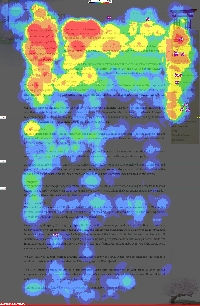
The pay-dirt from these studies is the ‘heatmap’. These diagrams use overlayed, color to demonstrate the relative appeal of the various page elements – typically bright red for attractive, high ‘eye traffic’ areas, yellow for medium traffic areas, and green and blue for progressively less attractive content. Very informative stuff indeed. You can speculate on what a user may or may not do till the proverbial cows come home, but it’s hard to argue with a swarm of free-wheeling eyeballs.
I think the thing that’s always impressed me the most with the Eyetools studies, is the consistency of the results from user to user. It seems that while more experienced users are certainly more likely to move through a given page with more speed and confidence than their less savvy brethren, they’ll still generally follow the same well-worn paths.
The particularly cool thing about this recent test case is they’ve chosen a site we’re (almost) all very familiar with – CSSZenGarden.com. Here we have the unusual situation of being able to witness users interacting quite differently with alternative layouts, even though we know the content and markup is identical.
Besides the more predictable conclusions — for example, users tend to scan headings first, and ‘above the fold’ is better — the example seems to show users paying signicantly less attention to navigation elements when they’re placed on the right-hand side. Of course, color, size and other elements are coming into play in the example, but I still think it’s quite instructive.
Fascinating reading.
 Alex Walker
Alex has been doing cruel and unusual things to CSS since 2001. He is the lead front-end design and dev for SitePoint and one-time SitePoint's Design and UX editor with over 150+ newsletter written. Co-author of The Principles of Beautiful Web Design. Now Alex is involved in the planning, development, production, and marketing of a huge range of printed and online products and references. He has designed over 60+ of SitePoint's book covers.


